超级板块 & 2021年751国际设计节展场设计,北京 / 不也设计工作室
紧急任务 An Urgent Commission
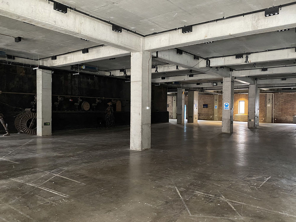
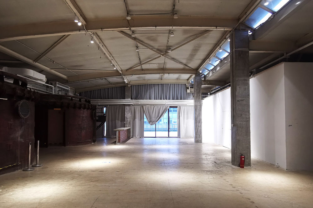
我们接到 2021 年北京国际设计周 751 国际设计节展场设计委托时,距离开展仅剩一个多月。以“超级链接”为主题的本次展览持续一周,聚焦设计、科技与大众的联系。主、副两处展场基地面积合计达 2000 余平方米,均由原国营 751 厂厂房改造而成,室内空间保留了大量工业设备和原始结构。主办方及策展人希望我们能颠覆同类型展览常用的严肃美术馆式展场,以低成本、草根化的空间设计为观众带来一次特别的观展体验。
We were committed to design the 751 Int’l Design Festival exhibition space about one month away from its opening date. As part of the 2021 Beijing Int’l Design Week series, this one-week long exhibition, themed Hyper_Connection, focused on the connection between design, technology and public. With a total area of 2000 m², the two sites respectively holding the main and sub exhibitions are both renovated from industrial buildings of the previously state-owned 751 Factory, preserving abundant industrial equipment and original structures in the interior. The organizer and curator deliberately selected these sites to deviate from the conventional white-box art galleries that usually adopted by similar exhibitions, and requiring us to deliver a low-cost, grassroot-feeling spatial experience to the visitors.
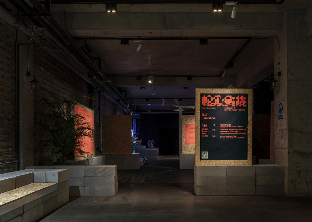
▼主展场入口的导览模块
guiding module at the entrance©UK Studio
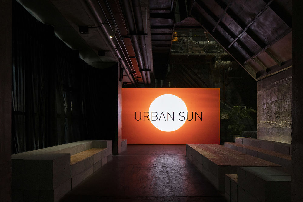
▼主展场艺术家 Daan Roosegaarde 展区
main exhibition area of artist Daan Roosegaarde©UK Studio
周期短、预算紧、面积大、方案又需要预留足够灵活度以应对疫情导致的展览内容的随时变动。
这些限制恰好促使我们思考,能否针对此类短期展览常见的巨大布展浪费问题,提供一种相对低技而环保的解决方案?
我们希望,布展所用的主要材料能够在撤展后被回收再利用,一方面减少浪费并通过回收所得降低成本,另一方面也呼应设计节主题“超级链接”:当回收后的材料被使用在其他场景时,本次展览也能获得空间和时间上的延续,在设计节之外被链入更广大的社会图景之中。
We quickly identified the challenges in this project: tight schedule, limited budget, large site and need of flexibility in response to the potential content changes caused by the COVID pandemic. We saw these constrains as opportunities to propose a sustainable and low-tech alternative solution to the common problem of excessive material waste in ephemeral temporary exhibitions. Our goal was to have most of the construction materials to be recycled and reused after the exhibition period, so that it would not only bring down the cost, but also connect this exhibition to a broader social spectrum through the second life of the recycled materials, echoing the exhibition theme Hyper_Connection.
▼主展场艺术家 Ursula Biemann 展区
main exhibition area of artist Ursula Biemann ©UK Studio
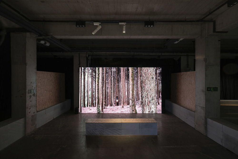
▼主展场艺术家 Thomas Thwaites 展区
main exhibition area of artist Thomas Thwaites ©UK Studio
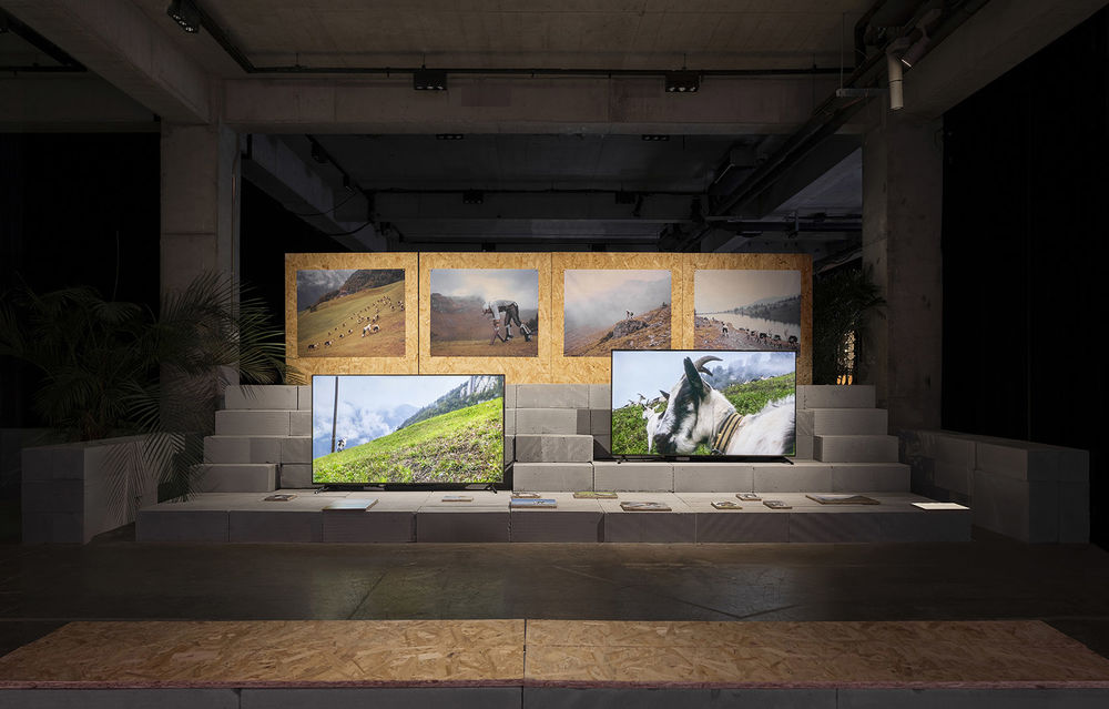
▼主展场艺术家邱宇展区
main exhibition area of artist Qiuyu©UK Studio

▼主展场“社会链接”主题展区入口的导言模块 guiding module of social connection section©UK Studio

“超级板+块”
The Hyper Board + Block
在甲方支持下,我们决定直接使用两种工地常见的施工材料——蒸压加气混凝土砌块和欧松板作为主材,设计一套空间布展体系来回应项目中的所有需求与挑战。借用设计节主题,我们将这套系统命名为“超级板+块”。
With the client’s support, we decide to use two common construction materials, Autoclaved Aerated Concrete (AAC) Blocks and Oriented Strand Board (OSB), to design one display system to satisfy all the needs and challenges in the project. Inspired by the exhibition theme, we named our system The Hyper Board + Block.
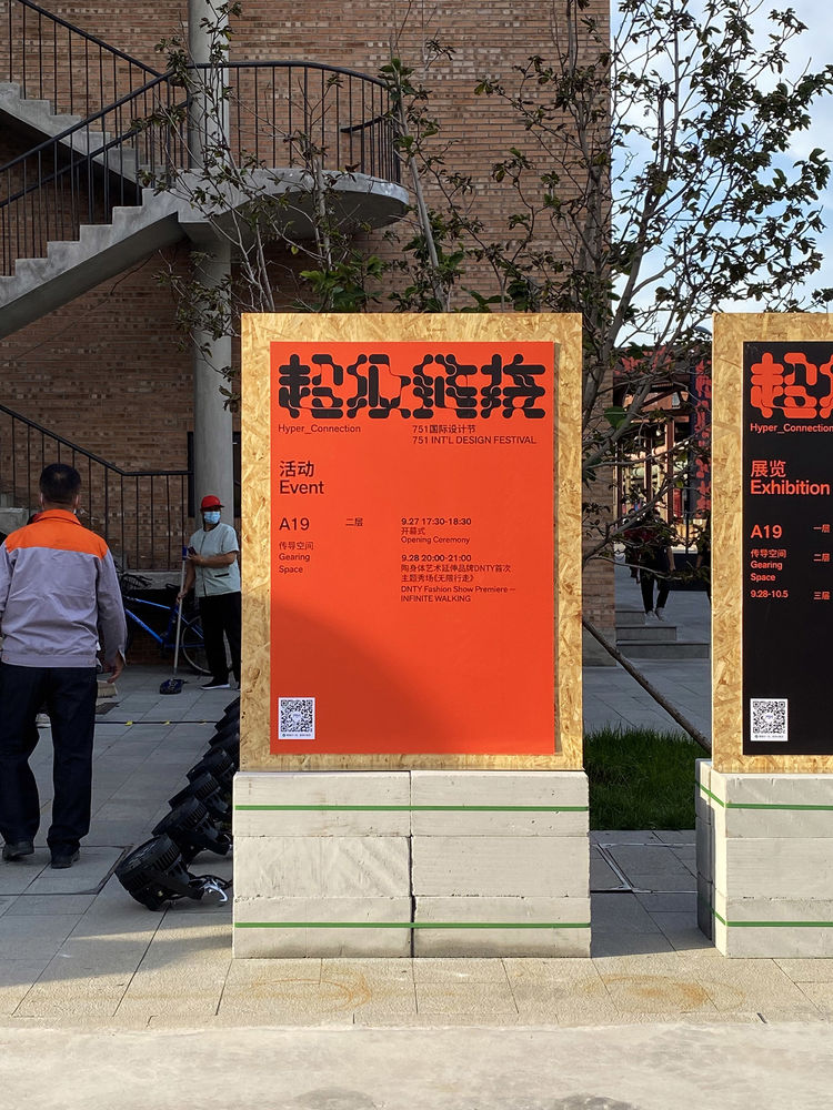
▼室外导览模块,绿色绑带用于束紧砌块,防止松动
exterior guiding module©Studio NOR
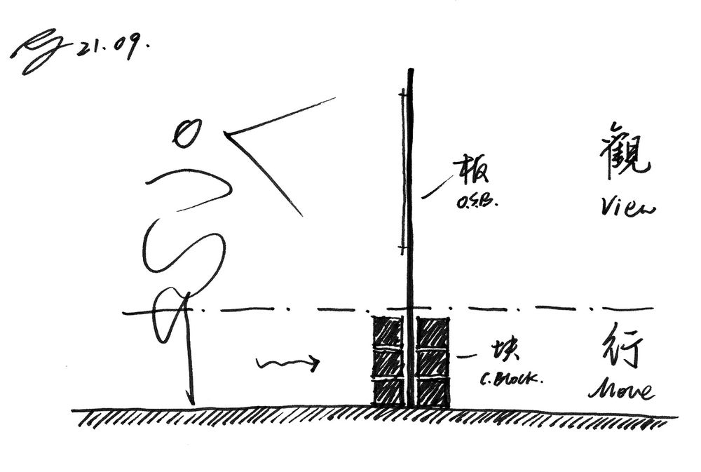
对上述两种主材的选择出于以下一些思考:首先,从观众行为角度出发,展场的基本空间功能可大致分为两类:行与观。前者指向平面性的空间分割与流线引导,后者指向立面性的展墙与展台。针对两者的最低限的形式处理要求,则分别是对观众膝盖以下高度进行连续控制,以及在观众视点范围内局部设置展示面。
砌块重而实,欧松板轻而展,天然适合上述两种不同功能:我们将前者贴地叠垒不超过四层,在最低限度满足划分空间需求的同时,还可作为展板配重和座椅家具,并且避免了叠垒过高带来的安全隐患;将后者用作展板和家具台面,板材自身足够硬挺,不需额外加肋,其光滑的触感和温暖的色彩还能中和砌块与基地的粗砺冷峻。
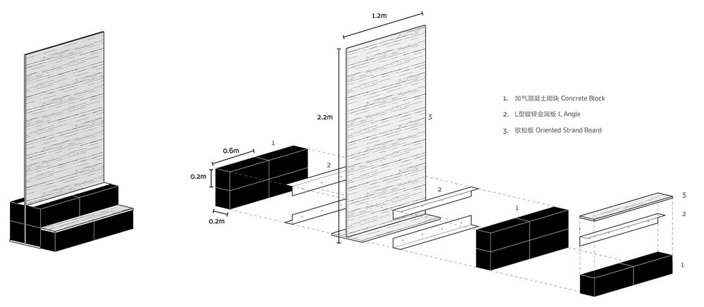
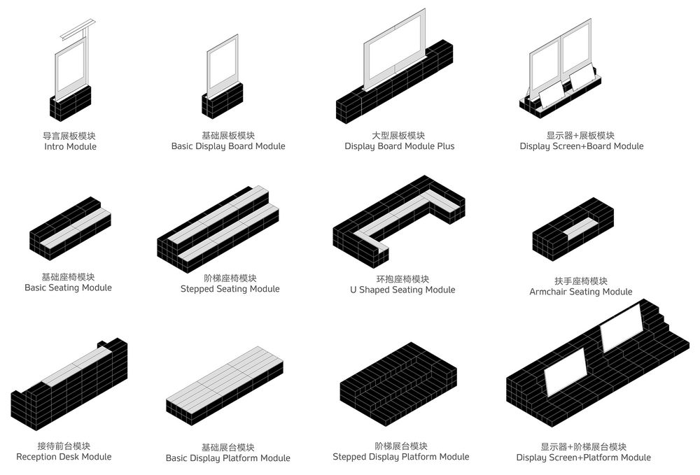
▼基础模块构造轴测示意图
axonometric of basic module©Studio NOR
▼部分模块组合轴测示意图
axonometric of different modules©Studio NOR
From the visitors’ behavioral perspective, the basic spatial functions of an exhibition space can be roughly divided into two categories: movement and viewing. Movement is related to the planar spatial division and circulation guidance, whereas viewing is related to the elevational display panels and stands. The minimum spatial treatment required for these two behaviors are respectively to set continuous boundaries at a height below knees, and to set occasional vertical surfaces at eye level, which the AAC Block and OSB are respectively sufficient for. The blocks were laid on floor at heights no more than four courses to efficiently guide the visitors’ movement while avoiding instability danger. The mass and weight of the blocks made them also suitable for seating furniture and display panel counterweights. Since the boards are stiff enough to self-stand without additional ribs, they were mostly used as display panels and furniture countertops. Their smooth touch and warm colors can also neutralize the roughness of the site and AAC Blocks.
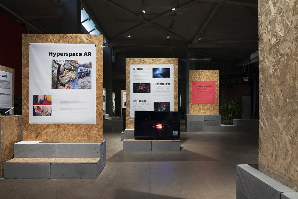
▼副展场二层空间总览
2nd floor of the sub-exhibition hall©UK Studio
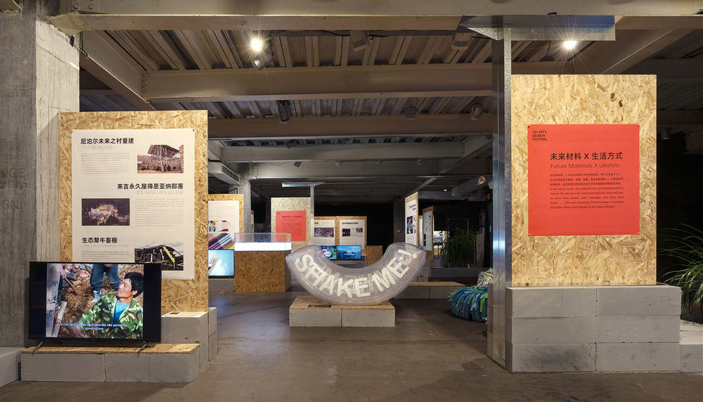
▼副展场三层空间总览
3rd floor of the sub-exhibition hall©UK Studio
其次,这两种主材的一系列特点能满足我们对时间、成本和可回收性的要求:
第一,在能快速塑造大块面形体的材料中,它们价格相对低廉、有大宗成品现货,能节省备料成本与周期;
第二,它们作为日常基础建材使用时无需外露,布展期间产生的表面损耗不影响材料的回收使用;
第三,加气混凝土砌块是密度最低的常用砌体,欧松板重量更轻,利于工人现场操作。它们无需表面处理,加上我们确定材料间不抹砂浆、不粘接的原则,可大幅减少布撤展与现场调改的难度和周期,更重要的是,能保证撤展后材料被折价回购的可能性;
最后,这两种材料都是模块化产品且具有相同模数,我们仅需为它们设计出不同组合方式,即可满足各种功能场景需求,可因此节省设计周期,为布展抢出更多时间。
From the logistics perspective, both materials fit into our schedule for time, budget, and recyclability. Firstly, among the materials that can quickly compose large massing, AAC Blocks and OSB are relatively inexpensive and have bulk off-shelf products in stock, which can save material preparation costs and time. Secondly, they do not need to be exposed when used as common construction materials, meaning the foreseeable surface damages during the exhibition will not affect the materials’ recycling and reusing. Thirdly, both materials are relatively lightweight, making them conducive to workers’ operation. They do not require any surface treatment and we determined there will not be any mortar or additional bonding applied between the materials, which can greatly reduce the difficulty and timespan of the construction and on-site adjustments. More importantly, it can guarantee that all the materials can be reused after the exhibition. Last but not least, the AAC Block and OSB are both modular products sharing the same modulus, so that we only need to design different combinations of the materials to meet all functional requirements in the project, which can save simplify the design process and save more time.
▼副展场脱硫罐内展示 softwaresoft 作品的基础展板模块
display module of the sub-exhibition hall©UK Studio
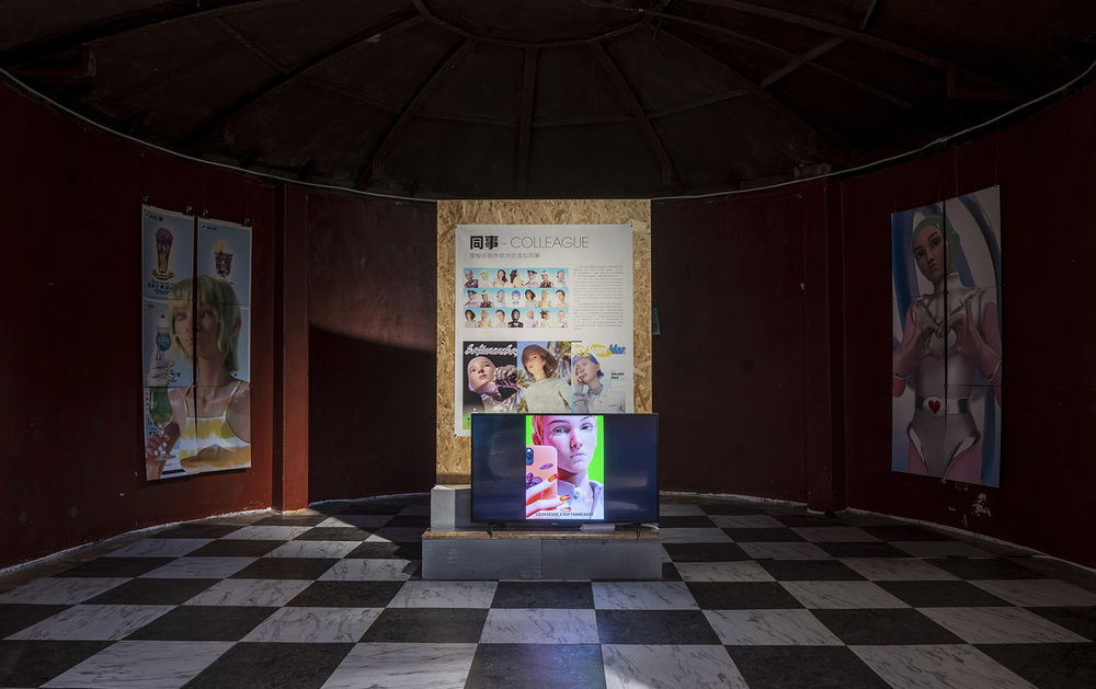
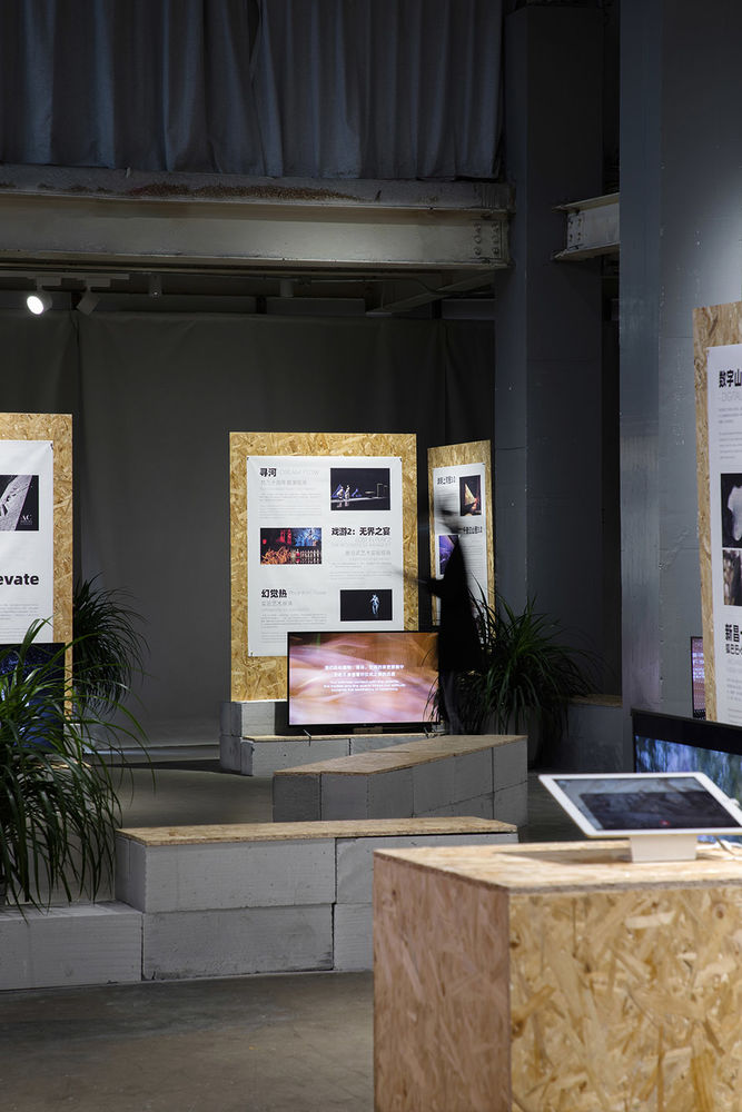
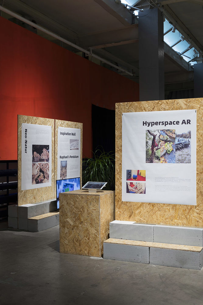
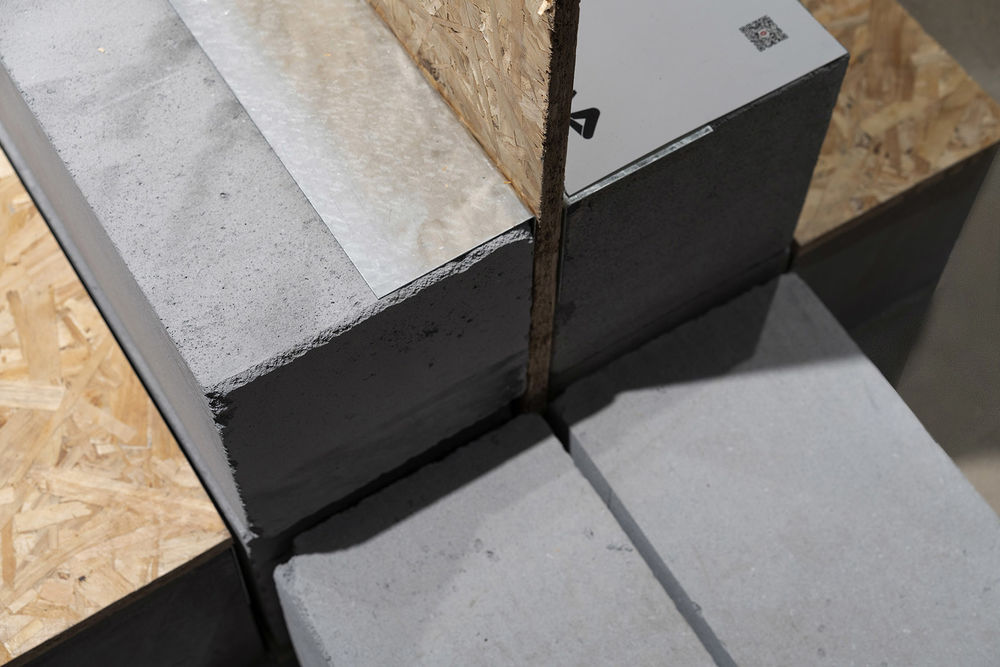
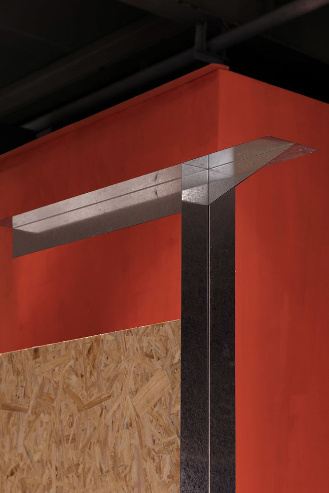
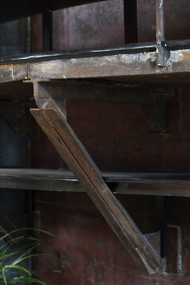
我们为展板、展台和桌椅三种功能各设计出一系列基本组合模块及变体。其中,一个基础展板模块由一块 1.2×2.4 米的成品欧松板切去 0.2 米高度后,在底部两侧各被四个 0.6×0.2×0.2 米的砌块夹住组合而成,而被切去的 1.2×0.2 米的欧松板在与 L 型镀锌板螺接后,恰好成为展台和桌椅模块的台面配件,以镀锌板卡入砌块缝隙内固定。使用 L 型镀锌板的灵感来自基地保留的工业脱硫罐的构造细节,我们在设计主题导言模块时特别强调了这第三种材料,以四条 L 型镀锌板呈 T 字型夹合做成指路标,提示观众流线方向。
We designed a series of basic modules and variants for each of the three functional categories: display panels, display platforms and seating/table furniture. A basic display panel module is made up of one 1.2×2.4m off-shelf OSB being cut off by 0.2m height and sandwiched at bottom by four 0.6×0.2×0.2m AAC Blocks on each side. The 1.2×0.2m chopped-off board is screwed with a L-shaped galvanized angle to become the countertop accessory module for display platforms and seating/table furniture, fixed by inserting the L angle into the gap between blocks. The inspiration for the tectonic use of L-angles came from a joint detail of the industrial desulfurization tank preserved on site. This third material is expressively celebrated on the design of the Intro Module, where four L-angles are assembled to form a T-shaped signpost to guide the visitors’ circulation.
▼副展场基础展板模块与欧松板展台
display tableof the sub-exhibition hall©UK Studio
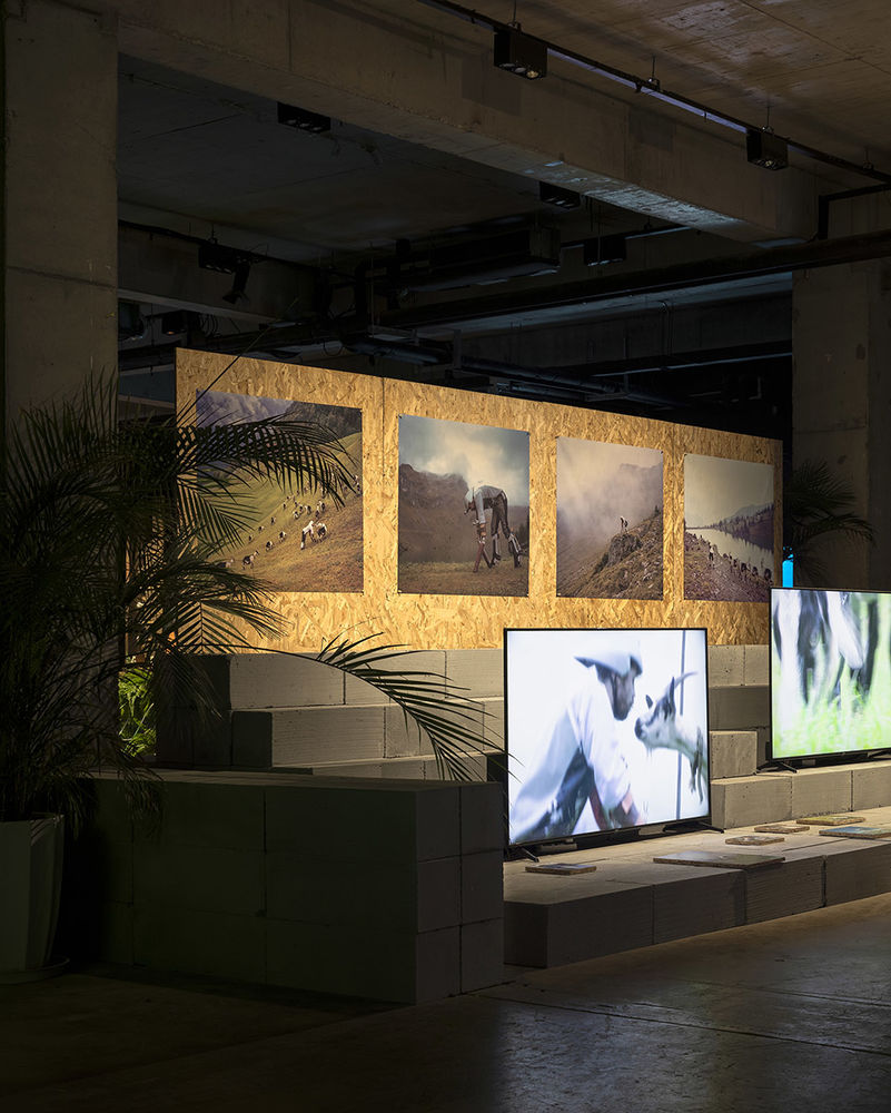
▼显示器+阶梯展台模块
display module©UK Studio
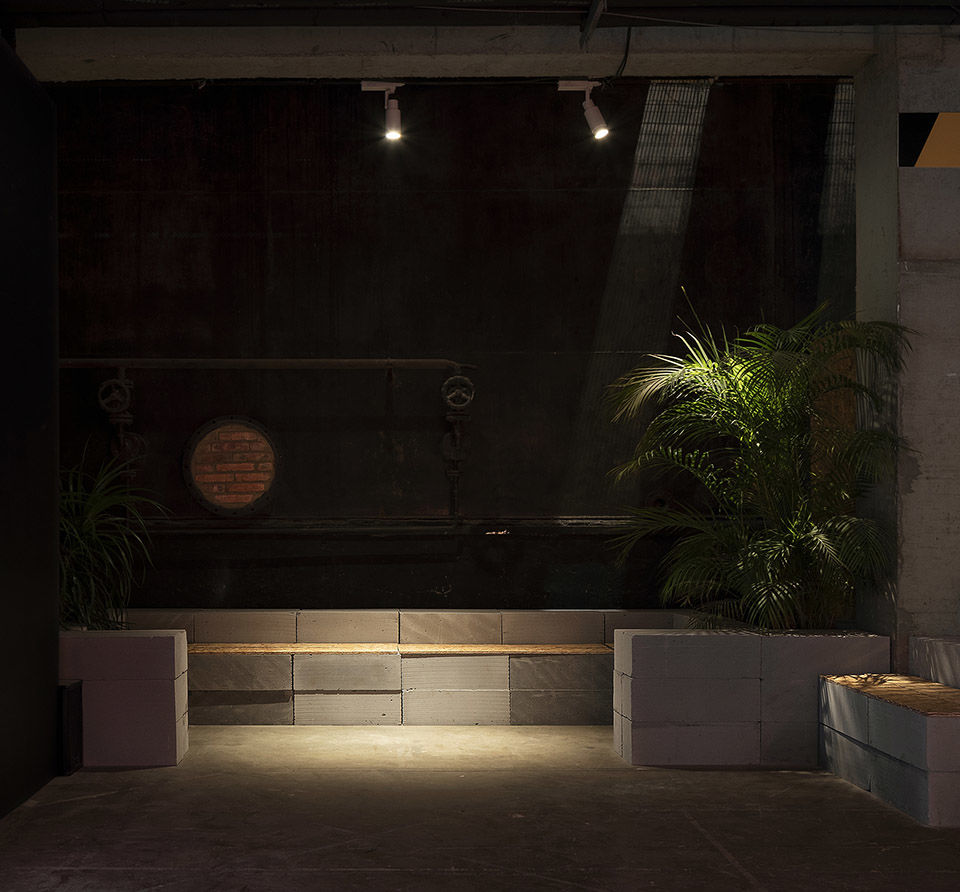
▼环抱座椅模块
boothdisplay module©UK Studio
因地制宜
Echoing the Genius Loci
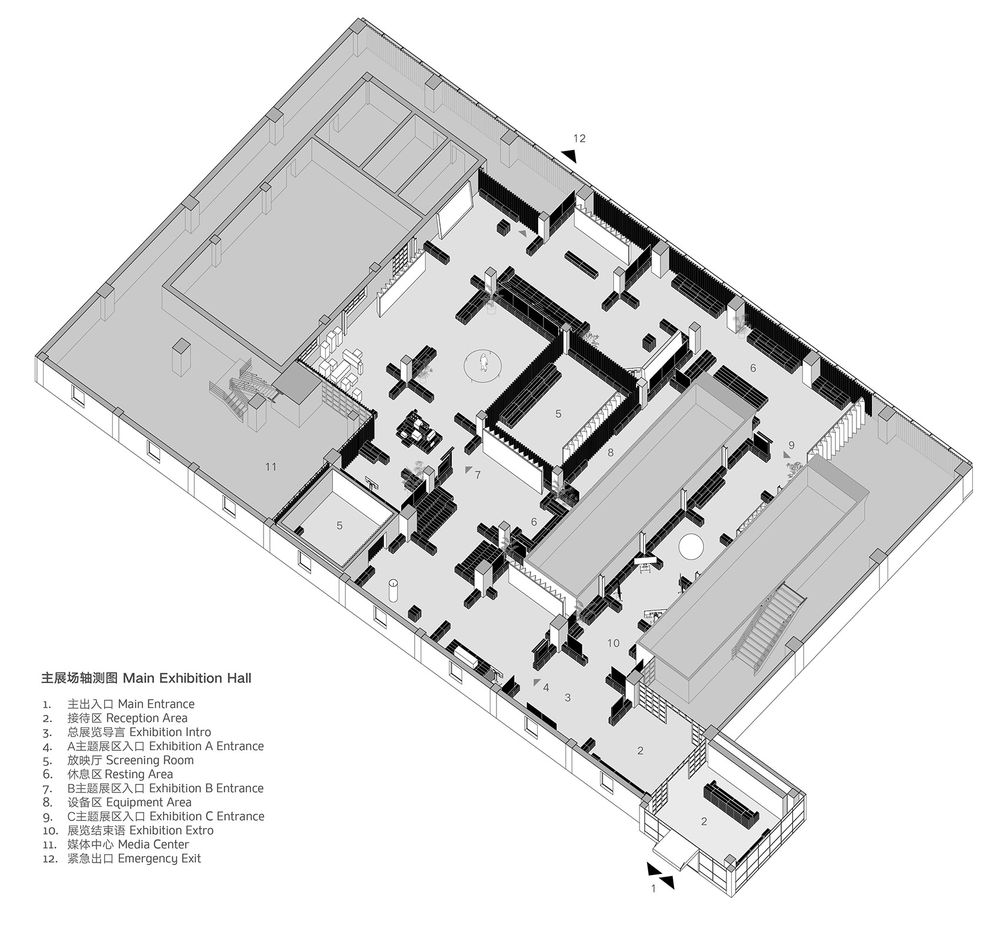
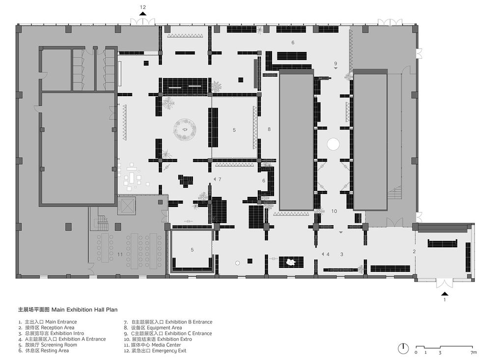
主、副两处展场基地均为框架结构,室内可见裸露的梁柱。我们希望用布展体系强化原有结构逻辑,使基地独特的工业历史成为展览的一部分。主展场主要展出装置及视频艺术,我们以每根结构柱为中心,沿着梁的投影方向在地面线性叠垒砌块,在膝盖以下高度将空间切割成诸多方形围合空间,每个空间分别承载一位艺术家的作品或一种服务功能(接待、导言、休息等),再通过局部在砌块隔断上打开缺口,限定出一条连续的环形流线贯穿三个主题展区。
Both of the two exhibition sites are frame structure buildings where exposed concrete and steel beams and columns have dominant present in the interior space. We hope to use the Hyper Board + Block system to strengthen the original structural logic, so that the site’s unique industrial history can be embraced as one part of the exhibition.
The contents of the main exhibition hall were mostly large-size installation and video arts. With each structural column as a center, AAC blocks were linearly stacked to radiate out along the projection of beams, dividing the original open-plan space into many enclosed squares under the height of knee, each of which hosts an artist’s work or a service program (reception, intros, resting, etc.).
By strategically setting open breaks on the block partitions, we created a continuous circulation path running through three theme exhibition zones.
▼主展场艺术家刘佳钰、李杭展区,布展体系强化原有结构逻辑,使观众注意到基地独特的工业历史背景 to strengthen the original structural logic of industrial history©UK Studio
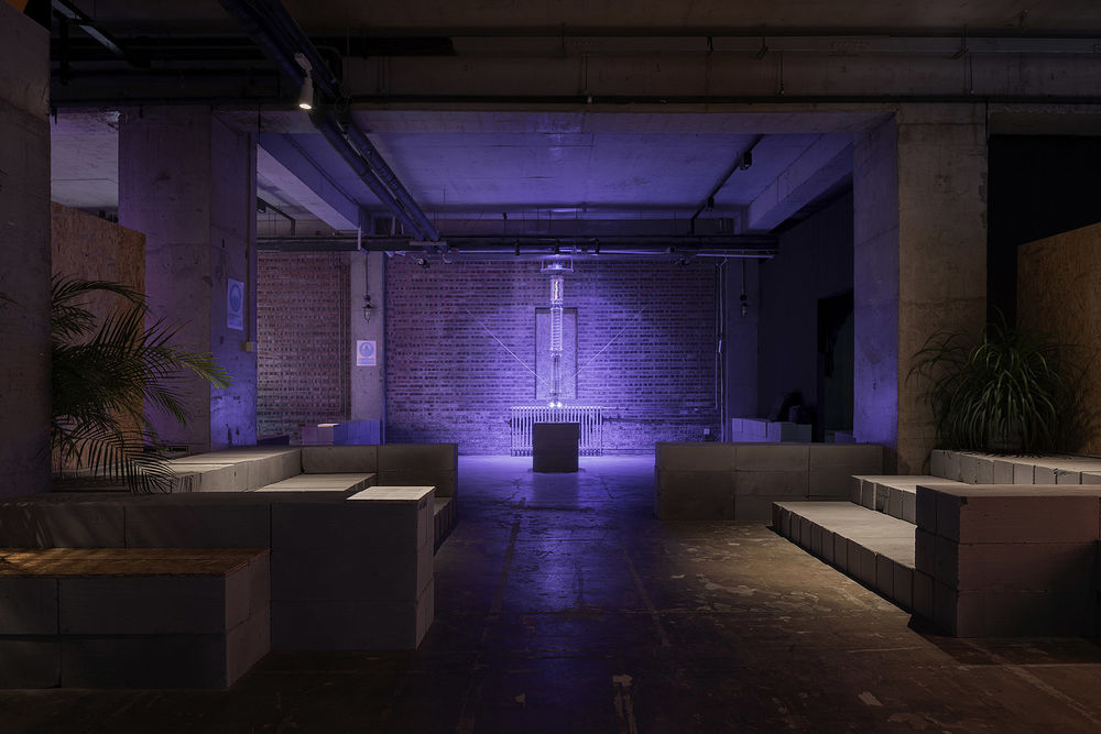
▼主展场艺术家高文兼展区,空间为观众构建出一幅新旧交织的工业景观异世界
main exhibition hall presenting artist Gaowen’s work©UK Studio

▼主展场休息区后被灯光洗亮的工业刮板机
industrial machine inmain exhibition hall©UK Studio
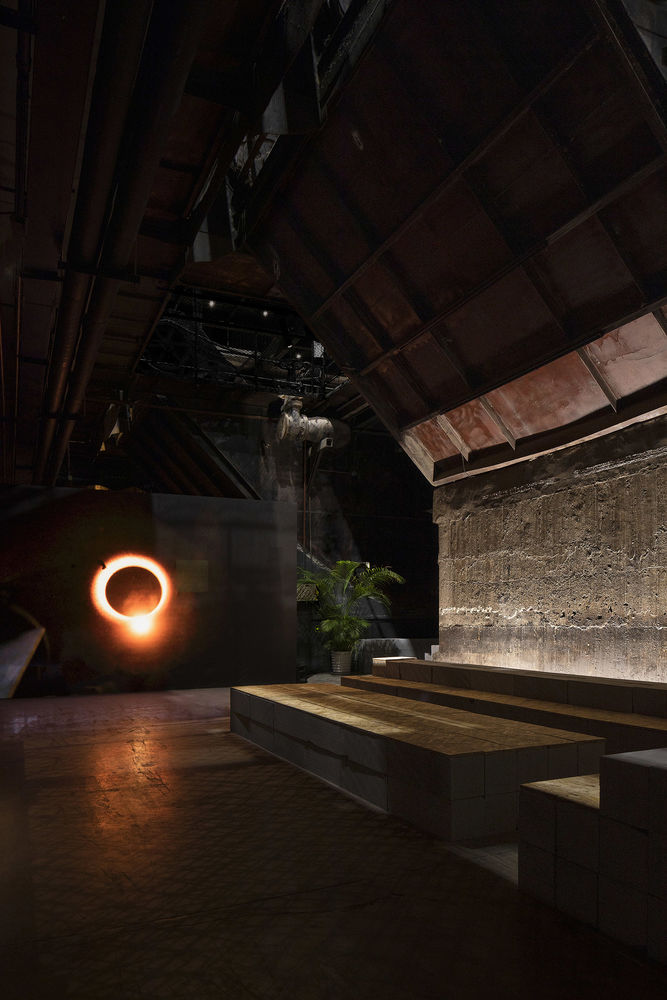
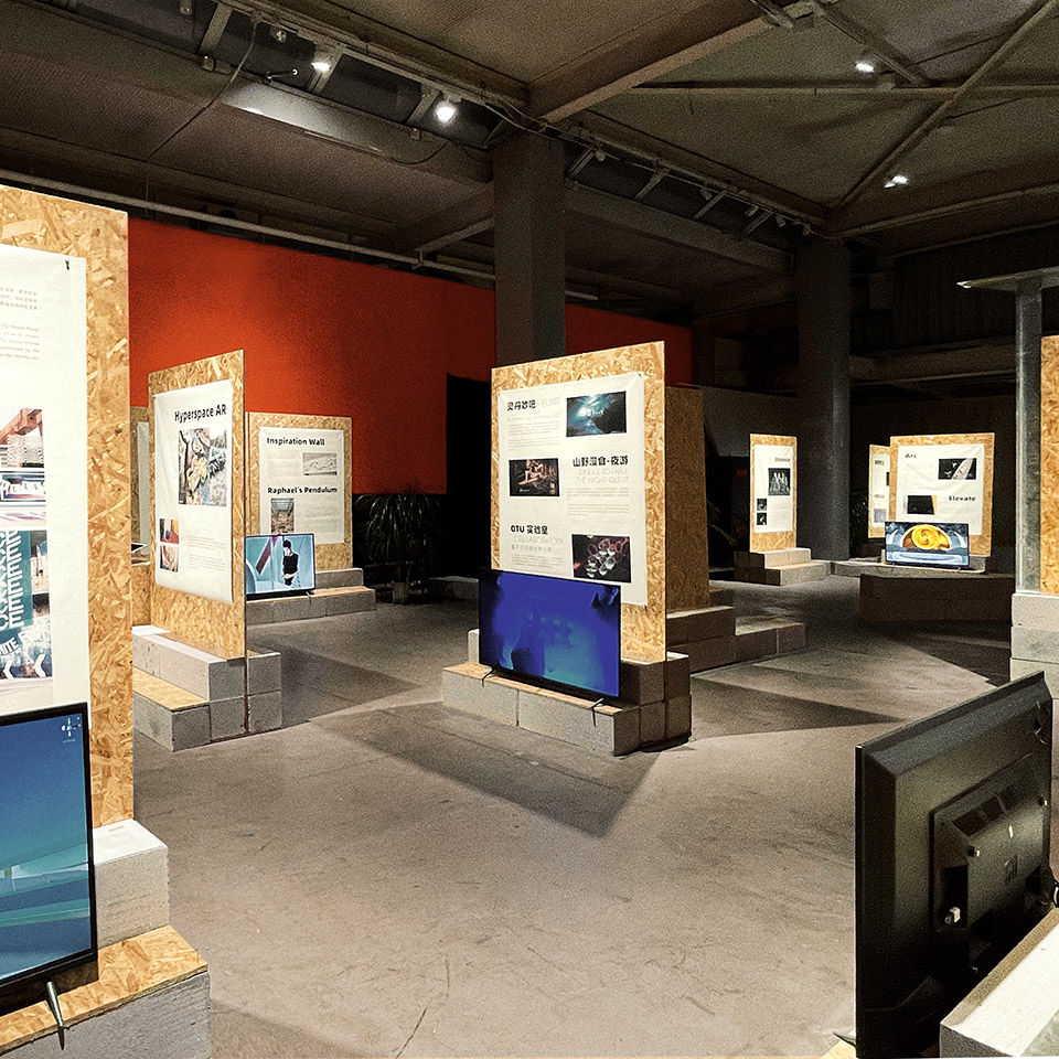
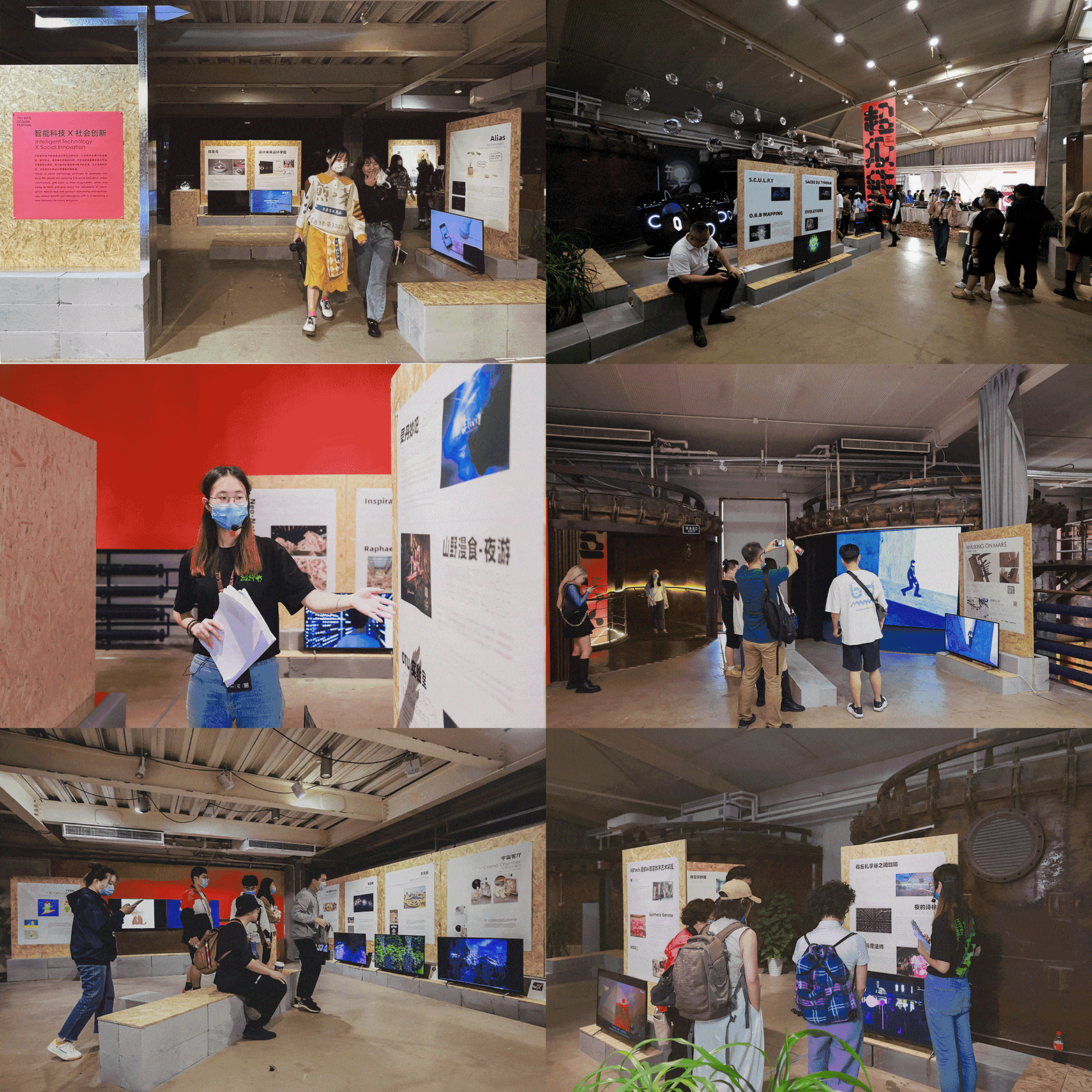
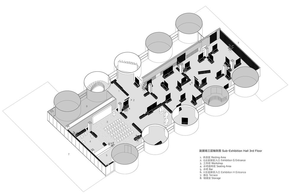
副展场的展览内容以文献及视频资料为主,还设置了工坊和水吧区,用于展览期间举办各类小型活动。策展人希望副展场空间能与主展场形成对比,呈现轻松活泼的社交氛围。
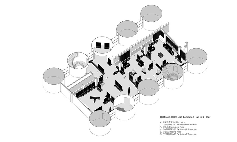
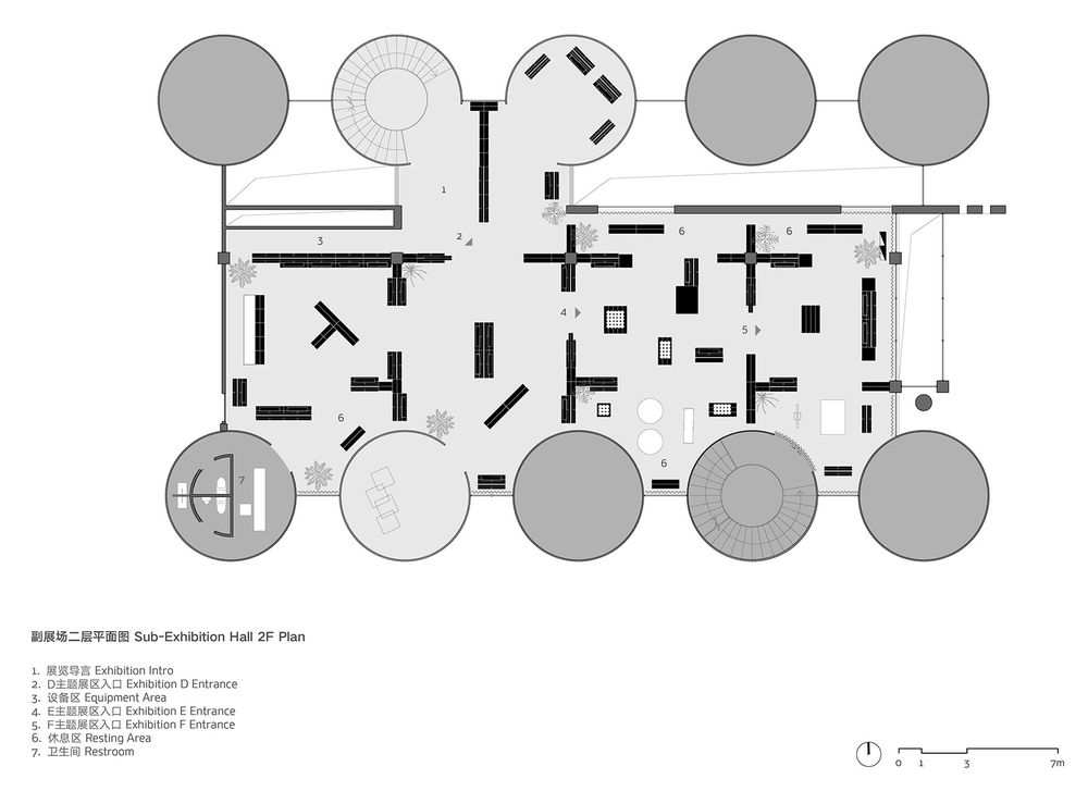
我们在沿用主展场空间分割手法的基础上,根据不同展区展品数量及类型,在各空间内部设计了多种模块组合形式,使展板和展台面向不同方向呈散点状阵列排布,又在局部设计了与结构正交网格呈角度布置的家具,创造出曲折回环的观展流线,吸引观众在游园式的体验中深入探索展览内容。
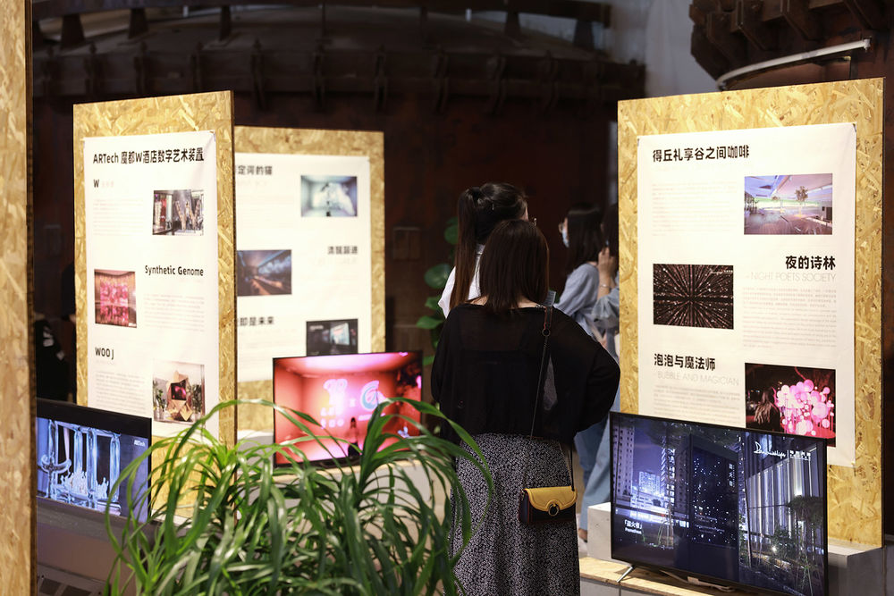
The contents of the sub-exhibition hall were mainly documents and small-size video clips. There were also a workshop and bar area required for holding activities during the exhibition. To contrast with the main exhibition, the curatorial team demanded that the sub-exhibition space to have a more relaxed and social atmosphere to promote impromptu communication among the visitors. Based on the layout strategy of the main exhibition, we developed a variety of module combinations for the sub-exhibition hall according to the amount and types of exhibition contents, scattering the display panels and platforms in different directions to form a field condition, and placing furniture at an angle to the orthogonal grid of the structure, creating a meandering experience for the visitors to explore and encounter the exhibition contents.
▼参观副展场的现场观众 exhibition scene©751D·Park&某集体 ART+TECH
超级链接 The Hyper Connection
有赖于“超级板+块”体系的灵活性,我们得以跟随策展需求的变动实时快速调整方案,通过与甲方、策展团队、灯光顾问及搭建团队紧密沟通合作,在一周内完成了全部展场的布展工作。砌块、欧松板、镀锌钢板、绿植与基地原有的混凝土和钢结构衔接融合,在装置与显示器跃动迷离的光色晕染下,为观众构建出一幅新旧交织的工业景观异托邦。
Relying on the flexibility of the Hyper Board + Block system, we were able to quickly respond to last-minute changes from different parties, and through close communication and cooperation with the client, curatorial team, lighting consultant and construction team, the construction process finished within one week. The AAC Blocks, OSB, L-angles, green plants seamlessly blended into the original concrete and steel structures of the site, together with the vibrant changing light emitted from the LED screens and monitors, creating for the visitors an industrial landscape heterotopia intertwined with the old and the new.
▼副展场三层工作坊区展览现场
exhibition scene on 3rd floor of sub-exhibition hall©UK Studio
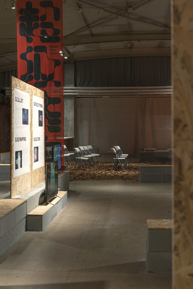
▼砌块、欧松板、松木屑、绿植与基地原有的混凝土和钢结构衔接融合
details of the Hyper Board + Block system©UK Studio
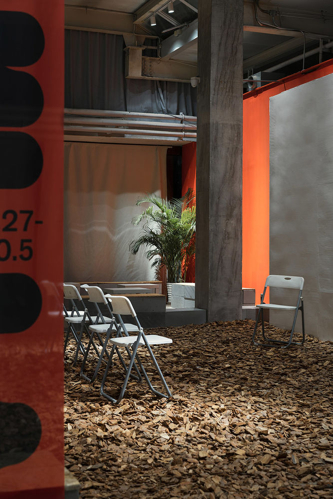
展览结束后,我们得知全部混凝土砌块与欧松板都已被完好回收,它们将携带着这次设计节的基因与讯息,如蒲公英般散落他方,去链接更多的人和空间。或许今后某一天,我们将在某面墙前重逢。
After the exhibition, we were glad to learn that all the blocks and boards have been recycled for reuse. They will carry the genes and messages of this design festival, spread like dandelion seeds, to connect more people and spaces. Perhaps one day in the future, we will meet them again in front of an anonymous wall.
▼砌块、欧松板与镀锌板组合的细部构造 details©UK Studio
▼主展场轴测示意图
main exhibition hall axonometric©Studio NOR
▼副展场二层轴测示意图
2nd floor axonometric of sub-exhibition hall ©Studio NOR
▼副展场三层轴测示意图
3rd floor axonometric of sub-exhibition hall ©Studio NOR
▼主展场平面图
main exhibition hall plan©Studio NOR
▼副展场二层平面图
sub-exhibition hall 2f plan©Studio NOR
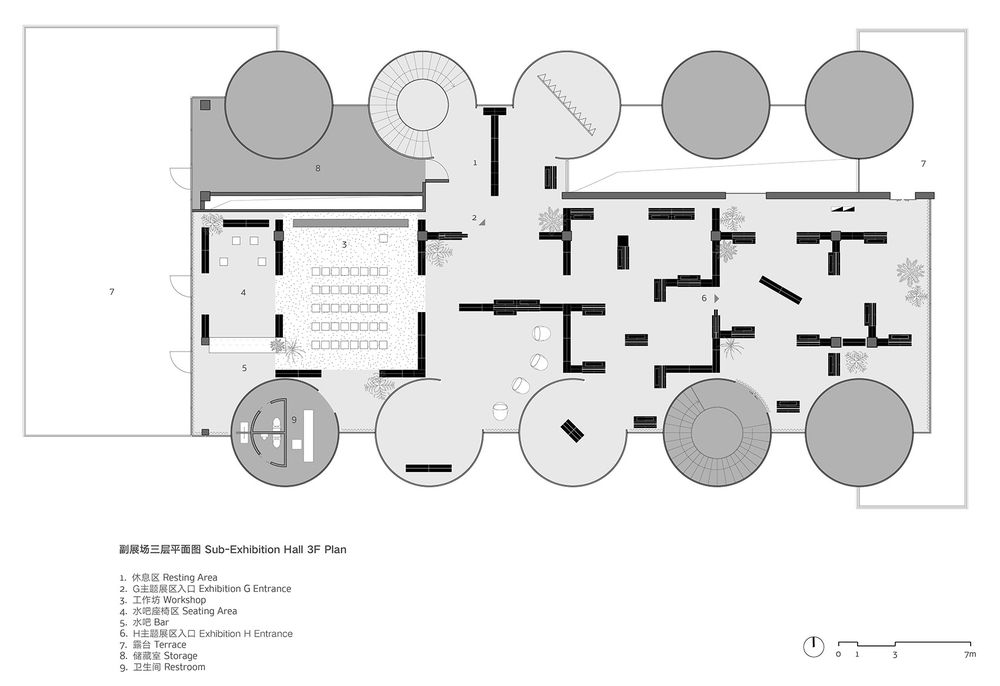
▼副展场三层平面图
sub-exhibition hall 3f plan©Studio NOR
More: 不也设计工作室
