色彩斑斓的 AEtelier 办公空间改造




Tucked away in an industrial zone in central Belgium, a wavy silver-coloured facade and a vibrant wild garden instantly mesmerise passers-by. Together with soft ivory-coloured windows, doors, and louvres, the reflective structure instantly lights up its surroundings, even on the most gloomy days. Contrary to what one might think, this is a complete transformation of an existing office building. The old structure was stripped to its core and re-erected by Studio Anton Hendrik Denys, who took on the complete interior, exterior, furniture, and landscape design. With collaborating architect Steen Architecten they created a permanent office for IT-consultant AE that simultaneously serves as a conference and event centre for various external companies. It's a place where people can eat, drink, and gather in an uncommon yet welcoming environment.
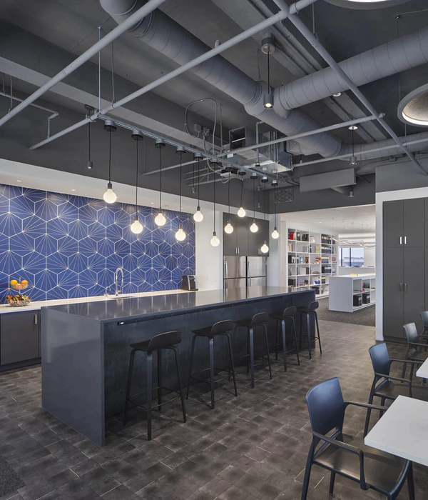
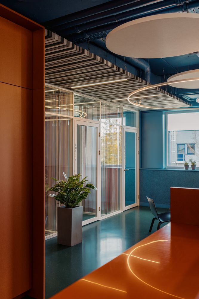
When entering the building through the central courtyard, a colourful whole emerges. Conceived as a contemporary twist on modernism, the vibrant interior takes visual cues from the corporate identity of its main resident with orange accents popping up amidst a range of bright blue shades. Stumbling upon touches of pink, green, and grey, the bold yet balanced colour-combinations are executed in an equally diverse palette of materials and textures. Circular soundproofing elements replace the former fake ceiling to expose the true height and openness of the industrial spaces. These round shapes continue into the walls in the form of wood-woollen circles and geometric cutouts in contrasting shades of blue, green, and black. This transition contributes to a coherent whole in which cooling and acoustic elements become part of the design.
Amidst this colourful and graphic assembly, a casted green floor guides users through the building and its various spaces while transitions into a softer green carpet introduce multiple private meeting rooms. Next to these visual cues, an entire wayfinding strategy was worked out in collaboration with information designer Jaap Knevel. Symbols to indicate waste disposal and refrigerators, blue lettering to identify different areas, flashy pink toilet icons, and large information totems all contribute to smooth navigation in and outside the building. A more subtle atmosphere has been assigned to spaces where peace and privacy are key. Toilets and changing rooms remain gloomy and dark with both indirect lighting and strips of natural daylight. Additionally, vibrant red alterations complete the barely-touched but instantly recognisable event hall. Inhabiting all these spaces we find a coherent mix of pre-owned furniture, together with new and custom made pieces that continue on the idea of blending styles.
A colourful wild garden that builds upon the interior design codes embraces all of this while complementing the aluminium facade. Developed in collaboration with Van Dyck Tuinarchitectuur, varying heights of vegetation enfold towards the building while remaining vibrant and colourful all year round. The landscape design becomes part of the interior while acting as a space on its own. In the central patio, an elevated concrete bridge connects two parts of the building while simultaneously serving as a multifunctional seating object.
Altogether, the complete transformation of AEtelier by Studio Anton Hendrik Denys embodies a new office typology that breaks from the mould of its predecessors. This by introducing a vigorous colour and material palette, and by moving away from the secluded concept corporate offices often build upon. By opening itself to everyone, the building ultimately strives for cross-pollination between ideas, companies, and people.
Credits
main designer & creative lead | Studio Anton Hendrik Denys collaborating architect | Steen Architecten
client | AE - Architects for Business & ICT
Photography | Hannelore Veelaert Text | Frederik Deschuytter


