宁波潜木设计 | MORANA KA KA 商业空间设计
QIANMU
DESIGN
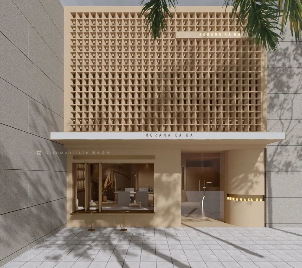
MORANA KA KA | Commercial Design | 2022
Project
Information
Project Address:浙江省 宁波市
Area: 180㎡ 两层
Design time:2022年6月
Main materials:
亚克力、
艺术涂料、金属漆、不锈钢定制造型
Introduction
≡
每个屋子都像是大树的一片树叶,没有完全相同的两片树叶。由于光线,层高,户型,朝向等因素,也不会有完全相同的两个屋子。而设计师则需要针对不同屋子各式各样的特点,解决屋子中的问题,并再向前迈一步,去发现其中的美。
Every house is like a leaf of a big tree, no two leaves are exactly the same. There are no two identical houses due to light, floor height, floor type, orientation and other factors. The designer needs to solve the problems of the house and take a step forward to discover the beauty of the house.
01
≡
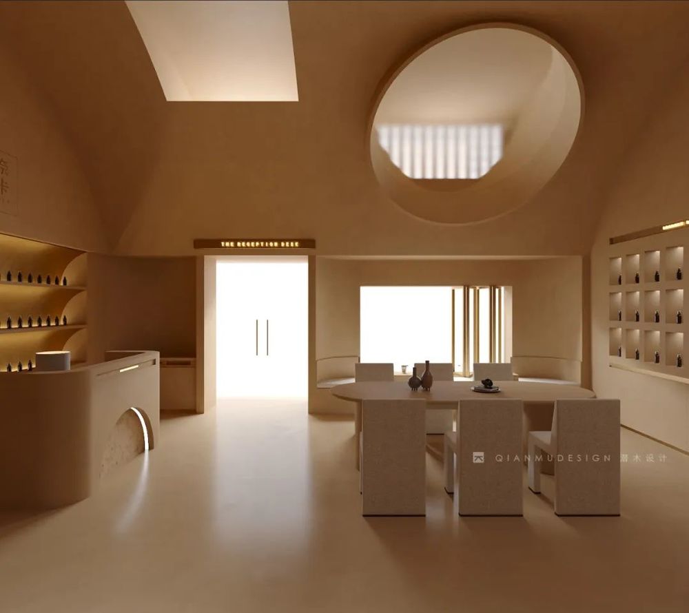
将侧自然光变为顶自然光
Change side natural light into top natural light
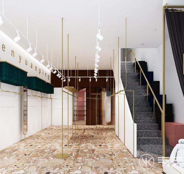
由于这个屋子的层高较低,所以我们采用了简单的线条最大化空间体感,空间结构化繁为简,省去一些繁琐冗杂的结构语言。在大厅使用相同石材和金属,点明功能重心和视觉焦点。
Because of the low height of the house, we used simple lines to maximize the sense of space, and simplified the structure of the space, eliminating some of the tedious and complicated structural language. The same stone and metal are used in the lobby to point out the functional focus and visual focal point.
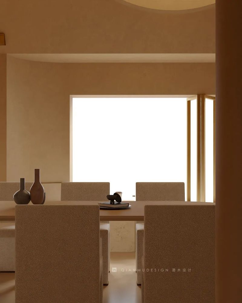
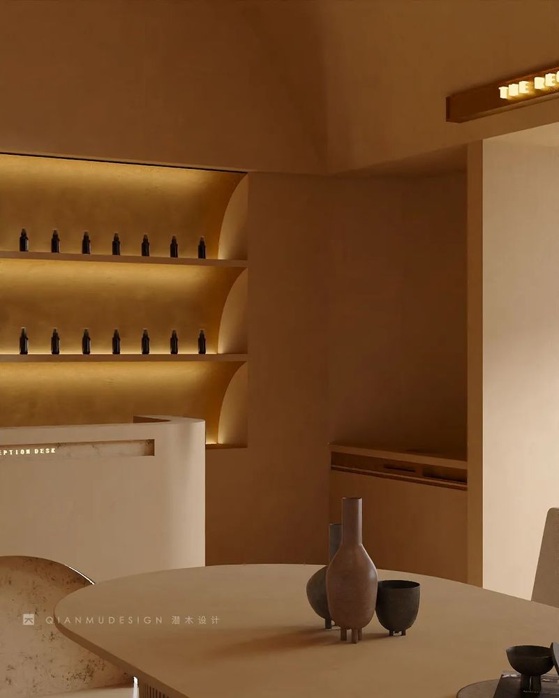
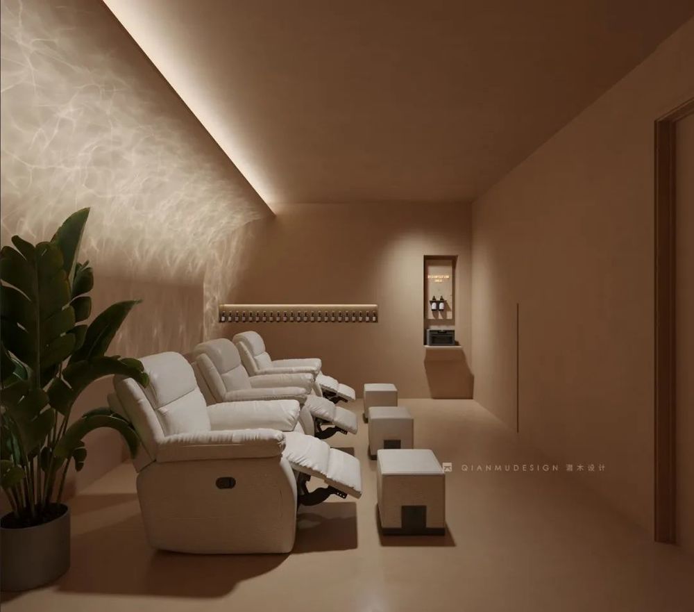
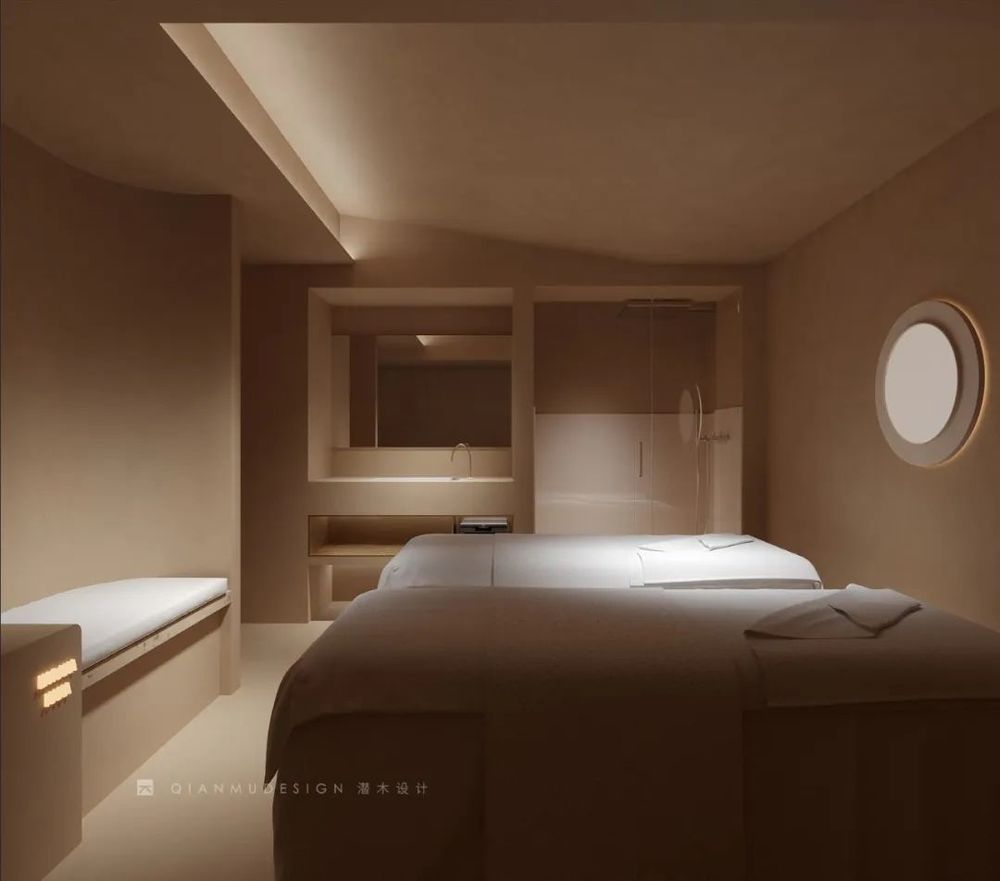
为了在空间里增加生命力,运用灯光的变换,将小空间做大,使顾客身处其中时,能够舒缓地、细致入微地去体验服务。
In order to add life to the space, we use lighting changes to make the small space bigger, so that customers can experience the service soothingly and meticulously when they are in it.
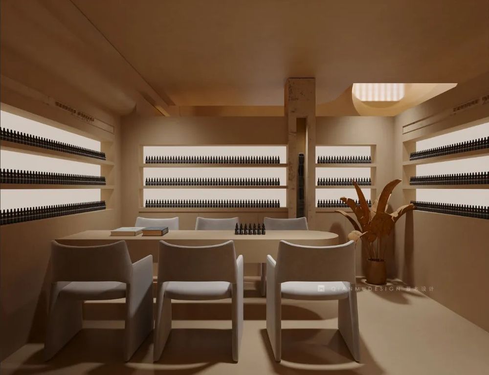
02
≡
避开梁位实现层高最大化
Maximize floor height by avoiding beams
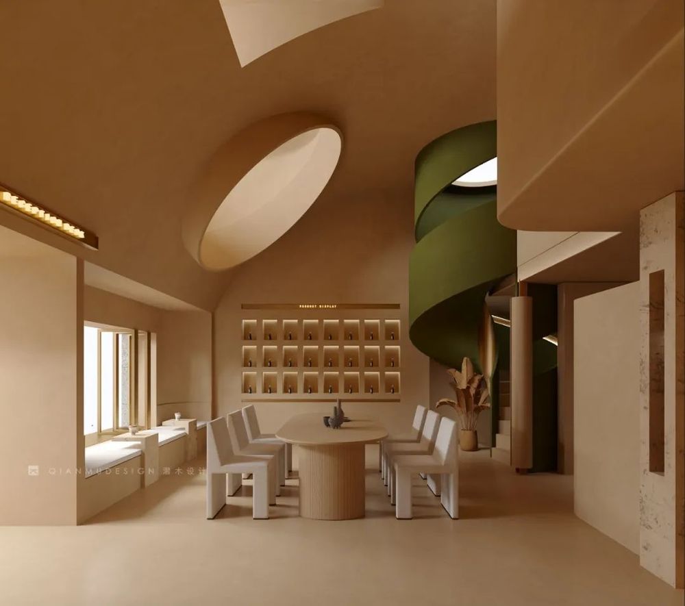
为使空间利用率最大化又保留空间的纵深感,接待区采用了挑空的处理形式。采用趋势向里的大弧度造型,让眼睛禁不住向里窥探。简洁的线条,同色的墙顶和地面,将空间留白。
In order to maximize space utilization and retain the depth of space, the reception area adopts a hollow treatment. The large curved shape with the trend inward makes the eyes can't help but peep in. The simple lines, the same color wall and floor, leave the space white.
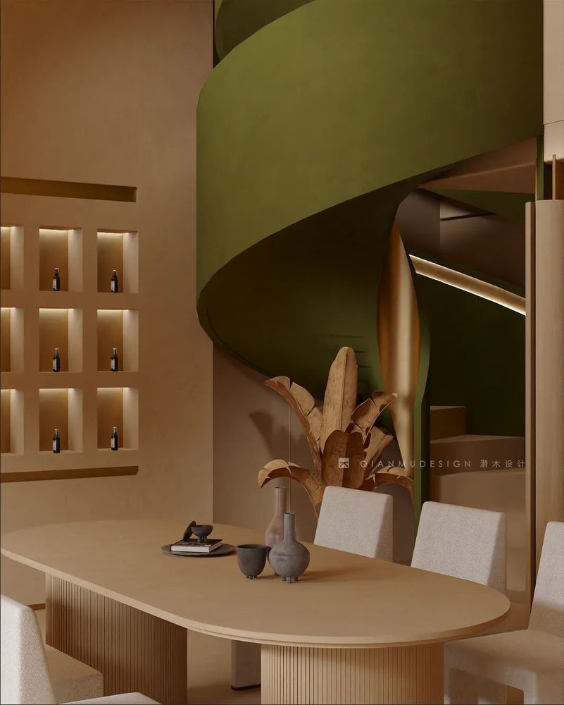
旋转楼梯的曲线美,在冰冷中融入一份柔和感。
The curved beauty of the revolving staircase incorporates a sense of softness in the coldness.
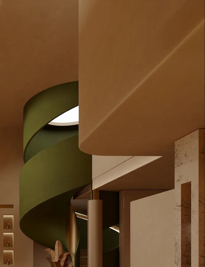
03
≡
使用大胆的跳色突出空间的形体
Use bold color jump to highlight the shape of the space
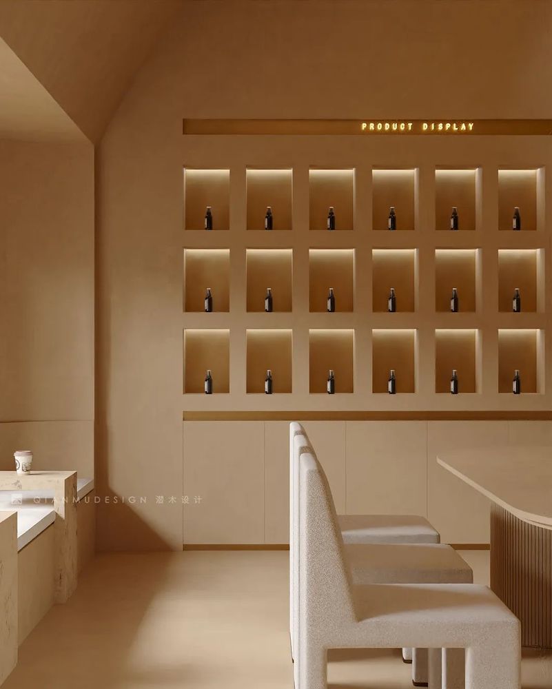
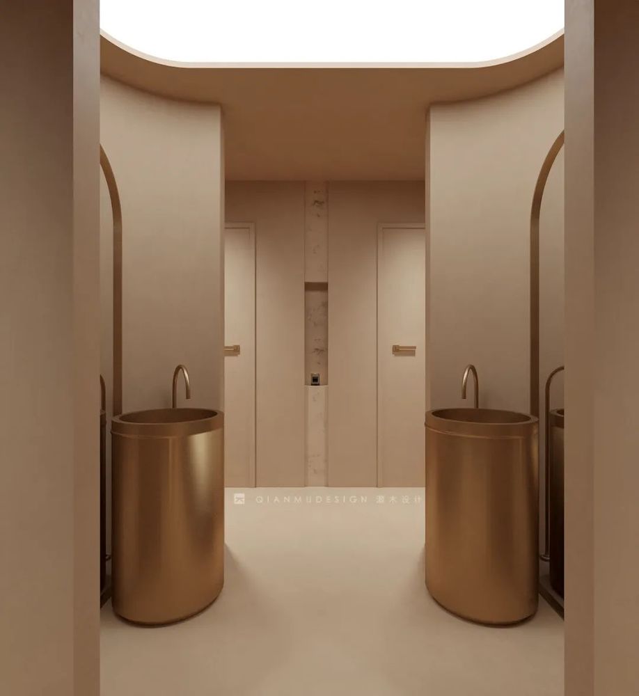
浅色空间中墨绿色的涂装形成视觉冲击,突出空间重心,素雅却不失力量。使用金属和石料,将光泽感同肌理感齐头并进,用材质的碰撞来打造层次感。
The dark green paint in the light-colored space creates a visual impact and highlights the center of gravity of the space, which is elegant yet powerful. By using metal and stone, the sense of gloss and texture go hand in hand, and the collision of materials is used to create a sense of hierarchy.
潜 · 以为学
木
·
以为心

