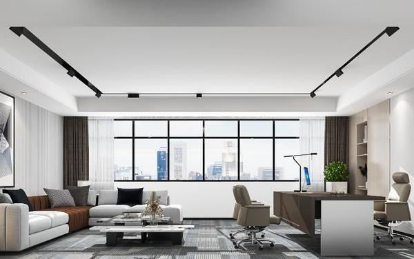
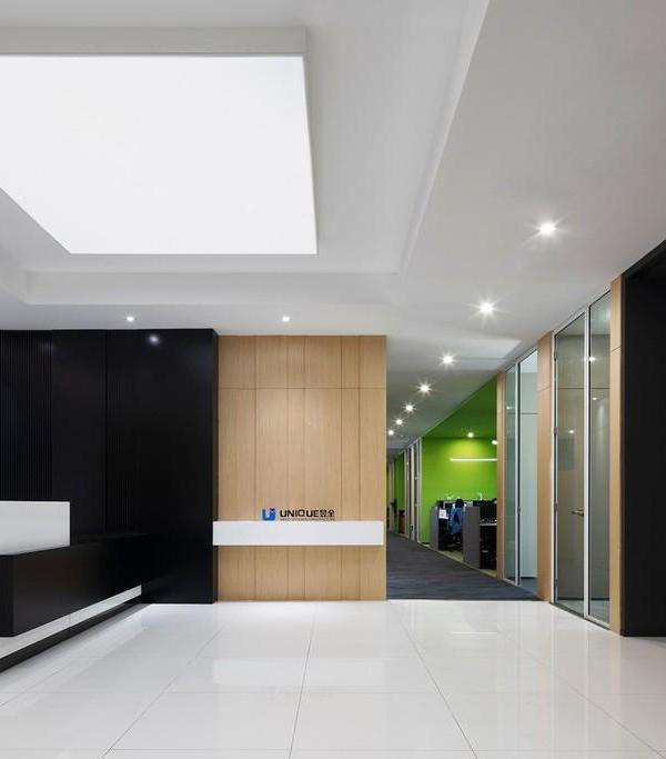
In response to the COVID-19 pandemic, Aspen Insurance reimagined their Jersey City workplace to better support hybrid, agile work, and embody the global insurance company's recent brand refresh.
HLW worked to create a space for flexible working at the Aspen Insurance offices in Jersey City, New Jersey.
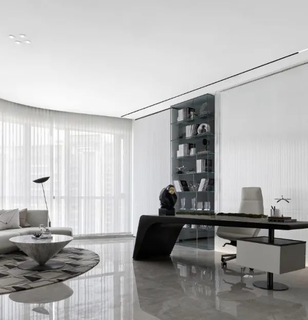
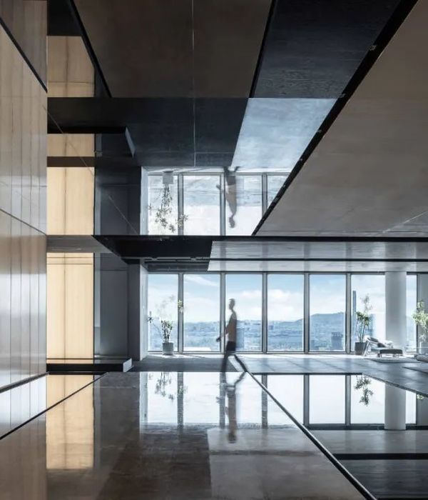
As a business in the sometimes convoluted field of insurance and reinsurance, Aspen has the expertise to bring clarity from complexity™ and the forethought to work with a design team to translate the company’s vision into its physical workplace. While its employees worked remotely during the pandemic, Aspen sought to downsize its real estate footprint while creating spaces that would better support hybrid, agile work, and embody the global insurance company’s recent brand refresh. Take for example the firm’s Jersey City location. Designed by HLW, the office has immaculate views of the Hudson River and Manhattan skyline. The space is washed with natural light and the natural elements to evoke a feeling of calm. Other materials used to induce calmness were biophilic elements such as moss walls and plantings within built screens and shelves were displayed throughout. Some details from the nature and pathways of leaves were even found in the handmade wall coverings throughout the space; natural oaks, soft neutrals, and marble added to the calm and inviting feel of the space.
Embracing Aspen’s creative culture, HLW’s interior design and branded graphics teams helped to reintroduce the company to the marketplace with a purpose-driven scheme focused on creating a more dynamic and inclusive workspace. The driving design principle behind the environmental graphics package was creating “pathways.” These pathways are visually found in urban landscapes and nature such as leaf veins. The visuals within the Aspen brand were used as drivers to create a clean palette with pops of green and blue color hues. The very specific angles of the pathways within its brand guidelines were used to create the core circulation patterns through the space and within feature areas such as the café. This concept directly inspired every element of Aspen’s new offices, from spatial planning to custom signage. HLW created a custom, comprehensive array of distinctive supergraphics, glass films, and wayfinding materials to affirm comradery and a common sense of purpose among the team. Moreover, the design scheme is replicated across four of Aspen’s locations to reinforce the shared identity across the country –– further connecting colleagues with one another across digital and physical divides.
The overlap between art and the “real world” cements the idea that Aspen practices what it preaches –– seemingly trivial decisions, such as the angle of a detail in a logo, are well-thought out and intentional. Especially in an industry like insurance and re-insurance, where no facet is too small, radiating this kind of detail-oriented mindset comprehensively within the workplace is crucial. Ultimately, HLW’s design helps to bridge the gap between virtual and in-person work. Especially for those who were hired remotely, this rebrand has provided more than an aesthetic facelift; it has helped reconnect colleagues and clients with Aspen, leading to a more innovative and productive workplace.
Design: HLW
Photography: Mike Van Tassell
15 Images | expand for additional detail
{{item.text_origin}}

