架构师提供的文本描述。前台是位于胡志明市中心的一家小饭馆。该项目是对一座前住宅楼底层的翻修,这座大楼是20世纪90年代完成的一座大型街区重建项目的一部分。形成这座街区的数十座排屋都是用类似的装饰元素建造的,比如希腊式的柱子和造型,这反映了开发商的立竿见影的建筑效果。这种昙花一现的梦,如今被认为是空想或被忽视,而这些原始的装饰元素,大部分都是随着近年来中央商业区的过度发展而消失的,在此期间,已经发现了下一个趋势。这说明了在越南主要城市正在经历的疯狂经济增长中,建筑风格是如何被书写和改写的。我们的项目一开始就对这个快速的趋势周期进行了反思,并以收回废弃的设计而结束,新的设计元素滑进了大楼。
Text description provided by the architects. The Proscenium is a small dessert restaurant located in the heart of Ho Chi Minh City. The project is the renovation of the ground floor of a former residential building that was built as part of a large block redevelopment completed in the 1990’s. Dozens of row houses forming the block were build with similar decorative elements such as Greekish columns and moldings, reflecting the developer’s intention for instant architectural potency. This kind of ephemeral dream is regarded as chimerical or is simply neglected nowadays, and indeed most of those original decorative elements have vanished through the recent years of overdevelopment in the central commercial district, during which time the next trend has already been discovered. This illustrates how an architectural style is written and rewritten during the frantic economic growth that major Vietnamese cities are currently undergoing. Our project began with a reflection on this rapid trend cycle and ended by reclaiming the abandoned design with a new design element slid into the building.
© Hiroyuki Oki
(C)小平之(Hirouki Oki)
与越南房屋的情况一样,现有建筑的特点是对安全过于谨慎,以及空间消耗大的中央楼梯。我们的设计干预侧重于在有限的预算范围内改变这两个要素。
The existing building is, as is often the case with Vietnamese houses, characterized by an over caution for security and a space-consuming central staircase. Our design intervention focused on changing these two elements within a limited budget.
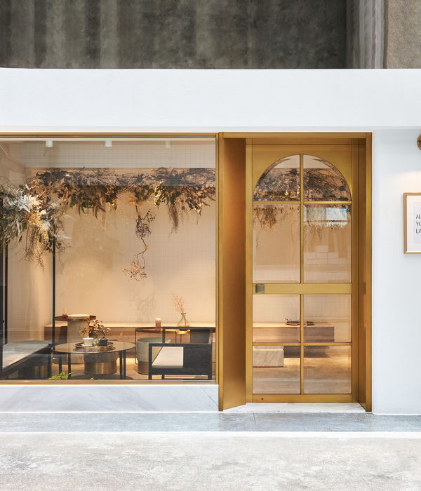
(1)接口餐厅的界面设计是确定商店如何与顾客沟通的关键。这一过程始于从现有的铁笼中释放前厅,并将这一空间转变为一个公众口袋公园,这是社区缺乏的一种公共元素。一扇原来的中法木门被一扇破碎的玻璃窗所取代,它把室内的感觉分割成多块,象征着内外之间的多种关系。一个简单的柜台通过窗户吸引人们的注意,从街道到内部,以及作为一个扶手为过路人。
(1) Interface The interface design for the restaurant was crucial in defining how the shop would communicate with customers. The process began with the release of the forecourt from its existing iron cage and the transformation of this space into a public pocket park, a type of communal element that the neighborhood is lacking. An original Sino-French wooden door was replaced with a fragmental glass window that splits the perception of the interior into multiple pieces, symbolizing the multitude of relationships between inside and out. A simple counter passes through the window to draw attention from the street to the interior, as well as serving as an armrest for passersby.
© Hiroyuki Oki
(C)小平之(Hirouki Oki)
(2)一间典型的越南式排屋,其形状又长又窄,在建筑物中央设有楼梯,将每一层楼分隔成前后两层,为整个空间提供天然阳光和通风。这被认为是一所房子的智慧之果,而不是一家餐馆,尤其是在一座小建筑里。我们建议修复楼梯,将最大的空间占用者转变为创造新空间的核心,并通过将这一要素延伸到整个底层来分配基本功能。由于担心被消费成为一时的趋势,新主人尽可能地消除了不必要的装饰元素。因此,一条中性物体链,与原来的古典装饰品并列,构成了整个室内空间。
(2) Space A typical Vietnamese row house has a long and narrow shape with a staircase in the middle of the building to separate each floor into the front and back, providing natural sunlight and ventilation for the whole space. This is regarded as the fruit of wisdom for a house but not for a restaurant, especially for in a small building. We proposed the rehabilitation of the staircase, transforming the largest space occupier into a core for creating new space, and distributed fundamental functions by stretching this element throughout the ground floor. For fear of being consumed as a momentary trend, the new occupant eliminated unnecessary decorative element as much as possible. As a result, a chain of neutral objects, juxtaposed with the original classical ornamentations, organized the entire interior space.
楼梯及其延伸部分采用钢结构,以尽量减少现有结构的额外负荷。确定楼梯的形状是为了使楼层的物理通道最大化。钢材的质量向后延伸,形成了一个柜台和一个开放式厨房,然后是一个封闭的厨房,最后是建筑物后面的一堵储藏室。在另一边,拉长的钢制线形成了一个多功能蛋糕站和一个从前窗口穿透的台面和计数器。
The staircase and its extension are made of steel to minimize the extra load on the existing structure. The shape of the staircase is determined in order to maximize physical passage at the floor level. The mass of steel is extended backwards, creating a counter and an open kitchen, followed by a closed kitchen, and ending as a storage wall at the back of the building. On the other side, the stretched steel line forms a multifunctional cake station and a table-cum-counter penetrating through the front window.
© Hiroyuki Oki
(C)小平之(Hirouki Oki)
考虑到施工前的状况,室内装修得到了保留,前厅采用了一种与前窗设计相呼应的新的混凝土砌块铺装。项目其余部分的配色方案反映了两个意图。第一种是突出甜品,这种黑色和蓝色的油漆与餐厅五颜六色的蛋糕形成了鲜明的对比。二是掩盖现有装饰品的存在。深色将短暂的过去转化为永恒的设计,中和其历史背景,并与插入的钢铁元素和谐相处。
Considering its state before construction, the interior floor finishing was preserved, while the forecourt has a new concrete block paving echoing the front window design. The color scheme for the remainder of the project reflects two intentions. The first one is to highlight the desserts, the black-and-blue paint clearly contrasting with the restaurant’s colorful cakes. The second is to mask the presence of the existing ornamentations. The dark colors transform the ephemeral past into a timeless design by neutralizing its historical context and creating harmony with the inserted steel element.
© Hiroyuki Oki
(C)小平之(Hirouki Oki)
{{item.text_origin}}

