The library building at the Erasmus University Rotterdam, built in 1968, is an example of brutalist architecture and is a municipal monument. It has been undergoing a sweeping renovation of its architecture and engineering installations. Having reached the end of its life-span, the building also needed upgrading to meet current and future ways of working. As more and more books are becoming digitalized, printed books are disappearing into the background. The renovated building will contain about 900 study spaces, 50 office spaces for staff, and the collections of the University Library and Rotterdamsch Leeskabinet.
In the simplicity and clearness of the original design we found a clear line for the transformation: to bring back these excellent qualities while adapting the structure to the current demands. The re-introduction of transparency, openness and a clear structure has lead the design process from that moment on. All the essential interventions were made in a way to enhance the harmony of the building and create a new and coherent reality.
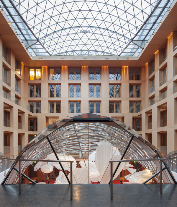
Meetings, working together and studying together are the main objectives of the library design; all interventions are aimed at opening up the building and introducing light, transparency and spaciousness. In addition to the existing entrance from the footbridge to the main building, the building has got a new main entrance. Large voids were introduced in the interior to connect the floor levels and create a greater sense of space; roof lights were added to bring in more light. A new main staircase connects the two entrance levels and guides the visitor in a natural and intuitive way. The staircases and fire separations that divide the building are made of glass, greatly enhancing spatial continuity between the western and eastern parts of the building.
The core-business of the library is to facilitate places for individual studying; the ones we have created here are the most quiet on the campus. A great variety of study places is offered; most of them are structured along the east-west aisles, were the bookcases work as an acoustic screen between the routes and the study area at the facades. One can sit around the voids, in an individual cloister niche or more relaxed in one of the lounges.
The “Rotterdamsch Leeskabinet” is – next to the University Library – the other user of the building. This unique collection of books has found a new home in the heart of the building. The dark central core was transformed into a classical library with an oak and brass interior and a very distinctive atmosphere.
From the viewpoint of sustainability and comfort, in combination with the monumental aspects of the building, all frames in the facade are replaced by custom-made insulated steel frames fitted with triple-glazing. A restrained selection of natural materials and colors that blend harmoniously with the original building: walls and columns in exposed concrete, frames of black steel, grey epoxy floor and black carpet, slatted timber ceiling and metal coffers.
{{item.text_origin}}

