Architects:Estudio DIIR
Area:100 m²
Year:2022
Photographs:Luis Diaz Diaz
Contractor: Reds
Program: Comercial
City: Madrid
Country: Spain
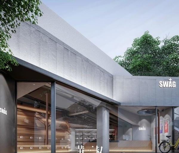
The desire to enhance the qualities of an already suggestive space makes this project an ambitious challenge. To achieve this, the intervention is reduced to three gestures whose conceptual load allows the space to be understood in a certain way.
Firstly, a perimeter device runs along the store's facade and changes its condition according to use. This means that this piece can become either a mirror, a shelf, a bench, or a planter. Its versatility envelops the project and brings unity to the entire composition. As a hinge element, a longitudinal piece of furniture is designed which, on the one hand, acts as a counter and, on the other hand, as a filter between spaces.
The public and commercial area is intentionally separated from the service area that functions as an office, bathroom, fitting room, and access to the warehouse. Finally, the most characteristic design of the store is located in the center of the public space. A sculptural volume is proposed whose main function is to organize the sales space and, by means of two steps, establish a hierarchy of use.
In the center of the composition, and perpendicular to the piece, a large cantilevered table is drawn. The imposing 8 meters length dictates a radial path around which the customer discovers the product.
The volumetric power of the projected elements contrasts with the neutrality of their tones. The peace that is sought to be transmitted allows for an atmosphere where the product is the great protagonist.
{{item.text_origin}}

