装配式景观实验 | 西安未央 168 商业街区露台改造
原筑景观:本案是针对已建成的未央168商业街区露台空间的一次“装配式”景观改造。
YZscape:This case is a “prefabricated” landscape renovation for the terrace space of the completed We Young 168 commercial block.
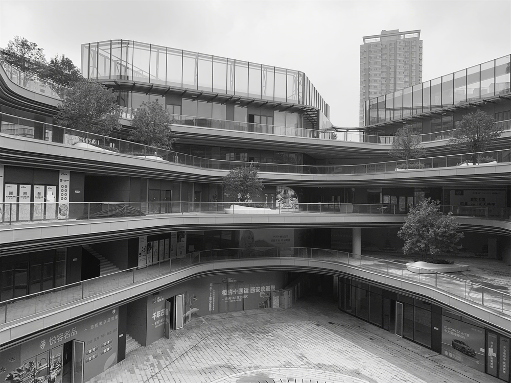
已建成的建筑极具流线形和科技感,在现场具有无可争辩的压迫感。由建筑师设计的景观空间强调宏大叙事与整体协调,虽然营造了大面积的户外露台作为交通和活动区域,由于视角仍然是“建筑”而导致这些露台区域大而空旷。这些露台空间在设计之初是想为商业和运营提供足够的灵活度,然而落成之后面对这些空旷的露台,甲方和运营方却都无从下手。显然这些室外露台空间缺乏定义,在建筑空间与运营使用之间缺少了一个重要的细化设计环节——商业景观细化设计。
The finished building is designed with extremely streamlined and technological style, with an indisputable sense of oppression. The landscape space designed by the architect emphasizes a grand spatial narrative and coordination with the building. Although large outdoor terraces are created as circulation and activity areas, these areas are large and empty because the perspective is still architectural. These terrace spaces were originally designed to provide sufficient flexibility for business and activities. However, after completion, neither client nor the business owners know how to use them. Obviously, these outdoor terrace spaces lack definition, and there is a missing link between terrace space and operational use – the detailed design of commercial landscape.
▽场地现状-错落的现代露台空间 Site status – Scattered modern terrace space
我们面临三个主要的问题:一、户外空间留不住人;二、缺乏打卡的节点;三、要赶在年底完成改造。这几个要求其实呼应了一般商业区存量改造面临的问题:要吸引人来消费、要尽量快改造完从而减小对运营的影响。
We must deal with three main challenges: first, provide opportunities for people to stay; second, create attractive details for people to take photos and videos; third, the renovation had to be completed in a very short time. These challenges actually echo the problems faced by similar commercial renovation projects: to attract and retain people to consume, and to complete the construction as soon as possible to reduce the impact on operations.
▽场地现状-空旷的二层露台空间 Site status – Empty second floor terrace space
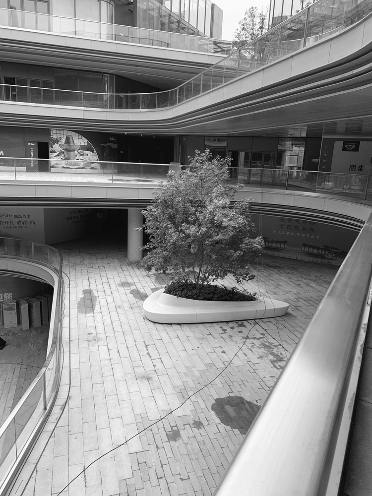
应对这些问题的策略简单而直接:用轻快便捷的装配式景观元素,更明确的划分停留和行走的空间,并把停留空间围合起来,然后再将妥帖的创意元素结合进去。
The strategies are simple and direct: use light and convenient prefabricated landscape elements to define the circulation and resting areas, and enclose the space for staying. Then incorporate creative elements into the designed space.
▽二层露台景观装配示意图 Schematic diagram of second floor terrace landscape assembly
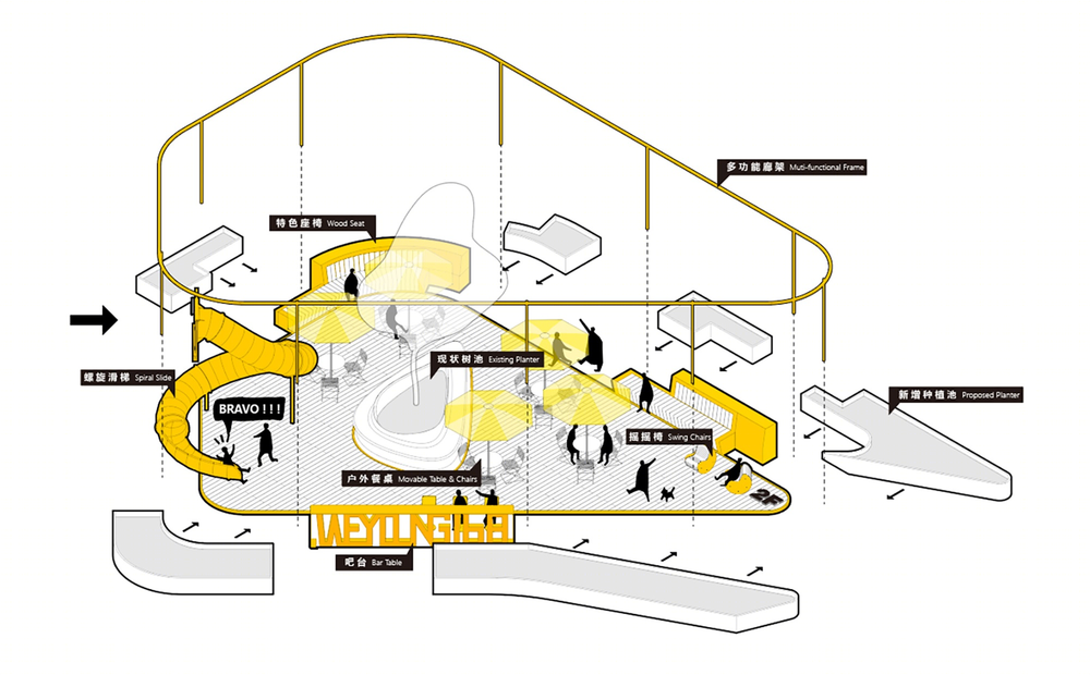
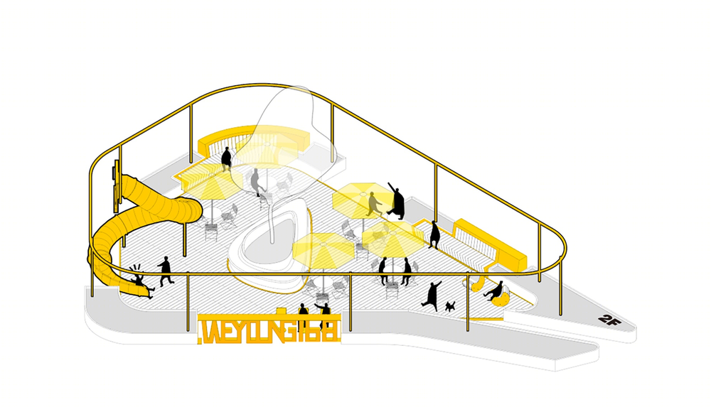
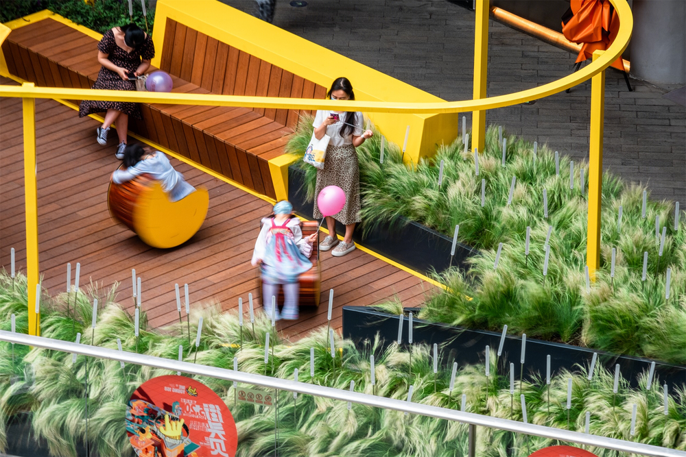
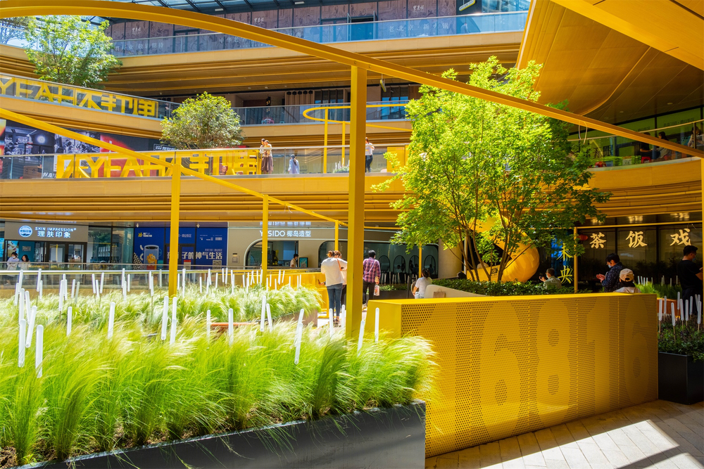
设计一个空间其实就是做它的顶、底和边界,而围合一个空间就是看边界如何设计。如果把现状乔木的树冠看做露台空间的顶,那么我们只要去把底和边界做好即可。底部我们铺设了木平台,给人更温暖、舒适的感觉。而边界则用吧台、花池、坐凳、靠背椅相结合的方式来围合,在二三层露台上我们还架起了两处轻快的廊架,用它进一步强调空间的围合感,同时也是灯架、展览架或其他悬挂物的基础设施。
Designing a space is actually to do its ceiling, floor and edge, and enclosing a space is to see how the edge is designed. If the canopy of the existing tree is regarded as the ceiling of the terrace space, then we only need to renovate the floor and the edge. We lay a wooden platform at the bottom to create a warmer and more comfortable feeling. The edge is enclosed by a combination of bar tables, flower beds, benches, and back chairs. We also set up two facile frames on the second and third floor terraces to further emphasize the sense of enclosure. It is also an infrastructure for lamps, display racks or other hanging objects.
▽二层露台设计图解 Second floor terrace design diagram
▽二三层露台景观 The second and third floor terrace landscape
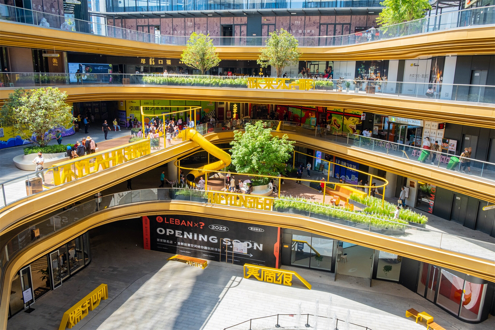
▽旋转座椅和靠背椅 Swivel seats and reclining chairs
▽露台花池、靠背椅背面 Terrace flower pool, back of chair
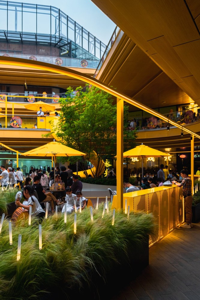
▽靠背椅夜景 Back chair night view
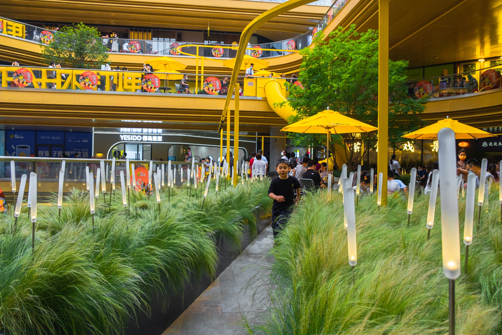
▽露台花池(细叶针芒)和萤火虫灯 Patio flower pool (fine leaf needle awn) and firefly lamp
▽边界座椅和种植 Border seats and planters

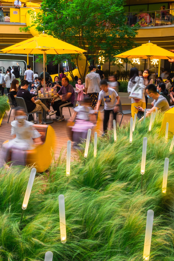
颜色上我们大胆选择了与建筑完全不同的亮黄色,让景观设施更加出挑,增强它们的“装配式”的感觉,表达它们不是建筑的一部分。同时,这种颜色也让每一个小空间更加轻快、温暖和令人愉悦,在冷酷的建筑氛围中形成了一个个的避风港(Escape)。
In terms of color, we boldly chose bright yellow, which is completely different from the building. It makes the landscape facilities more prominent and further enhanced their “prefabricated” appearance. At the same time, the bright yellow also makes each small space more light, warm and pleasant, forming an escape in the cold architectural atmosphere.
▽五层露台设计图解 Design diagram of the fifth floor terrace
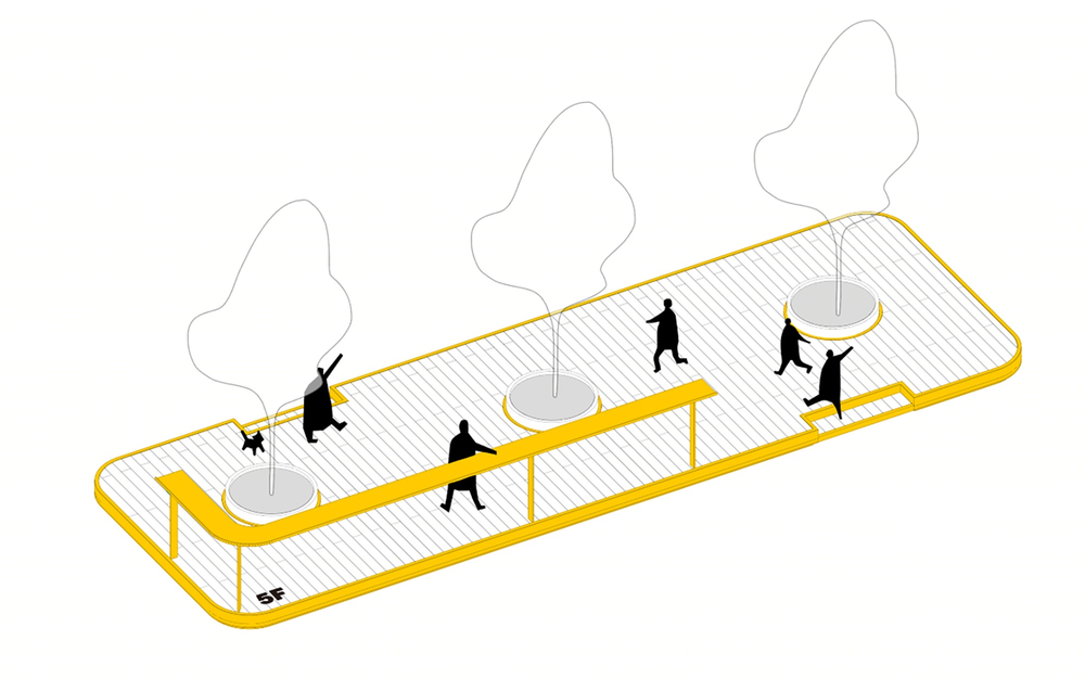
▽五层露台 Five layers of terrace
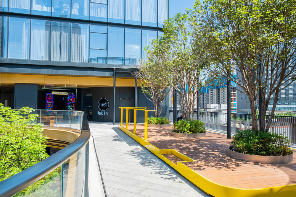
此外,我们还把一些文字结合到吧台中去,一方面是因为人对文字的敏感度很高,可以在瞬时间吸引注意力;另一方面是增加每个节点的趣味性,营造一些网红打卡的细节。
In addition, we also incorporated some Chinese characters into the bar tables. On the one hand, because people are highly sensitive to characters, they can be attracted in an instant; on the other hand, it adds interests to each terrace space. Also, it creates nodes for people to take photos and celebrate on their social media.
▽四层露台设计图解 Diagram of the fourth floor terrace design
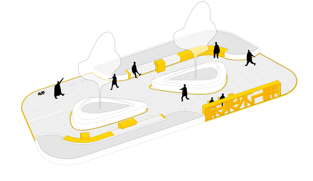
▽四层露台文字吧台(项目Slogan“味来不一样”)Word bar on the fourth floor terrace (project Slogan “Taste different”)
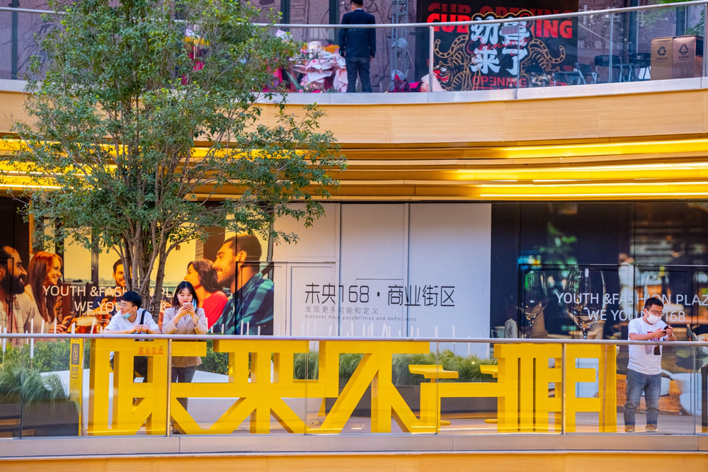
▽文字吧台背面 Text back of bar

▽吧台 The bar
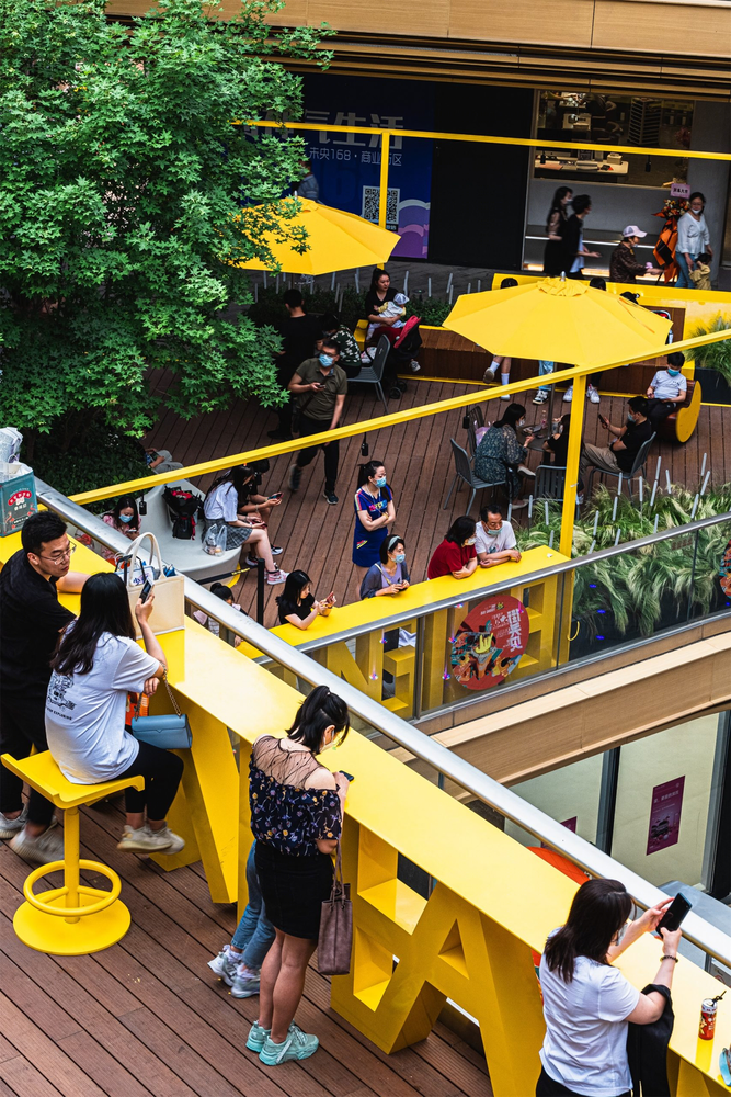
▽吧台与花池、阳伞结合 The bar counter is combined with flower pool and parasol
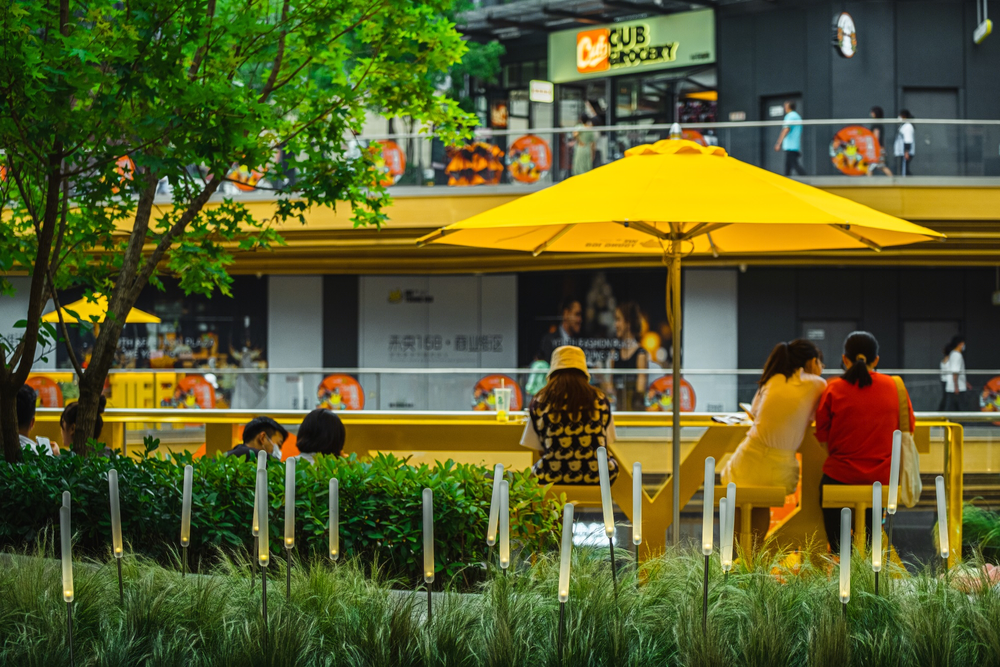
▽四层花池景观 Landscape of flower pools on four floors
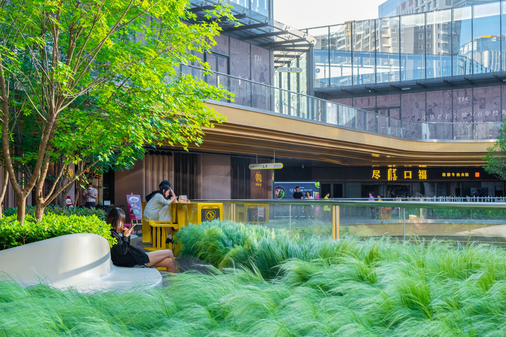
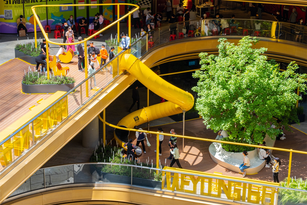
商业景观设计的关键是如何配合商业引流,将人流引入各个商业区域。首层通常有着最大的商业机会。为了将人流引入二层以上,我们在二三层之间设置了旋转滑梯和旋转座椅,让其成为汇聚人气的打卡点。
The key to commercial landscape design is to better promote circulations and guide people into different commercial areas. The ground level usually has the biggest business opportunities. In order to attract people to the higher floors, we introduced a rotating slide between the 2nd and 3rd floor, making it a popular interactive spot.
▽三层露台图解 Illustration of third floor terrace
▽二层露台滑梯 Second floor patio slide
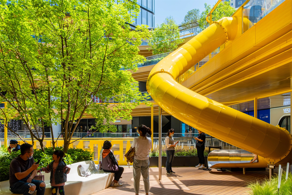
▽露台滑梯出口 Patio slide exit
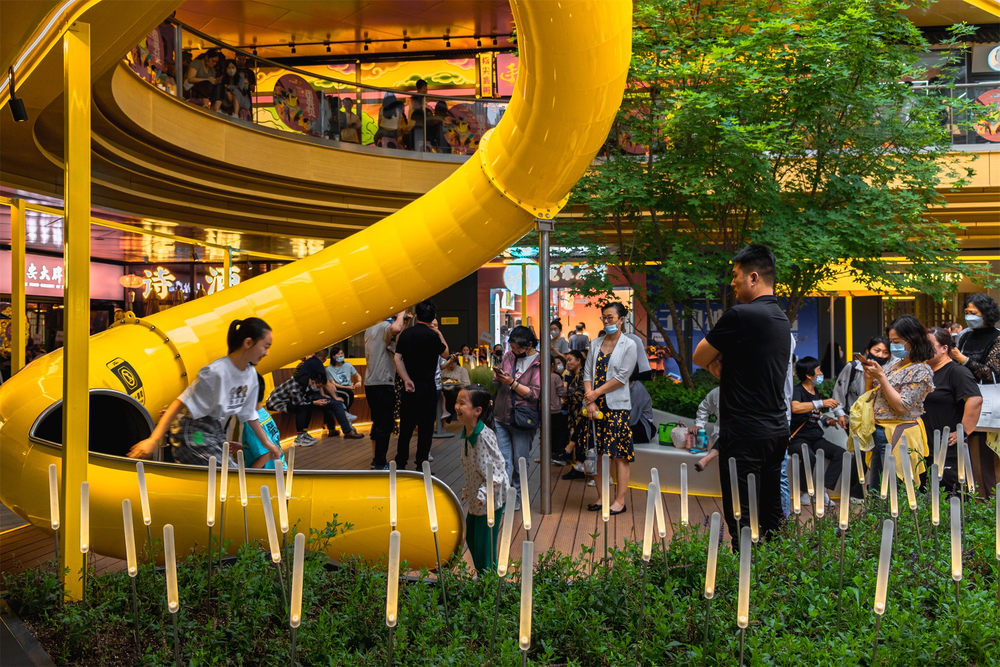
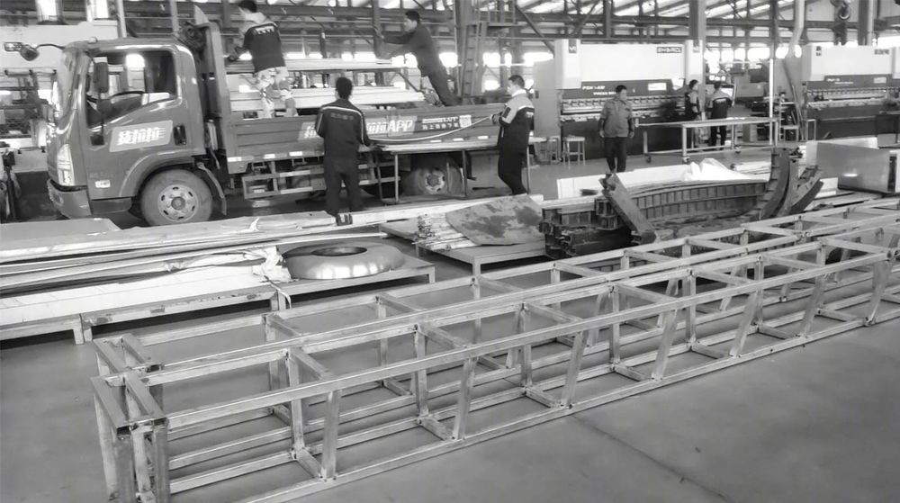
在已经完成铺装施工的露台上营造商业景观更像是室外版本的室内设计——我们尽量减少现场湿作业,更多的是将工厂预制好的景观“家具”在场地中进行安装。几乎所有的设施(除了木平台)都是由不锈钢制成的,这些设施的零件全部在工厂预制,然后再在现场进行安装固定。
Creating a commercial landscaping on a terrace that has already been paved is more like an outdoor version of interior design, we minimize on-site wet work and install the landscape facilities that has been prefabricated in factory. Almost all facilities (except the wooden platform) are made of stainless steel.
▽三层露台滑梯入口 Third floor terrace slide entrance

我们几乎没有破坏任何现有的铺装,为甲方节省了资金的同时最大程度的压缩了施工时间并降低了施工的难度。这种“装配式景观”的做法,是我们对商业存量改造的一次探索和试验。
We hardly destroyed any existing pavement, which saved the client money while compressing the construction time to the greatest extent and reducing the difficulty of construction. This “prefabricated landscape” approach is an experiment on how to renovate a existing commercial block.
▽工厂预制过程照片 Photos of factory prefabrication process
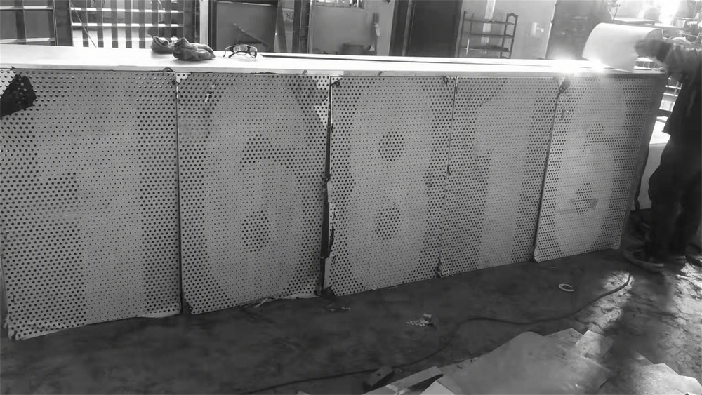

▽现场等待安装的预制零部件照片 Photos of prefabricated parts waiting to be installed on site
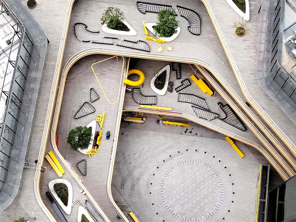
▽竣工鸟瞰 Completion of a bird’s eye view
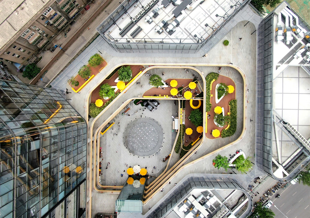
通过对空间的细分设计与景观小品的植入,我们将露台空间的尺度从”建筑宏大叙事“转为”景观细节体验“。而这种细节体验正是当代商业空间成功的关键。
Through the detailed design of the terrace space and the implantation of landscape facilities, we change the perspective of the terrace space from “architectural grand narrative” to “landscape detail experience”. And this kind of detail experience is the key to the success of contemporary commercial space.
▽露台烟火气 Patio smoke
项目名称:一次“装配式景观”实验——西安未央168商业街区露台改造
设计:原筑景观
项目设计 & 完成年份:2022年4月
主创及设计团队
主创:周啸
设计团队:周啸、闫明、雷雨恬、虞家洛、韩鹏
项目地址:陕西省西安市
建筑面积:3000㎡
摄影版权:原筑景观
摄影师:李晔、周啸
合作方
照明设计:Lumia Lab 庞磊、郑嘉豪
金属制品施工:上海秦韵不锈钢制品厂
木铺装施工:陕西庄晟生态园林有限公司
滑梯、旋转座椅深化设计及施工:张唐Hapitor
客户:西安北苑星城商业运营管理有限公司
Project name: The Xi’an We Young 168 Balcony Renovation Project
Design: Yzscape
Design year & Completion Year: 2022.04
Leader designer & Team
Leader designer: Zhou Xiao
Landscape team: Zhou Xiao,Yan Ming,Lei Yutian,Yu Jialuo ,Han Peng
Project location: Xi ‘an, Shaanxi Province
Gross Built Area (square meters): 3000㎡
Photo credits: YZscape
Photographer: Li Ye, Zhou Xiao
Partners
Lighting Design: Lumia Lab Pang Lei, Zheng Jiahao
Construction of metal products: Shanghai Qinyun stainless steel Products Factory
Wood pavement construction: Shaanxi Zhuang Sheng Ecological Garden Co., LTD
Slide, rotating seats deepen design and construction: Zhang Tang Hapitor
Clients: Xi ‘an Beiyuan Star City Commercial Operation Management Co., LTD
“ 亮黄的色彩冲击搭配灵活的设施元素,让原本落寞的场地空间充满活力与人气。”
审稿编辑 王琪 – Maggie


