- 项目名称:小着高级体验店
- 设计方:Offhand Practice
- 设计时间:2021.04-2021.06
- 施工时间:2021.06-2021.08
- 主创及设计团队:袁愿,聂璇,李月,林宸西
- 项目地址:上海市徐汇区武康路368号
- 建筑面积:室内:600m²,户外庭院:160m²
- 摄影版权:胡彦昀
- 客户:小着 XiaoZhuo
- 主要材料:羊毛地毯,涂料,微水泥,金属
在上海武康路的心脏地带,有一幢建于1930年代的老洋房,它与周遭蜿蜒辗转的小路交织在一起,群树环绕,四季的更迭在这里生动地演绎着。现今,这幢老洋房成为了新兴时装品牌“小着”的高级体验店。
Nestled in the heart of Wukang Road, there is a heritage garden house built in the 1930s. It is embraced by the surrounding trees and intertwined with the neighbouring roads. The changing seasons are vividly showcased here. Today, this heritage garden house has become a flagship store for the emerging fashion brand XiaoZhuo.
▼从武康路看向小着入口,The view from Wukang Road to the entrance of XiaoZhuo
小着的品牌性格是干净利落的,赞颂那些有小小创造力的、始终葆有好奇的、有趣的人们。业主希望在这个场域里人们不仅可以了解到小着是谁,同时也可以微妙感知到自己是被品牌引领着的且与人亲近的。
The clean-cut brand personality of XiaoZhuo celebrates people who have creativity, curiosity and a fun spirit. The founder has a strong emphasis on the essence of their brand. In this space, people will not only get to know XiaoZhuo, but also subtly perceive a sense of guidance and relaxation evoked by the brand.
绿色小径把武康路与主体建筑连接起来,The green path connects Wukang Road with main building
▼前院,The front yard
整个场地占地面积虽大,但被拆分成南北两个户外花园与夹在中间的五层楼建筑,内部空间楼层独立且单层面积小而零碎,好在建筑各个立面被大小不一的窗户包裹着,让窗外的绿意与窗内的光影相互交织。
Despite the sizeable gross floor area of the entire site, it is separated into two outdoor yards and a five-storey building sandwiched in between. The internal floor is relatively small and fragmented. On the good side, all facades are wrapped with windows of different sizes, allowing the greeneries outdoor to interweave with the lights and shadows inside.
▼轴测图,Axon
我们这次面临的设计挑战,不止关乎于空间上如何消解周遭环境与场地的边界,如何将前后户外花园与主体建筑连接起来,让彼此之间产生流动性,如何运用场地充足的自然光线让内部楼层之间更具呼吸感,也关乎于精神层面上如何在实体空间中传递出抽象的品牌性格与理念。
The design challenges this time are not only on the physical level – how to dissolve the boundary between the surroundings and the entire site, how to create a linkage between two outdoor yards and the main building, and how to maximise the ample natural light in the space. They are also on the spiritual level – to reveal the abstract brand characteristic and philosophy in this physical space.
▼从一楼室内看向前院
The view from 1F indoor to front yard
▼左侧主体建筑入口
The left entrance of main building
主体建筑的入口较为隐蔽,但好在前院紧邻着蜿蜒的武康路,我们便结合这一场地特征重新整合空间的动线与可达性,设计了一条小径将主体建筑入口与武康路连接起来,并将它延续到建筑内部空间,垂直向上贯穿五层楼。至此,这条小径作为一条注入空间中的定向路线,成为连接周遭环境、前后户外花园、主体建筑与内部楼层的主要纽带,让多者之间产生流动。
The entrance of the main building is relatively hidden. Fortunately, the front yard is adjacent to the winding Wukang Road. Drawing inspiration from the surroundings, we redesign the circulation and accessibility of the building, implant a path that connects the entrance with the winding Wukang Road, extend it to the back yard and carry it vertically upwards to all five storeys. Ultimately, this path as a directional route that binds all parts – the surroundings, the front and back yard, the main building, and even the entire five internal floors.
▼品牌故事,Brand story
一楼室内橱窗与品牌故事,Immersive window display and brand story on 1F
▼一楼室内走向后院,Stepping toward the backyard
绿色小径通往后院的各个方向,The green path reach to all directions in the backyard
多者之间的边界感通过这条定向路线得以模糊,那如何让内部楼层之间产生互动呢?我们重新规划空间各楼层的功能,打通了空间中几处零碎的区域,将较高楼层的自然光通过挑空的手法渗透到低楼层,光影随着日照时间的变化相互交织,楼层之间也有了呼吸感。
The boundaries between multiple parts have been blurred through this directional route, so how to interlock the internal floors is the challenge that we have to tackle now. We reconfigure the function of each floor and create several void spaces to allow natural light from the upper storey penetrate to the lower tier. Throughout the day, the lights and shadows on all floors generate a sense of fluidity.
▼由小径走向二楼陈列区
The green path guides you to clothing merchandise area on 2F
二楼陈列区看向户外小阳台,The view from clothing merchandise area to balcony on 2F
夯实的绿色小径从街边开始,刻意被抬高一点点,让人路过时便对它产生好奇,不自觉地步入进来。从一楼的沉浸式橱窗开始,或漫步到后院,或缓步上到二、三楼的服装陈列区。
As an extension of the winding Wukang Road, this green path is deliberately raised to urge people to step inside unconsciously. Starting with an immersive window display on the first floor, people can meander freely to the backyard or slowly ascend to the clothing merchandise area on the second and third floor.
▼从装置区看向陈列区
The view from installation to clothing merchandise area on 2F
二楼陈列区看向装置区,The view from clothing merchandise area to installation on 2F
▼站在小径内看向装置区
Looking into installation from the green path
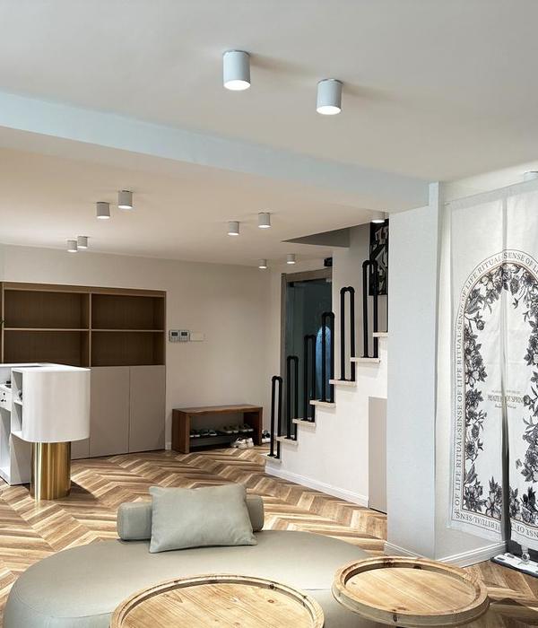
服装陈列区则以大面积的亚麻色地毯所包裹,低调干净的背景在恰当营造氛围的同时也让人的关注点更多地聚焦在服装上。
Linen wool carpets as the wall finishes for the clothing merchandise area, create an understated clean backdrop for all clothes.
三楼陈列区与二楼装置区的挑空互动,The void space interlocks 2F and 3F
而四楼作为讲述“小着是谁”故事的体验空间,我们则大面积留白,只置入一些可移动、可组合的展台,让小着日后可以灵活布展。至此,跟着这条小径,自然而然地从室外穿梭到室内,从一楼漫步至五楼的水吧稍作休息,再由原路线返回前院的取货口,享受一段空间中关于“小着是谁”的漫步旅程。
The fourth floor is a space for storytelling "Who is XiaoZhuo", movable and combinable carpet blocks allow XiaoZhuo to curate exhibitions in the future. Till this moment, this green path guides people from outdoor to indoor, end up at the water bar on the fifth floor, then return to the packaging at the front yard by the original route, the journey about XiaoZhuo has completed.
▼由四楼小径看向窗外绿意
The view from green path on 4F to greeneries outdoor
▼由四楼小径走向小着展厅
The green path guides you to exhibition on 4F
四楼小着展厅,The exhibition on 4F
▼四楼的两条小径连通三楼和五楼,The green path on 4F connects 3F and 5F
▼通往五楼水吧的垂直小径
The vertical green path towards 5F
▼五楼水吧,The water bar on 5F
贯穿始终的绿色小径由夯实的混凝土从地上生长起来,却赋予它亲近和圆润的形态;服装陈列区则由棱角分明的墙体所包裹,但材质上却予以温暖舒适的亚麻色羊毛地毯。刚与柔、冷与暖的结合,冲突对立却又和谐共生,让人踏入之后便不自觉地倚靠,又或是席地而坐。至此,人们在这个场域里被引领着又与之亲近着,“小着是谁”已渐渐明晰,我们也希望小着随着时间的变化慢慢成长,让这里更加丰腴。
This green path is composed of textured concrete with curved shapes as if they grow from the ground; as for the clothing merchandise area, all the angular walls are wrapped by warm and comfortable linen wool carpets. Rigidity and softness, coldness and warmth, conflict with each other but coexist in harmony within this space. So far, the story of XiaoZhuo has been gradually revealed. As time passes, we hope XiaoZhuo will grow progressively and enrich this space.
▼前院的取货口,The packaging in front yard
▼后院的墙上用摄影作品展示小着是谁,The photography shows XiaoZhuo on the wall of backyard
▼后院小径上的休憩座位
The resting seat on the green path
▼左:定制咖啡架与伞架;右:四楼阳台的户外装置
Left: Customized coffee and umbrella rack;Right: The outdoor installation on 4F balcony
一层平面图,Plan 1F
▼二层平面图,Plan 2F
▼五层平面图,Plan 5F
▼剖面图A,Section A
▼剖面图B,Section B
项目名称:小着高级体验店
设计方:Offhand Practice
公司网站:设计时间:2021.04-2021.06
施工时间:2021.06-2021.08
主创及设计团队:袁愿,聂璇,李月,林宸西
项目地址:上海市徐汇区武康路368号
建筑面积:室内:600m² ;户外庭院:160m²
摄影版权:胡彦昀
合作方:上海新魔力建筑工程有限公司,罗洋,Doublehood
客户:小着 XiaoZhuo
主要材料:羊毛地毯,涂料,微水泥,金属
设计内容:建筑外立面,室内,户外庭院,展示道具,灯光
{{item.text_origin}}

