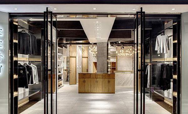
View of shop windows on Via Verri
照片 © Silvia Rivoltella
Window view from the gallery
照片 © Silvia Rivoltella
View of the sloped plaster ceiling
照片 © Silvia Rivoltella
View of the sales area on floor -1
照片 © Silvia Rivoltella
View of the customer reception area
照片 © Silvia Rivoltella
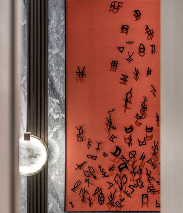
View of Linda Carrara's artwork
照片 © Silvia Rivoltella
View of the bar in the Canali Lounge
照片 © Silvia Rivoltella
Front view of the marble staircase
照片 © Silvia Rivoltella
Detail of the staircase to the Canali Lounge
照片 © Silvia Rivoltella
View of the sales area on floor -1
照片 © Silvia Rivoltella
Detail view of the sales area on floor -1
照片 © Silvia Rivoltella
View of the sales area on floor -1
照片 © Silvia Rivoltella
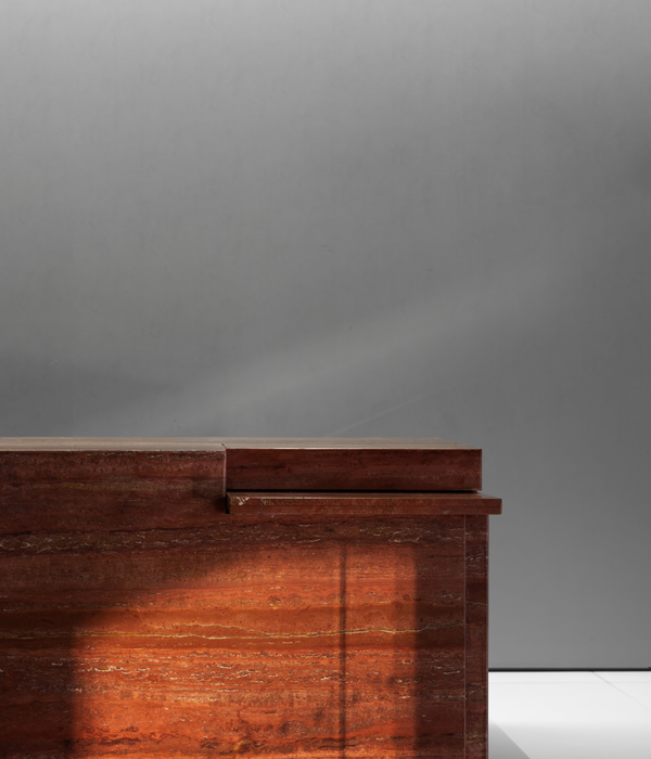
Details of materials
照片 © Silvia Rivoltella
Details of materials
照片 © Silvia Rivoltella
建筑师:Park Associati
位置:Via Verri 1, Milano, 20121 Milano, 意大利
年份:2024
客户:Canali
Trasveratility, textural contrasts and refinement: an interior project designed to convey the values of the Canali brand.
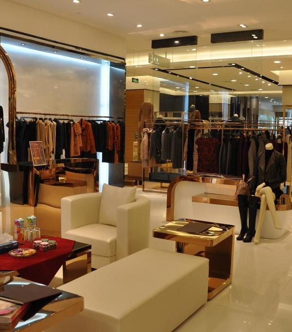
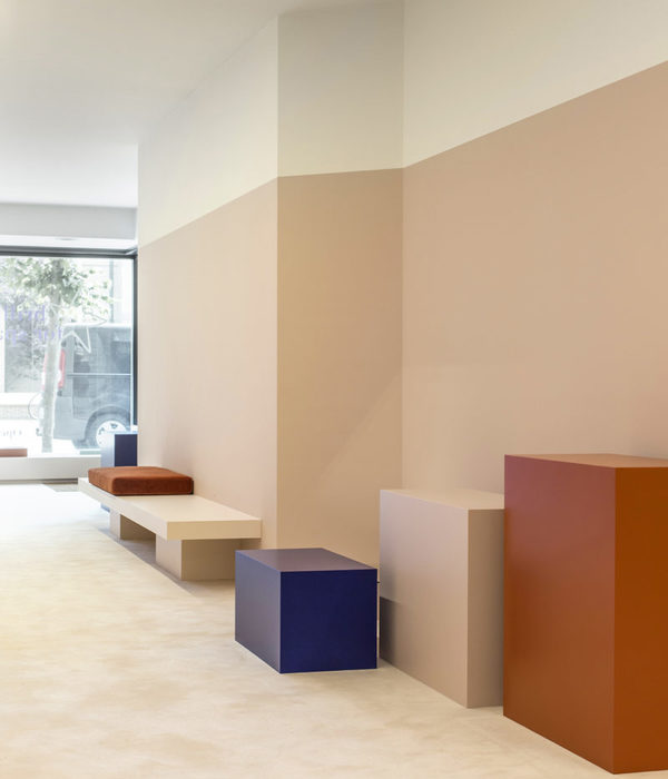
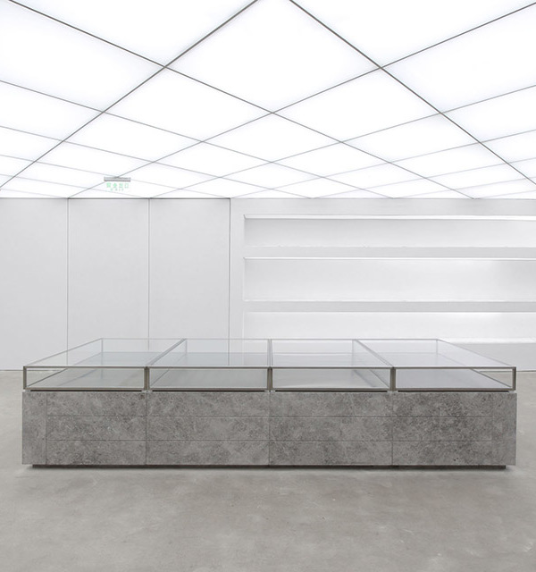
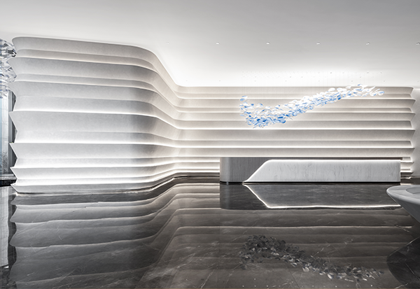
After designing the two Canali flagships in NY and Beijing and numerous stores around the world, Park Associati redesigns the brand's historic 350-square-metres space spread on two levels in the heart of Milan's fashion district. The project concept originates from an analysis of the brand and its distinguishing values: wide-ranging products, sober elegance and fluidity. The resulting transversal hybrid spaces aim at merging interior and exterior, as well as private and public areas. The three large double-height windows overlooking Via Verri, the access point to the store, act as transparent filters that allow complete visibility into the interior space from the porticoed area, with an even floor level and no vertical partitions. The whole space is perceived as a single large showcase, where the spirit of each Canali collection can be promoted with inspirational atmospheres. The defining scenic element of this room is the sloped plaster ceiling, a contemporary interpretation of the diamond-patterned ceilings of Milan's architectural interiors of the first half of the twentieth century. The ceiling's decorative motif incorporates regularly-spaced lighting units and creates a rhythmic and dynamic play of volumes. Characterised by a strong connection with the public space, the hall welcomes customers in an inclusive environment that lets the urban space in, where garments coexist with a contemporary work of art. The project's concept aims to foster a dialogue between art and fashion: a site-specific work with a strong visual impact by the artist Linda Carrara – the highlight of the customer reception area – invites customers to head towards the elegant marble-coated staircase that leads to the large exhibition space on floor -1.
After entering a large, varied exhibition path arranged over different levels where the brand's garments and accessories can be viewed, customers are lead to a reserved area, the Canali Lounge. This intimate, exclusive space features a bar overlooking an internal area that reveals the unexpected beauty typical of the internal courtyards of Milan's historic buildings. Breathing new life into the store by overturning the dynamics of the routes to increase the functionality and liveability of its spaces, the project reflects the elegant and distinct nature of the Canali brand, avoiding any formal or stylistic excesses in favour of a refined fluidity. Reflecting the brand's distinguishing sartorial features, the traditional materials used for the interior design acquire their uniqueness and value through applied craftsmanship. The timeless lines, the textural contrasts and the mood lighting complete an image that conveys understated elegance and awareness of contemporaneity.
The design intervention envisages curved and rounded surfaces that smooth out the corners of walls and furnishings softening the spaces. Research and attention to detail result in a comfortable, refined environment rich in contrasts thanks to the combination of different materials, but also sober. Proposed in two juxtaposed textural finishes, the hard mineral surfaces of marble and stone coexist with different types of wood characterised by controlled internal geometries and technically refined metallic finishes.
Designed to meet the different exhibition and display requirements, three different furnishing systems ensure visual continuity between the various retail environments: _ An adjustable system consisting of modular straight and curved back panels with a support structure covered with flexible wooden panels allows products to be displayed along the walls. The widths of the modules are tailored to the garments and accessories that will be displayed. A series of metal shelves with partition inserts and sculptural podiums in cipollino marble complete the structure of the display system. _ A Frame display system was designed as a self-supporting structure developing three-dimensionally in space according to a threadlike geometric structure. Nodes and metal bars can generate infinite compositional possibilities that can solve various layout and display needs, including double-sided display. Tone-on-tone metallic finishes and accurate workmanship reflect a world of sophisticated technological design. _ A system of recesses that can be articulated depending on the products on display develops along walls covered in veneered wood and features modules that can be adapted to different situations according to the exhibition space. A series of metal shelves and boxes was designed complete with a system of shelves with hanging hooks and bars as well as displays for belts and shirts. The display systems are completed by a set of tables and free-standing containers made of metal and veneered wood with a marble top and suspended volumes consisting of one or two units with drawers. Designed on two levels, the lighting emphasises the fine details and is key to creating a welcoming sophisticated atmosphere. The track direct lighting on the ceiling follows the rounded shapes of walls and furnishings, becoming a decorative element. The indirect lighting is distributed in the grooves of the perimeter walls, inside the recesses and behind the shelves.
{{item.text_origin}}


