PAU SCHOOL OF ARCHITECTURE AND DESIGN by KOTUstudio, Map/Mx, Sina Ozbudun
PAU School of Architecture and Design situates itself in a programmatically loaded social
zone, southwest corner of the campus, it is also a transition space from the built environment
and vast landscape. The project site can be rather inspiring for design students who will be
cultivated in an environment that has clear tension between the built and unbuilt.
The dualist mode of thinking in contemporary architectural profession for the building and
ground relationship fluctuates between either disguising the building with natural elements
and creating a fake sense of nature, or undermining the ground by fetishizing the figure. The
project sits in between, where the artificial and natural is in a symbiotic relationship. The
building is lightly positioned on the hill on three different elevations. The difference in
elevation not only brings diversity to the relationship between the spaces, but also makes
reference to the tectonics of Pamukkale’s symbolic travertine terraces. The modernist
pedestrian promenade design by Cengiz Bektas, creates a spine that relates human scale
with the campus, is extended into the faculty’s entrance generating the main axis of the
building. This pedestrian spine is then absorbed within the building by the courtyards and
circulation system. The plan curves that originates from the promenade, turns into walls,
windows, atriums and other elements; these curves also defines scores on the ground,
flower patches, or borders between soft and hard ground of the landscape. Thus the curve is
not only a representation of a building element but an overall aesthetic agent that alters and
defines both the building and landscape. The linear and fluid nature of the plan lines forms a
dynamic circulation diagram by expanding and constricting the spaces continuously.
The four historic typologies of the roof; pitched, flat, arch and inclined, have been
reinterpreted and run through the plan curves alternating on each wing according to the
programmatic requirements of the spaces below. Thus the curves also affect the form of the
building in section too. The section lines are sometimes segmented by elements like slits
and windows, losing its silhouette, but keeping the abstract trace of the roof typologies intact.
As different sections meet on the constricting moments on the plan they form tectonic
complexity by a multiplicity of the typologies, they diverge to become linear and turn into the
familiar roofs again. This formal complexity and simplicity has been balanced with a rhythmic
movement of diverging and fusing elements into the space.
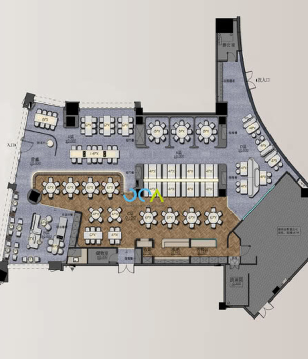
Programmatic separation begins as the building diverges into three wings symmetrically on
the main axis further away from the entrance. As the wings meet the circulation nodes
communal spaces is formed. The middle wing which lies on the main axis is the circulation
spine, and creates two coterminous loops as it meets with other two wings on different
instances. The courtyards in the loops provide, exhibition, leisure and activities for the
students. These two courtyards that differ in size are semiprivatized by the different
departments of the faculty which they are surrounded by. The cafe on the main axis serves
both of these open areas unifying them visually. The merging instances of the building
homes the vertical circulation and fire escapes whereas the linear stairs on the rest of the
wings provides fast circulation between floors. The directional stripes of the building are
frequently interrupted with vertical internal courtyards and light wells to minimize the
perception of a squeezed and linear space.
Year 2016
Status Competition works
Type Colleges & Universities
{{item.text_origin}}

