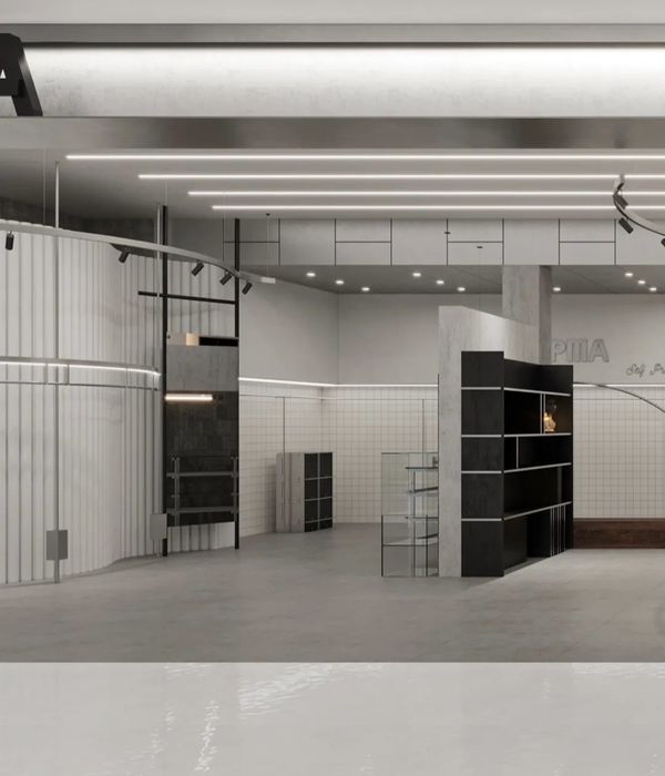
Agnes b. Galerie Boutique
This is one of the numerous retail spaces that TRA completed in SoHo. Artemide and the L&W Gallery were the first showrooms in SoHo and acted as an anchor for the Design District. The Pearl River Mart Department Store pioneered the introduction of large multi-level retail along the Mercer and Broadway corridors. In 2013, the Foscarini Spazio SoHo, similar to Agnes b. in the sense that it is a hybrid galley and retail space, expanded the SoHo shopping destination walk down to Canal Street.
When TRA was asked to design an innovative, authentic, responsible and flexible concept for the “flagship” Agnes b. laboratory, we had negotiated contrasting needs and programs.
The Howard Street space, located in an 1863 loft building, had to be elegant and timeless, sparse but not spare and warm and inviting, like the Agnes b.’s line itself. It also had to be specific to SoHo and entirely flexible, allowing for repositioning or complete removal of the fixtures, to support different interpretations and the development of what the company describes as “projects”.
The challenge was to design a space that was a store, but also where the well known and established, separate modes of the company could find their expression.
Like Agnes’s “point d’ironie”, a hybrid periodical - half magazine, half poster, the space is half gallery and half retail. It maximizes the brand through the minimalism of the space: the curated fashion, music, art and screenings are part of the décor.
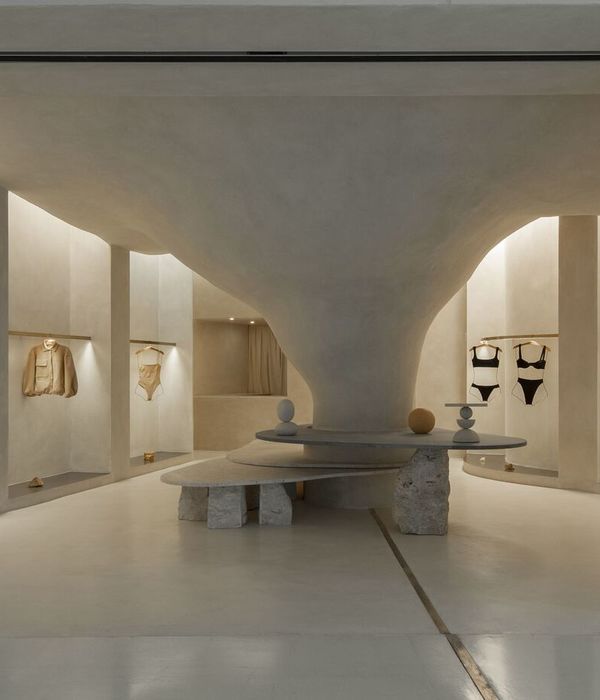
The loft presents the unusual characteristic of sloping more than a foot from the front to the back. The pragmatic resolution of the problem becomes the geometric structure and provides the iconic image around which the design is built. A 30 foot long, sleek, stepped platform greets the visitor and at once separates and connects the front “project room”, to the store proper. The lighting cove conceals the museum steel display cables that support the flexible display system. Like in a James Turrell installation, the ceiling appears to float above the thin cove edge.
The contrast between the thin cables and floating thick lacquered shelves, like the choice of rough and smooth finishes, parallels the Agnes B. aesthetic where sturdy fabrics can be found alongside the sheer and precious. The color is sparse, changing with the transition of the day.
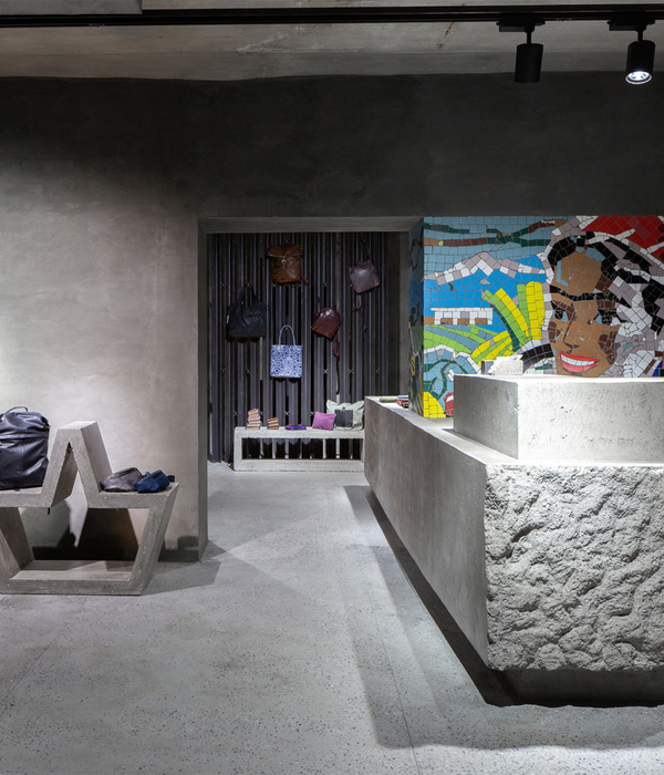
The industrial, authentic, responsible loft aesthetic and the blurred distinction between outside and inside is reinforced by the exterior grade “green materials", such as soft finish concrete and historic brick walls. We took full advantage of the historic surviving elements: this is a tranquil lifestyle space intended to last, where the elements will also get better with the patina of use.
TRA was also instrumental in the system and design detailing, project scheduling, project management and delivery.
Year 2012
Work finished in 2012
Status Completed works
Type Lofts/Penthouses
{{item.text_origin}}


