Located 400m from
Harbour, the heritage-listed former Department of Education building, part of the historic Sandstone Precinct, has reopened as the 5-star Capella Sydney Hotel. Make Architects was appointed by Pontiac Land Group to sensitively restore and remodel this former Edwardian Baroque-style governmental landmark for new uses, significantly opening the ground floor to be fully accessible to the public for the first time, with BAR Studio designing the refined new interiors throughout the hotel.
The design team worked closely with consultants and stakeholders, including Heritage NSW and the City of
, to reveal the original character of the protected building, which dates from 1912 and was designed by government architect George McRae. The grandeur of McRae’s architecture, with its Florentine-Palazzo style sandstone facade and marble-clad vestibules, lends itself to a future role as one of the world’s leading hotels.
With 192 guest rooms, event spaces, and 3 different bar and restaurant offerings, Capella
forms a landmark home that is connected to the life of the city center. This sense of belonging has been integral to the overall design vision for the project.
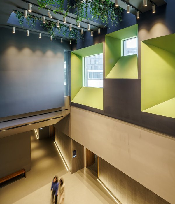
Originally built in two halves over a century ago, the former 8-story building occupies an entire city block. Its reconfiguration has been a major undertaking, especially as the integrity of many internal spaces has been compromised over the years by ad hoc changes made to the building’s fabric. McRae’s original design intent has been restored wherever possible, including the reinstatement of its internal garden courtyard, now named Aperture, on the ground floor. The surrounding spaces have been imaginatively repurposed for new uses, such as a variety of publicly accessible restaurants and bars and meeting and function rooms.
The former Department of Education’s gallery on level 6 has been preserved and transformed into the award-winning Auriga Spa, featuring a stunning 20m swimming pool, fitness suite, and private treatment rooms. The space is top-lit with copper-lined heritage roof lanterns that have been carefully restored and reimagined to draw in and diffuse the daylight into this unique well-being destination. Innovative engineering was required to insert the pool into the existing structure.
Four additional floors have also been added to the building, taking it to 11 stories. This complementary modern extension, with bespoke fluted fins and curved glass corners, has been set back to respect the original sandstone structure. A variety of guestroom offerings have been designed across both the heritage and extension levels. In the existing building, rooms are designed to showcase the existing window proportions and minimize the impact on the original structure while ensuring modern amenities are incorporated.
The new extension levels have presented Make with an opportunity to reimagine the roofscape. Designed as a fifth elevation, it now makes a positive contribution to the cityscape for those occupying high-rise buildings neighboring the hotel. Bespoke perforated screens and fluted cladding conceal the plant and services on the roof.
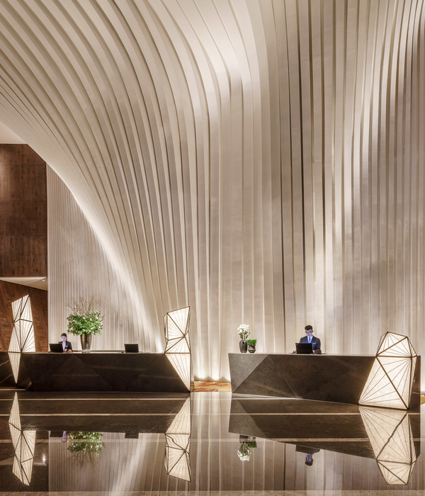
The interiors by BAR Studio embrace the existing built fabric and create a counterpoint to the once-utilitarian interiors. The design narrative responds to the rationalism and functionality of the original architecture while weaving in design gestures that speak to the buildings’ era and origins, like the use of black steel and steel-framed glazed screens and doors that make a subtle reference to the Age of Industry. A recurring motif of timber or metal-framed portals plays an important role in the definition of spaces, finishes, art, and objects.
A neutral base palette of warm grey stone and dark and light timber takes its cue from the building’s original architecture and design elements while creating a sense of a soothing urban sanctuary. Era-inspired design features, such as the black and white marble floor, antique mirrors, and the introduction of contemporary arches throughout the drinking and dining spaces, are a modern take on the elegance and glamour of the time.
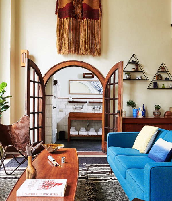
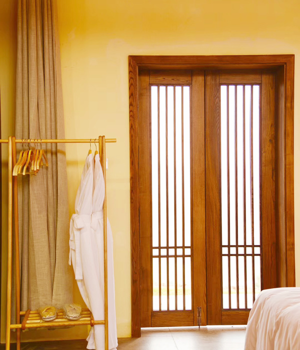
The design signature of bold portals carries through to the guest rooms, with dark wood and metal framing elements of the existing building as well as ‘zoning’ the different areas of the rooms. Campaign furniture – rooted in the need for flexible travel pieces in bygone days – has inspired freestanding wardrobes and minibars, as well as an integrated leather screen.
Externally, the hotel now creates a natural connection between the street at Farrer Place and Capella
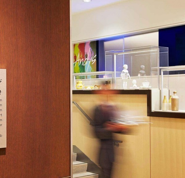
’s skylit inner courtyard. The team has designed an arrival sequence that welcomes the public through a journey from existing to new, further strengthened by the curation of public art and heritage interpretation between spaces. Art curation by Freeman Ryan Design and The Artling brings an extra layer of storytelling, with carefully curated works exhibited across the hotel’s public spaces as a way to share the area’s rich heritage.
Back-of-house facilities are accommodated across three new basement levels, thereby reducing the impact on the heritage fabric above ground. These underground service levels have been strategically planned to operate for both the Education Building and the neighboring Lands Building and provide efficiencies in energy use while minimizing the precinct’s carbon footprint.
{{item.text_origin}}

