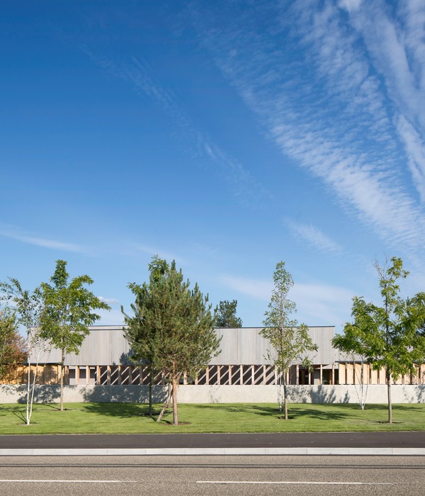
基地位于青岛平度城南新区,“生态商务区”的区级定位在项目招标时就已定下大基调。项目要求以此为框做命题作文,医院项目如何将自身的医疗建筑气质,融合到“生态”和“商务”的城市新区形象中。
The site is located in Southern New District of Pingdu city, Qingdao. The district level positioning of “ecological business district” has set the tone at the beginning of project bidding. The project requires to make a proposition composition based on this frame, dealing how to integrates its own medical architectural temperament into the image of “ecological” and “commercial”.
▼项目远观, viewing the project at distance ©楼洪忆
新区的“生态”环境来源于城区南北贯穿的一条主景观水系——现河景观轴,而景观轴的南端延伸至基地西侧的300亩景观公园,这点让设计团队明确了方向——方案必须以景观为先导。
The “ecological” environment comes from the main landscape water system running through north to south of the urban area – the Xian river landscape axis, and the south end of the landscape axis extends to the 300 mu landscape park on the west side of the site, which makes the design team clear the direction – the scheme must be guided by the landscape.
▼场地分析图,site analysis diagram ©中国中元国际工程有限公司
场地南侧阳光大道及西侧澳门路均为城市的重要主景观道路,方案确定了将场地西南侧做为先期启动的城市主界面来处理,由西南向北面、东面推进,逐级完成场地开发。
Sunshine Avenue in the South and Macao Road in the west of the site are important main landscape roads of the city. The scheme determines to treat the southwest of the site as the main interface of the city started in advance, and promote from the southwest to the north and east to complete the site development step by step.
▼医疗建筑与景观的融合,Integration of medical architecture and landscape ©楼洪忆
▼沿河立面,facade along the river ©楼洪忆
方案的交通解决策略则是,借鉴机场的落客系统,提出高效的人车分流体系,人行地上,车行地下,通过地下的长距离落客面解决各医疗功能区出入口的车行落客,进而解放出南面入口广场,完全为步行服务的单纯功能则不需要大尺度的空间,60米的建筑退线距离既符合就医人群步行的合理区间,又把一期250米长的建筑体量通过近距离的展现,呈现出符合新区“商务”特质的城市形象。尽可能将充足的用地让给中心景观区及远期的发展用地。
▼分析图,diagram ©中国中元国际工程有限公司
The traffic solution strategy is to draw lessons from the drop off system of the airport and put forward an efficient pedestrian vehicle diversion system. The pedestrian line is on the ground and the vehicle line is underground. Through the long-distance drop off surface underground, the drop off of vehicles at the entrances and exits of various medical functional areas can be solved, so as to liberate the south entrance square. The 60 meter building setback distance is not only in line with the reasonable walking range of the patient, but also presents the 250 meter long building volume of phase I through close display, showing a city image in line with the “business” characteristics of the new area.
▼入口立面,entrance facade ©楼洪忆
▼由城市道路看建筑,viewing the hospital from the street ©楼洪忆
后勤及污物车辆由东侧车行出入口进入,经坡道直达地库北侧后勤区,设置药房、营养厨房、太平间及垃圾站的装卸区,避免后勤车辆在地面上进行繁杂的作业。
Logistics and dirt vehicles enter from the entrance and exit of the vehicle on the east side, and go directly to the logistics area on the north side of the basement through the ramp. The loading and unloading areas of pharmacy, nutrition kitchen, morgue and garbage station are set to avoid complicated operations of logistics vehicles on the ground.
▼由入口广场看建筑, viewing the building at the entrance plaza ©楼洪忆
▼住院部入口, entrance of the inpatient department ©楼洪忆
▼地下停车场入口, entrance of the underground parking ©楼洪忆
一期的医疗综合体采用H形一横两纵的主街架构,横轴为门诊医技主街,沿轴南北分列门急诊和医技功能,垂直交通体及各集中等候区均位于横轴主街两侧,便于交通联系。两条纵轴分列东西,分别为一二期的住院主街,纵向串联起南北的住院单元体。
The medical complex in phase I adopts the main street structure of H-shaped, one horizontal and two vertical. The horizontal axis is the main street of outpatient medical technology, which is divided into outpatient and emergency and medical technology functions along the north and south of the axis. The vertical traffic body and various centralized waiting areas are located on both sides of the main street of the horizontal axis, which is convenient for traffic connection. The two longitudinal axes are divided into East and West, which are the main inpatient street of phase I and phase II respectively, and the inpatient unit from north to south is longitudinally connected in series.
▼入口大厅,entrance hall ©楼洪忆
▼整洁明亮的医院氛围,Clean and bright hospital atmosphere ©楼洪忆
这种区别于常规三段式布局的H型主街架构,在功能上做到了一定的创新:中部的医技区位于横轴中心,同时又与两端纵轴住院主街贴临,医疗流程上服务于门急诊区及住院区的距离最短,极大提高了医疗效率。
This H-shaped main street structure, which is different from the conventional three-stage layout, has achieved some innovation in function: the medical technology area in the middle is located in the center of the horizontal axis and adjacent to the main inpatient street of the vertical axis at both ends. In terms of medical process, the distance between the outpatient and emergency area and the inpatient area is the shortest, which greatly improves the medical efficiency.
▼治疗/手术室,operation room ©楼洪忆
立面采用统一的建筑语言把综合体统合在竖线条的设计思路下,形成完整而延续的城市界面。首层二层内收形成架空廊道,愈发承托整体建筑形象的挺拔之感。沿街没有常规意义上的裙房,250米长的城市形象面把高层挺拔的落地面和顺势延展开来的横向裙房面统一用一种折型铝板造型表达,以特定角度下呈现的强烈光影感和统一性,商务形象淋漓尽致。
The facade adopts a unified architectural language to integrate the complex under the design idea of vertical lines to form a complete and continuous urban interface. The first floor of the building is more and more tall and upright, forming the image of the first floor of the building. There is no podium in the conventional sense along the street. The 250 meter long urban image surface unifies the tall and straight landing surface of the high-rise and the horizontal podium surface extended by the trend with a folded aluminum plate shape. With the strong sense of light and shadow and unity presented from a specific angle, the business image is incisive and vividly.
▼夜景鸟瞰,aerial night view of the project ©楼洪忆
▼夜景,night view of the project ©楼洪忆
▼总平面图,master plan ©中国中元国际工程有限公司
▼一层平面图,1F plan ©中国中元国际工程有限公司
▼四层平面图,4F plan ©中国中元国际工程有限公司
▼立面图,elevations ©中国中元国际工程有限公司
▼剖面图,section ©中国中元国际工程有限公司
▼项目更多图片
{{item.text_origin}}

