说在前面 Customer information collected before design
这一次我要改造的房屋,位于北京朝阳区的一个住宅小区,小区的建筑为混凝土结构,随着不同屋主对房屋内各自的“添砖加瓦”以及内部的装饰,呈现出五花八门的样貌。我希望通过重新设计,构造出一个无论从视觉风格还是生活规划上都完全属于符合屋主习惯和审美的空间。
屋主SU :喜欢去世界各地旅行,喜欢去不同的美术馆,旅行中会收集饰品和心仪的画。
将这次设计定义为以下关键词:空间开敞、 模糊边界 、舒适独立的角落 、温和、 包容性强 、自然 、 复古、 温暖 、不过份装饰 、 有质感 、有岁月痕迹 、白色 、木质。
This time, the renovation house is located in a residential district of Chaoyang district, Beijing. Buildings of above residential district are concrete structured. As different renovation and decoration from different house owners were added to the house, it presented a chaos appearance. Through redesign, I hoped to construct a space, which is coincident with the house owner’s habit and beauty appreciation, no matter from vision style or from life regulation.
House owner SU: like traveling around the world; like different kinds of art museum; would collect decorations or favored pictures during travel.
Key words of this time design were set as below:Open space, Vague border, Cosy and exclusive corner, Gentle, High inclusiveness, Natural, Nostalgia, Warm, No over-decoration, Textured, Trace of time, White, Woodiness.
▼改造后的房屋室内概览,interior view of the house after renovation
装修时间:2018年6月-2018年12月 Renovation time: Jun. 2018 to Dec. 2018
说说什么给了你灵感:每个能成为作品的案子,屋主都是很清晰自己需要需要什么样的空间,在这个基础上,我主要是倾听,然后做出适合屋主的空间。
你对这套作品最满意的地方在哪里,为什么:各个空间打开后,相互的关联更密切,不再是各自独立封闭的状态,使用方便,也让给空间显得更宽敞。
对平面布局做了哪些优化改动,为什么:移除原空间内的3处隔墙,将原本各自独立的小空间,化零为整,形成一个开阔舒适的空间。
整个装修最大的挑战是什么:1:地台中暗藏了暖气,与各方多次协调,最终达到一个较好的结果。2:保留原始混凝土结构材质,铲除墙皮后,不做任何处理,一直是有担心的,直到全屋定制安装好,才放心。
回看这套房子,设计当中有什么遗憾的地方吗:装了中央空调,整体线条感会更清晰利索。
为了满足客户的个性化需求,你在设计过程中做了哪些事情:基本我们是很友好的沟通过程,我们两个人对待事物的态度比较一致,就是具体问题灵活解决。
Where did your inspiration come from: In every case that a renovation can be called an art work, the owners all clearly knew which kind of space they want. On this foundation, my task was mainly listening and making suitable space for the owners.
What is your most satisfied place in this set of work, and why: After the open of each spaces, the connections among spaces are more close, free from isolated status, which also brings use convenience and makes the space more open.
What kind of optimization was done to plane layout, and why: Removing three walls in the original room changed small and separated room into one, forming an open and cosy space.
What was the biggest challenge: 1: Heating was installed in the platform, which was made by negotiation with many parties and got a relatively satisfied result in the end. 2: Original concrete structure texture was saved. After removing the surface of all walls and without any further operation to it, there was always worry till the installation of whole house customization.
Look back on this house, is there any unsatisfied place in the design? If central air-conditioning was installed, the whole line would be more clear and neat.
In order to satisfy the customized requirement from customer, what did you do during the design process: Basically we had a friendly communication process, we have relatively coincident attitude toward the renovation. Specific problems were addressed flexibly.
改造前 Before renovation
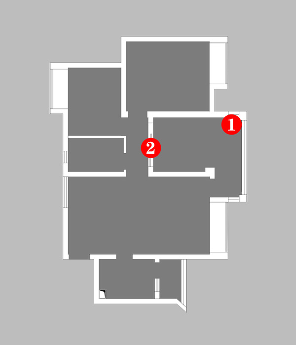
是一套常规的一室一厅,套内面积43平米,空间中的3处隔断墙体,将空间划分为独立的卧室,客厅,厨房,卫生间,尤其是卫生间问题比较突出,晦暗无光又狭窄。淋浴区的湿漉漉蔓延整个卫生间地面。
This house was a general set of one bedroom with one living room. With 43 square meter, this house was divided into separated bedroom, living room, kitchen room, and bathroom by three partition walls. Problems in bathroom were especially serious with dark and narrow space. Damp situation of shower area extended to all floor of the bathroom.
改造后 After renovation
将空间中所有隔断墙体移除,分别植入一个盒子概念的卫生间、一个通透的隔断书架、一个综合功能的地台,形成了全新的空间模式。
All partition walls were removed. Bathroom with box-concept was installed, a transparent partition book-shelf was installed, and an integrated functional platform was set. All above formed a new room model.
▼移除空间中所有隔断墙体,形成全新的空间模式,all partition walls were removed and the designformed a new room model
玄关Entryway
1:敞开式收纳,日常的鞋、衣物、包袋出门前在这里都可以搭配好,轻松出门。
2:玄关走向客厅的一个角度。
1: Open-type collection. Daily used shoes, clothes, bags can be matched up here, so house owner can easily dressed before going outside.
2: An angle from entryway to living room.
▼敞开式收纳,open-type collection
▼从玄关走向客厅,walk from the entryway to living room
客厅Living Room
1 :将移动家具移走,空间的状态依然存在,通过梳妆台边上的帘子,可在夜间划分睡眠区的私密性。
2:一个白色中轴线吊顶,贯穿了起居室与卧室。 墙皮铲除后保留了建筑结构的混凝土质感,与顶面的白色吊顶形成了鲜明的对比。
3:这个角度可以看到起居室、休息区、梳妆台、卫生间的空间关系,卫生间整体以盒子的形式被嵌入整体空间中。
4: 地台上黑色圆孔是出风口,下面暗藏有暖气,透过书柜看向休息区,沙发、床体一次摆放在白色吊顶下。
1: After removed removable furniture, the space is still there. Curtain beside dressing table can separate a private sleeping space at night.
2: A white central axis ceiling goes through living room and bedroom. After the removing of the walls surface, concrete texture of the structure is saved, which makes a bright contrast with the white ceiling.
3: In this angle, the space relationship among living room, bedroom, dressing table and bathroom can be seem. Bathroom as a whole was installed into the whole space in the form of a box.
4: The black round holes on the platform is wind outlet with heating installed inside. Seeing through book-shelf, sofa and bed are set under white ceiling in order.
5: 白色中轴线吊顶贯穿起居室与卧室,卫生间整体以盒子的形式被嵌入整体空间中。
餐厅Dining room
在起居室与厨房的过渡空间中,一个L形状大理石吧台,最大化不阻隔光线,平时这里是屋主用餐和办公的角落,在这里还可以享受窗外的绿色植物带来的自然气息。
On the transition place between living room and kitchen room set a bar counter with L shape and made from marble. It tries not to block the sunshine. Usually, this is the place of eating and working. From this place, house owner can also enjoy the natural flavor from the green plants outside of window.
▼处于起居室与厨房过渡空间中的一个L形状大理石吧台作为用餐和办公角落,on the transition place between living room and kitchen room, there is a bar counter with L shape and made from marble serving as dinning and working area
厨房Kitchen
1:分为两部分,其中L形橱柜是负责主要操作的区域。
2:吧台一侧的餐边柜是另一部分橱柜,收纳咖啡、饮品、小食,这里保留了落地窗的采光,光线可以穿过吧台到达卫生间及玄关。
1: it is divided into two parts, with L style cupboard as the main cook area.
2: Cupboard on one sided of bar platform is another part of the whole ambry, which can collect coffee, drinkings, and snacks. Floor to window design was taken to make sure sunshine can go through the bar platform and reach both bathroom and entryway.
厨房分为两部分,L形橱柜是负责主要操作的区域,it is divided into two parts, with L style cupboard as the main cook area
卧室Bedroom
1:地台提供了多种可能性,可以摆放和更替不同物品。
2:在整个空间最里面的的区域是休息区,一个地台连贯了起居室与睡眠区,整合储物和休闲等多功能,空间的界限既清晰又模糊,同时为了节省空间,定制了胡桃木材质的床头板。
3:阳光照在床上的感觉。
1: Platform provides many kinds of possibility, which can be set and replace different kinds of items.
2: The innermost area in the whole space is resting section. A platform combines living room and bedroom, which also has multifunctions like storage and relaxation. The border of space is both clear and vague. At the same time, in order to save space, walnut headboard was customized.
3: The feeling of sunshine on bed.
▼一个地台连贯了起居室与睡眠区,整合储物和休闲等多功能,空间的界限既清晰又模糊,aplatform combines living room and bedroom, which also has multifunctions like storage and relaxation; the border of space is both clear and vague
为了节省空间,定制了胡桃木材质的床头板,in order to save space, walnut headboard was customized
卫生间
Bathroom
1:三扇玻璃推拉门将光线引入卫生间,解决了原来无自然采光的问题,同时也改善了通风。
2:为了尽量控制比较少的使用材料,在洗漱盆的后面,只是做了一条超白背漆玻璃,起到挡水作用,卫生间其它墙面部刷漆。
3:浴室一个角度。
4:随意摆在浴缸上的小画,是屋主心爱的物品。
5:马桶左侧是洗衣机干衣机,右侧是淋浴区。
6::浴室另一个角度。
1: three glass pushing doors lead sunshine into bathroom, resolved the problems of natural light and also improved ventilation situation.
2: In order to control the usage of material, only one super white lacquered glass was set behind the wash basin to block water. All other walls in bathroom were only painted.
3: An angle of bathroom.
4: Pictures randomly set on the bathtub are the favors of the owner.
5: The left side of closes-tool is laundry and dry-cleaning machines, while on the right is shower area.
6: Another angel of bathroom.
▼三扇玻璃推拉门将光线引入卫生间,three glass pushing doors lead sunshine into bathroom
▼洗漱盆的后面只做一条超白背漆玻璃,起到挡水作用;马桶左侧是洗衣机和干衣机,右侧是淋浴区,only one super white lacquered glass was set behind the wash basin to block water;the left side of closes-tool is laundry and dry-cleaning machines, while on the right is shower area.
▼随意摆在浴缸上的小画;不同角度的浴缸,pictures randomly set on the bathtub andbathtub from different angles
项目信息:设计:罗秀达施工图深化:何砂施工:黄文斌摄影:金伟琦材质:混凝土 自流平地面 胡桃木贴皮 长虹玻璃
材料及品牌1:全屋定制:班尔奇2:自流平厂家:雷帝3:橱柜厂家:宜家4:画-淘宝店:「旁白VoiceOver」
Project Information:Design: Luo xiuda
Shop drawing deepening: He Sha
Construction:Huang Wenbin
Photography: Jin Weiqi
Materials: concrete, Self-leveling materials of floor, Walnut veneer, Changhong glass
Materials and Brands
1: Whole house customization: Pauchie
2:Self-leveling materials company: Laticrete
3: Ambry manufacture: IKEA
4: Pictures – Taobao stores: 「VoiceOver」
{{item.text_origin}}

