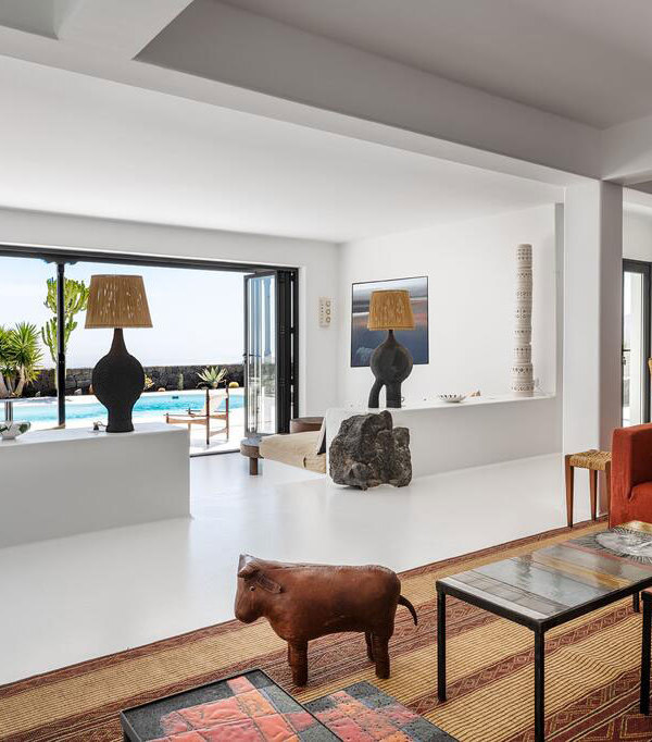
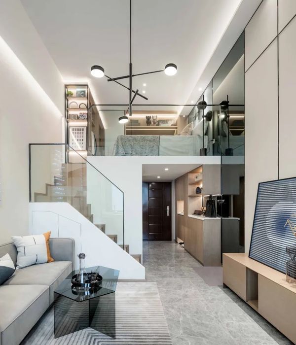
这是针对台北一所老公寓的设计项目。原有的空间布局为了满足三个卧室和两个浴室的需求,牺牲了厨房和餐厅的空间。因此,原本应放在厨房内的冰箱只能放在餐厅,进一步压缩了餐厅空间,使餐厅内无法放下四人的用餐桌。
This project is an old apartment located in Taipei. The original layout, in terms of spatial configuration, sacrificed the space in the kitchen and dining room to meet the need for three bedrooms and two bathrooms. Thus, it was impossible to place the refrigerator in the kitchen, and it could only be placed in the dining room. However, this compressed the dining room space, and it was then not possible to place a four-person dining table in the dining room.
▼起居室,living room
设计师希望改善厨房和餐厅空间狭窄的问题。因此,设计师缩小了一间卧室面积,将空间分配给厨房和餐厅,让这两个区域的空间更加灵活,厨房内有足够空间放下冰箱,使用更加有效率,餐厅能够放下足够尺寸的餐桌和椅子。起居室也获得了更多的工作空间。
In this regard, we hope to improve the problem of narrow kitchens and dining room space. Therefore, we will scale down one bedroom and allocate that space to the kitchen and dining room, making the space more flexible and allowing sufficient space in the kitchen for a refrigerator and dining table. In addition to more efficient use of the kitchen, the dining room can also fit a full-sized dining table with chairs, while the living room will have more working space.
▼起居室内工作空间,working space in the living room
▼从起居室和厨房看向餐厅,view from living room and kitchen to the dinning room
▼可以放下桌子和椅子的厨房,dining room can fit a full-sized dining table with chairs
在实施过程中,除了解决当前功能需求无法满足的问题,设计师将重点放在了业主喜爱的设计风格上。设计师与业主尽可能详细地进行讨论,了解业主从小对空间和家庭的记忆,希望依据业主成长和熟悉的环境来进行家居和环境设计。
In the execution process, in addition to solving the current problem of the unmet functional needs, we tried to focus on the preferred style of the homeowner. We discussed with the homeowner, in as much detail as possible, their impressions of space and home from their childhood. We hope to base the design of the home furnishings and environment on that which the homeowner grew up around and what feels familiar.
▼充满记忆的家居设计,design full of childhood impressions
设计师采用与业主记忆产生共鸣的元素并将它们结合在一起。首先,在重新进行室内设计时,砖墙不做任何处理,直接用作表面材料。第二,采用水泥地板、墙纸和松木胶合板共同营造一种业主熟悉的居住氛围。最后,设计师尽可能的减少装饰设计,努力呈现出一种简洁感,使材料能够通过本身特质表达设计师最初的设计意图。
Later, we included some elements that resonated with the elements from the homeowners’ impressions and integrated these. First, brick walls were used directly as a surface material without any modification when rebuilding the interior compartment. Second, cement floors, wall decals, and pine plywood were used to construct a familiar residential atmosphere. Finally, we also tried to reduce decorative designs as much as possible and strived to present a sense of simplicity so the materials could express our initial intentions through their own properties.
▼未经处理的砖墙,brick walls without modification
▼水泥地面、墙纸与松木胶合板,cement floors, wall decals, and pine plywood
▼简洁的卧室,bedrooms in a sense of simplicity
▼洗手间,bathroom
▼住宅平面,plan
Project Name: Weng’s house
Design Agency: 2BOOKS Space Design
Designer: Jeff Weng
Client: Mr.Weng
Location: Taipei city, Taiwan
Area: 83㎡
Photography: moooten studio
{{item.text_origin}}

