Architect:ZROBIM architects
Location:Minsk, Belarus; | ;
Project Year:2021
Category:Apartments
The main conceptual idea of the project was a combination of two concepts: logic and elegance. The entire interior is designed in one calm color scheme, which combines the simplicity of light monochromatic surfaces with a complex texture of materials such as marble, wood, concrete. All this is complemented by a noble blue color in its various shades. Artworks fill the space with life, thereby showing the owners' love for beauty.
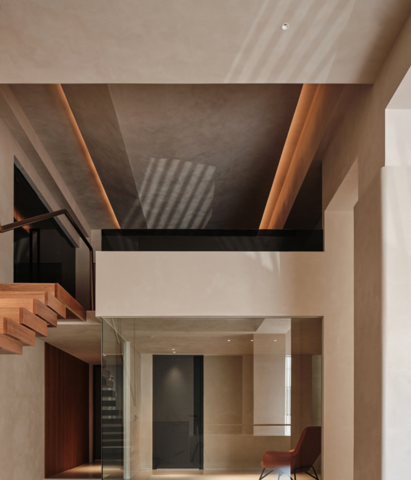
Special attention is paid to the light in the apartment. It was important for us to provide different lighting scenarios. In addition to its functional purpose, light has one more function here - it reveals, emphasizes the volumes and materials of the interior.
We have developed some of the luminaires specifically for this project.
When working on an apartment plan, it was important for us to preserve the maximum volume of the kitchen-living room, while we got a full-fledged bedroom and a nursery. In the apartment, special attention is paid to storage, there is a full dressing room and a laundry room.
Getting into the hall space, the first thing we see is a picture located directly opposite the entrance, which immediately sets the mood and reveals the overall design concept of the apartment. We were faced with the task of making the entire space as light and spacious as possible, and we began to implement this idea from the corridor.
We have made all doors hidden with different finishing materials. One of the walls we made completely mirrored so that the light from the living room through the reflection from the mirrors fills the space of the corridor. A sleek transition from one room to another we made through the rounded shapes of furniture and walls. Thus, the entrance area flows smoothly into the living room.
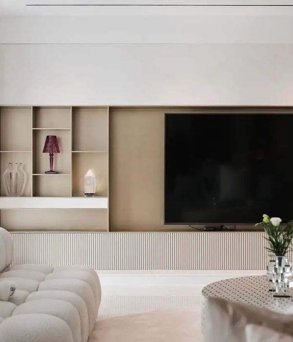
The living room is the core of this apartment. It unites the kitchen and living area into one airy light space, where every piece of furniture has its own place and orientation according to the planning system. So, the center of the space is the bar counter, which conventionally divides the space into two zones - living and dining. This is a very functional solution, as it provides space for various scenarios of life.
The expanse of the apartment is filled with art objects that are located in different rooms, but what makes this interior truly special and individual is the painting depicting our client. Initially, this picture was not established in the design project, but in the process of working, our designer saw a photoset of our client and offered to create an art object out of it. Such wise we made this interior even more personal.
Since the floor levels on the balcony and in the apartment are different, we had the challenge to find a solution for this feature. Under the TV we placed a shelf for books, which is at the same time a niche for the convertor, and due to its height, we made a smooth transition from the balcony to the room.
In the parent's bedroom, we see the continuation of the basic idea of rounding forms, individual furniture, flowing from one finish to another, and the versatility of the use of objects. So the table in the bedroom can be used both as a dressing table for make-up and as a full-fledged workplace when we close the mirror with a curtain so that nothing distracts us during work.
In the bedroom, we see another functional solution. All the doors in the apartment are hidden and from the side of the living room they are made in the same plane but from the side of the bedroom, we had a protruding box, which we decorated with an MDF profile frame and built into a part of the wall specially extended from drywall. Thus, the platband and the wall are on the same level so visually all structural elements are in harmony.
The master bedroom is located in the opposite corner relative to the nursery, thus we achieve maximum sound insulation for all family members.
When we started designing the nursery, the clients didn't yet know the gender of the child and, in addition, they had a second child in their plans, so we decided to make the children's room unisex. We used a neutral color scheme that matches the overall color of the apartment. The main feature of this room is the floating tabletop, which has no support, located by the window.
The wardrobe in the children's room replicates the dressing room at the entrance - it is closed with a curtain and is designed as functional as possible.
From the developer, we received an apartment with a large bathroom and a smaller guest toilet. The general style of the apartment is also reflected in both bathrooms. Here we see the already familiar color scheme, graphic lines, the use of MDF platbands, and a combination of various materials. In the bathroom, we used micro cement as a wall decoration, due to which we achieved the seamlessness of the planes.
We made a small recess for the bath and cabinets, which is not only functionally convenient but also creates the visual effect of floating surfaces. All these architectural techniques add airiness and lightness to the space according to the overall design concept.
▼项目更多图片
{{item.text_origin}}

