UW-SPACE DESIGN
有无设计
Apartment&villa Exhibition Office Restaurant
Hero
英雄的家
2020
Copyright©The UW-SPACE DESIGN
EDIT/ © UW DESIGN
© 有无设计
PHOTO
穆彪家,不仅是我们避风的港湾,也是我们梦想开始的地方。每个成年人的外表之下,也许仍怀揣着少年时期留下的梦想,跳跃不息。本案位于纽宾凯·锦城,一线公园湖景美宅原户型五房格局,小夫妻两口第二居所,小两口热衷“买买买”......男女独立衣帽间,需要大量的储物空间。男主人是“手办”爱好者需要大量的展示手办空间.风格上双方一致倾向现代轻奢风格,整体简洁、时尚、高级而不失温馨。
Home is not only a shelter for us, but also the place where our dreams begin. Under the appearance of every adult, perhaps still carrying the dream left by his youth, jumping ceaselessly.The case is located in new Binkai · Jincheng, a first-line Park, lake view house, the original house type of five room pattern, the couple’s second residence, the couple are keen on "buy buy buy"... Men’s and women’s independent cloakrooms, which need a lot of storage space. The host is a "hand-made" enthusiast, and needs a lot of display space. The style of both sides is consistent with the modern light luxury style, which is simple, fashionable, advanced and warm.
▼客厅
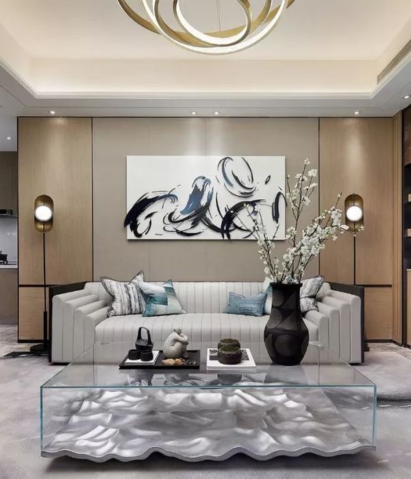
拆改非承重墙体,将五房改一房,设计男女上独立衣帽间,以及独立展示手办墙.由于几乎全是承重结构墙改造空间非常有限于是采用“微调”的方式打通整个空间.中厅的设计方式打破了原有狭长的过道空间。
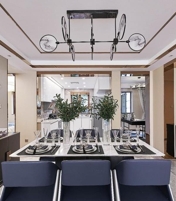
开方式厨房使整个客厅餐厅厨房原本十七米的跨度变得格外的通透。
展示墙使用大量的不锈钢板定制高质感展示柜,既有精致高级展示效果又保留了工业风的元素。
视觉冲击力十足,背景的石皮与金属产生强烈对比使得模型融入其中……本案整体风格为现代轻奢,运用了体块分色,材质比例协调分割,装饰上现代感十足的石材、岩板、金属、木饰面等材质穿插.满满的感激感。
Because almost all of the walls are load-bearing structure, the space for transformation is very limited, so we use the way of "fine adjustment" to open up the whole space. The design of the middle hall breaks the original narrow corridor space. Open way kitchen makes the whole living room dining room kitchen originally 17 meters span become particularly transparent. The display wall uses a large number of stainless steel plates to customize the high-quality display cabinet, which not only has exquisite and advanced display effect, but also retains the elements of industrial wind. The visual impact is full, and the stone skin and metal in the background have a strong contrast, which makes the model integrate into it The overall style of the case is modern and luxurious. It uses the color separation of the body block, the material proportion is coordinated and divided, and the decoration is full of modern stone, rock plate, metal, wood veneer and other materials.
▼书房
厨房空间减去了厚重的墙面隔屏也减轻了视觉的重量感,大面积的开窗设计,更将大平层的采光优势、迷人景色完全引入室内。这些设计不外乎是为了拉近各个空间甚至使用者的距离,让生活更贴近生活。我们所介意的不只是适切的空间,而是一个良好生活的开始。
The kitchen space minus the heavy wall partition screen also reduces the sense of visual weight. The large-area window design will fully introduce the daylighting advantage and charming scenery of the large flat floor into the interior. These designs are just to shorten the distance between each space and even users, so that life is closer to life. What we care about is not just the right space, but the beginning of a good life.
▼厨房
在纹理中利用错拼分割的律动,来传递石材塬有的样貌,依不同比例切割墙面的进退面手法,来诠释量体在空间之内的堆叠,加上石材的肌理转折到天花的运用,木地板的温度延伸到壁面的手法,来呈现环境在空间的包覆性。
In the texture, we use the rhythm of wrong spelling and segmentation to convey the appearance of stone tableland. We use the method of cutting the wall in different proportions to interpret the stacking of volume in the space. In addition, the texture of stone turns to the use of ceiling, and the temperature of wood floor extends to the wall to present the coverage of environment in space.
▼衣帽间
▼主卫生间
整体上以开阔布局、明朗光线为主,营造出惬意的安适感同时,结合各人性格喜好的不同,在独立空间设计上,注入相对应的元素,让家的每一个角落都真正成为身心、精神的归属地。
On the whole, it is mainly open layout and bright light to create a comfortable sense of comfort. At the same time, combined with the different personality preferences of each person, the corresponding elements are injected into the independent space design, so that every corner of the home can truly become the home of body, mind and spirit.
▼卧室
▼平面布置图
(滑动可查看平面布置图)Name | 项目名称
陈老板的英雄家
Quality | 空间性质
室内住宅设计
Design team | 设计团队
余庆新
|胡双喜|谭海森
camerist | 摄影
穆彪
Adress | 项目地点
武汉市
Interior Design | 项目设计
洪雅娟
|明海琪
UNI-X ASSOCIATES
Copyright ©UW-SPACE DESIGN
. A
ll rights reserved.
/More About Information
有无设计
UW-SPACE DESIGN
1024094303 | Q Q
武汉东湖尚郡 | 地址
{{item.text_origin}}

