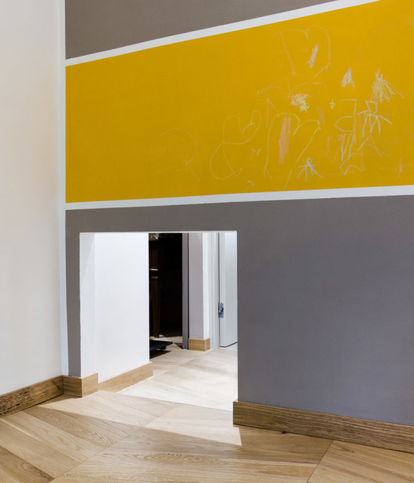
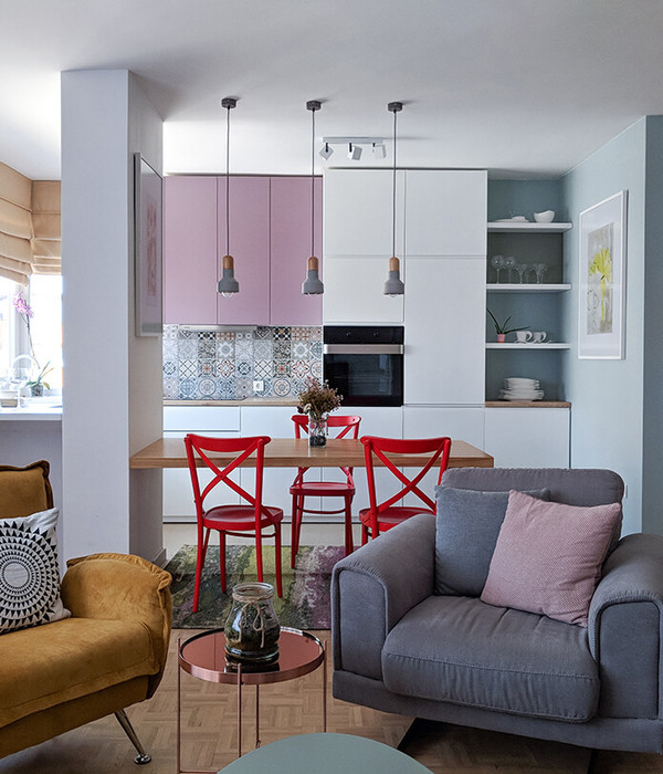
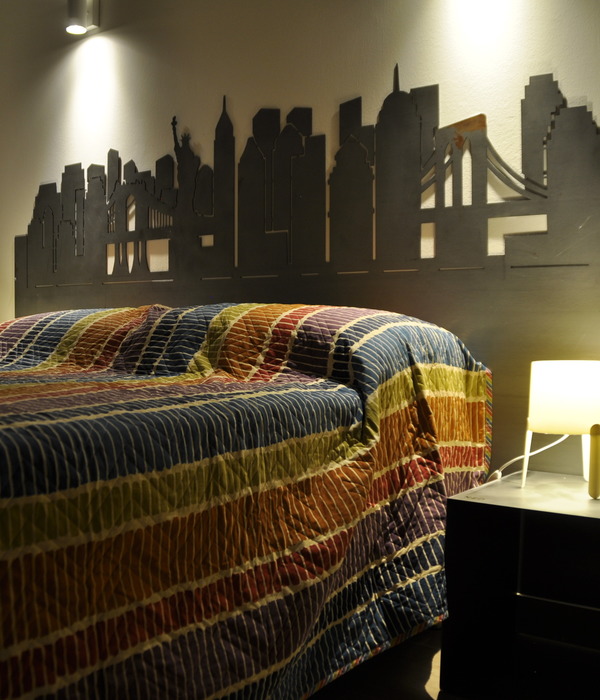
“ 纯色基调, 壮丽留白。 ”
设计师手记 无需 额外物品 的简约空间 这个地方的 每一个部分 都是一个有 魅力的展示品 整个的空间就像 是一个特殊艺术空间
Magnificent blank · Calm
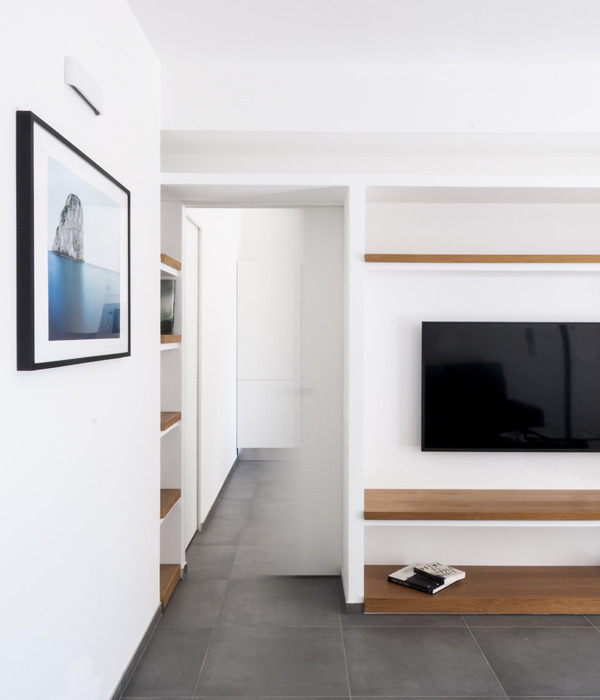
一对夫妇的公寓位于基辅的一个新住宅区。客户在家庭之外过着积极的生活——经常参加活动、工作和旅行。为了平衡这一点,他们希望自己的公寓成为安静的地方。
The apartment for a couple lies in a new housing complex in Kyiv. The clients have an active life outside the home – participate in events, work and travel a lot. To balance that, they sought their apartment to be the place of silence.
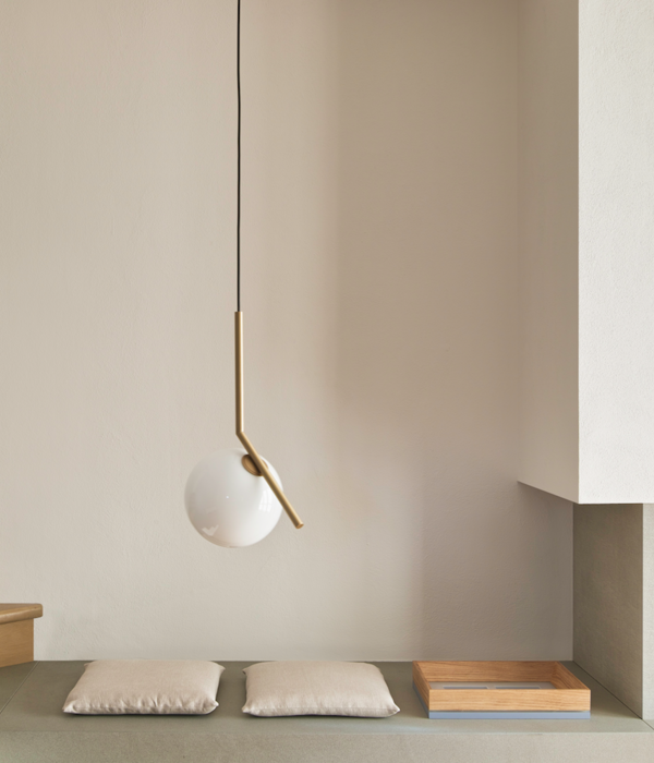
纯线条的壮丽留白概念就这样出现了。 无需额外物品的简约空间。 这个地方的每一个部分都是一个有魅力的展示品,整个公寓就像一个艺术空间。
That is how the concept of the magnificent white space with pure lines appeared. The minimalistic space with no additional things needed. Every part of the place is a charismatic showpiece, and the whole apartment works like an art space.
关键区域之一是您可以从入口看到的壁橱。它的氛围类似于时尚品牌的陈列室。两个大的白色衣柜彼此相对。它们都有玻璃门,一个是透明的,另一个是白色的。
One of the crucial zones is a closet that you can see from the entrance. Its atmosphere resembles a showroom of a fashion brand. Two large white wardrobes stand opposite one another. Both of them have glass doors, one is transparent, and the other is painted white.
杆子上的双面镜可以很容易地自行转动。
A double-sided mirror on the pole can be easily turned around itself.
宽敞的客厅与厨房相结合。
The roomy living room is combined with the kitchen.
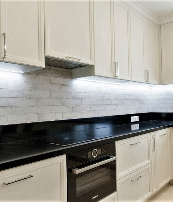
公寓的主人喜欢做饭,但她不想看到所有的厨房设施和设备。所有这些都隐藏在抽屉内或隐藏在桌面后面的滑动系统内的单独单元内。
The owner of the apartment likes cooking, but she does not want to have all the kitchen utilities and equipment in sight. All of them are hidden inside drawers or the separate unit hidden inside the sliding system behind the tabletop.
客厅的中央是 Edra 的大沙发变压器。它具有三个单元和一个头垫,您可以随意移动。
The center of the living room is a big sofa transformer by Edra. It has three units and a head cushion that you can move as you please.
两间浴室的水槽和淋浴间的搁板均由蓝色大理石制成。这就是设计师如何满足客户让大海进入他们家的愿望。
Sinks in two bathrooms and the shelf in a shower are made from blue marble. That is how the designer met the desire of a client to let the sea come into their home.
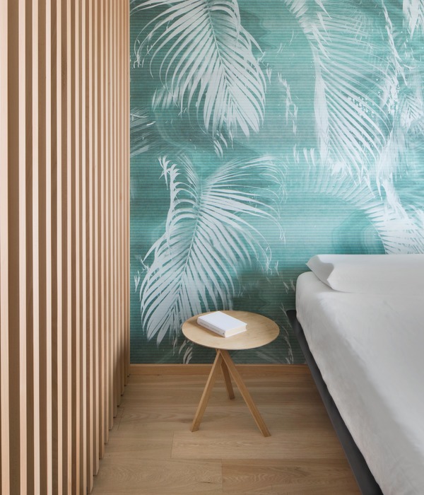
主卧室的焦点是种植多汁绿色植物的花盆。您还可以从浴室透过智能玻璃墙看到它们如画的剪影。
The focal point of the master bedroom is the planter with juicy green plants. You can see their picturesque silhouettes also from the bathroom through the smart glass wall.
儿童房保持简约的概念,但有不同的颜色托盘。墙壁和家具立面选用米色,窗帘和家纺选用深绿色。设计师的目标是不超过房间里的物品数量,让孩子有更多的空间来发挥他们的幻想和创造力。
The children’s room is in keeping with the minimalistic concept but has a different color pallet. The shade of beige was picked for the walls and furniture facades, and the deep green was chosen for the curtains and the home textile. The designer aimed not to exceed the number of objects in the room, so the child has more space for their fantasy and creativity.
在大厅天花板的边缘,有一个嵌入式照明系统。它可以选择冷光、暖光或彩色光,完全改变公寓的气氛。
On the edge of the ceiling in the hall, there is a recessed light system. It lets to choose cold, warm, or color light that totally transforms the mood of the apartment.
sympathy of the original character
Adam Kane Architects 重新设计了一座加州平房,为一个成长中的家庭增添了现代气息,他着手尽可能多地保留当时住宅的特色,同时确保他们的工作保持对原始角色的同情。
Redesigning a Californian bungalow with a contemporary addition for a growing family, Adam Kane Architects set out to maintain as many features from the period home as possible, while ensuring their work remained sympathetic to the original character.
受他在现有住宅中与客户会面时所获得的洞察力的启发,Adam 以简单的最小调色板理解了他们干净、明亮和整洁的审美。“一切都井井有条,各得其所,”他说
Inspired by the insight he had through meeting with his clients in their existing home, Adam understood their clean, bright and tidy aesthetic with a simple minimal palette. “Everything was very ordered and had its place,” he says.
这种洞察力为他的愿景提供了灵感,从外部开始,扩展的具体渲染外部。在内部,精致的材料调色板超越了整个家庭,抛光石膏连接套间和防溅板,而白色混凝土骨料地板毫不费力地流过石色墙壁和漂浮的白色楼梯。
This insight informed his vision, beginning from the outside, with the extension’s concrete render exterior. Inside, a refined material palette transcends the entire home, with polished plaster connecting the ensuite and splashbacks, while a white concrete aggregate floor flows effortlessly through the stone-coloured walls and floating white staircase.
厨房的带凹槽的彩绘细木工隐藏了步入式餐具室、冰箱和亚麻橱柜,而化妆间则反映了起居区的细木工单元,在空间之间创造了一致的对话。
The grooved painted joinery in the kitchen conceals the walk-in pantry, fridge and linen cupboard, while the powder room mirrors the joinery unit in the living area, creating a consistent dialogue between spaces.
主人套房、客房、家庭办公室和洗衣房现在位于原来的家中,而在新的极简主义立方体中,儿童卧室和新浴室,现在楼上还有第二个生活空间。
The master suite, a guest bedroom, home office, and laundry now lie in the original home while in the new minimalist cube, with the children’s bedrooms and a new bathroom, complemented by a second living space now upstairs.
开放式厨房配有白色大理石厨房岛台,暗示着充满家的沉浸式宁静。该区域由大型玻璃开口构成,分散了内外之间的界限,起居和用餐空间毫不费力地流入内森伯克特景观建筑花园。内部调色板和景观协同工作而不是竞争;绿色植物为精简的空间增添了活力。
The open plan kitchen with a statement kitchen island bench in white marble alludes to the immersive serenity that fills the home. This area is framed by large, glazed openings that diffuse the boundary between inside and outside, with the living and dining space flowing effortlessly into the Nathan Burkett Landscape Architecture garden. The interior palette and landscape work together rather than compete; with the greenery lending vibrance to the pared-down spaces.
Simple element aesthetics
Sørensen HQ 是位于丹麦奥胡斯的一个极简主义空间,由 Norm Architects 设计。今年秋天,Norm 完成了 Sørensen Leather 在丹麦奥胡斯外的新总部的内部装修。
Sørensen HQ is a minimalist space located in Aarhus, Denmark, designed by Norm Architects.This fall, Norm completed the interior of Sørensen Leather’s new HQ outside Aarhus, DK.
在这里,皮革在家具内外营造出一种平静的凝聚感——作为整个室内的舒缓触感表面。
Here, leather creates a calm sense of cohesion on furniture and beyond—as a soothing tactile surface throughout the interior.
皮革为您的感官增添了一种不言而喻的优雅,是装饰本身各种元素的理想材料。
Adding an unspoken elegance that engages your senses, leather is an ideal material for all kinds of elements in the décor itself.
{{item.text_origin}}

