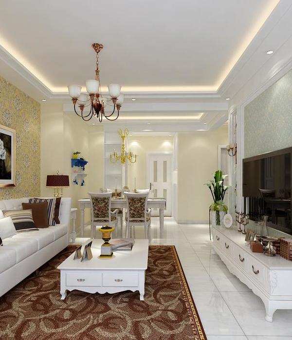
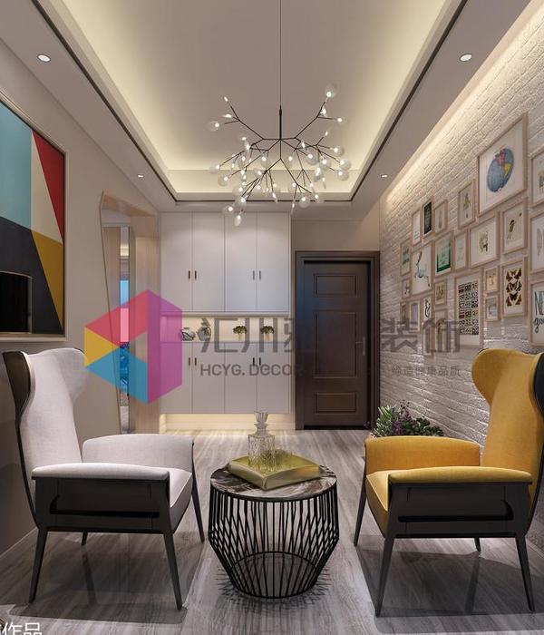
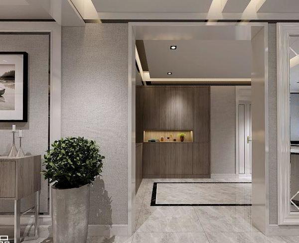
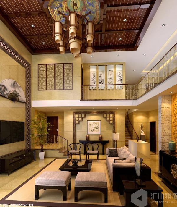
Following an analysis of the existing unit and client demands, the project's primary focus was on the property's main social areas. By observing the apartment's original plant, we found a pressing need to unify the living room and dining room, which were partially compartmentalized. The kitchen's layout was also questionable, presenting evident issues in proportion and circulation. As in a game of logic, with few movements of the dividing lines, the resulting space turned out to be very interesting. The premises of the project were therefore defined.
Part of the existing structure, previously hidden by walls, is now present in the ensemble. The wall opposite the windows, partly pre-existing and partly newly built, has been lined with an extensive shelving unit, which is present in all three ambiences of the space: family room, living room and dining room. There is also an opening that connects to the kitchen, which was preserved during construction, bringing more ventilation and natural lighting to it from the windows at the opposite end of the unit.
Floor-to-ceiling panels in Freijo wood with embedded pivoting doors were used for the main entrance, restroom and kitchen. During the renovation, the original walls were found to be made of solid brick, common at the time the building was erected and also apparent in the adjacent walls. These were simply painted in white and their texture preserved.
{{item.text_origin}}


