The Design Group has realized the office design for Accor & Orbis, two different but complementary hospitality groups, located in Warsaw, Poland.
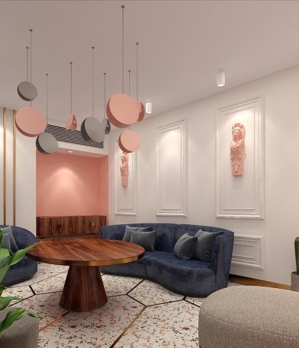
Although both offices are separate units with different teams, in their style there are more common points than differences. The general aesthetics are very similar, and e.g. kitchens are almost identical – with creamy fronts, sinter quartz on countertops, bright lamps and characteristic graphics on fronts and walls. Such meeting and integration venues are a very important part of the office. Coffee points are conducive to spontaneous meetings and conversations in casual circumstances. And a chillout room is a place where you can relax and for a moment, calm down on a comfortable sofa, away from the office hustle and bustle.
The Accor office, which is almost half the size of an orbital office, is dominated by co-working space. Orbis is a more traditional open space. Each of the spaces is equipped with high quality furniture, and through large windows you can admire a beautiful view of the panorama of Warsaw. This is an important aspect that builds the climate of the place.
The Design Group in its work focuses on the involvement of the customer and his employees in the entire design process. Thanks to this, the final result not only meets the expectations of the investor, but also the expectations of future users. The same was also true in this case – the inclusion of the Orbis and Accor teams was necessary also because the new location brought a change in the existing work style. The team contributed to the design process – at each stage it listened to the comments and suggestions of the employees and consulted on changes. Inspirations from the employees are particularly strong in the conference rooms – eight rooms were designed with their ideas in mind.
Each room is decorated in a different style – unconventional aesthetics and solutions stimulate creativity and original ideas. In the room called Slim&Fit you can sit on balls and there are wallbars. In the Globus hall, the neon sign on the wall draws attention – it is a reference to the Orbis company’s symbol, and the dark color scheme is conducive to concentration. There are also separate rooms in which we learn about the history, ambitions and rules of the network (Orbis History, Map, Planet 21 or Heartist) – this reminds us of creating solutions consistent with the company’s values. Brain Fitness conference room is filled with board games and elements stimulating interaction and intellectual competition, which makes it an ideal place to relax and look for unconventional ideas. The Illusion Room, on the other hand, is an area where the sense of sight is deceived – it allows one to avoid patterns in thinking and acting,” says The Design Group.
Design: The Design Group
Photography: Fotomohito
15 Images | expand for additional detail
{{item.text_origin}}

