ANGLE安格是深圳最具标志性的买手店之一,中文含义译为“角度”,正如其名,集合着风格轮廓鲜明的个体。本项目位于深圳南山区OCT PARK华侨城欢乐时光,是ANGLE安格的第二家店。
ANGLE is one of the most iconic high-end multi-brand stores in Shenzhen China. ANGLE means “aspects and degrees”, which symbolizes as its name—a collection of individuals with sharp outlines. As the second store of ANGLE, this project is located in Overseas Chinese Town(OCT),OCT PARK, Nanshan district, Shenzhen China.
▼项目概览,General view © 林哲聪/山竹设计事务所
ANGLE安格通过多样化的风格塑造,连接时尚与生活,希望以多重视角探索艺术,打造多角度的时髦生活与艺术风尚。“多角度”,一种充满可能性的描述,山竹设计认为顾客在买手空间里面游走,在丰富的服装、饰品、鞋包中,沉浸式地享受着不同的体验视角,这个过程中包含了期许、记忆、时间、走动和观看。并非定点欣赏一幅静态画作的概念。
顾客是空间创作的一部分,山竹设计重新去构建顾客、动线、商品、陈列之间的关系。
Through diversified styling, ANGLE connects fashion with life, explores art with life, and creates a diversified lifestyle and artistic expression. The brand concept “different angles/multi-degree”, a description full of possibilities, offers the space where customers can enjoy themselves in clothing, accessories, shoes and bags with various perspectives and views. Therefore, in designing the whole space, SHANCHUK considers it as a moveable and wonderful tour full of abundant experiences, different visions, expectations, memorable time and remarkable impression. This is a brand new design idea, which is completely different from viewing a static point.
Formation of customers is a part of the space; therefore SHANCHUK rebuilds the relations between customers, foot traffic, products, and displays.
▼轴测动图示意,Axon gif. © 山竹设计事务所
我们希望顾客置身于⼀个互动呼吸的空间⾥⾯,⼈、物、景的构成,既和谐如画,也流动如乐章。顾客围绕商品体验⾛动,感受空间里有层次和节奏的变化。秉承以上关系设想,我们没有做过多的空间分割,在保留空间⼀体化的基础上,⽤装置的形式来营造整个天地感——独特的装置在空间内构筑出⼀种奇妙的⾃然物理状态,兼备柔与力的质量感、舒适的利落块⾯、温柔的细腻曲线,所有的感受与视角随着顾客的运动⽽变化,带来丰富的空间互动感受。
We hope that customers will immerse in an interactive and living space. All the people, creations and the indoor space consist in a unique picture, a beautiful verse, and a glorious symphony. Customers enter, move, and leave around the products, to feel the living style in ANGLE. Based on the assumptions above, we did not set much division, but kept the whole space integrated with the form of construction to create a sense of heaven and earth. We hope that it will construct a wonderful natural physical state here. The quality of softness and strength, blocks of comfort and neatness, curves of gentleness and delicateness, will bring changeable and interactive feelings and visions to customers with every movement.
▼空间兼备舒适的利落块⾯和温柔的细腻曲线 © 林哲聪/山竹设计事务所 The blocks of comfort and neatness are combined with the curves of gentleness and delicateness
ANGLE安格华侨城的空间整体呈正方形比例,面积218平方,拥有一整面的落地玻璃窗,窗外是深圳的城市山景。门⼝区域设计了地板材质分区,⿊⽩拼砖引⼊了经典元素,同时有意地打破单一的感知层次,带来更富变化的空间感受。
The overall space of ANGLE OCT is in a regular square as a whole, with 218 square meters. Besides, there are full-length floor-to-ceiling glass windows inside, which bring us the unique natural view in urban city center. The entrance area is designed with partitions of the black and white tiles, which is another floor material. It introduces classic elements by breaking the single level of perception, bringing a more varied spatial experience.
▼门⼝区域设计了地板材质分区 © 林哲聪/山竹设计事务所 The entrance area is designed with partitions of the black and white tiles
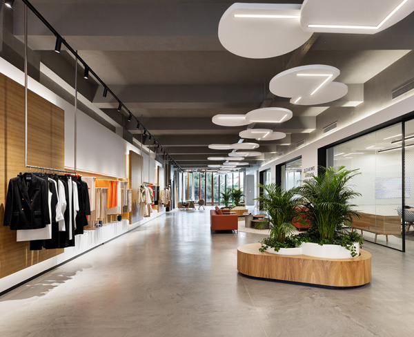
店铺内设有⾯积颇大的落地窗,引⼊了可观的⾃然光线。为了呈现空间内的天地感,我们设计了椭圆形的可调节亮度的天幕灯光,椭圆形的造型也很好的带出了“物体感”与“神圣感”,带来⼀种可看⻅的、超越地表⽣命⼒的神圣感受。天幕灯酷似天使眼的造型,让光线均匀地覆盖整体空间,同时搭配点位射灯为商品提供聚焦的展示,顾客在其中⾏⾛能感受到⾃然且舒适的光线环境。
There are floor-to-ceiling windows with in the store, which brings in a considerable amount of natural light. In order to express the sense of heaven and earth inside, we designed an oval horizon ceiling light with adjustable brightness. The oval shape also brings out the sense of sacredness that beyond the surface of earth.What’s more, the horizon ceiling light resembles the shape of angel eyes, allowing the light to cover the entire space evenly. At the same time, we have matched spotlights to provide the focused display lighting for the products, where customers can choose the specific items as well as feel the natural and comfortable light environment.
▼“天使眼”天幕灯光让光线均匀地覆盖整体空间 © 林哲聪/山竹设计事务所 The oval-shaped ceiling light allows the light to cover the entire space evenly
▼陈列区,Display area © 林哲聪/山竹设计事务所
作为整个场域的中⼼点,中间的柱⼦被设计包裹成不规则的不锈钢陈列架,连接天与地,奠定了整个空间的现代时髦基调。不远处的更⾐间,采用镜⾯体块装置的形式与空间融合。而收银服务区域,则以内嵌体块的形式呈现,仿佛不远处的更⾐间体块就分离于此。不锈钢材质将整个体块包裹,以⾼级理性的语言诉说风格美学,收银台则由温润⾃然肌理的意⼤利云⽯组成,整体传递出高级时装的属性。
As the visual center of the entire space, the middle columns were wrapped into the stainless steel rack for parts of display function. In between the ceiling and the floor, it establishes the modern tone of the whole space. A few steps forward, there are fitting rooms with mirror block devices. The cashier area is presented in the form of an inlaid block, as if it’s the gap where the fitting room blocks beside were separated from.The stainless steel material envelops the entire volume, expressing style and aesthetics in high-end rational language. The cashier counter is composed of warm and natural texture, which conveys the attributes of high-end fashion as a whole.
▼不锈钢陈列架,Stainless steel rack © 林哲聪/山竹设计事务所
▼收银服务区视角,View from the cashier area © 林哲聪/山竹设计事务所
场域中间的服装陈列架以极⼤跨度的弧⾯与凌空的姿态出现,营造出犹如飘带般悬浮于⼤地之上的视觉效果,给⼈量感轻盈的层次错觉,精细的弧⾯造型也让动线划分更灵动。
The clothing display racks in the middle of the space appear in a wide arc, creating a visual effect that a ribbon is floating above the ground,and giving an illusion of lightness. Besides, the shape of fine arc makes foot traffic division more flexible.
▼弧形陈列架,The arched display racks © 林哲聪/山竹设计事务所
胡桃⽊与不锈钢构筑的利落块⾯成为了整个空间的服装陈列区域,⼤量的柔和线条给人慰籍与舒适,冰冷理性的不锈钢材质在温润的⽊饰⾯搭配下,呈现出温柔的感知。
The neat block constructed of walnut and stainless steel has become the clothing display area of the entire store. A considerable amount of soft lines gives customers comfort and joy. Even the cold stainless steel material becomes more gentle and soft with the warm decorative surface.
▼不锈钢材质搭配温润的⽊饰⾯,The warm walnut surface provides background for the stainless steel elements © 林哲聪/山竹设计事务所
展示架上的镜⾯材质穿插在空间的各个动线位置,像万花筒⼀般映射出丰富的角度,透过这些镜⾯看见视线⽆法直接触达的角落。顾客能自然地被这些巨⼤的弧形装置引导着进⾏空间探索,⾏进活动会带来⾮常微妙的流动体验。
The mirror elements on the display racks are interspersed in different foot traffic positions in the space, mapping out rich perspectives like a kaleidoscope. So we can see where the sight cannot directly reaches through these mirrors. Customers can naturally be guided to explore the space by these huge arc-shaped constructions, and will gain a wonderful flow experience.
▼镜面元素映射出丰富的⻆度,The mirror element reflects rich perspectives of the space © 林哲聪/山竹设计事务所
在整个空间内,所有构成都在天幕天使眼的仪式感与光线下被守护着,崭新而丰富的风格故事将会开启。
In the entire space, the angel eyes—the oval horizon ceiling light, are guarding all the components and events inside. Under the ritual sense and the even lighting, new stories will be told from now on.
▼试衣间和休息区,Fitting room and seating area © 林哲聪/山竹设计事务所
▼项目更多图片
{{item.text_origin}}


