一尚门餐厅,广州 / 立品设计
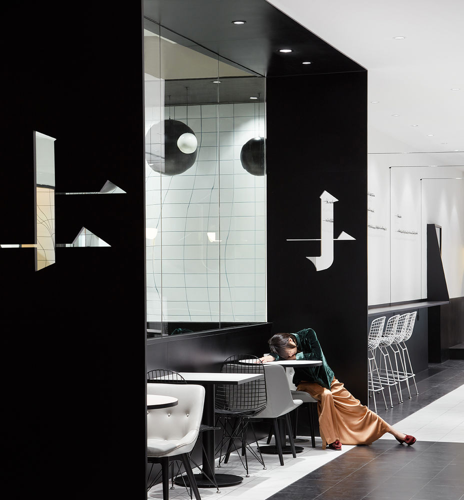
立品受邀为广州知名原创时尚设计师买手集合店中全新的餐饮业态打造健康简餐咖啡空间;空间设计既要延续及强调买手店的时尚属性,又需要提供餐厅主力消费群体所要求的独特就餐体验。与时下流行咖啡店的老墙、水泥等复古工业风元素不同,我们从时装设计大师对黑与白及点线面的偏爱中获取灵感,希望打造先锋、极简、有格调、同时又暗藏趣味细节、值得探索的餐饮空间。
Guangzhou based renowned lifestyle store brand TFD (The Fashion Door) is adding a restaurant to its business, Leaping Creative believes that the space should indicate the brand’s fashion sense and at the same time provide its customers with an unordinary dining experience. Rather than following the popular trend of industrial or Nordic interior style in China, Leaping Creative is inspired by fashion designers and their love for black and white as well as their trick of using dots, lines and planes. We aim to create a minimalist, intriguing dining space.
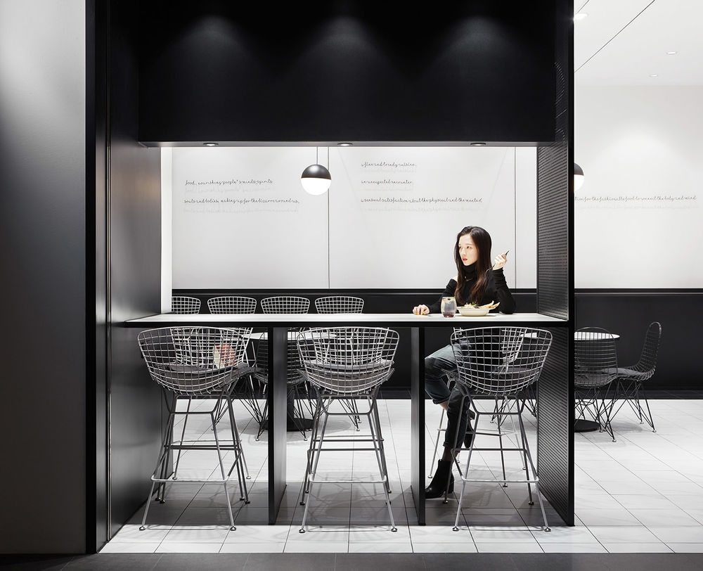
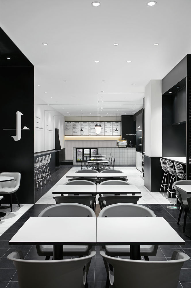
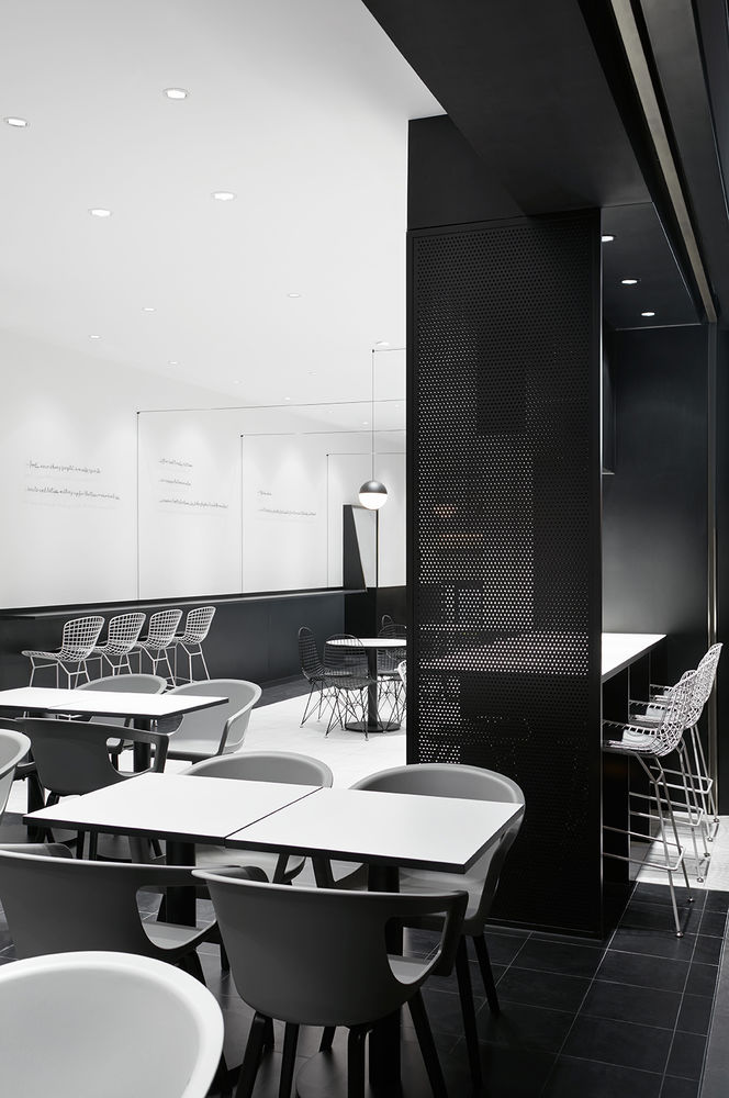
▼先锋、极简风格的室内设计,the minimalist, intriguing dining space
▼餐厅内部,the interior
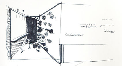
从构思阶段到设计定稿到店面完工一气呵成,始终没有偏离最初的设计概念;这是这个项目非常有趣的地方。——主案设计师 郑铮
“Our design concept is well carried out from initial sketches to the final outcome, which made it a very interesting design process.” Said Zen Zheng, leading designer of the Leaping team.
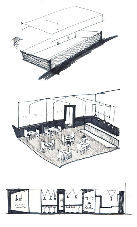
▼草图,sketch
▼店铺外观,the shopfront
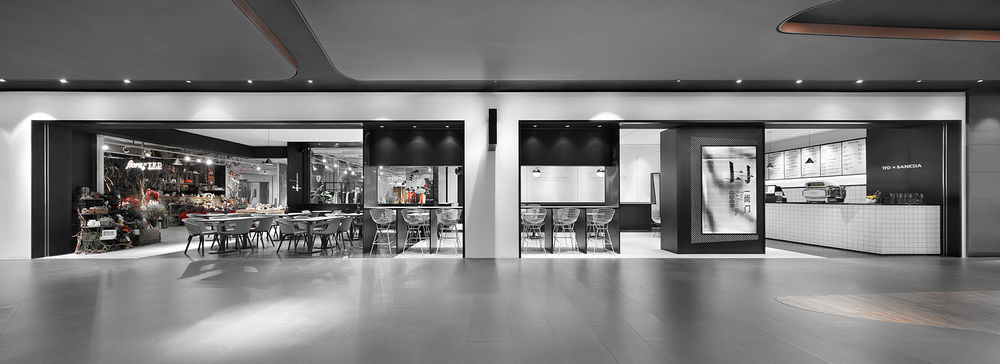
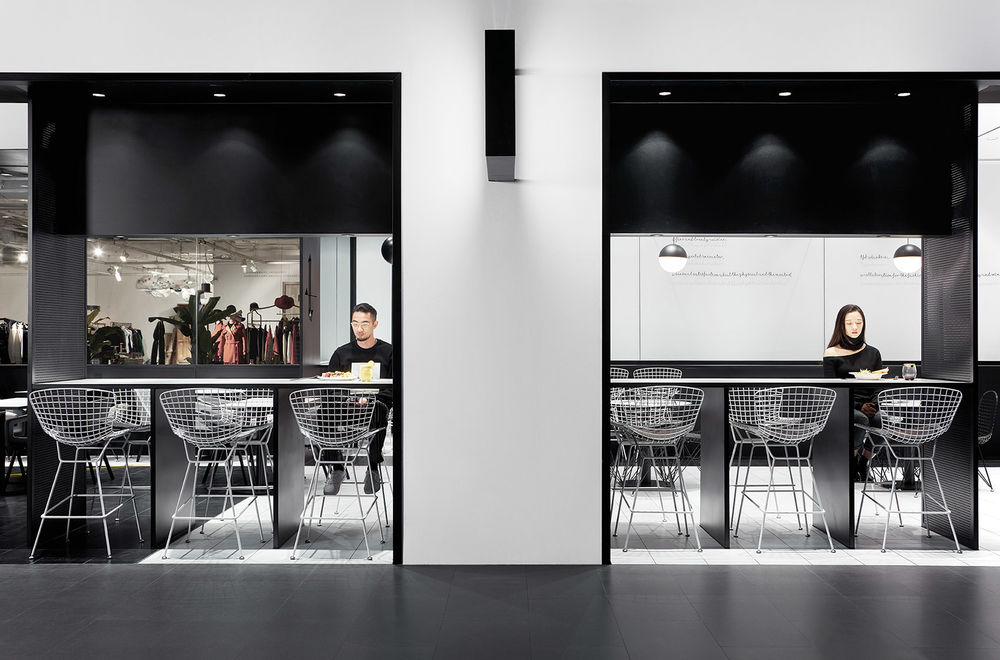
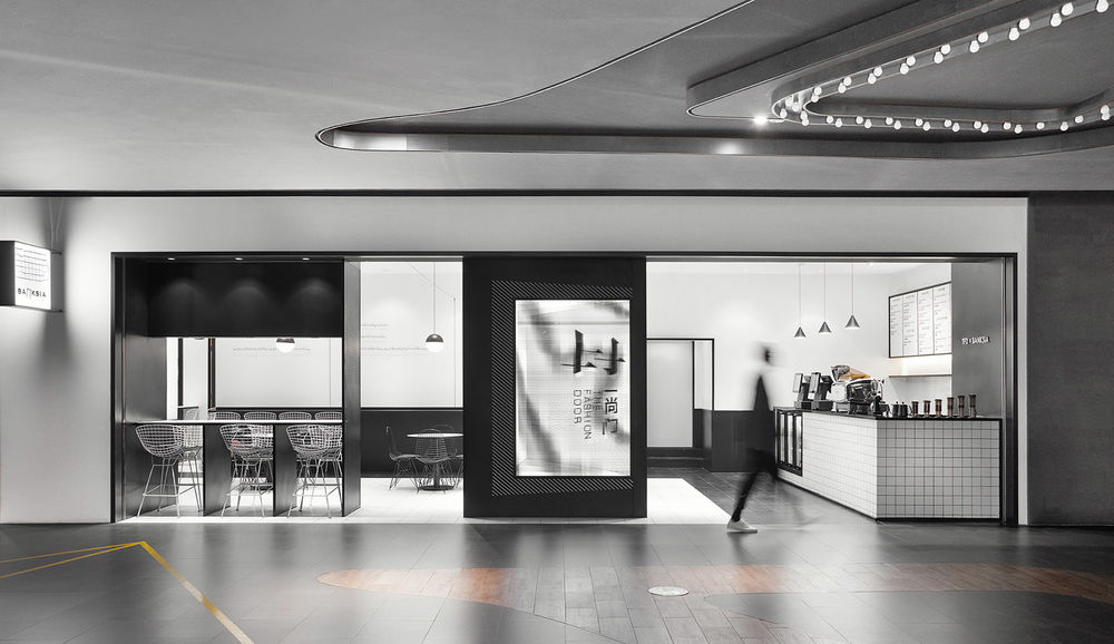
餐厅狭长的外立面被黑色轮廓线清晰划分,大LOGO招牌以光栅立体画的形式呈现“门”的开合动态变化,与品牌名称“一尚门”相呼应。
The long extended façade is outlined by the black frames, in which a stereograph is embedded as a signage, presenting the TFD logo with a 3D door image that can be seen both opened and closed by the passers-by. It embodies the brand’s name The Fashion Door, and also creates an external visual focus.
▼Logo会随着们的开合而变化,3D image on the door will variate with the its movement
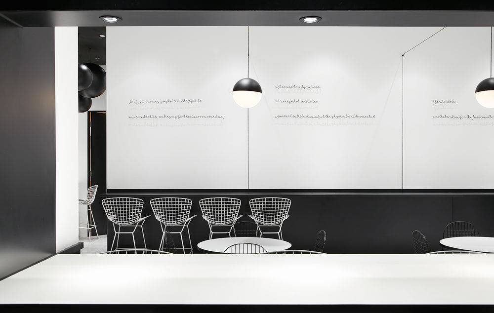
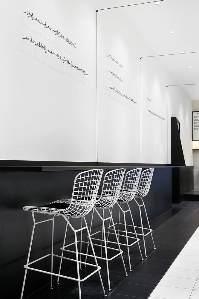
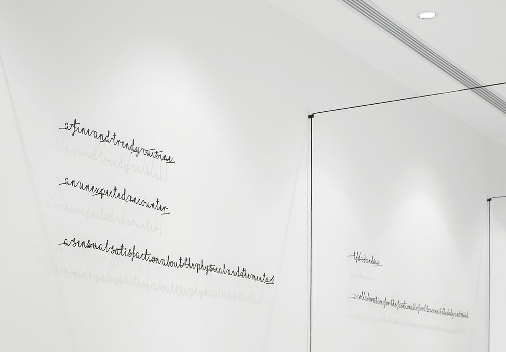
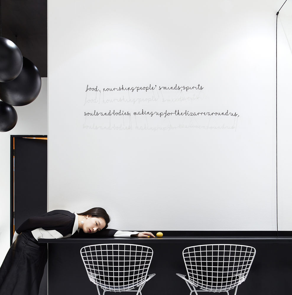
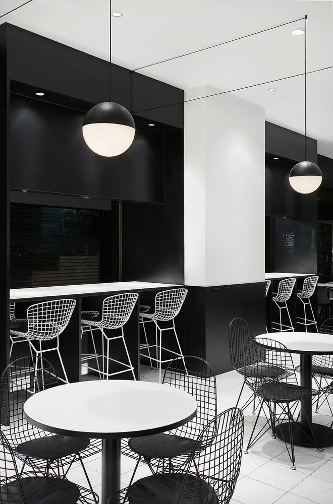
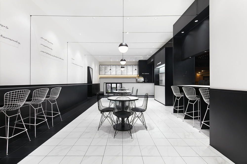
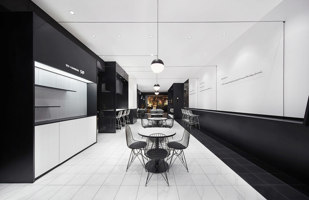
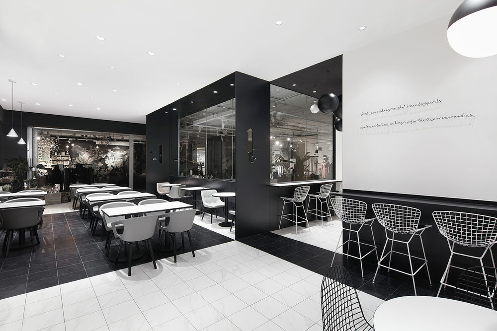
黑白色块间的利落分界完成了对空间的分区;白色空间中穿插着黑色的点线元素作为点缀:球形吊灯、整齐排布的吊线,纯白墙面上黑色细铁丝被弯成了有趣的时尚格言文本。
The space is neatly parted by black and white colors, where the two colors interacts with each other in various ways. Lights covered with black globes are attached to the white celling using ordered black lines, while black wires are bended to form some “fashion quotes” on the white wall.
▼黑白色块划分了空间,black and white colors define the internal spaces
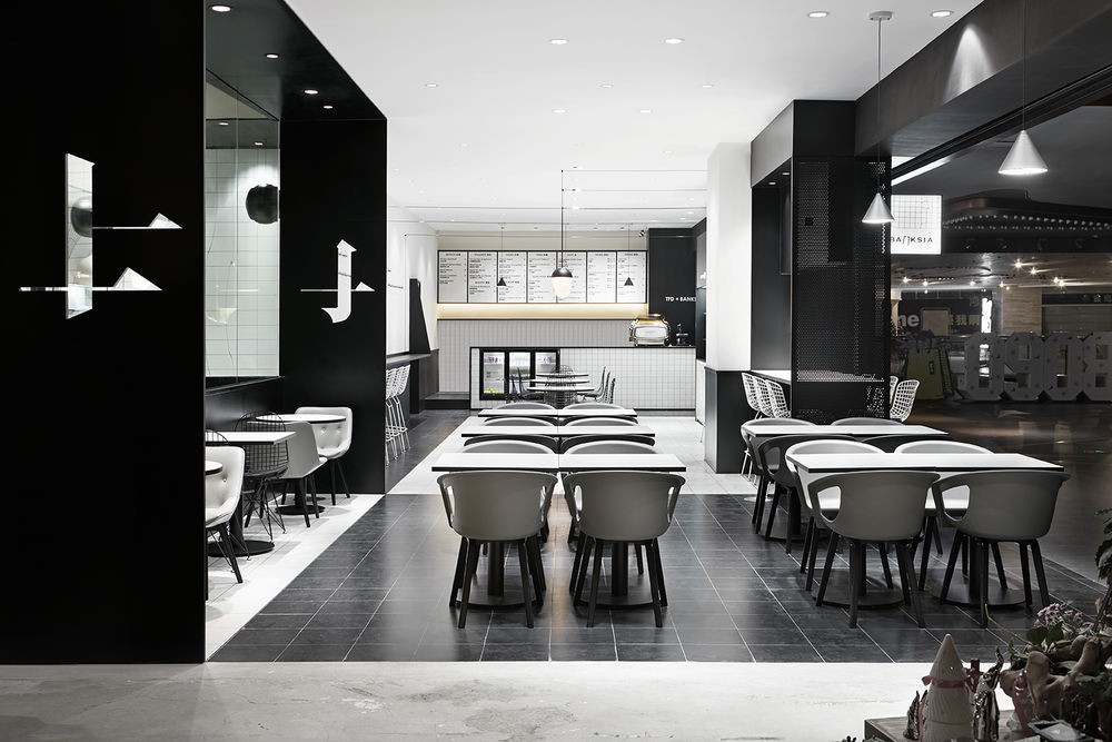
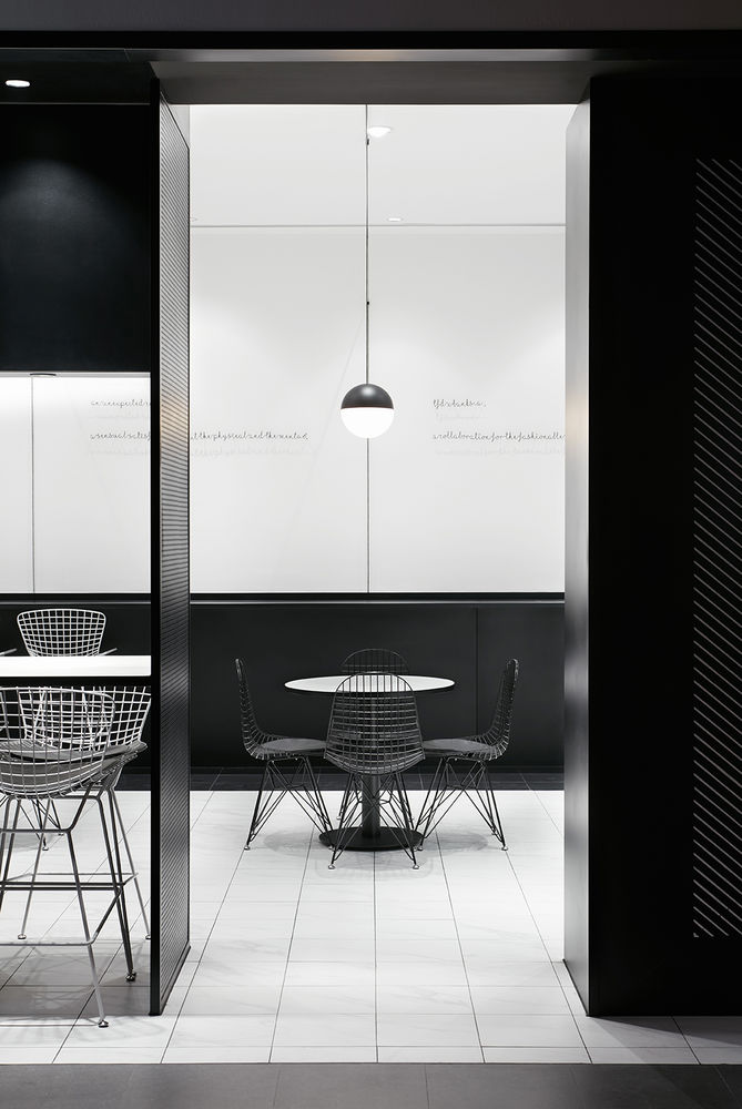
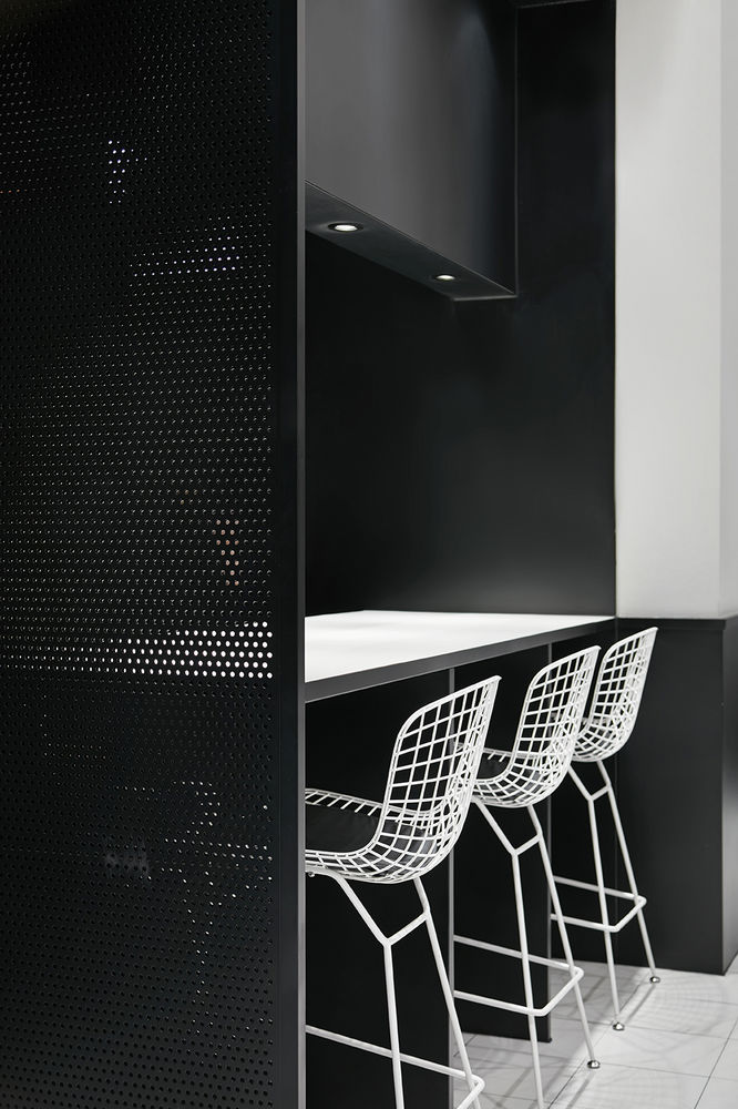
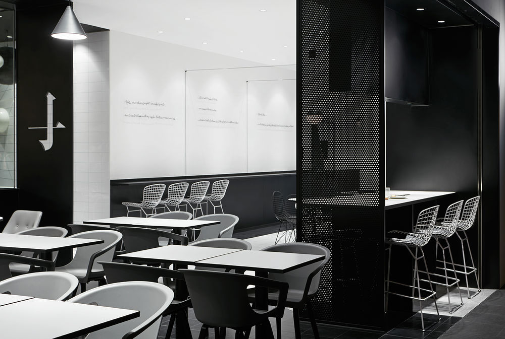
另一方面,黑色折面的运用强化结构感,白色的网格状吧台椅及餐桌则同样为黑色背景织入线与面的元素。
Black partitions created a more private area with the Chinese Logo “门(door)” embodied onto it, and the white mesh pattern of the bar stools and tables dotted the black background with lines and planes.
▼空间中织入线与面的元素,the space is embodied with lines and planes

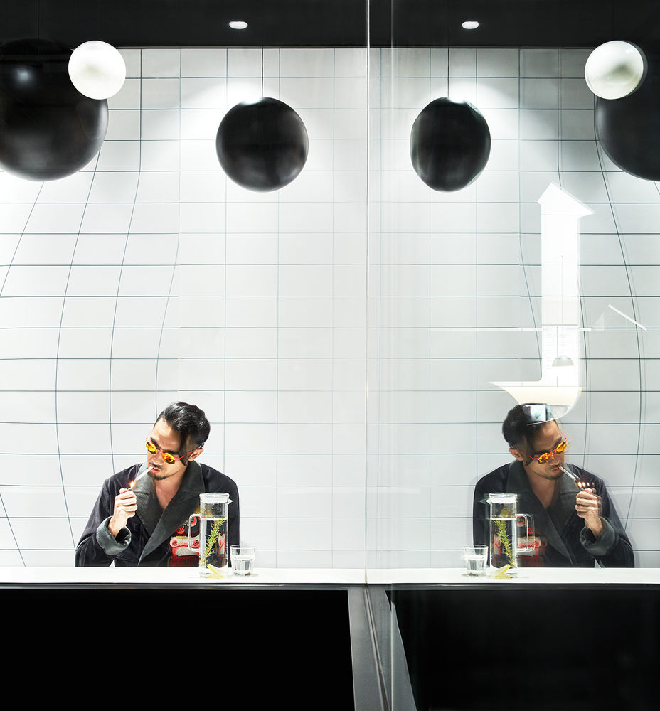
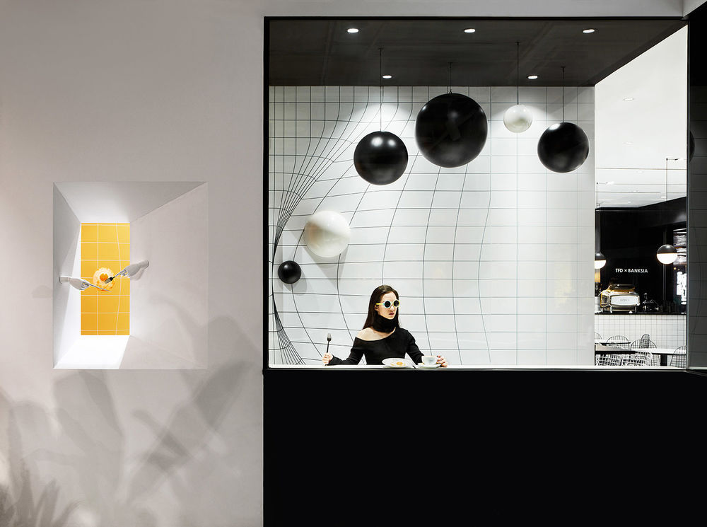
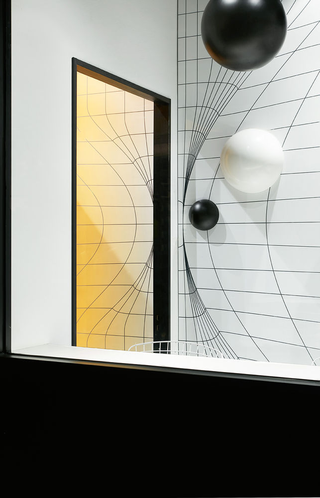
拐角区域的装置成为严谨空间中的个性隐喻:大大小小的球体漂浮着从门缝中涌出,在令四周的规整空间发生扭曲形变的同时又逐渐融入墙面的黑白色方格中,我们以此探讨个体与环境的辩证关系。
In a secret corner of the restrained space, a group of black spheres floats out of a mysterious door that left unlatched, breaking the structured grid pattern and gradually integrating into the wall, such that we probe into the dialectical relation between the individuals and the world they live in.
▼转角处的惊喜,a surprising space hidden behind the coner

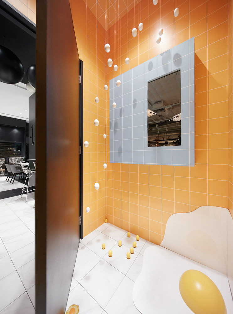
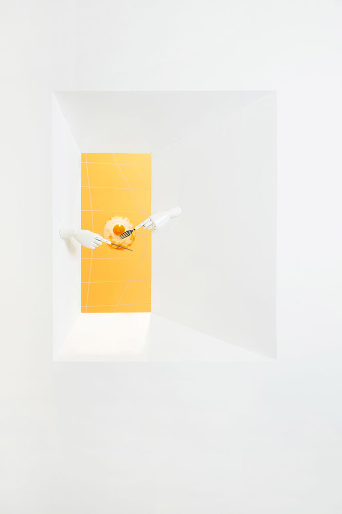
而在这道门的背后,藏匿着黑白表象之下的平行世界;作为食材主角的鸡蛋仿佛蕴含着无穷能量,连即将成为盘中餐的煎蛋也不甘平凡,上演了一场精心谋划的出逃。装置作为视觉点与记忆点,吸引消费者在美食果腹之余,在自发地探索与发现的过程中与空间产生互动,感受荒诞却治愈的意外惊喜。
The bright yellow color that appears from the crack inserts in the conceptual scenery of black and white, inferring the existence of a Parallel World hided behind the door. Inside, eggs as the main ingredient of the menu also play the leading role; a ready-to-serve poached egg is fleeing form the dish, yet it is framed by a small window attached with a pair of hand models using folk and knife; so that an unexpected humorous scene can be found on the other side of the window when people wandering about the TFD store.
▼门背后的平行世界,a colorful parallel world at the coner
▼空间中的细节,detail in the space
设计单位::Leaping Creative 立品设计 项目地址::Guangzhou, China 项目面积:150m² 主案设计师:郑铮 参与设计师: 姚丁凌、谢伟钿、黄杰宁、陈常 摄影: 黄早慧
