INK酒店,荷兰 / concrete
concrete公司在荷兰阿姆斯特丹完成了一座风格现代的独特城市酒店-INK,为那些希望定义自己的时间,与城市以及环境紧密共处的游客提供别具一格的服务。
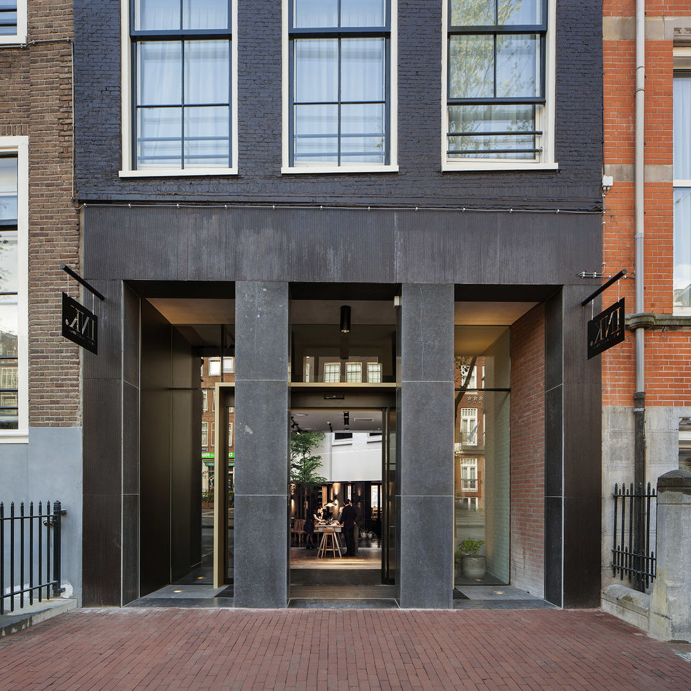
地处阿姆斯特丹中心的酒店离水坝广场只有几分钟的步行距离,身处历史建筑核心区的酒店建筑前身乃是报社总部和打印店的所在地。如今新兴的INK酒店以开放的面貌应对城市,采用巨大的入口,以及与入口相连通的内庭院打造出城市公共空间延伸区,模糊建筑内外的区别,邀请人们进入酒店对外开放的餐厅与酒吧。公共功能安排在地面与地下,楼上部分用作酒店客房。
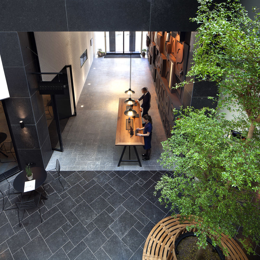
▼ lobby and garden 高品质城市酒店INK,其与城市联系的入口大通道与内庭院直接联系,建筑内外的边界由此被模糊。
INK hotel Amsterdam combines the city’s unique local flair with the needs of the modern urban traveller. A place that caters to travellers who want to define their own time, and identify themselves with the urban context of the hotel, the history of the building and the city in which they are staying.
The hotel is situated in the heart of Amsterdam, a few minutes walking distance from Dam Square. It consists of a conglomeration of historic buildings along the main street with its main anchor being the former newspaper head office and print shop of ‘De Tijd’ (‘the times’ in English). A place where stories were written in the same building as they were printed forms the foundation on which INK hotel Amsterdam, including its restaurant The PRESSROOM, has been built.
INK hotel Amsterdam, a place where new stories are yet to be written…
Concrete blurs the boundaries between inside and outside by pulling the street into the building through a series of mayor architectural modifications. Concrete widened the entrance and inserted a new alley that connects the different buildings and patios, invites in light as well as people and provides insight into the public spaces. The goal on the ground floor is to create a mix of locals and hotel guests as they share the restaurant and bar. All public functions are allocated to the ground floor, from where guests can find the vertical connection to the hotel rooms on the floors above.
Highlights: - Reception full height wall (4500mm) composed of wooden letterpress blocks - Restaurant: 64 seats, open kitchen - Full length feature cabinet (total length 32m) with integrated styling, seating, cooling, buffet, POS - Bar floating shelf with warmly illuminated distilled liquor bottles - Library bookshelf encircling the room with books arranged by colour - Guest rooms open bathroom characterised by a brass vanity piece - Full height graphic wall by local artist Jan Rothuizen - Signage / room numbers hand written elements by Jan Rothuizen
project INK. hotel amsterdam
client accor
designer concrete
project location INK. hotel amsterdam
photography Ewout Huibers / Mitchell van Voorbergen
total area 6,650 sqm
hotel rooms 149
duration construction 4 months
opening april 2015
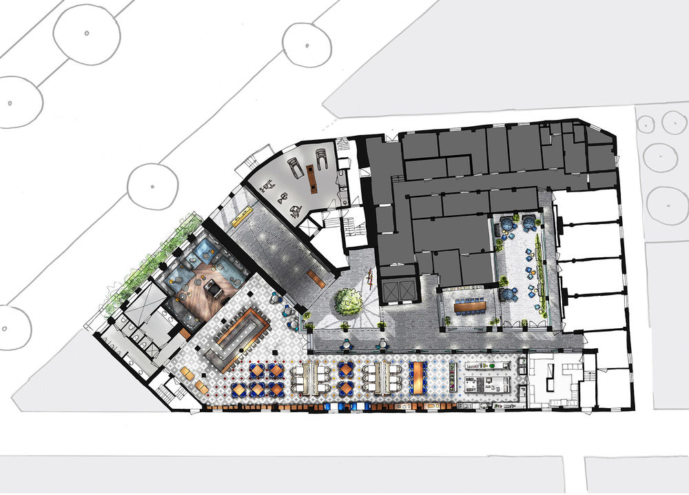
▼ plan 酒店地面层总平面
抵达 / 循环|arrival / circulation
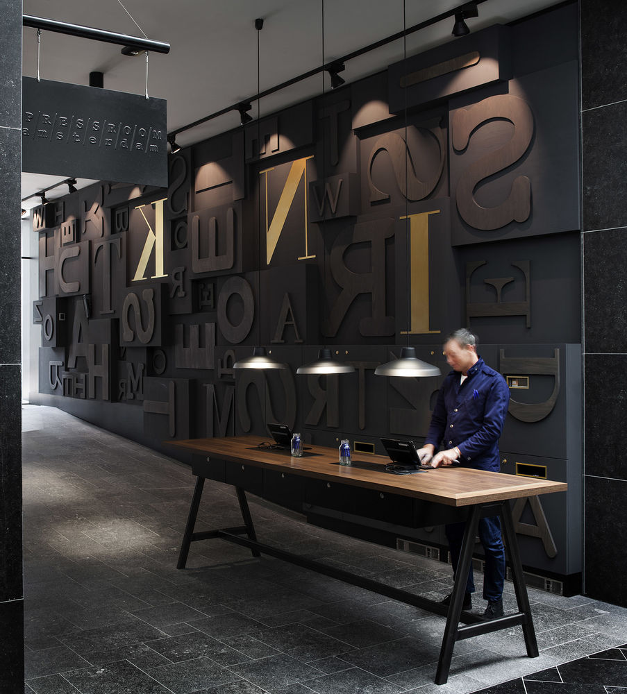
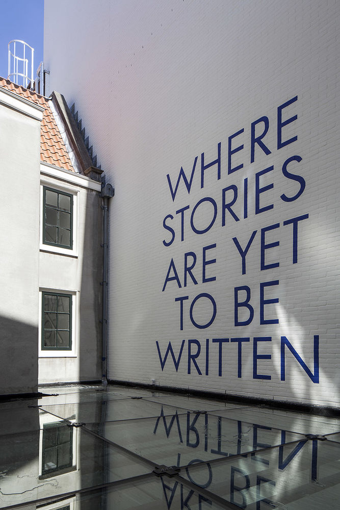
被扩大的酒店入口通道就像城市中那无数让人着迷的“小巷”,其直接与内庭院相联系,展现出酒店开放的面貌。入口巷子左侧墙面采用了木制凸版块装饰,彰显出该酒店在阿姆斯特丹的历史与故事。签名墙上的字母包含了酒店的座右铭“这里的故事还没被写入”。
The former narrow and low entrance was substantially expanded, while two major roof segments of the 1985 annex were opened up to create patios. This invites guests and passers-by to browse through the newly created ‘alleys’ that reflect the character of the narrow streets of historic Amsterdam. The signature wall on the left in the entrance alley is a composition of wooden letterpress blocks, emphasising the history and narrative of INK hotel amsterdam. The signature wall is secretly an anagram that contains the name of INK hotel amsterdam and their motto: “where stories are yet to be written”.
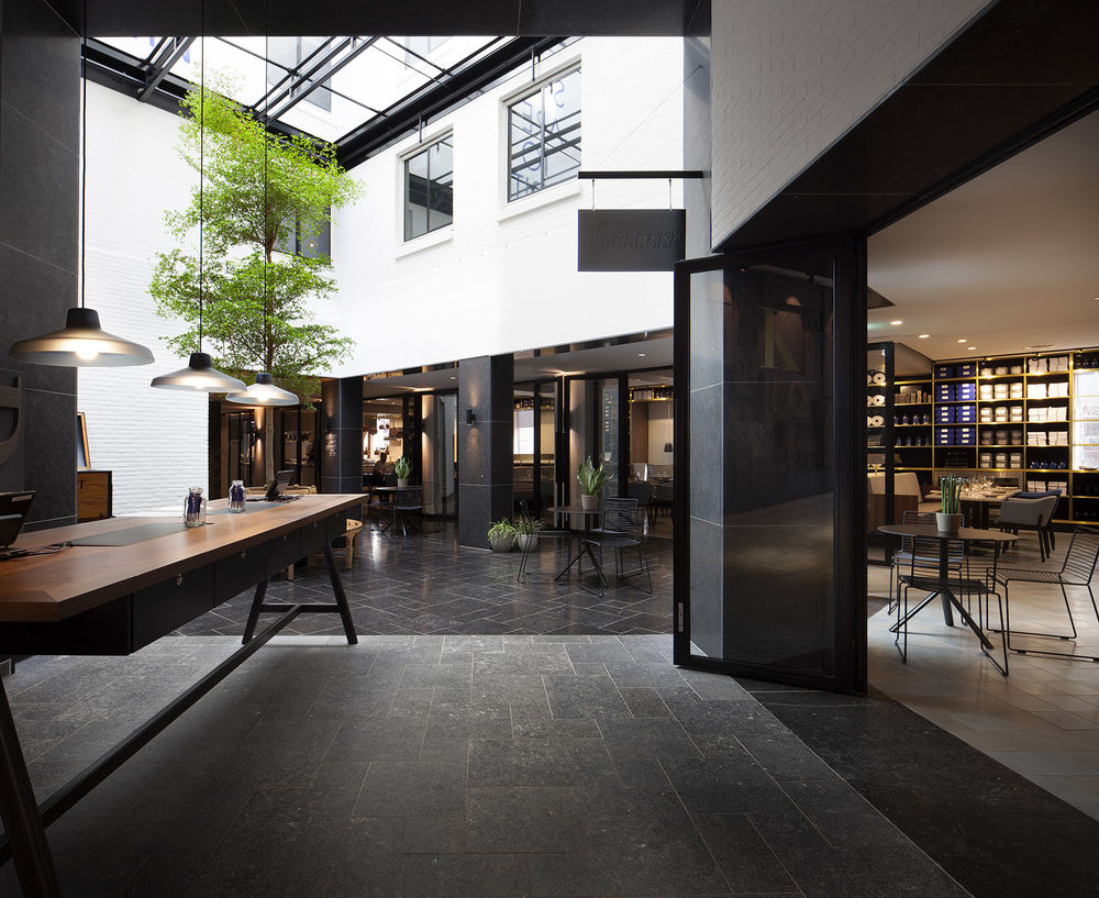
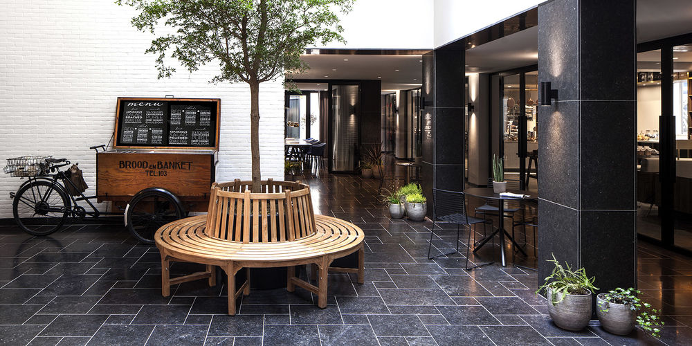
The main walkway runs from the front door through the first patio (with a large tree), alongside the restaurant, garden room and open kitchen, all the way to the second open patio. The finishes of the floor & walls in this zone are typical exterior finishes with natural stone, concrete stucco and brickwork. As a result the reception feels rather more like a gateway that opens up to the patios than a fixed line between outside and inside.
The first of the patios is protected against the elements by a glass roof and serves as the main hub between the informal reception table, bar, restaurant and vertical access to the rooms. Through the new glass roof the historic facades are fully exposed. The brick walls are painted white and claim the motto of the hotel as described above.
The second patio is entirely open, allowing daylight to enter the back of The PRESSROOM, the open kitchen and the Garden Room, a boardroom that also serves as private dining. This patio functions as a break-out zone with garden furniture and suspended lamps above to create a calm oasis in the heart of the city. All walls are white painted brickwork and the wide glass windows surrounding the patios allow light to flow into the building.
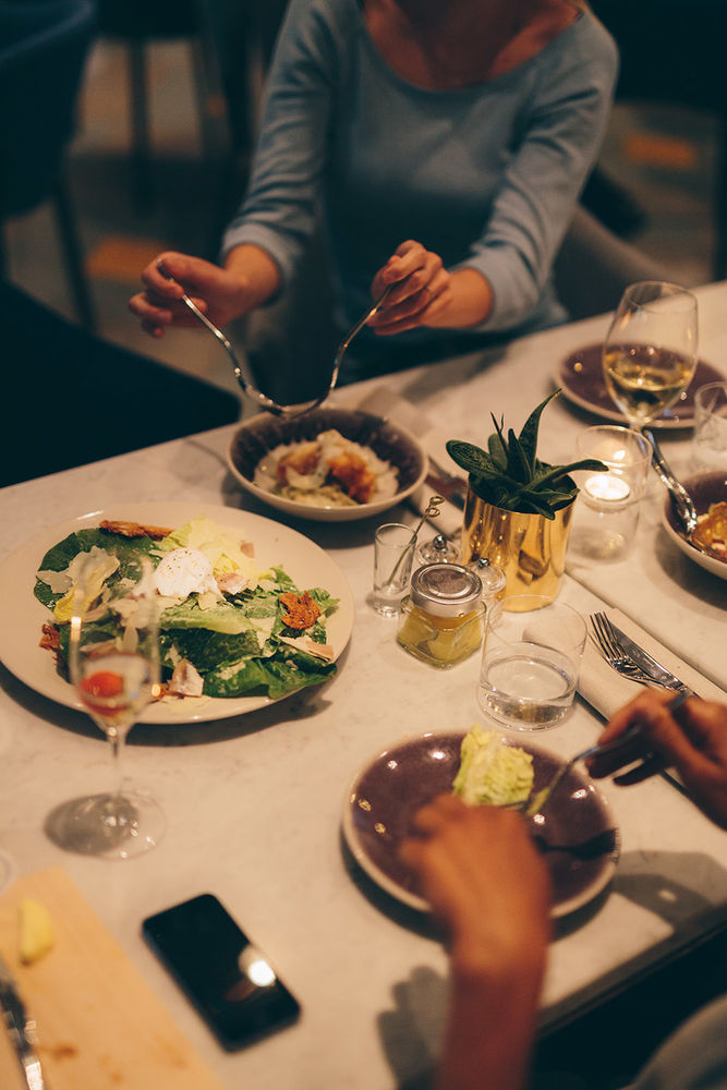
The PRESSROOM is the restaurant (all day dining), bar and living room of the hotel, offering drinks and food for every craving at any time of the day.
▼ 被扩大的开放入口
▼ 接待台
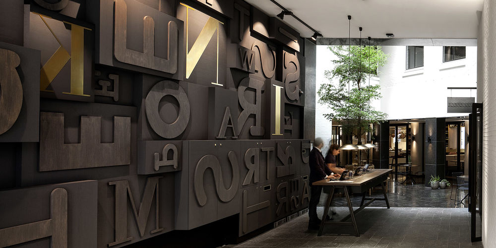
▼ 包含了酒店座右铭“这里的故事还没被写入”的木制凸版块装饰。
▼ 前庭院
▼ 后庭院
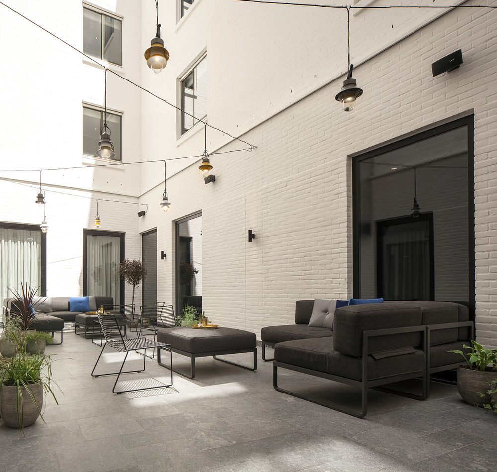
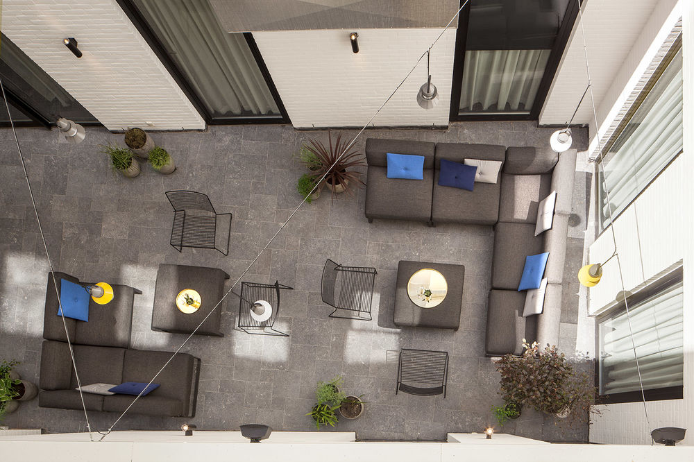
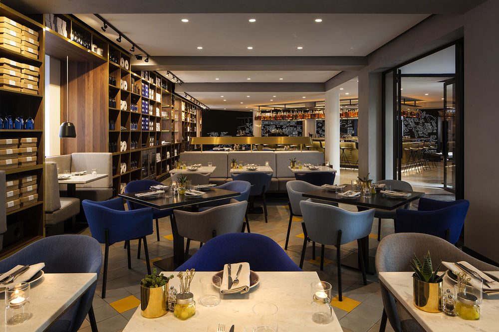
为了与历史上的打印店相呼应,餐厅沿墙布置了32米长的,打印店常常配置的木柜子,这些木柜子在餐厅中可被用来储存酒以及各种服务用具,还有些被放置了打印店的幽默,纸张,旧打印机。
餐厅尽头是开放式厨房。整个空间采用温暖的黄铜色和琥珀色作为色彩基调。
The backbone of the PRESSROOM is a wooden full-height cabinet along the full length of the side wall (32 metres), designed based on the principles of a letterpress type case drawer and referring to the historic context when the space was used as storage for the print shop. The cabinet structures the space by using larger and smaller openings which accommodate various key functions, such as wine cabinets, a refrigerated buffet, shelves for glasses, and cashier service stations. Seating niches are integrated in the cabinet along the windows, featuring jars of ink, old typewriters and lots of paper to amplify the narrative of the space.
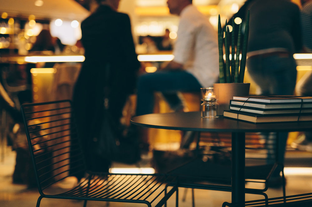
The cabinet continues into the open kitchen at the rear and reaches to the bar at the very front of the restaurant. The restaurant space is structured by two fixed brasserie benches with marble tables, while black stained wooden tables fill the open floor around the benches. The chef’s table is positioned parallel to the front counter of the kitchen. The upholstery of the individual chairs consists of a randomly distributed selection of ‘BIC pen’ blue tones.
The Pressroom features a colour palette ranging from ‘BIC pen’ blues towards warm brass and amber ‘liquor’ shades.
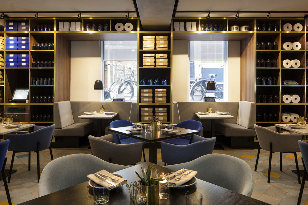

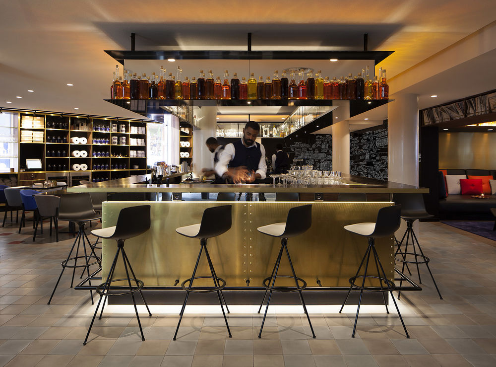
酒吧|the bar
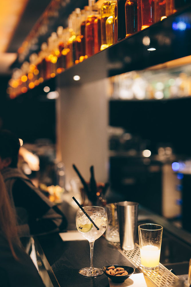
开放式厨房对面的酒吧顶部装饰着黄铜色的酒瓶。酒吧早上为客人提供咖啡和羊角面包,中午为客人提供简餐,晚上为客人提供酒水。
这个非正式用餐空间宽敞舒适温馨。设计师以地面铺装的微妙区别来界定酒吧与餐厅。
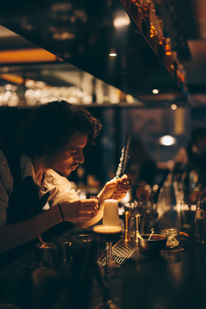
Opposite the kitchen, the brass clad bar with floating top shelf transforms throughout the day from coffee & croissants in the morning, to bites around lunchtime, and cocktails in the evening. Bar stools with low backs and a relatively deep bar top provide enough space for informal dining as well. The floating top shelf is stacked with a selection of bottles reflecting the warm malty and amber tones of distilled liquors, while the backlight gives the bar the inviting warm glow that reflects on the ceiling.
A cement tile floor runs throughout the bar and restaurant. The pattern follows the historic floor-pattern of the building when it was used as a print shop. New accent colour tiles change from bar to kitchen, subtly defining the different zones.
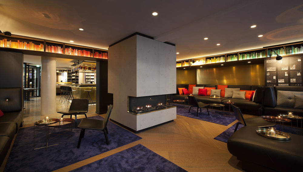
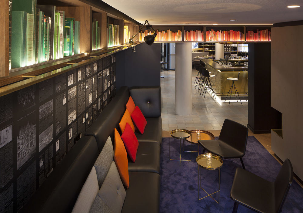
图书馆主题大会客厅|the library living room
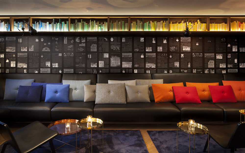
酒店大会客厅靠近酒吧,以图书馆作为主题,沿墙布置了真皮沙发,中心安放一个温暖的大壁炉,顶部墙面以图书作为装饰,中部墙面印上当地历史重要的剪报内容,地面采用图书馆常用的人字纹木材铺装,再铺上了紫色的地毯。
The library adjacent to the bar features a central fireplace, surrounded by a long leather sofa that runs along the walls, and transforms into day beds where more depth is available. Above the sofa, a suspended shelf follows the sofa along all four walls, displaying a selection of books sorted by colour to create a lively gradient. A brass profile as used in old libraries to attach ladders runs along the lower edge of the shelf and features arm lamps. The sidewalls in between the back of the sofa and shelves feature a wallpaper print displaying historic newspapers that were printed in the former print shop with context referring to the building.
Wide wooden floor planks laid out in one super-sized herringbone pattern underline the reference to classic libraries.
Rugs in different shades of blue with brass and copper side tables add to the cosiness of the space.
花园房|the garden room
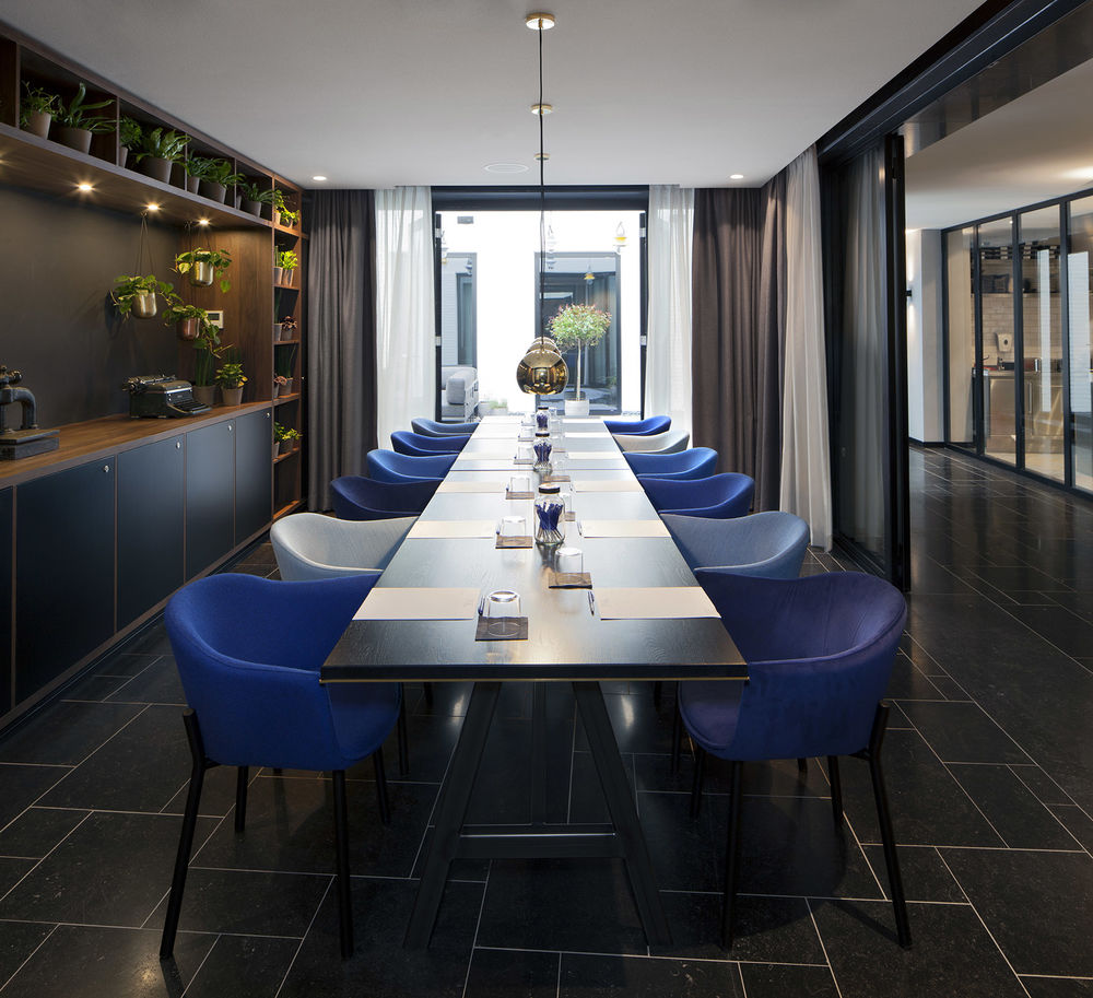
The garden room is an indoor continuation of the second open patio that can be used as additional space for lunch and dinner as well as meetings or private dining. It features a back wall similar to the restaurant cabinet that accommodates all functions such as storage, wardrobe, and a sliding panel that can be used as black board and notice board.
The other three sides of the garden room are full height glass doors with a layer of sheer and black-out curtains on the inside. Depending on whether the garden room is used for public or private functions, doors and curtains can be fully opened or closed.
As the name already suggest the cabinet is stocked with all kinds of small plants which enhance the outside/inside feel, especially when the doors towards the open patio are opened to let in fresh air.
▼直接与第二花园联系的花园房,靠近厨房,适合作为宴会厅与餐厅延伸空间。但所有的门窗打开,便于外界融为一体。
酒店标准间客房|INK // the room
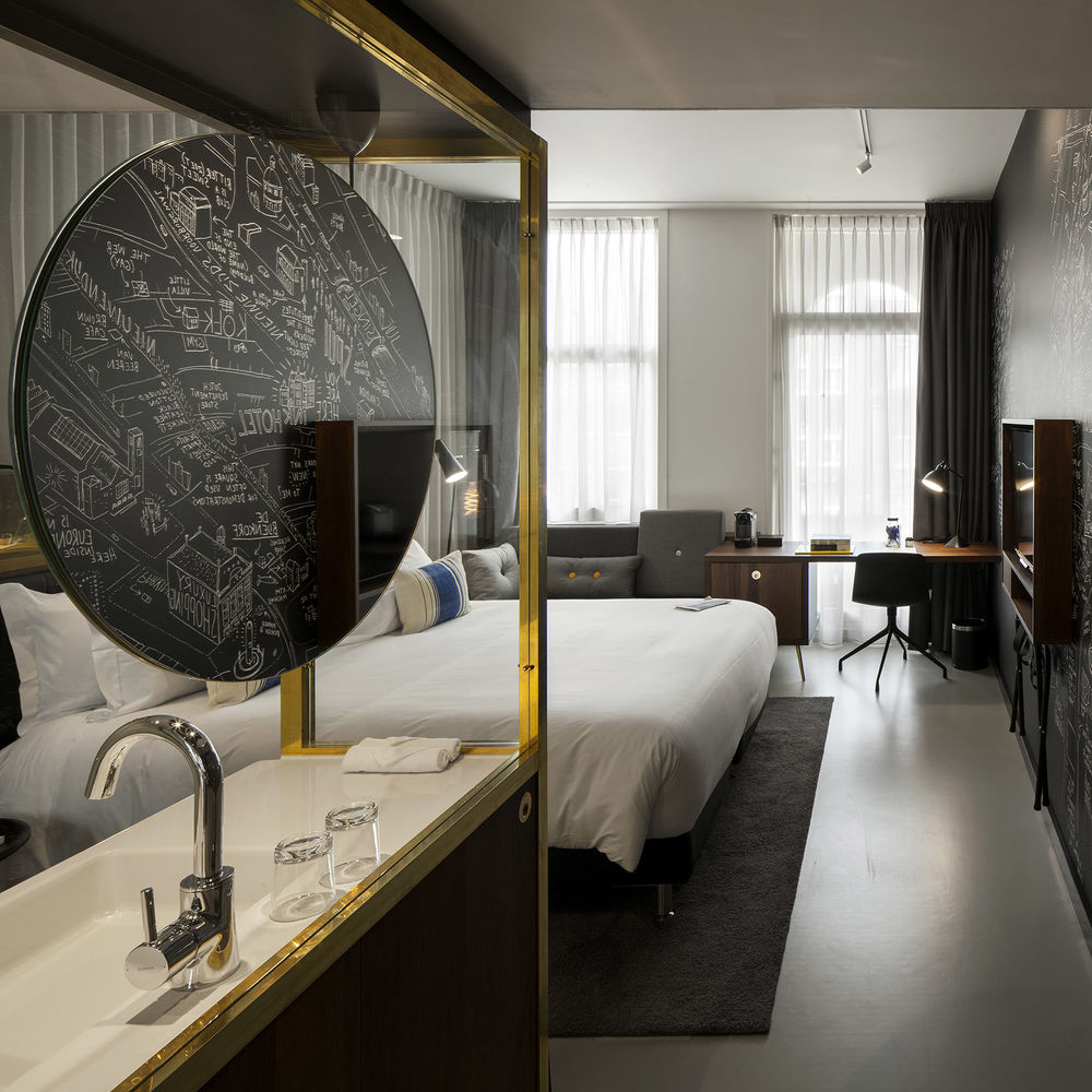
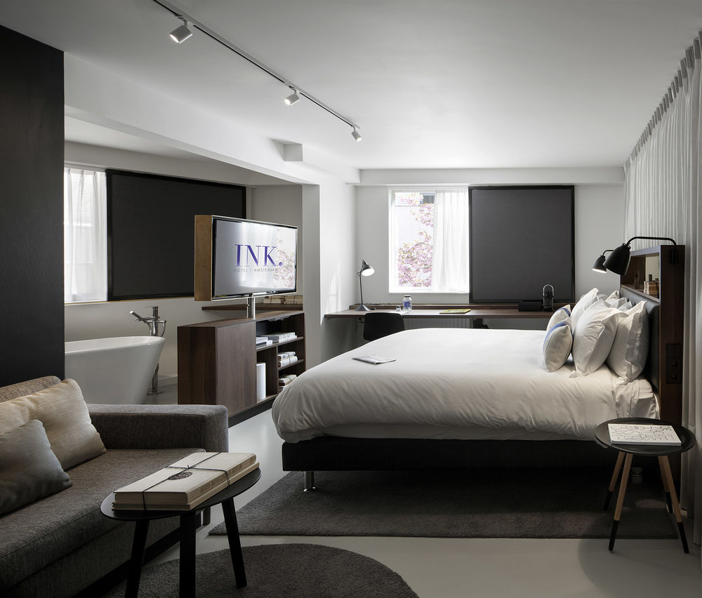
The standard guest room is designed with an open plan, giving guests a good overview, multi-functional features and the maximum square metres.
Entering the room, guests are welcomed by the vanity cabinet, functional on both the entrance and the bathroom side. On the entrance side, the brushed brass frame and walnut finished cabinet accommodates a full height wardrobe (that opens up to both sides), a shoe cupboard and space for the safe. On the bathroom side, the vanity cabinet contains a generous porcelain sink with walnut cabinets underneath and the wardrobe. Above the sink a clear glass panel is framed by the brass, providing transparency and an open view towards the room. The clear glass holds a circular mirror (mirrored on both sides) to play with the view and reflection.
Further into the bathroom, a solid marble block houses the shower and toilet, both closed-off with matte glass doors and separated from each other by a matte glass wall. The feature wall of both shower and toilet is tiled in the round pattern with tiles from the Kho Liang Le series by Mosa. The relief tiles refer to the positive-negative inversions used in the classic letterpress method.
Further into the room, the bed is located against the lateral wall. Its walnut headboard features a leather-padded back and a wide compartment with brass back panel displaying items that relate to the history of the building. The wall behind the bed is covered in white sheer fabric to give the bed a soft back-drop.
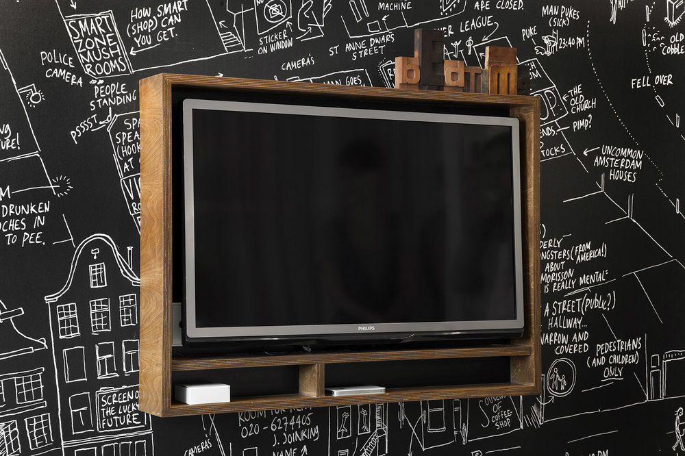
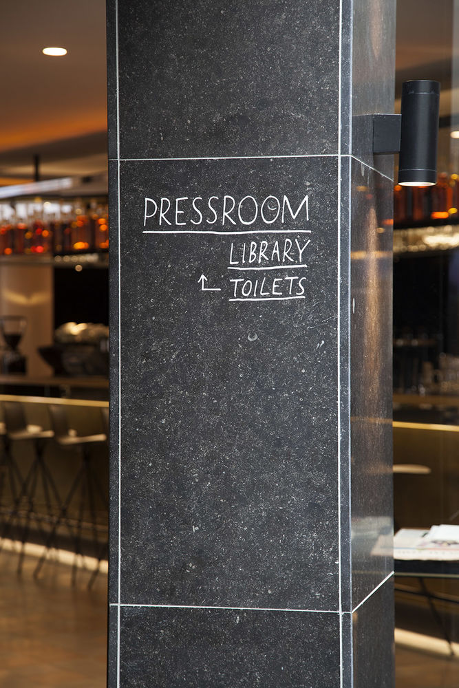
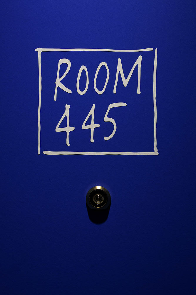
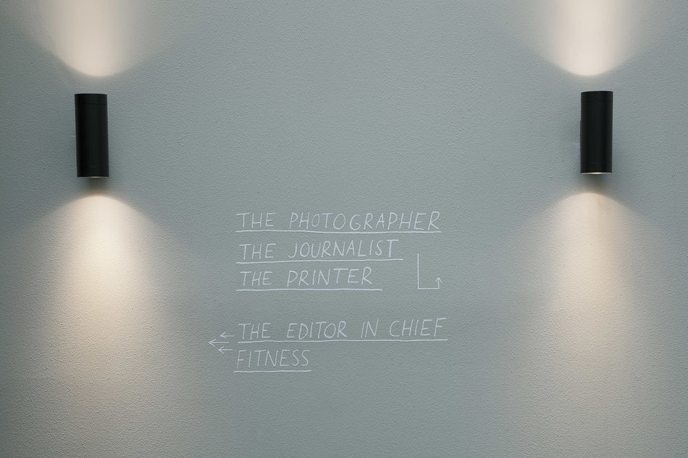
The wall opposite the bed, connecting the entrance to the facade, is fully covered in a wall graphic drawn by local Amsterdam artist Jan Rothuizen. Rothuizen developed three different hand-drawn maps telling the story of the hotel, neighbourhood, and cultural context. His handwriting is also used for signage elements throughout the hotel.
Opposite the bed, a walnut finished TV frame is mounted to the wall.
The sofa-desk is a hybrid piece of furniture that starts as a desk along the facade wall, doubles up in the middle to form a drawer with minibar, and then folds down to become a custom upholstered sofa. The back cushions of the sofa are decorated with porcelain buttons in delft-blue style to bring together the local spirit and the building’s history.
A black-out sliding panel in a brass rail runs along the full width of the table. The panel consists of a dark wooden frame with a fabric inlay. The same sheer fabric as used behind the bed returns as window curtains.

酒店套房|suites
The suites consist of the same design components enriched with additional luxury such as a free-standing bath tub, a free-standing TV unit on a swivel, a sofa bed, a lounge, and a large vanity niche.
There are four types of suites which symbolize the contributors of the newspaper: the editor in chief, the journalist, the photographer, and the printer. All rooms feature their own typical element such as large amounts of books, a typewriter, cameras, or rolls of paper.
fitness
Located on the ground floor, the central element of the fitness is a piece of furniture that combines bench, lockers, shelving for towels, the water dispenser and other basics. The finish is kept in wood and brown leather in reference to classic gym furniture. A full-size wall graphic covers the widest wall and shows press photographers from back in the day. The adjacent side wall is a full height mirror that virtually extends both the graphic wall paper and the width of the gym, allowing the photographers to capture the guests’ best moves on film.
Identity INK hotel amsterdam
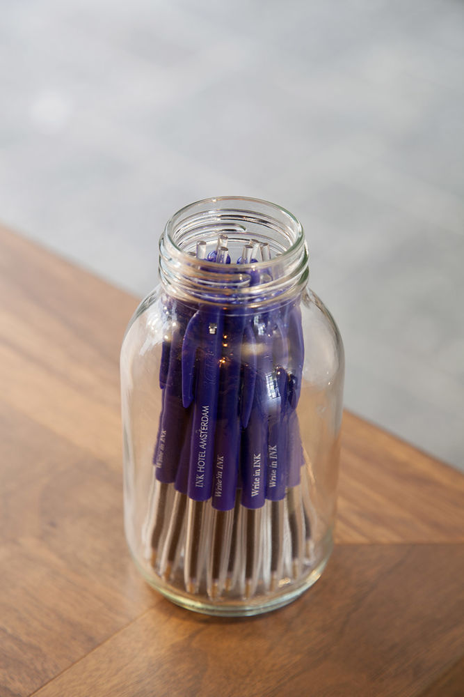
The name links to the history of the building, when it was the home of newspaper ‘De Tijd’; the place where stories were written in the same building as they were printed. Bold capitals (Didot font, a modern serif) are gradually filled up with ink as the stories are written. As every story is unique and there are countless different ways of putting ink on paper, a library of INK logos was created for different specific purposes. For example, the INK capitals contain a digital type letter to be used for all digital related work and a handwritten type letter for all stationary elements.
Identity PRESSROOM
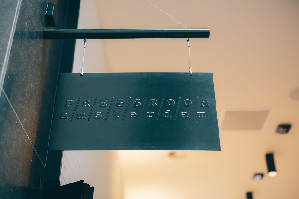
The identity of PRESSROOM is inspired by the former print shop of ‘De Tijd’. Traditional type writers, glass ink bottles and large rolls of printing paper can be found in the cabinet of the restaurant, and they were also used as the starting point for creating the identity. A subtle logo refers to the type bars of a typewriter, with uppercases above and lowercases below. Revealing the letters pressed into paper, the logo is built up from the shadow lines created by the pressure. The menu is presented as a newspaper and structured by typical journalistic terms that link to the concept, for example: breakfast//start the press, aperitivo//the interview, and sweets//off the record.
factsheet
reception and public ‘alleys’ floor dark limestone, stepped square pattern walls white washed brickwork dark polished granite columns bespoke furniture (letter boxes) ceiling plastered and painted bench tree seat by garpa
restaurant and bar floor cement tiles, pattern inspired by historic reference walls cement stucco antico black board paint bespoke furniture cabinet in walnut finish, brass strokes ceiling plastered and painted lose furniture chairs: felix by resident, hee by hay table: miura table by plank bar stool: lottus by enea
library floor natural wood, treated, layout in single large herringbone pattern walls cement stucco antico bespoke furniture leather sofa, bookshelf walnut finish, brass panels along day-bed wall graphic old newspaper prints ceiling plastered and painted lose furniture side tables: habibi by e15 chairs: HK002 by artek lamps: la lampe gras
patios floor dark limestone, stepped square pattern walls brickwork, painted white ceiling glass roof / open lamps: santorini by marset chairs: hee by hay tables: miura by plank couches: sit by bivaq
guest rooms floor rubber floor, artigo walls wall graphic by jan rothuizen, printed by vescom sink: vero by duravit office chair: aac by hay alarm clock: lexon – flip clock
