在纹身的过程中,客人往往会觉得十分没有安全感,因此设计让人们从入口和等候区无法看到操作空间。同时,设计师也希望将接待和操作的体验区分开来,最后采用了前区与纹身区分隔的平面布局。
Receiving a tattoo can feel very vulnerable, so we didn’t want that process to be visible from the entrance or waiting area. As well, we wanted to distinguish the clients’ experience of being greeted from being served. So, we designed a layout that separates the front of the house from the tattoo area.
▼店面外观
external view of the atelier
▼面向庭院的纹身区,与接待区分开
tattoo area separated from the building front
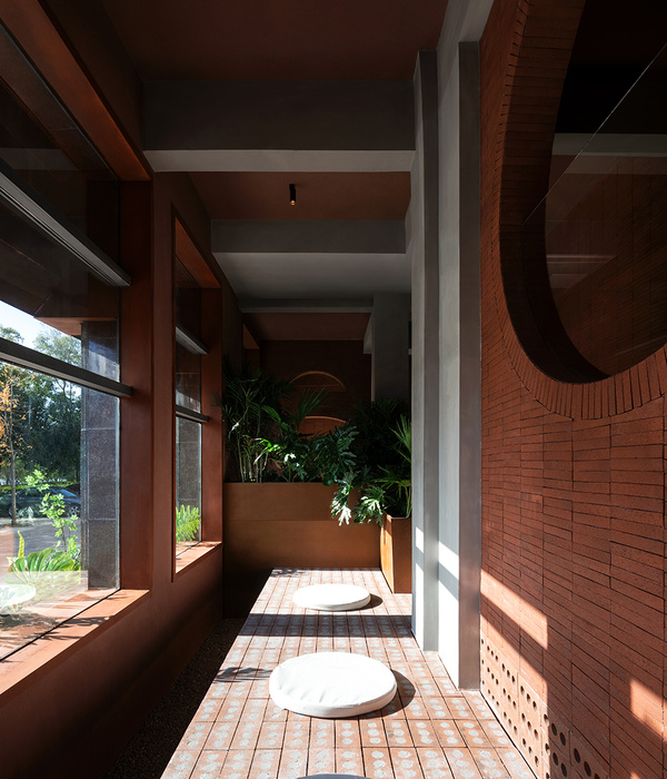
空间主要使用的材料有混凝土、钢、核桃木、白蜡木、玻璃和银。所有完成面都被处理成没有光泽的磨砂质感,给空间带来一种脚踏实地的感觉,让人容易亲近。颜色的搭配以石材、木炭、蛋壳和大地色为主。冷色调的日光通过落地窗洒满空间,由暖色调的卤素灯具调和。设计的一切都关乎平衡。由于艺术家会在这里为完成的作品拍照,所以必须要仔细考虑空间中的色彩。让艺术成为焦点是设计的关键,不能让工作室本身喧宾夺主。
The primary materials in the space are concrete, steel, walnut, ash, glass and silver. We chose all matte finishes and brushed textures, to keep the space feeling down-to-earth and approachable. We sought a natural palette of slate, charcoal, eggshell and earth tones. Cool daylight pours in from the floor-to-ceiling windows, balanced by warm, halogen bulbs in our lighting fixtures. It’s all about striking a balance. We also wanted to be mindful of color, as the artists take photos of their work in the space. It’s important that their art is the focal point, and never feels overpowered by the studio itself.
▼室内空间概览
overall view of the interior space
▼接待区,气氛温馨
reception area in warm atmosphere
▼等候区
waiting area
入口处的长椅由褪色的白蜡木制成,正对深色玻璃组成的店面,默默迎接和送别进出的客人。室外座椅使用再生木材制作,由工厂回收的钢梁支撑,给人感觉稳重而坚固,如果坐在一棵倒伏的树木上。设计师特意选择未经处理的自然硬木,在经年累月的使用中保留建筑自身的特色。
His entryway benches are bleached ash, anchored by dark glass inserts in opposing directions. It’s a subtle nod to the movement of people within the space, both entering and exiting. His outdoor seating feels stately and heavy, as if resting atop a fallen tree. It’s made of reclaimed wood, with steel legs from a reclaimed factory beam. We chose all natural hardwoods without any seals or lacquers, so they’d keep building character with prolonged use.
▼入口处的木制长椅
wooden bench at the entrance
设计师找到了一家当地的木工工作室,以亲自实践的方式与他们合作。这项工作一开始并不顺利,选择的公司不是太大就是太小。最终,设计师锁定了来自CauvDesign的Joe Cauvel。他为项目定制了长椅、书架、桌子和立镜。这些家具都采用弧形线条,缓和建筑本身的锋利棱角。空间中的一切无缝衔接,自由流动,仿佛它们一直存在于此。
We sought out a local woodworker, to ensure we could collaborate with them in a hands-on way. It was tough at first, because so many companies were either too large or too small for our needs. I was so happy to finally find Joe Cauvel of CauvDesign. He crafted custom benches, bookshelves, desks and standing mirrors. They’re all curved, to offset the sharp edges of the architecture. Everything flows seamlessly with the space, as if his pieces had always been there.
▼弧线形的木制置物架
curved wooden shelves
▼纹身区
tatto area
▼天然材料营造舒适的氛围
natural materials creating comfortable atmosphere
▼室外座椅
outdoor seating
私密部位的纹身需要更加谨慎地对待,因此设计创造了私密性更高的夹层工作区。每个工作站之间设置可以升起的屏风,为艺术家和顾客提供绝对的隐蔽环境。
For intimate tattoos that may require more discretion, we created the upper mezzanine as an even more private workspace. Each station has a pop-up screen, as well, which instantly offers total seclusion for the artist and client.
▼夹层工作区
workspace on the mezzanine
▼屏风分隔的私密空间
private space created by screens
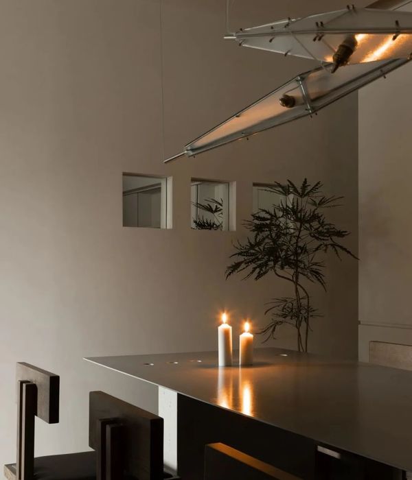
灯光设计上,形式和功能并重。设计师找到了加拿大艺术家Matthew McCormick,并对他的“Mila”系列灯具一见钟情。精致的棕色玻璃球体被设置在弧形磨砂钢框的底部,二者相互平衡。据艺术家所说,这些灯具的灵感来自于他怀孕的妻子轻轻捧起肚子的姿态。灯具本身的美感和背后的故事让设计师无法忘怀,最终的成品令人无比满意。
For lighting, form and function are equally important to me. I found Canadian artisan Matthew McCormick, and fell in love with his “Mila” lamp concept. These delicate, blown glass spheres balance at the base of brushed steel arcs. He said they’re inspired by his pregnant wife cradling her stomach. We completely fell in love with both the aesthetic and the story. Overall, I couldn’t be happier with the final product.
▼Matthew McCormick设计的灯具
lightings designed by Matthew Mccormick
空间中设计师最喜欢的部分是土耳其画家Murat Palta创作的生动的艺术作品。设计希望在中性的空间中植入一个醒目的元素。画家的作品将西方波普文化与土耳其传统的微缩化结合在一起。由于设计师本身是土耳其移民,也是一名艺术家,Palta的画作装饰在大厅中,也成为了设计师介绍自己的小小方式。
My personal favorite part of the space is the vibrant artwork by Turkish painter Murat Palta. I wanted only one standout feature to bring color to the otherwise neutral palette. His work blends western pop culture references with a traditional Ottoman miniature style of painting. Since I’m also a Turkish immigrant and fine artist, Palta’s work in our lobby is my little way of introducing myself.
▼点缀空间的画作
artwork brings color to the space
▼细部
details
{{item.text_origin}}

