环保企业展厅:自然之栖,肆意生长
Environmental protection enterprise exhibition hall: natural habitat, wanton growth
“建筑首先是生活的容器和背景,容纳着地板上脚步的节奏,工作的专注和静态的寂静”
——卒姆托
"Architecture is first and foremost a container and a backdrop for life, accommodating the rhythm of footsteps on the floor, the concentration of work and the static silence"
- Zumto
l 清美设计说
l Qingmei Talk
本案为清美空间携手环保企业打造的展示空间项目。通过挖掘企业理念,我们推崇更加自然、本质、真实的展厅;肯定却不刻意,倾诉却不矫情的设计。希望每一种设计语言都与品牌叙事相一致,是极简主义更是“极质主义”。
This case is an exhibition space project created by Qingmei Space and environmental protection enterprises. By excavating the corporate philosophy, we advocate a more natural, essential and authentic exhibition hall; Affirmative but not deliberate, confiding but not pretentious design. I hope that every design language is consistent with the brand narrative, which is minimalism and "maximism".
l 空间解读
l Spatial interpretation
印象 / 空间之于相识
Flow/Space for people
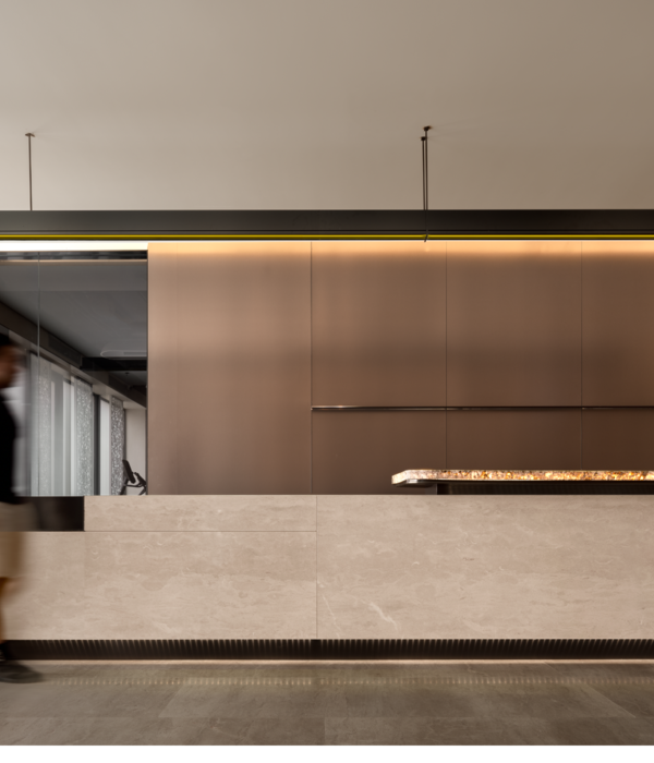
前厅:来访者的第一印象
The Lobby: The visitor's first impression
用户对企业的认知会从“一幕幕弧墙”出发,由浅入深地了解一个空间、一项服务......进入大厅,顶部倾斜的镜面不锈钢造型映入眼帘,其最重要的功能是反射室内外环境的影像,使得整个空间更为丰富明亮。通过LED显示屏用户第一眼便可看到企业宣传片。在此驻足观赏,logo及介绍的醒目标识,加深了到访者的第一印象。
The user's cognition of the enterprise will start from the "scene of the arc wall", from the shallow to the deep understanding of a space, a service... Entering the lobby, the mirrored stainless steel shape with a sloping top catches the eye, and its most important function is to reflect the image of the indoor and outdoor environment, making the whole space richer and brighter. Through the LED display, users can see the corporate promotional video at first glance. Stopping here to see, the logo and the eye-catching logo of the introduction deepen the first impression of the visitor.
聚焦 / 空间之于产品
Focus/ Space for Products
关于产品的展示,我们希望运用简洁的素材充分传达产品的核心特质。产品与人的交互在设计中特别的被重视,材料沁入在空间中使用户受到启发,在感受质感的魅力时链接到本身。所以设计师采用简单的几何体块,形成开放的大尺度展台展区,在强烈对比中突出产品的特性。
When it comes to product presentation, we want to use concise materials to fully convey the core characteristics of the product. The interaction between products and people is particularly valued in the design, and the users of the materials are inspired by the materials that penetrate into the space, and are linked to themselves when they feel the charm of the texture. Therefore, the designer uses simple geometric blocks to form an open large-scale booth exhibition area, highlighting the characteristics of the product in a strong contrast.
当材料成为展品,它并非“不可触摸”、“非本质的”、“可有可无的”,我们想要人和材料产生一些互动,在行走流动中为之驻留。在发生指尖的触碰,眼睛的凝视里细味材料,发现创造。
When the material becomes an exhibit, it is not "untouchable", "non-essential", "dispensable", we want people and materials to have some interaction, and to stay for it in the flow of walking. I savor material in the touch of the fingertip, the gaze of the eye and discover creation.
对话 / 空间之于生长
Focus/ Space is for growth
草木,有时不被关注有时被等同于荒芜但它们具有独特意义。
Plants and trees, sometimes unnoticed, sometimes equated with barrenness, but they have a unique meaning.
绿植作为生态环境的基础,设计师将其用于空间作重要的基底。生命力极其旺盛的草木,在岁月荣枯中,通过不同的色相变化提醒大家:生命是一个循环,每个阶段都是自然而然的状态,伴随空间释放出独特的美。
Greenery is the foundation of the ecological environment, designers use it as an important base for space. The plants and trees with extremely vigorous vitality, in the years of prosperity and decay, remind everyone through different hue changes: life is a cycle, each stage is a natural state, and the space releases a unique beauty.
此时的共享空间置入风、光、景的自然元素,非室内,亦非室外。光线、材质、气味共同营造一种放松舒适的氛围使用户更好地进一步了解产品场景。
At this time, the shared space is filled with natural elements of wind, light and scenery, neither indoor nor outdoor. Light, materials, and scents work together to create a relaxing and comfortable atmosphere that allows users to better understand the product scene.
专注 / 空间之于协作
Flow/Space for people
自由办公布局下,桌椅的不同朝向可以解锁灵活的使用方式,留出的空隙让员工自由发挥。每个人脱离电脑,可随时快速讨论。长桌穿过墙体,也表示着企业与客户的紧密关联:润物无声地融入用户生活中。
Under the free-form office layout, the different orientations of the desks and chairs can unlock flexible use, leaving a gap for employees to play freely. Everyone is off the computer and can quickly discuss at any time. The long table passes through the wall, which also represents the close connection between the enterprise and the customer: moisturizing things silently integrates into the user's life.
企业十余年来以“环保”为主精耕细作,因此设计师以“岁月荣枯”为核心串联起设计灵感,为草木赋予功能:穿插在各功能空间,或是遮掩,或是观赏,使得空间边界消隐;人流动线更通透。
For more than ten years, the company has been intensively cultivating with "environmental protection" as the main focus, so the designer has connected the design inspiration with "the prosperity and withering of the years" as the core, giving functions to the plants and trees: interspersed in various functional spaces, or covering, or ornamenting, so that the boundaries of the space disappear; The flow of people is more transparent.
在体验纯粹空间时,我们不需要用户进入预设好的生活场景,而是将自己溶进一种温和且悠长的无为环境中,释放更多可能性。从而让使用者体会到“让概念幸免于形式的俘获,让形式收获真正的自由”。
When experiencing pure space, we do not need users to enter a pre-set life scene, but dissolve themselves into a gentle and long-lasting environment of non-action, releasing more possibilities. In this way, the user can experience that "let the concept survive the capture of form, and let the form gain real freedom".
互动 / 空间之于融合
Flow/Space for people
咖啡厅由休闲桌椅、水吧柜台、卡座等组成,这在整个开放空间中定义了一系列间隙性的休息空间。倾斜的镜面天花:携景入室,引光入室。坐在窗边虽在高层,但天花反射的街景画面让人置身于一层咖啡馆,身边的车水马龙似乎与我们无关,能更专注于方案讨论。
The café is composed of casual tables and chairs, water bar counters, booths, etc., which define a series of interstitial rest spaces throughout the open space. Tilted mirror ceiling: bring the scenery into the room, and bring light into the room. Although sitting by the window is on the upper floor, the street scene reflected from the ceiling makes people feel like they are in a café on the first floor, and the traffic around us seems to have nothing to do with us, so we can focus more on the scenario discussion.
开放的共享空间被设计成一个巨大的多功能厅,可以容纳主题会议、工作坊、学习项目、举办活动等功能。屋顶的“一道天光”像是天花上开了一条“天窗”,将室外的日光引入室内。
The open shared space is designed as a huge multi-purpose hall that can accommodate themed conferences, workshops, Xi programs, events, and more. The "sky light" on the roof is like a "skylight" in the ceiling, bringing the outside daylight into the interior.
“离离原上草,一岁一枯荣,野火烧不尽,春风吹又生。”生命力是企业的延续,是对场地的回应,是对材料诗意的表达。在这里没有绝对独立,只有相对关联。
"Leaving the grass on the plain, one year old and one withered, the wildfire burns inexhaustibly, and the spring breeze blows and grows again."Vitality is the continuation of the enterprise, the response to the site, and the poetic expression of the material. There is no absolute independence here, only relative correlation.
项目名称:自然之栖,肆意生长
项目地点:中国 北京
项目面积:1300㎡
设计时间:2023
竣工时间:2023
设计总监:孙佳靓
主案设计:万昌谦
落地呈现:冯兴帆
效果表现:张宏志
软装呈现:梅子(主理人)、桥
项目拍摄:高腾云
宣传策划:牛馨然
{{item.text_origin}}


