Architects:Wutopia Lab
Area :1726 m²
Year :2021
Photographs :CreatAR Images
Construction Team :Taizhou Huangyan Municipal Garden Construction Development Co. Ltd., Xingwei International Home Furnishing Co. Ltd., Zhangjiagang Yujia Metal Decoration Co. Ltd.
Chief Architect : Ting Yu
Design Manager : Shengrui Pu
Pre Project Architect : Zhuoer Wang
Post Project Architect : Shengrui Pu
Design Team : Begoña Masia, Junzhu Song, Yaping Wu, Jiajun Wang, Lei Wang, Yunfeng Dai, Minmin Zhang, Jianv Guo, Xiaoyan Wu, Xue’en Chang, Ye Lu, Wensui Zhang, Dong Meng, Yawei Jing
Project Architect Assistant : Kejie Mi
Lighting Consultant : Chloe Zhang, Mingjie Cai
The Client : Shanghai Century Cloud Culture Development Co., Ltd
Design Consultants : Office ZHU
Construction Drawing Development : Shanghai c-yuspace Design Co. Ltd., Shanghai Zhiye Architectural Design Consulting Co. Ltd.
City : Taizhou
Country : China
Getting Up. The beginning of a design can be based on a mood. I envied the tranquility and pleasantness of this city, which is scarce in Shanghai. Suddenly, I decided there should be a cloud, calmly and slowly rising over the river. Clouds have a sophisticated and pure beauty. Rather than perform cosmetic surgery on a collage of cluttered commercial territorial façades, I decided to wrap them in a continuous white perforated aluminum panel wall. The continuous white creates a complex and pure interface on the riverside (by controlling the perforation rate, the façade creates a cloud of layers) hiding the bookstore. The aluminum wall is the façade, or it can be stripped away to become a courtyard enclosure or both. The continuous white aluminum wall is used as an addition to create a serene and pleasant visual subtraction. A cloud rises over the riverside, and the readers of the bookstore are in the cloud.
Traditional Typology. The site of the academy is located in buildings 1 and 3 of a group of four buildings on the edge of the Yongning River. Building 1 is also composed of two buildings connected on the first floor as one. The public space site has a basement patio and an evacuation stairwell. It is a place where the focal points are scattered and unfocused. Traditionally, the "shuyuan" with scale and form are formed by a group of ordered buildings. If I consider the scattered buildings 1 and 3 and the interior space as the type of pavilions and pavilions in a traditional building group, then it is obvious that such a building group lacks a courtyard as a focal point. Since I needed a space to control these scattered individuals, creating a courtyard type was a natural choice for me.
I planned a square yard in the open space between buildings 1 and 3. However, this yard was hidden behind the fence between buildings 1 and 2 (other people's properties). I turned this courtyard into a front yard. It became the official entrance of the bookstore. The first area is the lifestyle book (area), and the coffee (pavilion) on the east side is near the water. I designed the staircase from the coffee to the second floor as a display (terrace) for reproductions of rare books combined with traffic. The second floor of the coffee is then the future urban parlor room (building).
An interior aisle has been added on the west side to Building 1. The first floor of Building 1 is the bookstore area, with the entrance being the unique Duoyun shelving area (kiosk) with attitude, and then turning north into the main bookstore display (hall). After passing through the cashier's desk, you will enter the reading (dwelling) designed using the aisle, followed by the creative (house).
The upstairs of the cultural and creative area is an exhibition (museum). The upstairs of the bookstore is a stepped lecture area (room). The second floors are all connected to each other by roof terraces. These (platforms) are a children's play platform, a mirror terrace, a discussion terrace with a fire pit and a labyrinth terrace as a coffee outing.
The advantage of borrowing the typological architecture of pavilions and courtyards is that the connection between the function and the architectural type of the garden makes it easier for an uneducated audience to understand and support my use of the new courtyard to transform the public space and integrate the buildings into an easily interpretable new courtyard. The courtyard, later named Baiyunting, and its three side gardens (the front garden, the south garden, and the west garden) and the wall, integrate buildings 1 and 3 into a visually continuous complex. Thus, a new courtyard architectural space is born out of the historical building type and rewrites a group of scattered commercial buildings, finally creating a new visual and spatial image.
Metaphors and Symbols of Colorful Clouds. I insist that architecture should be full of metaphors. We distilled the clouds into an easy-to-read formal symbol, turning them into doorways, logos and even UIs, while the white of the clouds covers all the background spaces of the building to reinforce the symbolic meaning in the clouds and represent the Shanghai of the clouds. The orange color extracted from Huangyan's most famous orange not only represents the Huangyan of Duoyun, but also becomes the main color in the foreground of the entrance book and coffee area. From white clouds to orange clouds, it is easy to build a story about five-color auspicious clouds. The bookstore area thus includes the green color in the foreground of the cultural and creative area. This is also the classic color in the Duoyun Bookstore series. More importantly, the blue as cyan has a special meaning in the local Taizhou area and cannot be used as the main color, so the classic green in the Duoyun Bookstore furniture series was chosen as the cyan cloud. Crimson was chosen as the red cloud for the speech area on the second floor, and pink and purple was chosen as the purple cloud for the exhibition area on the second floor. The five different colors identify the different main functional areas. This is a further interpretation of the metaphor of clouds. The story of the five colored clouds finally replaces the typological architectural borrowing as a prominent statement linking function, Shanghai, Huangyan, allusion, documentation, history and locality. The richness of the clouds as a metaphor and the legitimacy of the symbolic use are reinforced. Thus, a "myth" of reading in the clouds is established.
Pyramids and Labyrinths. In discussing the topic of the visual focus of the space, a photograph of the Pyramid of Oranges, created by artist Roelof Louw in 1967, provided by the project architect, served as inspiration. An orange pyramid book table with books was created in the foyer. (The Pyramid is actually more like a Ziggurat, but the Chinese is the same). It becomes the dominant device in the space, and a larger green pyramid book table becomes the centerpiece of the shelf area (kiosk) with attitude. And the triangle stripped from the pyramid becomes a translucent acrylic cashier's desk that becomes the controlling visual focal point of the main bookstore area (hall). The relationship between the color orange and Huangyan is in a sense more in line with the official name of the artist's installation, Soul of City, which was created in the Duoyun Bookstore in Huangyan.
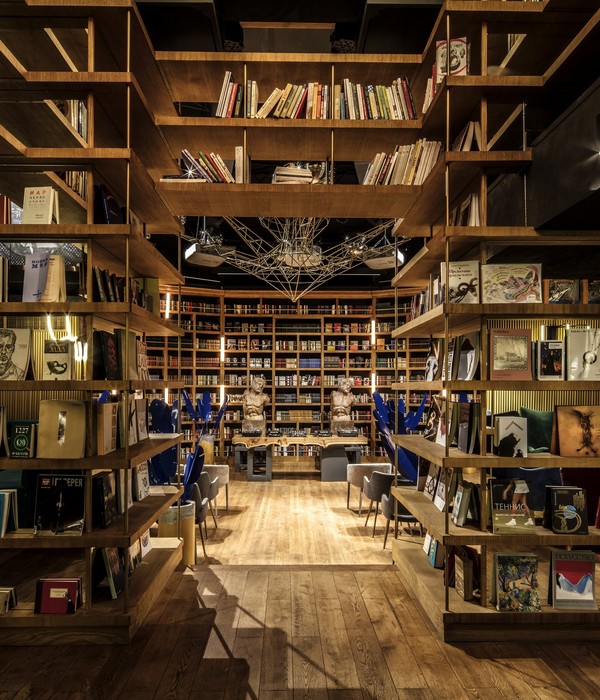
I have always been fascinated by the complex organization of direction and vision in places to create the experience of time, relative fast and slow. A labyrinth is an excellent architectural type combined with light to achieve this experience. So the bookshelves and furniture become the walls of the bookstore maze. Transparent and translucent interfaces blur the clarity of light, creating a disorienting and curious uncertainty in the space. So much so that time seems to slow down a bit here. Unexpectedly in the coffee area (pavilions), the orange-colored furniture is more like ripples. And when I laze on the sofa on the raised platform near the window, the river level unfolds like a scroll, a kind of time view formed by Chinese painting unexpectedly comes back to life, matching that emotion I felt when I stood by the river for the first time. Due to the extra structural secondary beams under the roof panels, I could not open the sky light on the cashier ceiling to make the water and sky into one color. I could only replace it with a luminous canopy, which is slightly regrettable as there is one less light combination.
Water Surface and Sky. To increase the confusion of the maze, I used corrugated aluminum panels as the ceiling to resemble the rippling water of the Yongning River. At the same time, the roof deck of the cashier area was turned into a mirror reflecting the sky. I condensed the water and sky on the front and back of the floor to create a place where direction and time are lost.
The Myth of the White Cloud Garden. The courtyard of the bookstore embodies an attempt to pursue the spirit behind the form of the garden. With the authorization of the owner, I had full will to be the owner of this courtyard to design it subjectively. I decided to create a world (garden) that fits my own concept of the site. I eliminated the structures and facilities on the original site. I kept the original trees and plants, and also kept but modified the fire stairwell and smoke extraction courtyard required by code. I viewed the courtyard as a water surface, and the three groups of trees forming a green island formed the basic paradigm of a pond and three hills in a Chinese garden.
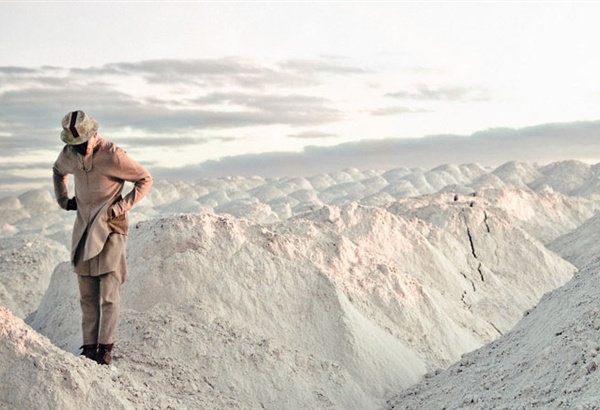
The matching and organization of the trees is borrowed from the composition of Ni Zan, the great painter I love. However, the white stones and greenery shown in the courtyard are easily associated with Japanese dry landscape gardens. But this inspiration comes from a fragment of Qiu Ying's "Garden Views" about Chinese dead landscapes. In the painting a vibrant rosebush stands on a wide mock sparkling white stone work ground, simple and sparse. The courtyard in the painting is enclosed by a bamboo curtain, while I have enclosed a translucent courtyard with white perforated aluminum panels, as well. The light can be sifted through the fence and sprinkle the courtyard like rain to form dappled light and shadows, adding vividness to the courtyard. The courtyard does not seek the form of a traditional garden, but conveys the Chinese love of creating a vibrant earthly wonderland in the most crowded place in the world, the so-called Peach Blossom Garden. It is also a real dream world for contemporary people.
Dream and Reality. The white aluminum walls do not hide all the old buildings from view. In most parts of White Cloud Court, the reader is almost completely trapped in a complete dream world. In some places, there are slight traces of the old buildings showing through. This reality behind the dream world instead builds a magical realism, an unreal reality, or an unfamiliar familiarity. This is about the accident that I am happy to see.
Surprises. Readers will find two cloud stools, one white and one blue, in the White Cloud Court. These are made of plastic from recycled marine garbage. Taking advantage of Huangyan being the capital of molds, molds were made to infuse and mold the plastic. The use of plastic from recycled marine garbage comes from my daughter's education on environmental protection and the need for architects to express an environmentally friendly attitude in their own designs.
There is a blue glass house up the spiral staircase of the cafe, and the daylight tints the area where the orange staircase and the roof meet an extremely beautiful purple. But as soon as you press a switch, the blue glass becomes colorless and transparent, and the Yongning River leaps into view. This glass is a car glass technology developed by a local company in Huangyan. I brought it for the first time to use it in architecture. I also used this glass in the lecture area. Because I always fantasize this scene, in spring, I sit on the steps, the blue color fades, the blooming cherry blossoms bloom like clouds under my feet, it's all, so nice.
▼项目更多图片
{{item.text_origin}}

