万磊微水泥展厅





至简的纯粹与平衡的张力,赋予空间独特而内敛的极致魅力。在这个120㎡的微水泥展厅中,设计师以规整的中轴对称布局为框架基底,借由材质、色彩与丰富的体块结构等多种空间要素为纽带,探索不同维度上的制衡关系,让严谨的秩序感与多元的视觉对冲,这对相悖的矛盾体,以和谐相融地姿态存在于同一空间画面。
The purity of simplicity and the tension of balance give the space a unique and introverted ultimate charm. In this 120 square meters micro-cement showroom, the designer takes the regular symmetrical layout of the central axis as the framework base, and explores the checks and balances in different dimensions by using materials, colors, and rich block structures and other spatial elements as the links, so that the strict sense of order and the diversified visual hedge, which are contradictory contradictions, exist in the same spatial picture in the form of a harmonious harmony and compatibility.
同时,展厅摒弃传统商业空间生硬的样品陈列模式,作为空间展品的微水泥以灵活多样的形态,自然而然地渗透到设计师搭建的每个空间场景之中,与空间形成更为深刻的“亲密关系”。
At the same time, the showroom abandons the rigid sample display mode of traditional commercial space, and the microcement as a spatial exhibit naturally penetrates into each spatial scene constructed by the designer in a flexible and diverse form, forming a more profound “intimate relationship” with the space.
Prologue to the space
Beginning and turning and gradually getting better
灰色极简风格的门厅拉开了整个展厅空间的序幕。设计师保留了原始空间开阔方正的格局,仅在入口处模拟住宅空间中入户玄关的形式,隔出一个相对独立的区域,作为进入主空间的过渡地带。门厅与展厅主空间保持了视觉上的连通性,预留了直联的开放入口,且与内部的样板展示区形成规整的对称关系,从而构成具有流动性和秩序感的精简灵活的布局结构。
The gray minimalist foyer opens the entire exhibition space. The designer retains the open and square layout of the original space, and only simulates the form of the entrance hallway in the residential space at the entrance, separating a relatively independent area as a transition zone into the main space. The foyer maintains visual connectivity with the main space of the exhibition hall, reserves a direct open entrance, and forms a regular symmetrical relationship with the internal model display area, thus forming a streamlined and flexible layout structure with a sense of fluidity and order.
空间不再只是单纯作为陈列展品的容器,而是让二者成为彼此的延展,自然地融合为一体,用更加立体和直观的方式向客户展示涂料的质感。全灰色的门厅空间,墙面和地面均采用微水泥材质,摒弃多余的装饰,配合纯粹的单一色调,让客户在进入展厅的第一时间,就能聚焦于涂料本身赋予空间的美学价值以及高级的氛围气场。
The space is no longer just a container for displaying exhibits, but an extension of each other, naturally blending into one, showing customers the texture of the paint in a more three-dimensional and intuitive way. The all-gray foyer space, with microcement on the walls and floors, abandons superfluous decoration and a pure single tone, allowing customers to focus on the aesthetic value and high-end atmosphere of the space given by the paint itself as soon as they enter the exhibition hall.
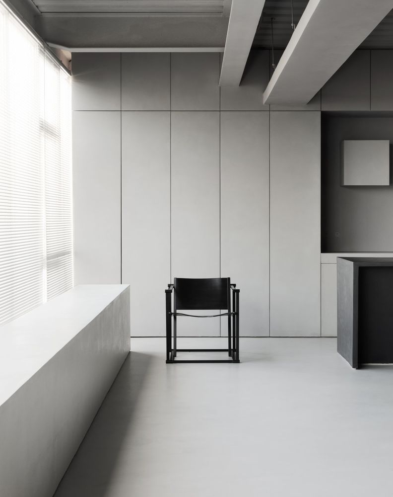
门厅角落陈列着一把金属扶手椅,整个椅面和扶手呈现出自然有机的曲线,与硬朗的材质形成对比,而金属的光泽感又同微水泥细腻的质地相映成趣。墙面黑色的不规则几何装置,在简洁的空间环境内增添前卫的艺术气息。
In the corner of the foyer is a metal armchair with a natural and organic curve that contrasts with the tough material, while the sheen of the metal contrasts with the delicate texture of the microcement. The irregular geometric installation with black walls adds an avant-garde artistic atmosphere to the simple space environment.
Extreme and rich black
A grand and magnificent visual feast
黑,一种象征着永恒的颜色,既肃穆庄严又克制内敛。在进入展厅主空间的首个区域,设计师用极致而丰盈的黑色来为空间视觉张力的塑造推波助澜。
Black, a color that symbolizes eternity, is both solemn and restrained. In the first area of the main space of the exhibition hall, the designer uses the ultimate and rich black color to contribute to the shaping of the visual tension of the space.
展厅内部的区域呈开放的洄游动线,沉稳的黑灰色作为空间主色调,用以彰显契合品牌调性的艺术高级的环境氛围。每个功能区之间通过色彩与几何形态的呼应,来制造区域之间的连接,本品牌的涂料被应用在整个空间的墙面和地面,除此之外,随着场域的层层递进,涂料样品也以更加多元的形态出现于各个展区之中。
The interior of the exhibition hall presents an open migratory line, with calm black and gray as the main color of the space, which is used to highlight the artistic and high-end environment atmosphere that fits the brand's tonality. The brand's paints are applied to the walls and floors of the entire space, and as the field progresses, paint samples appear in more diverse forms.
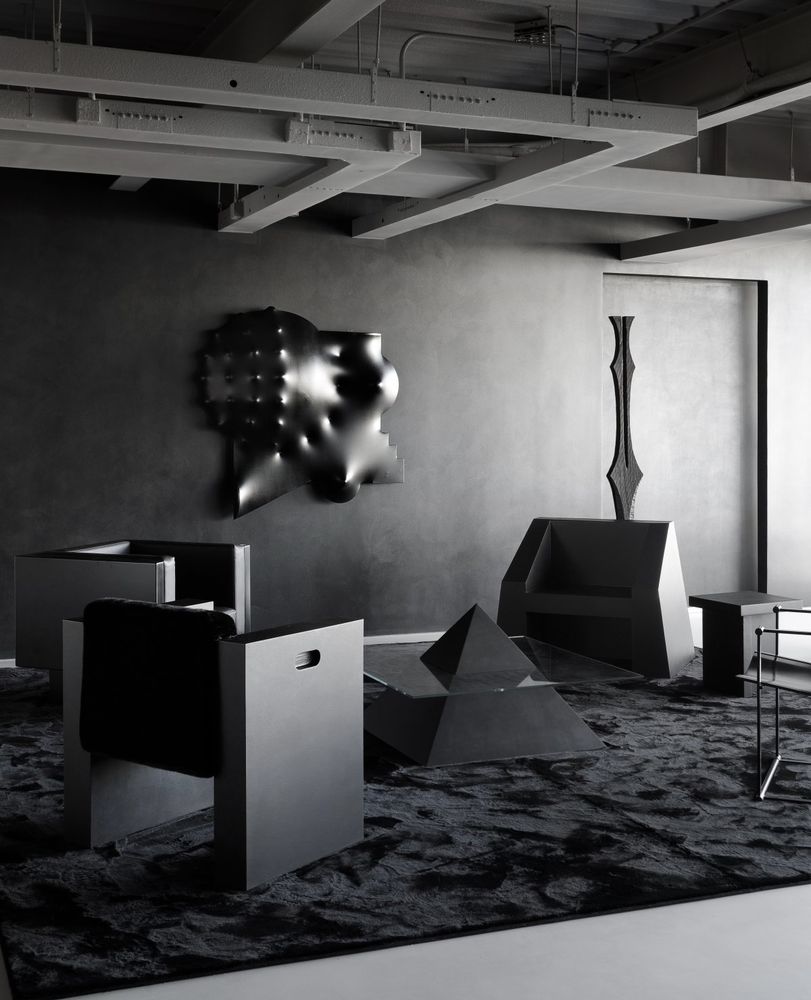
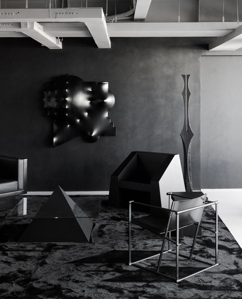
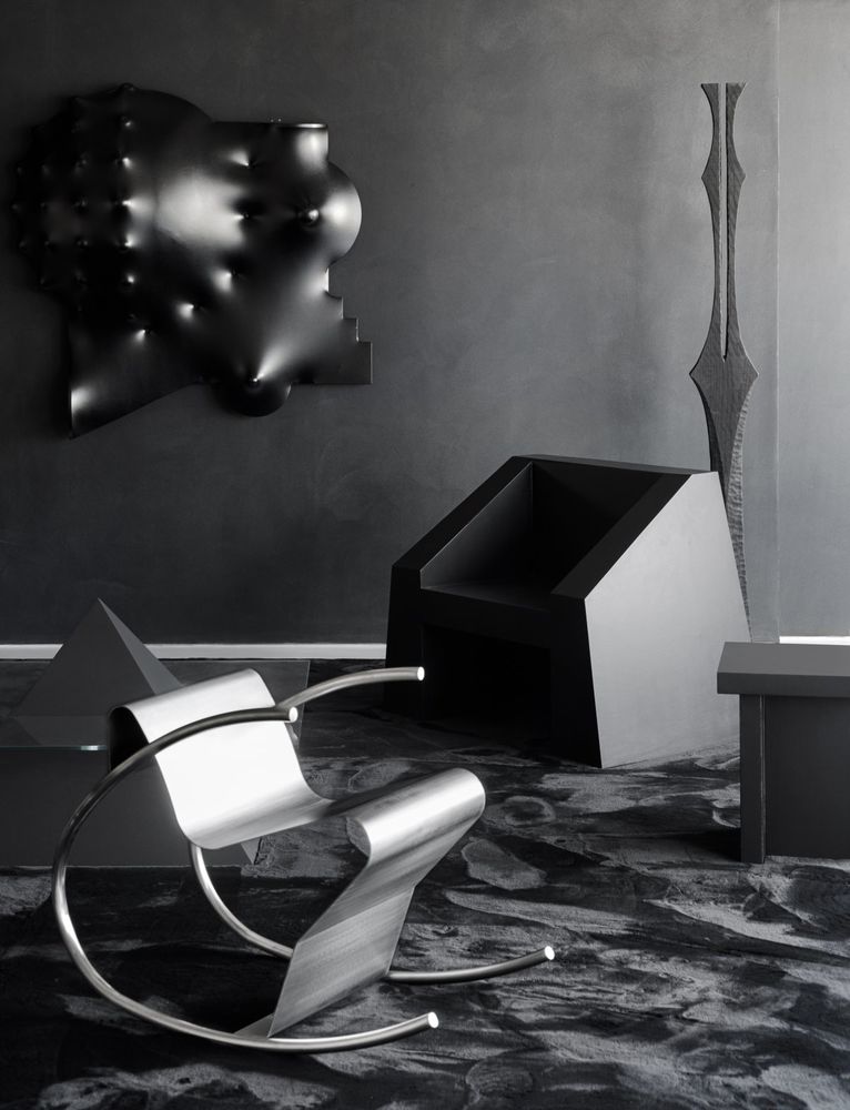
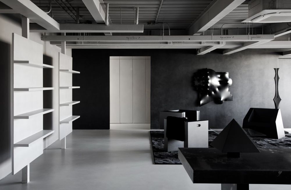
沙发区用纯粹的黑色来呈现极致且富有冲击力的视觉效果。在统一的色彩之下,借由不同维度上立体多元的几何形态与细腻丰富的材质变化,营造非常规叙事式的超现实主义画面。
The sofa area is made in pure black for an ultimate and impactful visual effect. Under the unified color, through the three-dimensional and diverse geometric forms and delicate and rich material changes in different dimensions, it creates an unconventional narrative surrealist picture.
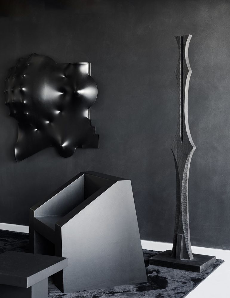
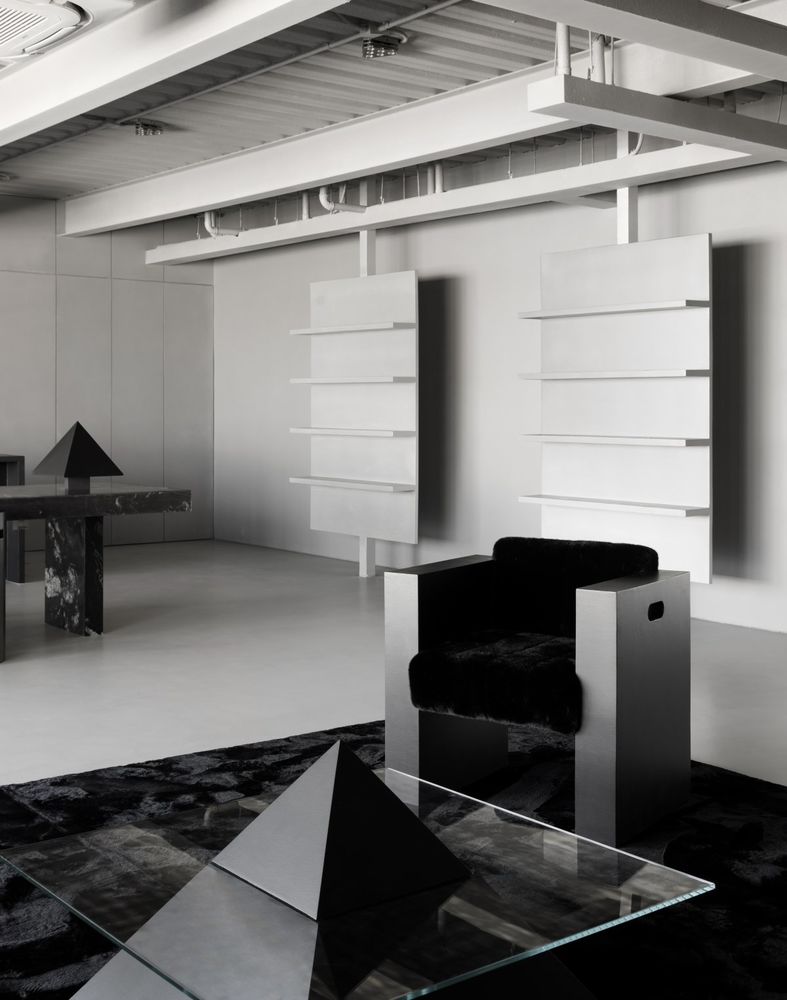
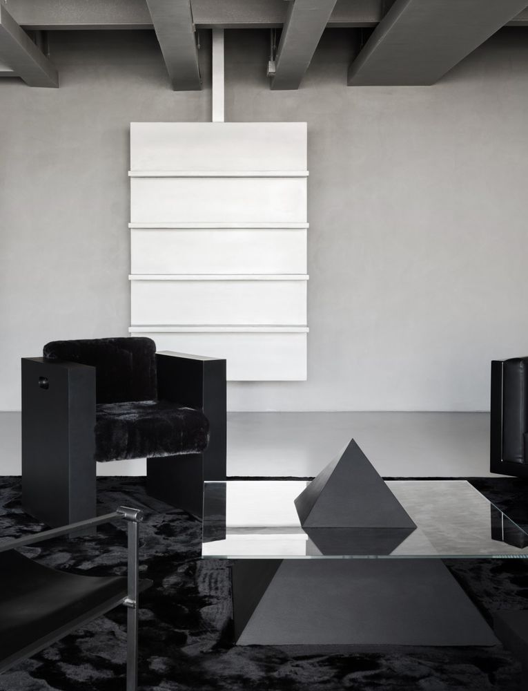
四把不同形态的黑色椅子围合出整个沙发区,每把椅子都是设计师精挑细选的“有意而为之”。它们风格相近,却和而不同,有着各自鲜明的特征。左上角的黑色皮椅是出自设计师本人的设计款家具产品系列,从椅面到框架、底座呈现出独立且规整的几何造型。右下角的扶手椅是对荷兰设计大师Radboud van Beekum的致敬,拥有荷兰设计风格标志性的体块,搭配柔软的座面。这两把相邻的扶手椅在造型上同样是方正规整且线条简洁有力,但在材质和细节处理上又有各自独特的风格属性。
Four black chairs of different shapes enclose the entire sofa area, each of which is "intentional" and "intentional" by the designer. They are similar in style, but they are harmonious and different, and they have their own distinct characteristics. The black leather chair in the upper left corner is a design furniture product line designed by the designer himself, showing an independent and regular geometric shape from the seat surface to the frame and base. The armchair in the lower right corner is a tribute to Dutch design master Radboud van Beekum, with the signature volume of Dutch design style and a soft seat top. The two adjacent armchairs are also square and neat in shape, with simple and powerful lines, but they have their own unique stylistic attributes in terms of materials and details.
右上角的雕塑感造型单椅,表面通体涂刷了微水泥,在材质统一的基础上,通过斜切面的扶手强调整体形态的变化。右下角的中古椅,采用纤细的金属框架,对比其他三把椅子,则更加轻盈且具有透气感,在形形色色的扎实体块中轻松脱颖而出。四把雕塑感造型椅,在不同的体量和材质之间,形成稳定的制衡关系,缺一不可。
The sculptural shape of the chair in the upper right corner is painted with microcement throughout, and on the basis of the unity of the material, the change of the overall shape is emphasized through the armrests of the beveled section. The second-hand chair in the lower right corner, with its slender metal frame, is lighter and more breathable than the other three chairs, making it stand out from the solid blocks of all shapes and colors. The four sculptural chairs are indispensable for forming a stable balance between different volumes and materials.
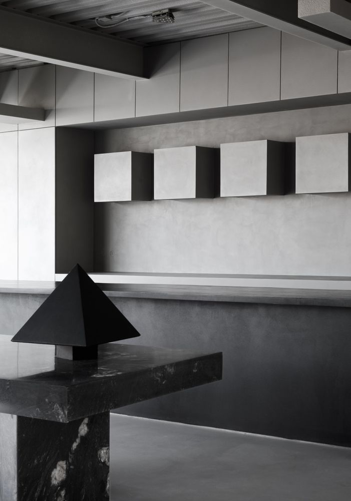
沙发区中心的三角形茶几模拟了金字塔的形态,在“塔身”中间插入玻璃桌板,进而对原本基础的几何体块做以切割,再加上玻璃与微水泥两种截然不同的材质对比,赋予其艺术品般的装饰属性。微水泥作为空间的展品,被应用于家具产品的设计上,设计师希望通过这种方式,向客户展示涂料在日常场景中的更多可能性。
The triangular coffee table in the center of the sofa area simulates the shape of a pyramid, inserting a glass table in the middle of the "tower" to cut the original basic geometric block, and adding the contrast between two completely different materials, glass and microcement, giving it a decorative attribute like a work of art. Microcement is used as a space exhibit in the design of furniture products, and in this way, the designer hopes to show customers more possibilities of coatings in everyday scenes.
地面黑色的地毯,将几件造型各异的家具单品统合到同一阵列之中,并在展厅内部的开放场域中,划分出一个只有关于黑色与雕塑感体块的独立区域。
The black carpet on the floor unites several pieces of furniture with different shapes into a single array, and divides a separate area in the open space of the exhibition hall that is only about black and sculptural blocks.
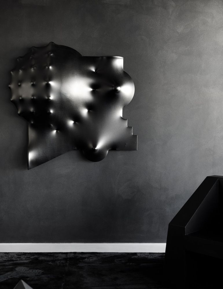
沙发区背景墙的3D立体感雕塑装置来自新锐艺术家尚思齐。装置表面不规则的凸起,象征一种向往突破束缚,却又被制约于体制之中的矛盾与挣扎综合体,边缘扭曲的结构线条配合尖锐的凹凸起伏,孕育出强烈的视觉张力。
The 3D three-dimensional sculpture installation on the background wall of the sofa area comes from the emerging artist Shang Siqi. The irregular bulge on the surface of the installation symbolizes a synthesis of contradictions and struggles that yearn to break through the constraints but are confined by the system.
立式装置是青年艺术家谢小东的新作,它介于中式美学和西式符号之间,是抽象的组织秩序和对自然的参照的集合,游走于不同的视觉体系之中,探索着多元的平衡形态。借由这个立式装置的加入,沙发区的几何结构和材质构成变得更加完整。
The vertical installation is a new work by young artist Xie Xiaodong, which is between Chinese aesthetics and Western symbols, a collection of abstract organizational order and reference to nature, wandering through different visual systems and exploring multiple balanced forms. With the addition of this vertical installation, the geometry and material composition of the sofa area are further complete.
A return to pure beauty
Create a rigorous sense of sequence
多元的体块结构是连接整个展厅的纽带,设计师以此为原点,推动着空间叙事的展开。通过调整不同场域中体块的存在形态和比例,获得一种动态式的平衡。
The multi-dimensional structure is the link that connects the entire exhibition hall, and the designer uses this as the starting point to promote the development of the spatial narrative. By adjusting the existence form and proportion of the blocks in different fields, a dynamic balance is obtained.
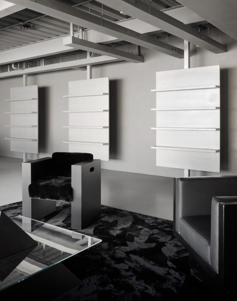
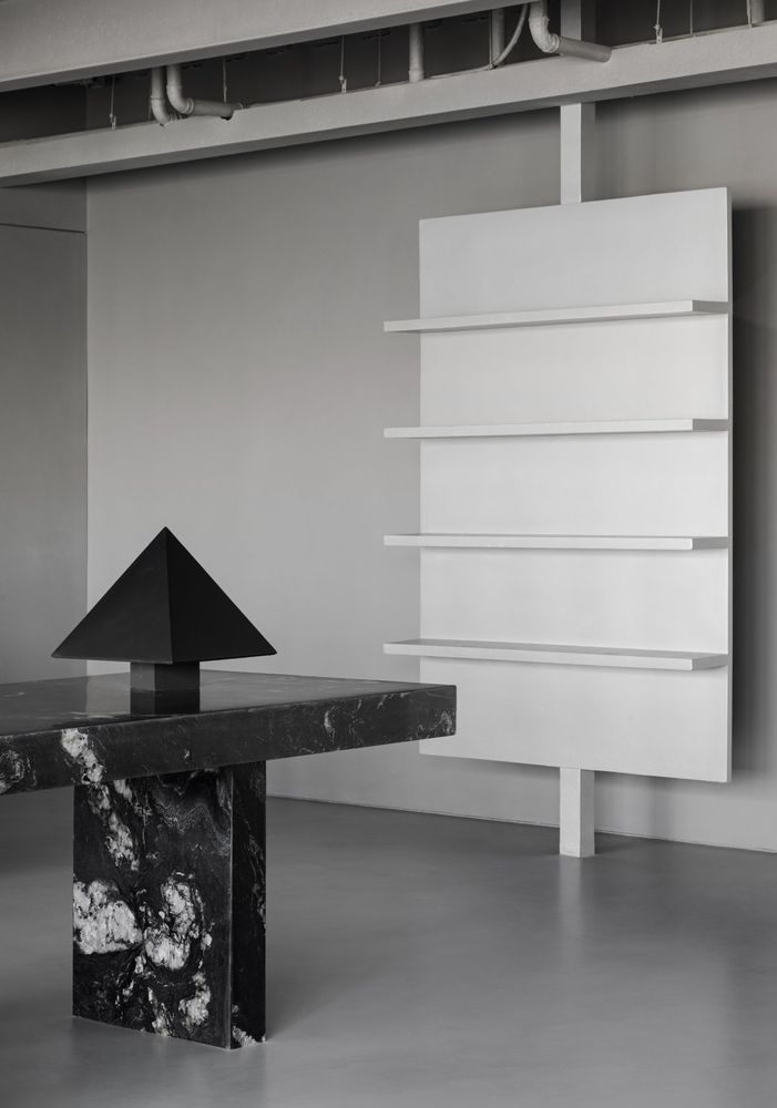
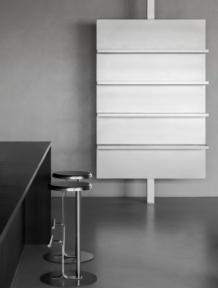
展厅两侧是集中的产品陈列区,其中靠近门厅入口的一侧,由三组独立的悬空置物架组成。不同于侧重多元与强烈视觉冲击的沙发区,展陈区以大型体块的重复使用,以及绝对的视觉对称,强调了严谨规整的序列感,为展品陈列提供一个极简纯粹的背景。
The hall is flanked by a concentrated product display area, one of which is close to the entrance to the foyer and consists of three separate sets of suspended shelves. Different from the sofa area, which focuses on diversity and strong visual impact, the exhibition area emphasizes the rigorous and regular sense of sequence with the repeated use of large volumes and absolute visual symmetry, providing a minimalist and pure background for the display of exhibits.
展架用方正的矩形背板,搭配直线型隔板,回归最原始朴实的线条结构。架体背面纤细的支杆将整个架身悬空,从而巧妙地打破了原本厚重的体量感。同时,支杆也如由上至下无限延展的中轴线,对平面做出严谨的划分,在横纵的对仗之中,阐明稳定对称的视觉逻辑。
The display shelves are equipped with a square rectangular back panel and a straight partition to return to the most primitive and simple line structure. The slender pole on the back of the frame body suspends the entire frame in the air, thus subtly breaking the original heavy sense of volume. At the same time, the strut is also like a central axis that extends infinitely from top to bottom, making a rigorous division of the plane, and clarifying the visual logic of stability and symmetry in the horizontal and vertical battles.
表面涂刷金属光泽的艺术漆,为空间注入细腻的肌理变化。展架与墙面留有一定距离,既保证了通畅的呼吸感,又通过光影与空间产生互动,同时还可以观察到阴翳之下,涂料材质的肌理质感。
The surface is painted with metallic lacquer to inject delicate texture changes into the space. There is a certain distance between the display shelf and the wall, which not only ensures a smooth sense of breathing, but also interacts with the space through light and shadow, and at the same time, you can also observe the texture of the paint material under the shade.
Immersive
Eclecticism between functionality and scenography
不同于传统的商业空间,设计师希望在商业功能的基础上,赋予空间生活化的家居场景,在功能性与场景化之间实现折衷共相,让客户身临其境的体验到涂料展品在家居环境中的真实使用效果。
Different from the traditional commercial space, the designer hopes to give the space a living home scene on the basis of commercial functions, and achieve a compromise between functionality and scene, so that customers can experience the real use effect of paint exhibits in the home environment.
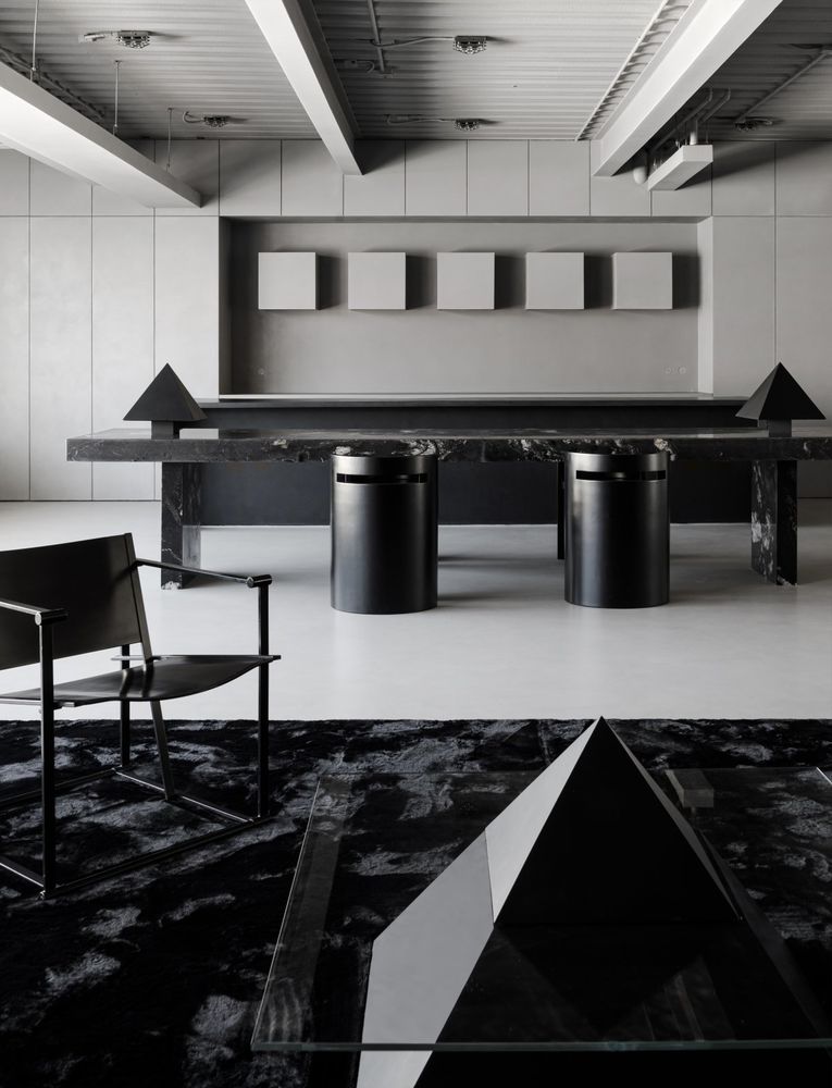
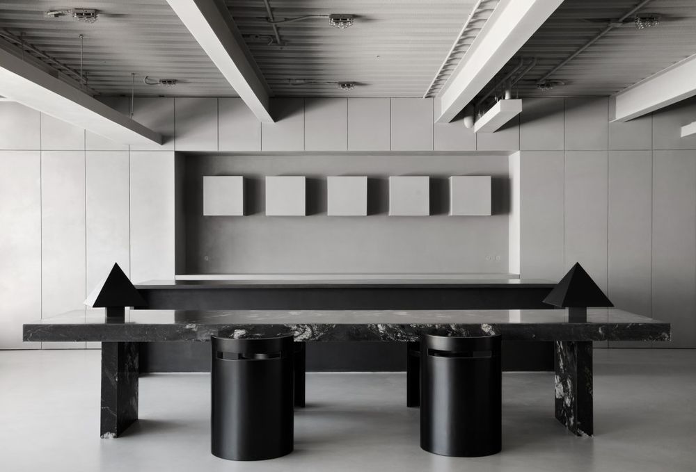
展区整体的布局结构,模拟了由玄关、客厅到餐厨的常规住宅动线。位于展厅最内侧的洽谈区域对应了住宅中的开放式餐厨区。整个区域延续了对仗工整的对称式构图,并用大面积的留白结合多样的几何体块,营造协调安定的高级美感。
The overall layout and structure of the exhibition area simulates the regular residential circulation from the entrance, living room to dining kitchen. The negotiation area, located at the innermost end of the exhibition hall, corresponds to the open kitchen area in the residence. The whole area continues the symmetrical composition of the neat battle, and uses large areas of white space combined with various geometric blocks to create a harmonious and stable high-end beauty.
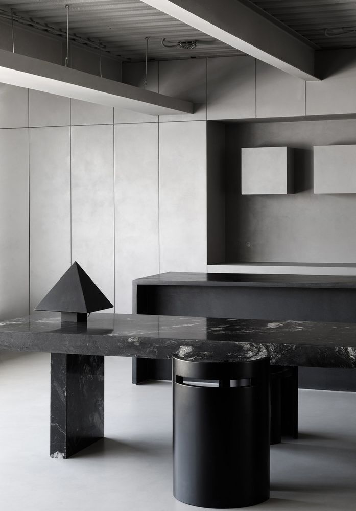
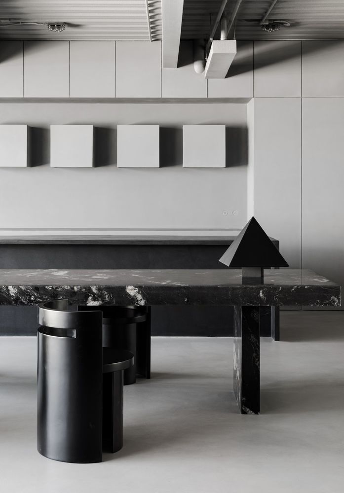
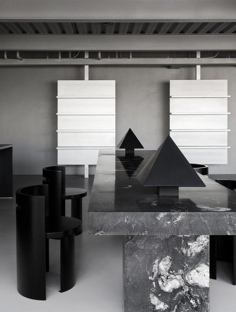
黑色矩形长桌采用的是一款市面上少见的大理石材质——“宇宙风云”。黑色的石材基底之上夹杂着好似絮状星云般的白色纹理,整个桌面就仿佛是凝缩于空间内的一方小小宇宙,浩渺无垠,诗意浪漫。
The black rectangular long table is made of a rare marble material on the market - "Cosmic Storm". The black stone base is mixed with white veins like flocculent nebulae, and the whole desktop seems to be a small universe condensed in space, vast and poetic.
长桌的两侧是两盏特别定制的三角形台灯,表面涂刷了微水泥材质。台灯自身尖锐的棱角与方正的长桌形成对比,同时克制的体量又不会改变矩形体块为主导的流畅规整的视觉效果。台灯也是一处暗示,和沙发区的三角形茶几在造型上相呼应,从而让两个区域拥有了低调的连接。
The table is flanked by two custom-made triangular lamps with a microcement finish. The sharp edges and corners of the table lamp itself contrast with the square long table, while the restrained volume does not change the smooth and regular visual effect dominated by rectangular volumes. The table lamp is also a hint, echoing the shape of the triangular coffee table in the sofa area, thus giving the two areas a discreet connection.
四把黑色的圆柱形单椅对称排布于长桌两边,它们也是出自设计师本人之手。作为空间内少有的圆润饱满的体块,它们在硬朗的直线条中增加了些许松弛柔和的氛围。
Four black cylindrical side chairs are arranged symmetrically on either side of the long table, also by the designer himself. As a rare round and full volume in the space, they add a little relaxed and soft atmosphere in the hard straight lines.
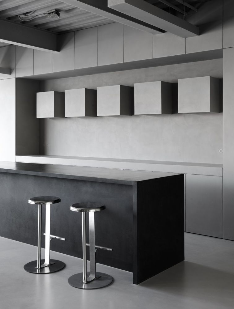
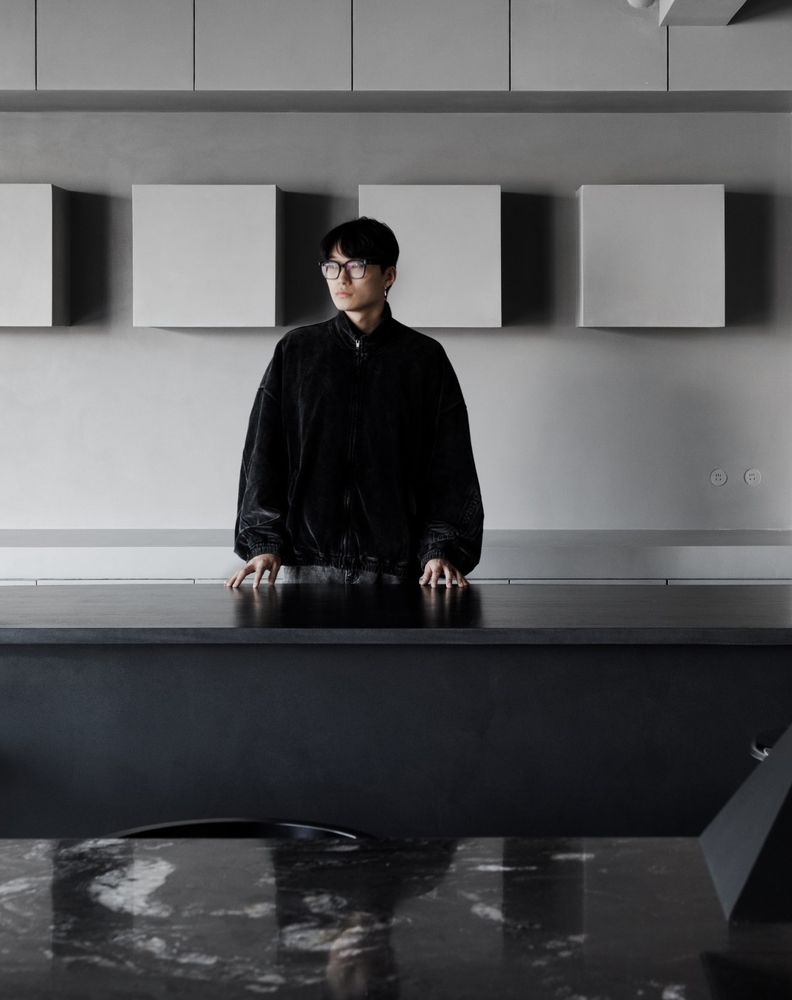
长桌内侧是一个开放式厨房造型感的水吧区域。微水泥涂刷的黑色岛台在体量上与长桌相匹配,造型极为简洁规整。
On the inside of the long table is a water bar area with an open kitchen style. The black island painted with microcement matches the volume of the long table, and the shape is extremely simple and regular.
灰色微水泥打造的橱柜造型区域,消除了所有视觉上的障碍,着重于几何秩序感的建立。墙面的正方形吊柜造型,冲破平面束缚的立体感,再加上多数量的组合式模块,大大提升了整体的视觉冲击感。
The cabinet-shaped area made of grey microcement removes all visual obstacles and focuses on the establishment of a sense of geometric order. The square wall cabinet shape on the wall breaks through the three-dimensional sense of plane constraints, coupled with a large number of combined modules, which greatly enhances the overall visual impact.
顶部的吊灯采用不锈钢材质,充满了工业与科技感。为空间增添一些金属点缀的同时,又增加了一些未来元素。
The chandelier at the top is made of stainless steel, which is full of industrial and technological sense. While adding some metal accents to the space, it also adds some futuristic elements.
空间内暗藏了一些令人心动的精巧细节。橱柜两侧的内嵌插座,采用与墙面同样的微水泥材质,并且与墙面完全持平,从而达到了完全“隐身”的效果。
There are some intricately subtle details hidden in the space. The recessed sockets on both sides of the cabinet are made of the same microcement material as the wall and are completely level with the wall, so as to achieve the effect of complete "invisibility".
靠窗的区域是一个相对低矮的展台,阳光透过窗户打在样板上,客户可以看到自然采光之下涂料样品最真实的状态。
The window area is a relatively low booth, and the sunlight shines through the window on the sample, so that customers can see the paint sample in its most realistic state under natural lighting.
Interiors:NOTHINGDESIGN
Photos:立明


