EXTENSIVE TRADING-UP With the most extensive renovation and reconstruction in the over 100-year history of the family business Garhammer, the architects and interior designers of Blocher Blocher Partners have carefully expanded the complex commercial property in Waldkirchen in three building phases. And extended the building northward, with a major new construction of some 2,500 square meters, linked to the original structure via several glassed-in skyways. The result is 9,000 square meters of retail space, up to four-storeys high, extending between the Market Square and Ringmauerstraße. Due to the steep topography of Waldkirchen's downtown area, the arrangement of space follows the site's natural features. In keeping with the principle of split-level construction, several floors are set off from one another, with each level having its own identity. Whatever their standpoint, customers take in exciting vistas and absorb new impressions. One might say that the historic city centre, with its squares, its alleyways and stairways, has a friend in the new Garhammer.
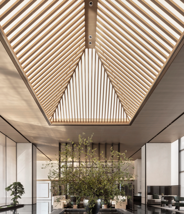
The roof landscape combines the historic and modern buildings like wings of a butterfly, before the joint structure gently slopes toward the northwestern edge of the property, leading to the new restaurant "Johanns". The theme continues in the access areas, which link Garhammer to the urban space using multiple entrances, exits and passageways, making the retail store accessible from all sides. The interior is no less daring: Here, the creative use of varying ceiling heights, open spaces and sales levels leads to differentiated realms of experience.
THE CHARM OF NOVELTY A lot has changed; it's more beautiful and bigger. The baby and children's departments have moved to the new building; men's clothing took over the space. Now, the so-called "stronger sex" fills the entire ground floor with an embarrassment of riches. The women's department has the entire first floor above ground to itself, including the new building. The second floor now houses undergarments and nightclothes, including the newly created premium department and sport underwear. The ground floor of the new building – which is actually below ground due to the steep incline – is reserved for women's shoes, bags and accessories.
Blocher Blocher Partners also ensured that customers not lose their orientation in the vast space. Given the slope of the Garhammer property, the architects and designers made playful use of the split-level format in the sales area. Of course there are staircases and lifts – but the charm lies in the abandonment of the classic floor construction. As a central connecting element, the staircase links all the levels, even as it varies stylistically: sometimes a simple landing stage; sometimes with multiple turns or gently curved staircases. Occasionally, a small skywalk or skyway makes it easy to go from the old building to the new. The "airspace bridging" is particularly impressive in the new building. Here, a construct reminiscent of an M.C. Escher etching, with pillars, spiral staircases and pedestals, reaches upward from the furniture store "Freiraum," across the handbags, children's and women's departments toward the third-floor skylight. Even in the original building, the airspace draws attention, in part because the path to the access core leads through a tunnel and a mirrored ceiling – the pretty chiaroscuro effects are no accident.
The bistro at the base of the airspace was repositioned in the course of the restructuring, as was the walkway on the higher level. It runs like an elevated boulevard between the main entrance and the famous greeting stand, which is as much a part of the Garhammer experience as the "accompanying" fashion consultant or the glass of champagne with the personal shopper.
Both elements – the repositioning of the bistro and the boulevards on the ground floor and first aboveground level – help with orientation in the space. Together with the increased floor space, with the previously unused corner on Ringmauerstraße, the result is a generous sales floor that allows for a clear organization of space and personalized arrangements of collections, showing them off to their best advantage.
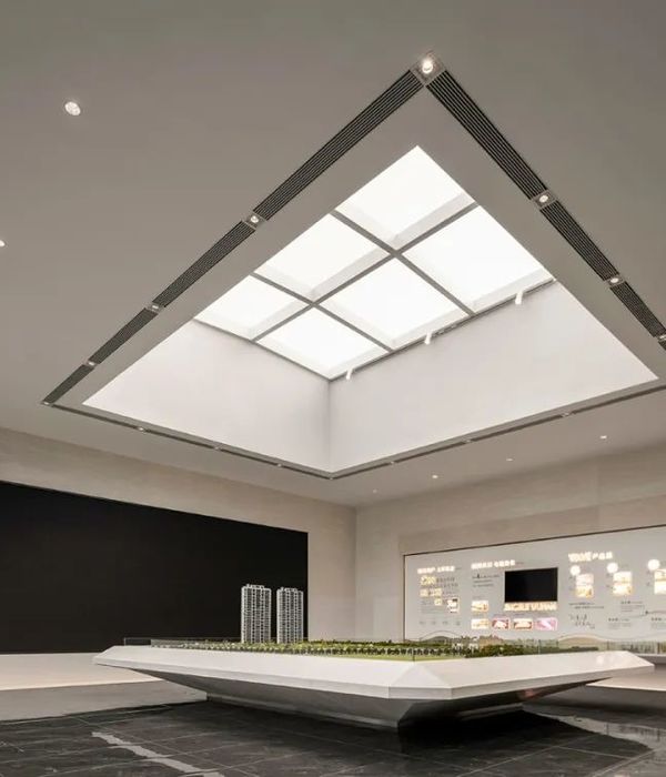
DOWN-TO-EARTH ON A COSMOPOLITAN LEVEL Among the many atmospheric details are: The Gründinger house as a link to the old city wall, whose natural stone masonry runs through parts of the showroom; the multi-storey curtain of anthracite-coloured slats, which structures the airspace in the main building and is even more eye-catching thanks to the large-format murals; the backlit triangle above the boulevard, which underscore the importance of the central axis of access; and the children's department in the new building, resembling a large adventure playground with its wild, tree-house atmosphere, light-green animal figures, illumination resembling leaves, murals and a slide. There is the Young Design section with its space dividers of brass, black and rust-coloured steel, into which imaginative ornaments have been cut. There are also the towering shelving units at the passage from the first to the second floor of the new building, perfect for drawing attention to seasonal themes; and the items on display can be perfectly staged using polygonal, bronze-coloured attachment lights – specially made, like many objects from Blocher Blocher Partners. Other highlights: sheets of Indonesian metal as the perfect backdrop for selected undergarments items; floral prints on table tops; gold-coloured wallpaper; capitals of bleached wood; and so on, and so on... Whether decorative or functional – sophisticated style worlds pop up around every corner (Space Communication / Visual Merchandising: Blocher Blocher View).
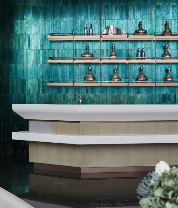
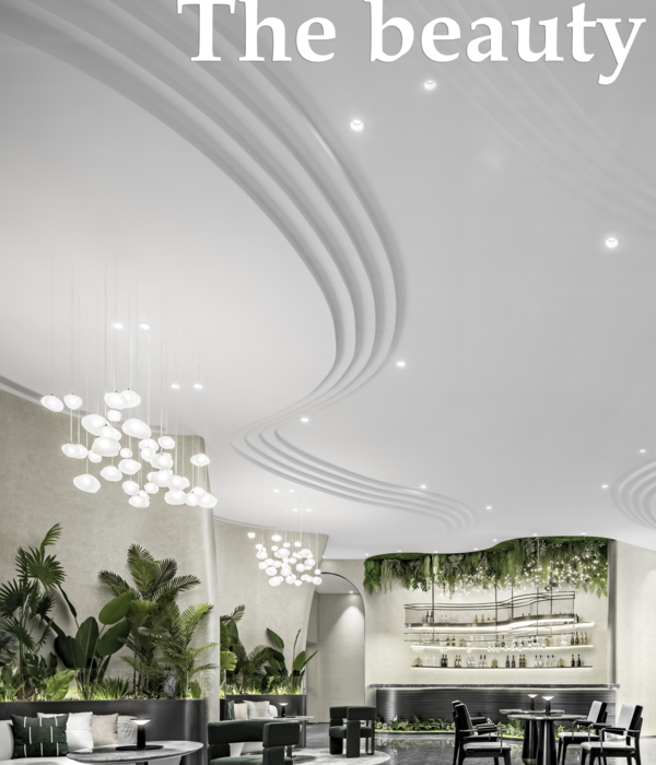
The fact that, with all their fascination for detail, the planners did not lose sight of the project as a whole is also due to the mediation between architecture and interior design. Numerous points of reference make it easy to find your way in the house; be it on a particular floor or over several levels. For example, there are specific pieces of furniture placed near the entrances to stairways. While the front is decorated with products as usual, the back serves as a graphic indicator to customers. And there is another recurring theme in the new Garhammer: Tradition and modernity. They go hand in hand in this interior design concept. Garhammer exemplifies this duality: Big-city fashion is sold here with a down-to-earth Bavarian flair. So it makes sense that "Johanns" also reflects these values – the new culinary attraction high in the new building – with its wine cellier, lounge, restaurant and a roof terrace, which promises a sensational view.
{{item.text_origin}}

