The opportunity to tackle the Giasa Real Estate project arises when its partners, already active in the business at that time, raise the need to have a physical space where they can carry out their work.
The basic requirements of the item are: space to carry out activities such as meetings, customer service, administrative tasks and procedures. The most substantial challenge of this project was, in addition to responding to this program, to promote the business through a "window" that would present it to the city as a point of attraction for new opportunities.
The place is located on a corner on one of the busiest roads entering the city. This condition was used to give visibility to the intervention from different angles and at different times of the day. The panels that make up the corner volume, which can be appreciated by both pedestrians and vehicle drivers, allow the facade to be approached from both streets and also diagonally. To achieve optimal visibility, the geometry of the corner "flies over" the public space of the sidewalk and advances on the line where the building ends. The curvatures of this volume move the movement generated by the panels that organize the ground floor outwards. The exterior lighting remains on and becomes a "beacon" when daylight ceases.
Through a single device, the various functional sectors (entrance, waiting, reception, archive and consultations) are organized on the ground floor, while the movement of people is guided and the furniture is made up. The space for the meeting room is reserved for the upper floor, where it is possible to find the necessary sound insulation.
The strategy of using a material widely known in the field of architecture in a completely renewed way offers many possibilities. The everyday becomes innovative when a "corrugated" sheet (metal or plastic) appears used vertically, as opposed to its traditional horizontality. The project appropriates its texture and its flexibility to create curvatures and, at the same time, accentuate the direction of its lines. It works both on the outside (with opaque panels) and on the inside, where translucent and transparent panels are combined that provide various conditions of visual isolation depending on the case.
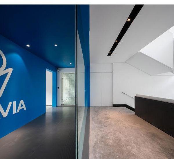
This material, used as an envelope for the central device, is supported by a structure made up of metal guides that, anchored to the ceiling and the floor, give rigidity to the shape. The minimalist aesthetic is manifested in the purity of the white color of almost all the elements, and in the contrast with the black color of the horizontal support surfaces. Thus, a result is achieved with zero visual saturation, but with an aesthetic and formal impulse. The warmth and color are provided by the natural plants that are located in the contour of the entire glazed sector of the facade in the internal part of the room.
{{item.text_origin}}


