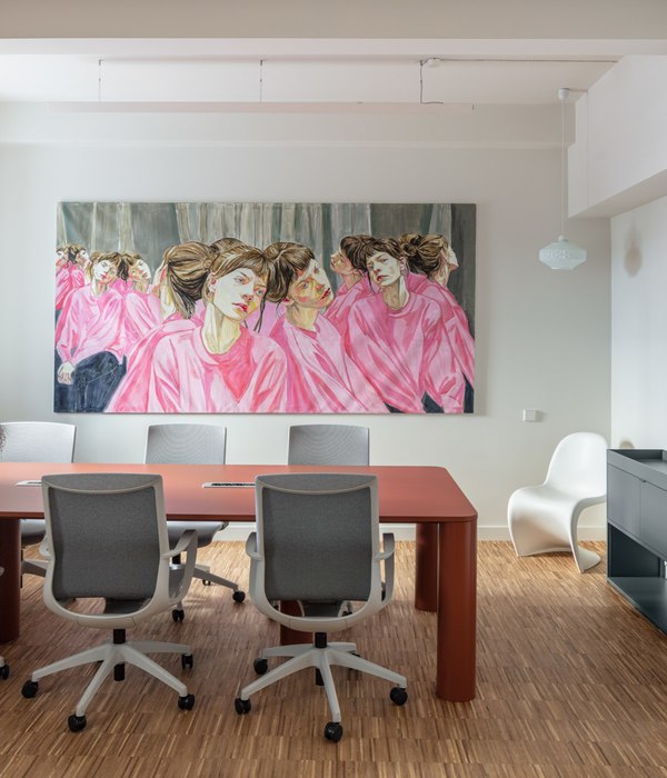
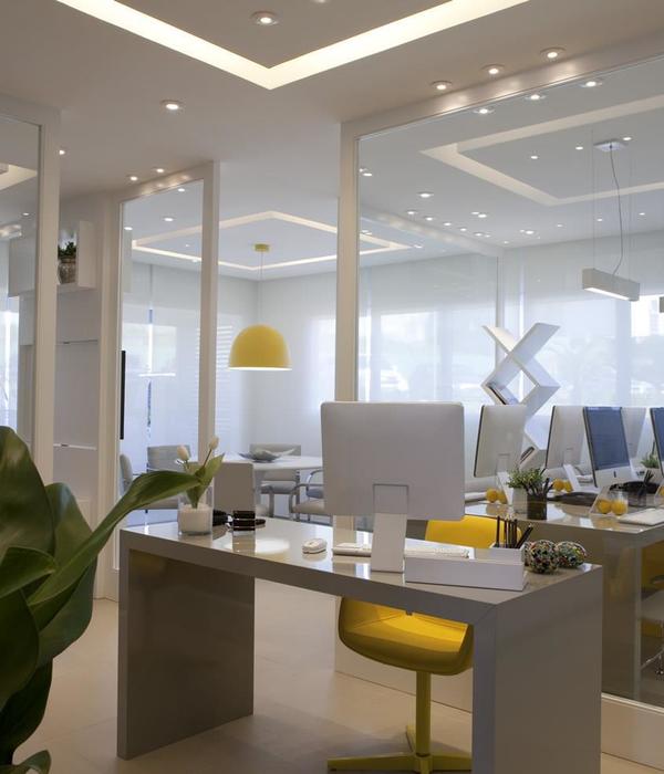
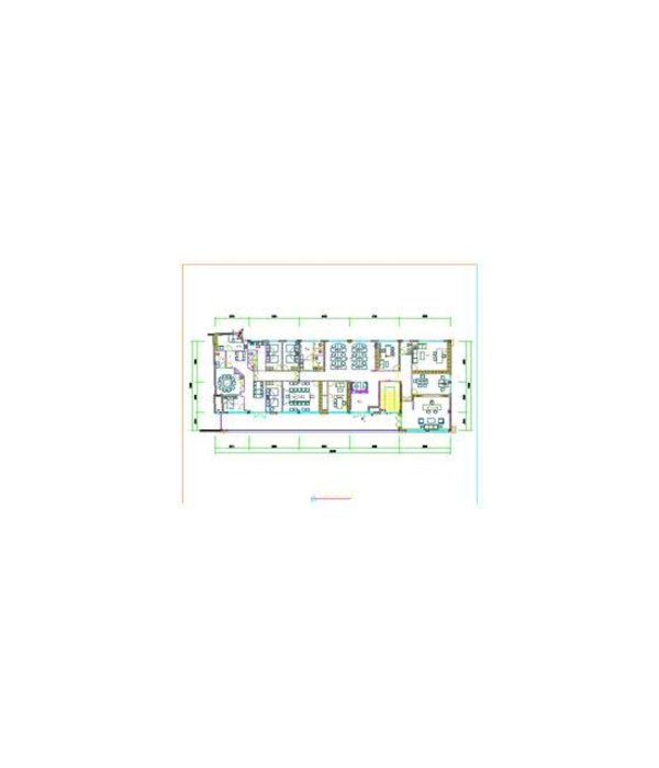
Already nearing its second decade, Travelstart remains one of Africa’s leading online travel agencies and booking websites. Having recently relocated its Cape Town headquarters to a two-and-a-half-storey set of offices in Longkloof Studios, located just off the bustling hub that is Kloof Street; it is natural that the company should wish to set itself up in a working space that would reflect its efficiency and modernity. The initial interior design concept was inspired by the office featured in Nancy Meyers’ 2015 comedy film The Intern, upon which Travelstart’s CEO wished to model the new space. From there, Inhouse Director, Phillip Wyatt and Senior Designer, Chrismari Loubser, were delighted to help make the vision happen.
Like any booming business, Travelstart has long since learnt that initial impressions can’t be undervalued. As a result, they requested a reception area with, as it might be called, a “WOW effect”. To answer the brief, Inhouse designed a reception area dominated by a huge, circular blue light box situated behind the reception desk. Modelled after Travelstart’s logo, the light box makes an immediate impression of the brand’s identity the moment one enters the office. To the right is a coffee bar, and behind the light box is a lengthy 24-seater communal table, which was crafted out of a tree log and set on a steel frame with large castors.
A two-metre long model aeroplane suspends from the ceiling in the triple volume space over reception. This whimsical feature element was relocated from Travelstart’s previous offices and serves as a playful nod to the company’s service offering.
Up the stairs, the first floor opens onto a central kitchen and stadium seating area that can be used for company presentations, from which point the office expands in both directions. A number of glass-walled meeting rooms divide the room down the middle, while shared worktables line the walls. The communal workspace is easily accessible and roomy.
The second floor contains slightly more enclosed (though still glass-walled) spaces. These comprise recreation rooms, including a games area and meditation room, as well as offices and the main boardroom. The latter bears an oval frame, rather than the rectangular shape of most of the other enclosed rooms. Nonetheless, the floor maintains the air of capaciousness and accessibility that defines the rest of the office.
Throughout, a number of consistently recurring themes serve to lend the offices a very particular aesthetic. The brand’s distinctive colour scheme of blue, white and grey dominates every floor. The circular logo, prominent on the ground floor, persists on the first and second in the form of circular ceiling pendants that lower the lighting. The open layout, transparent walls and four-metre-high ceilings foster ease of access, create a spacious atmosphere, and help to ensure that full use is made of the natural light from the building’s sizable windows. Discreet acoustic ceiling panels ensure that this openness does not result in a noisy atmosphere.
“For Travelstart’s offices, we considered everything about the business, from its logo, to its vision, to the manner in which it conducts itself,” says Wyatt.
“Throughout reception and the work areas, one can feel the company’s brand identity throughout the interiors. Utilising Travelstart’s corporate colours consistently reinforces the brand, while the integration of various breakaway areas and communal spaces within an open-plan layout, enhances the progressive nature of the business”.
With its freshly renovated Longkloof offices, Travelstart has done a great deal more than simply change its address. It has established itself in an environment specifically crafted to promote and preserve its identity and the growth of its vision. It’s a process that most entrepreneurs will agree is key to nurturing a business. And it’s one that Inhouse is delighted to play a role in…
{{item.text_origin}}

