Metzgerei Stuttgart
Metzgerei Stuttgart
Metzgerei Stuttgart
Metzgerei Stuttgart
Metzgerei Stuttgart
Metzgerei Stuttgart
Metzgerei Stuttgart
Metzgerei Stuttgart
Metzgerei Stuttgart
Metzgerei Stuttgart
Metzgerei Stuttgart
Metzgerei Stuttgart
Metzgerei Stuttgart
A Swabian butcher. A Turkish host along with a Montenegrin chef, as well as a German- Kazakh-Indonesian architect team –
Multicultural cousinism at Bismarckplatz. For the gastronomic concept as well as the restaurant name stood the butchery, which was once operated in the historical monument of the century turn. The restaurant developed within a very short time to a culinary hotspot in Stuttgart, which firmly anchored the long neglected Bismarckplatz in the Stuttgart gastronomy scene.
Spatial diversity
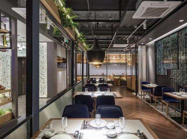
The restaurant is divided into three sections - a main room with a bar and two other smaller, more intimate areas.
A well-coordinated range of seating possibilities, from the informal
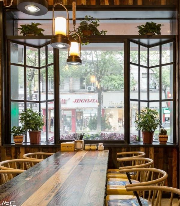
“come together” in the lounge area, which is around a deep wooden seating in the window line oriented to the place, as well as at the leather panel covered bar, which dominates the main room, right up to intimate seating areas with simple benches made of brushed larch wood.
In the rear of the two small rooms, green plants hung on simple reinforcement mats in clay pots form a living and natural wall picture, which stands out clearly in front of the black wall back- ground.
Authenticity through naturalness
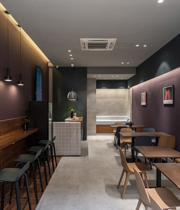
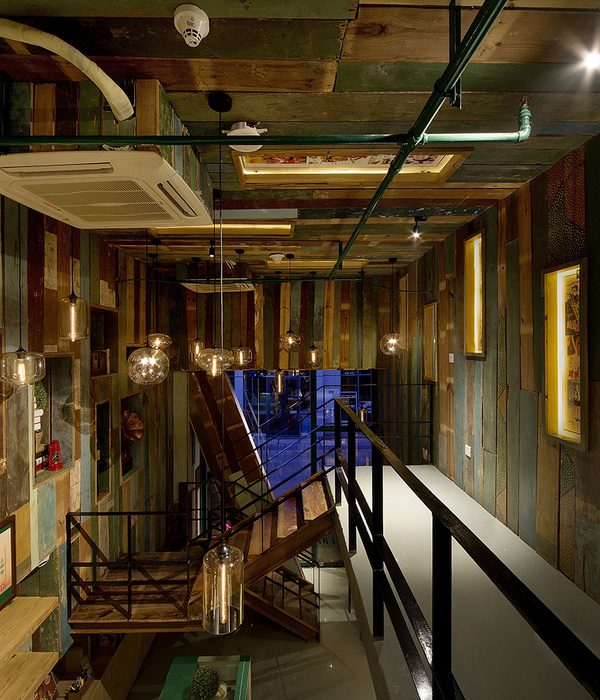
Authentic materials and naturalness characterize the mood. The material selection is essentially limited to oil treated raw steel, leather and brushed larch wood. These materials are accompanied by the hues of the walls between black, blood red and delicate pink. The clear appearance of the room with its archaic furniture contrast with the accent walls of soft pink, playful table top and exciting flea market fundus. Small details like the round leather seat cushion with red seam, that make sitting on the rustic workshop seats comfortable revealing the analysis of every detail, which is also reflected in the kitchen.
Between Today and Yesterday
The shelf, welded from rebars, accompanies the wall behind the counter and disappears with its black shelves. Only the vertical reinforcing bars gleam golden and are thus a structural element of space. It is all about content. The steel shelf is being read like a mixture of library and flea market items, somewhat between nostalgia and design. You and yourself somewhere between today and yesterday.
Moody light
The lighting is buzzing. A few precisely placed spots bring light onto the dining table and the coun- ter. From the wall-supporting steel racking system, light sources are spotlighting, which reveal the space of the shelf.
Above the hackblock, that both inwardly and outwardly honestly shows the identity of the con- cept, hangs an archaic round luminaire, which is rather like a reverse grill than a design piece. On the walls we and individually or pair arranged wall lights, small offshoots of the hanging light above the hack block. The attention is established on light is in the foreground, not the lamp design.
Status Completed works
Type Bars/Cafés / Restaurants / Interior Design / Custom Furniture / Lighting Design / Furniture design / Product design
{{item.text_origin}}

