Swiss Design-Duo defines new design-language for Pan-Asian restaurant-chain
The translation of the restaurants food-concept that is all about fresh fish, high standards of preparation and friendly, fast service into an innovative, functional and forward-looking interior design was the goal and task for designers DYER-SMITHFREY. SUAN LONG Enge AG, with more than 16 branches the largest Asian restaurant chain in Switzerland, has commissioned the interior designers to find a new design-language for the new restaurant.
Bright wood, blue highlights and an allover transparent room design: DYER-SMITH FREY have consciously abstained from opulence. As a defining panasian design feature they decided for fish scales patterns ruling the design of paravents, wall panels and wallpaper in all areas. The fish-shed pattern of the paravents is lasered out of oak layers and was especially developed by the designers. As a separative element, the paravents define the restaurant’s character and its tripartite spatial structure: Bar and Lunch area, Open-Restaurant and Fine Dining.
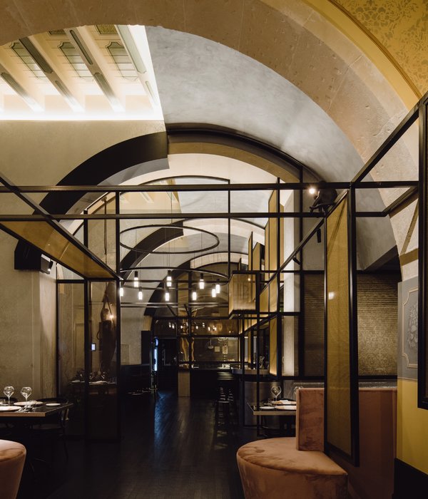
The front wall of the Fine Dining, framing the backside of the 244 sqm restaurant, an impressive circular mirror forms the visual center. White semi-high wall paneling joined by smoke-blue Art Deco wallpaper identify the Fine Dining’s classic elegance. Black armchairs and modernly interpreted lamps from rice-paper accentuate the Asian momentum.
The Open-Restaurant, defining the center of the space, suggests ideal conditions for a relaxed get-together featuring royal blue, Alcantara upholstered benches and oval-shaped tables made from Silent Stone. Providing indirect light, the ceiling lamps designed by DYER-SMITH FREY, interprete Asian papery parasols. Lunch area and tiled bar counter are located in the light-flooded entrance area. The ecru-colored tile floor separates the casual Bar from the Lunch area and changes into an oak solid wood flooring. Turquoise blue tiles and chairs contribute a fresh sea breeze to the bright space.
At the entrance to the bar, a staircase leads down to the restrooms. Walls are hand-painted with Chinese bamboo sprouts motifs – the golden Koi wallpaper turn washrooms into an aquarium. The wooden shingle wall at the second entrance to the Lunch Area plays with the Asian fish-shed motif on the one hand and reminds of the traditional Swiss facade cladding on the other.
Design:
DYER-SMITH FREY
Photography: Nico Schaerer
{{item.text_origin}}

