The remodeling of the Garcia Apartment considers the transformation of spaces and their uses in each of its rooms. The property has approximately 550m² distributed among two floors, located on the penthouse of a building located in Riviera de São Lourenço, a city on the coast of the state of São Paulo, in Brazil.
The family’s desire was to have extreme comfort but also a lot of space. The apartment has 5 suites, but also common areas where they could relax and have fun together. With that in mind, it was necessary to organize the space in a very practical way.
After imagining the family’s routine in a beach apartment that could host up to 22 guests, we faced the project’s structure in a way that was similar to a small hotel.
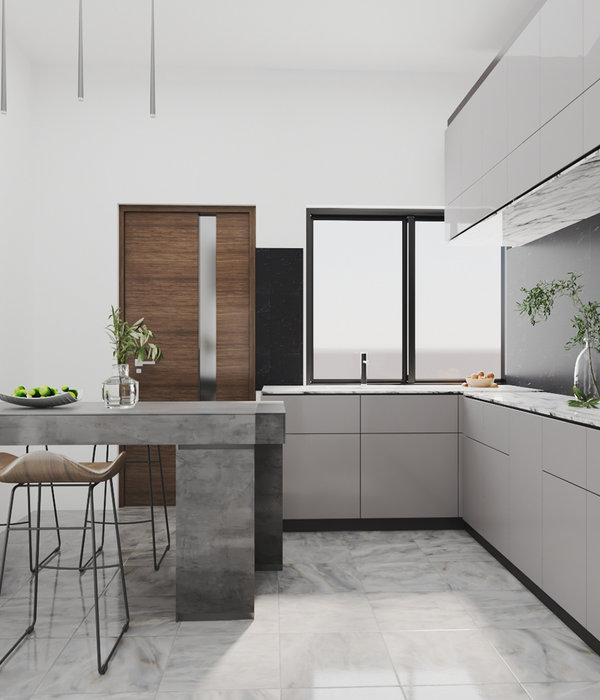
The lower floor contains the 4 main suites and also the service area that is needed. The functional kitchen is also located on this floor, connected to a breakfast area, an important room for the family and their guests.
Each suite has a double bed, a bunk bed, and a trundle bed, so a couple with kids can have an extremely comfortable stay.
Still, on the lower floor, there is a comfortable living area, with a TV and a bar, so that they can have relaxing moments at the end of the day.
On the upper floor, the kid’s suite and all the leisure areas are connected through the pool, which was remodeled to guarantee that.
For the gourmet area, we designed folding doors that offer the possibility of full integration with an external terrace and with the pool area. Also, there is a sauna, a barbecue area, and a big solarium.
Still thinking about the concept of a “small hotel”, storage areas, deposits, and pantries were thought in a way that was connected to the leisure areas so that the flow and maintenance could be easier. Also, we intended to use all the existing angles on their original shapes to put these rooms, so that each corner was used without compromising the straightness of the main spaces.
There were few materials that were chosen so that a visual pattern and easy maintenance were guaranteed. The material that was used on the floor was a highlight because it was the same in each room. It is a porcelain tile that was cut in organic shapes and put in a way that no boundaries were defined, smoothing the encounter with the angles on the walls.
Wooden ceilings and panels guarantee the visual comfort that was desired. The materials, in neutral but light tones, contribute to the creation of a relaxing and calm environment, a proper scenario for leisure and fun.
O espaços ainda incluem sauna, churrasqueira e um grande solário.
{{item.text_origin}}

