新加坡国立大学斯蒂芬·赖迪中心——多元化学习空间的创造
Firm: DP Architects
Type: Commercial › Office Cultural › Hall/Theater Educational › Auditorium Library University Hospitality + Sport › Sports Center Landscape + Planning › Urban Green Space Residential › Student Housing
STATUS: Built
YEAR: 2012
SIZE: 100,000 sqft - 300,000 sqft
Photos: Marc Tey Ge Wai (2), Rory Daniel (1)
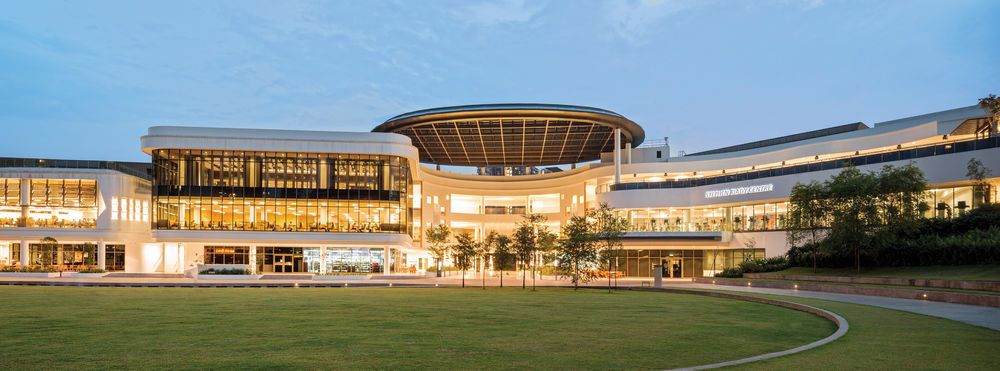
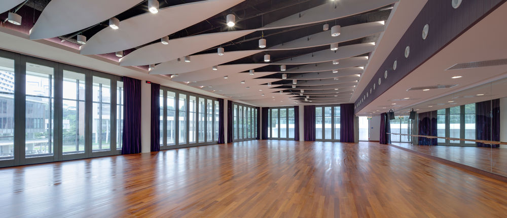
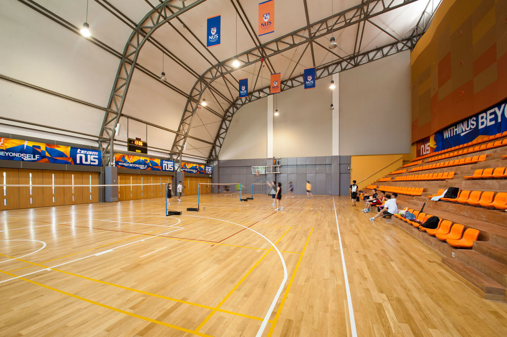
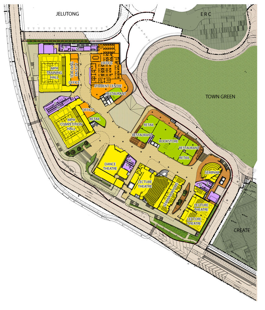
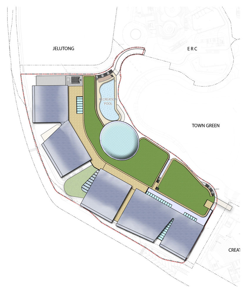
The Stephen Riady Centre is located on an angled site at the south-west corner of the National University of Singapore’s University Town. The centre faces the internal vehicular ring road and aims to establish a strong identity for the university while addressing the catchment from the central pedestrianised town green area. The client’s brief called for a landmark building which would house the most diverse group of users on the campus together – sports, education, dance and administration departments. With 21,600sqm of space for students, a plethora of facilities have been provided, including a student centre, sports halls, theatres, offices, shops and a restaurant on the first storey; a gymnasium, music practice rooms and classrooms on the second storey and a swimming pool, music library and multi-purpose hall on the third storey.
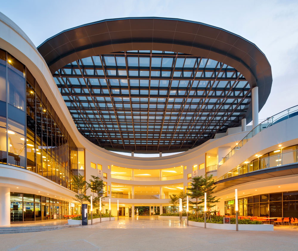
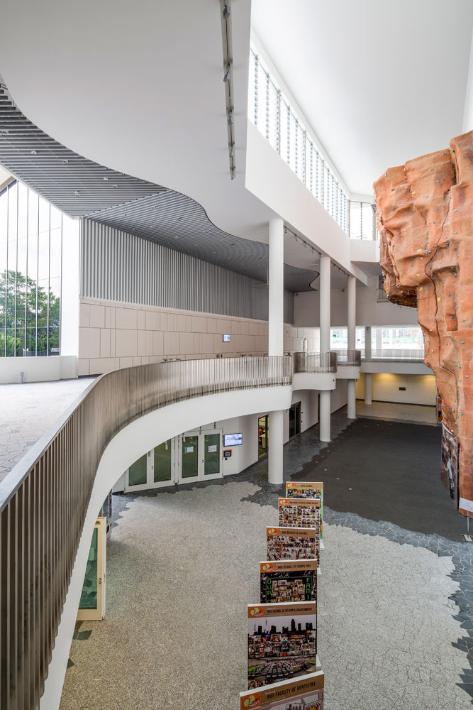
Previously a golf club with several old trees, the nature of the site drove the evolution of the design proposal. Respectful of the scale of the town green, a simple three-storey volume was adopted. The centre offers an open, inviting campus passage on the ground plane, accessible by all. The central space has been carved out to create an area for congregation, or forum, that connects the various functions designed on the ground plane – a modern take on the ancient Roman place of gathering and discourse. The internal space was further defined by two main circulation spines. At the intersection of the spines, the forum has been shaped to encourage meeting, interaction and discussion. It not only offers an area for temporary exhibitions, events and concerts, but also facilitates direct pedestrian connections with the town green.
DESIGN PROCESS
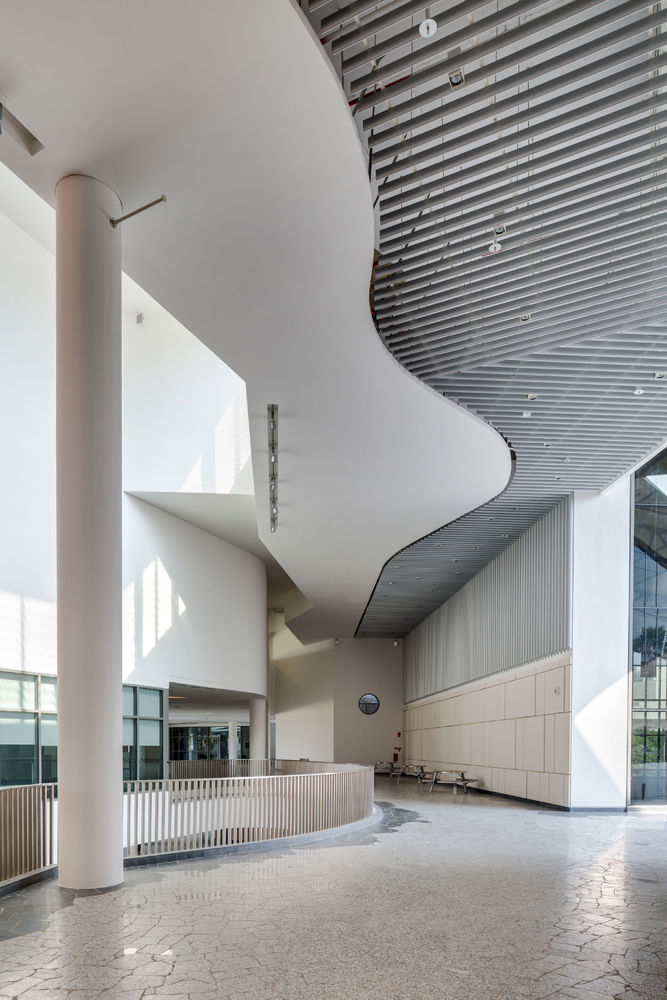
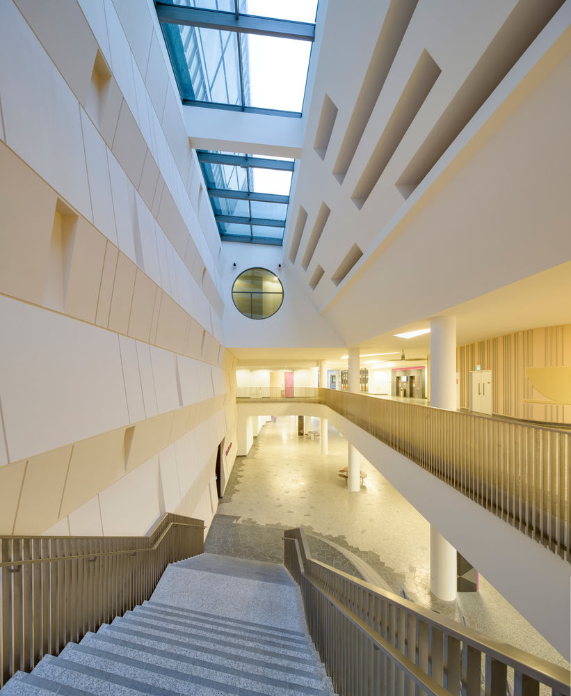
The architectural team started with the notion of ‘Pedagogy’ – learning no longer needs to be confined to classrooms and may even occur in open, incidental spaces. To achieve this, the team started by looking at the lie of the land. The site sloped gently down to the west and connectivity to the neighbouring buildings was at a higher level than the site’s base level – roughly equivalent to L2. Rather than fight against this level difference, the team decided to embrace it, creating a stack of three interlinked ‘highways’ through the building. They allow seamless entry from all external levels into the building and easy dispersal of pedestrian traffic within the building itself through a series of generously proportioned atria. The various functional elements of the building were plugged into this series of highways, along with a multitude of intimate breakout spaces generally located in close proximity to the atria. This allows students to get a view of activities happening across the building and encourages interaction. This design favours spontaneous learning in the classroom as well as in public spaces. The generous landings of the stairs have been shaped to foster meet-ups and consultations. Natural air and light fill the exposed interior spaces while from the outside, visitors are treated to scenes of the centre kept abuzz with movement and student activity.
SUSTAINABLE DESIGN
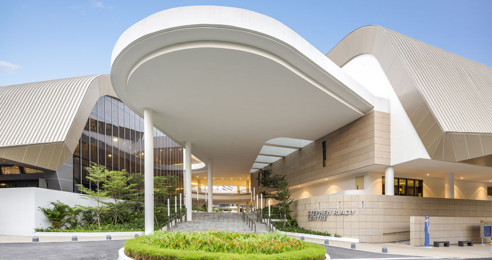
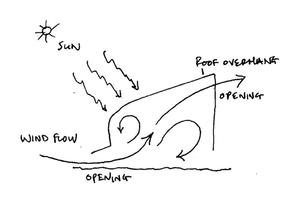
A blend of architectural and sustainable strategies was adopted to effectively reduce the impact on the site. Inspired by the longhouses of Sarawak in East Malaysia, the sloped aluminium roof with a substantial overhang provides shade to reduce solar loads.
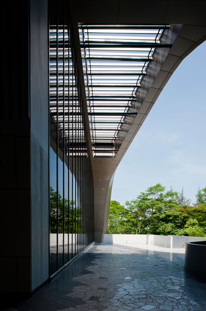
The sports halls on the first floor also adopt a similar architectural and environmental strategy. Facing the west is a large roof with a long overhang that descends to a low level, warping downwards and doubling up as the façade. The overhanging roof also ensures that the walkways are protected from heavy rainfall and hot tropical sunshine yet remain porous for ventilation. The overhang of the roof addresses the sun on the west side to reduce the strongest solar gain. The glazed north and south façades provide views and allow light to stream into the building, decreasing overall energy consumption. The building’s openings are aligned to prevailing wind directions to maximise natural airflow along the walkways. 55 percent of the areas in the building are not air-conditioned, substantially reducing the energy used for building operations.
INTERIOR SPACES
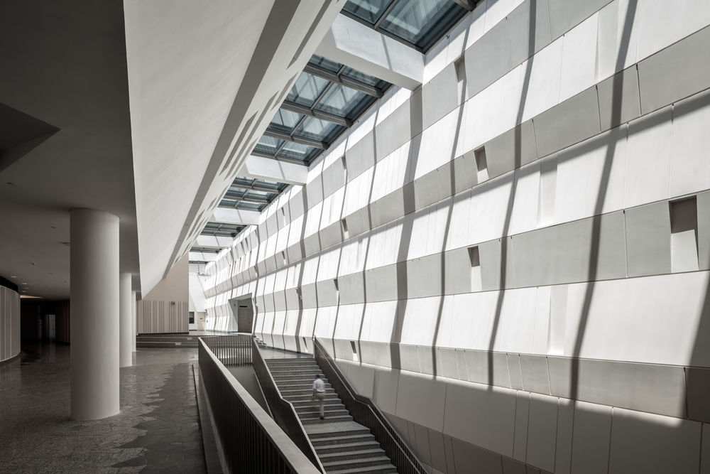
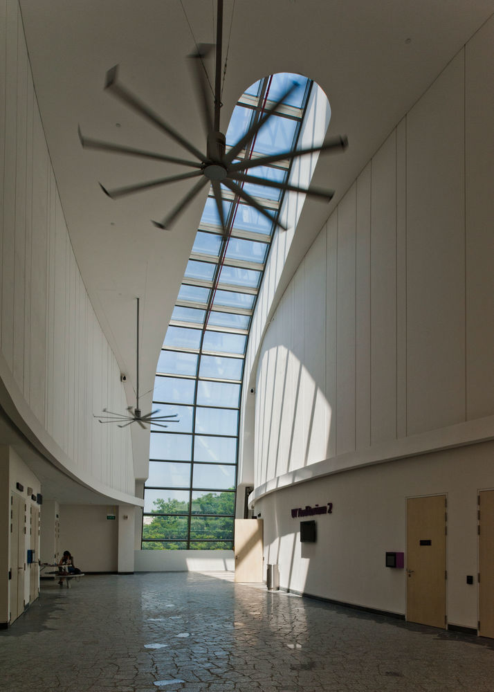
Another unique feature in this project is the undulating wall that serves as a dynamic backdrop for ceremonies – an interesting design combining light and shadow, colours and movement. The wall generates different patterns as the sun moves through the day, creating a continually changing appearance. The materials of the interiors were also meticulously chosen to support and help embody the design idea. For example, random-paving patterns were used for the flooring to reflect the dynamism of the space.
The roof has five large glazed skylights, and these generous openings serve as lungs that filter natural light beautifully into the space. They also provide direct connectivity with the outside world by showcasing the changing intensity and colour of the sky.
By utilising spatial strategies, the Stephen Riady Centre employs an architecture which strives to create a more spontaneous and intimate learning environment both responsive and sensitive to its environment. It offers students opportunities for discovery and interaction within a diverse array of dynamic spaces.
