项目概况 | Project Overview
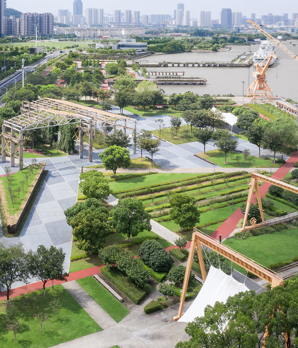
项目位于北京市北五环外,立水桥地铁站以东600米处,周边居民较多,而离项目地块最近的住宅则只有一路之隔,可以说是“楼下的公园”。
The project is located outside the North Fifth Ring Road of Beijing, 600 meters east of Lishuiqiao Metro Station, with many residents in the surrounding area, while the nearest residence to the site of the project is only one road away, which can be said to be “the park downstairs”.
▼公园鸟瞰图,bird-eye’s view of the park
项目为带状公园,因使用度不高,景观内容破损较多,需进行改造提升。种植方面,因场地现状的层次搭配较好,只需适量增加色叶植被以丰富整体色彩,沿路加设花境式植物组团,亲近游人,提升品质。
The project is a Linear Park, and due to low usage, the landscape contents are damaged which need to be renovated and improved. In terms of planting, because the current hierarchical collocation of the site is good, it just needs to add appropriate colored leaf vegetation to enrich the overall color, and add flower type plant groups along the road, to be close to visitors, and improve the quality.
▼公园鸟瞰局部,增加色叶植被以丰富整体色彩,partial bird-eye’s view of the park, adding appropriate colored leaf vegetation to enrich the overall color
前提思考 | Premise Thinking
改造项目最含糊的是我们究竟要做多大动作,是要面面俱到标新立异,还是局部发力点到为止。改造项目和新建项目的本质不同是新建项目从零起跑,属于“创办”;而改造项目更像是接力赛,要保留原状可取之处,“延续”场地记忆。“楼下的公园”就像儿时院外的小河,我们捉鱼的记忆永远在那。而作为设计者,能够让充满回忆的场地尽可能得到延续,是为他人留下的宝藏,也是送给我们自己的嘉赏。
The vaguest thing about the renovation project is what kind of action we are going to do, should we be innovative in every aspect, or should we focus on some areas and stop at where it should. The essential difference between renovation project and new project is that the new project starts from scratch and belongs to “founding”; while the renovation project is more like a relay race, which needs to preserve the original advantages and “continue” the memory of the site. “The park downstairs” is like a small river outside the yard when we were children, and our memories of catching fish are always there. And as designers, being able to make the site full of memories last as long as possible is a treasure for others, as well as a reward for ourselves.
▼改造后公园的功能分区,the programming of the park after renovation
设计定位 | Design Positioning
设计之初的第一次现状考察,印象最深的是全园95%的人群都集中在篮球场区,而篮球区面积只占全园1/20,这对于城市公园而言是严重的功能失衡。所以我们设计的重点是要让其余区域的使用度提高,补充缺失的功能景观,使周边居民能够享受到实实在在的便民福利,增加人民生活的幸福指数。
In the first investigation of the current situation at the beginning of the design, what impressed us most was that 95% of the people in the park were concentrated in the basketball court area, while the basketball court area occupies only 1/20 of the whole park, which is a serious functional imbalance for urban parks. Therefore, the focus of our design is to increase the use of the rest areas, complement the missing functional landscapes, enable surrounding residents to enjoy real convenience benefits, and increase people’s happiness index.
▼公园鸟瞰图,bird-eye’s view of the park
设计解读 | Design Interpretation
公园项目几乎必备的是有一条能环起来的路,供人们饭后遛弯、健身慢跑等等。设计将现状未形成的环路系统进行优化,增加一条道路连接构成“8”字环路,将原路面拆除1.5米宽变为塑胶跑道,增加了人们对道路系统的使用率。项目可活动空间最大的两个区域一是篮球场,二是中心的混凝土平台,和塑胶跑道共同组成三大流量区。
What is almost necessary for a park project is a path that can be circled, allowing people to take a walk after meals, jogging, etc. The design optimizes the existing unformed loop system, adding a road connection to form the “8” ring road, and removing the original road surface 1.5 meters wide into a plastic runway, which increases the use of road system. The two areas with the largest movable space in the project are the basketball court and the concrete platform in the center, which form the three flow zones together with the plastic runway.
▼公园内的塑胶跑道,增加了人们对道路系统的使用率,the plastic runway in the park, increasing the use of road system
▼塑胶跑道旁设有座椅,arranging seatings along the plastic runway
篮球场有一处混凝土圆台,曾是水景设计,因为造价问题而夭折。此处空地该如何利用?从功能出发,需要为篮球爱好者营造一处临时避雨空间,同时也为“篮球家属”提供一处等待观看的休息区。廊架顶部故意压低,一是比例关系需求,二是由内向外营造景框效果。廊架做镜面材质,是为了尽量消隐它的存在,让廊架显得更加轻盈通透,同时镜像特性也能让有限的廊下空间变得更加开阔。除5根承重柱以外,多根不同间距的细柱组合是为了与背景树干形成“视觉混淆”,弱化树干,以免突兀。细柱的半围合处理,也是让人们在心理上对廊架有种空间的归属感。
▼篮球场中的廊架,不仅为篮球爱好者营造了一处临时避雨空间,同时也为“篮球家属”提供一处等待观看的休息区,the gallery on the basketball court, creating a temporary shelter from the rain for basketball lovers and a waiting area for the “basketball family”
▼镜面廊架结构,structural diagram of the gallery
There is a concrete round table on the basketball court, which used to be a waterscape design, but died because of cost problem. How should the space be used? From the perspective of function, it is necessary to create a temporary shelter from the rain for basketball lovers, and also provide a waiting area for the “basketball family”. The top of the gallery is deliberately lowered. Firstly, it is the need for proportional relationship, and secondly, it is to create a frame effect from the inside out. The mirror surface material is used for the gallery frame to eliminate its existence as much as possible, make the corridor more light and transparent, and at the same time, the mirror image can also make the limited space under the gallery more open. Except for 5 bearing columns, the combination of several thin columns with different spacing is to create “visual confusion” with the background trunk, so as to weaken the trunk to avoid being abrupt. The semi – enclosing treatment of thin columns is also to make people feel a sense of belonging to the space of the gallery.
▼廊架,使用镜面材质以尽量消隐自身的存在感,从而使其显得更加轻盈通透,the gallery, using the mirror surface material for the gallery frame to eliminate its existence as much as possible, making the corridor more light and transparent
▼从廊架向外看,多根不同间距的细柱组合与背景树干形成“视觉混淆”,弱化树干,viewing surroundings from the gallery, the combination of several thin columns with different spacing is to create “visual confusion” with the background trunk, weakening the trunk to avoid being abrupt
▼篮球场,the basketball court
在场地边缘添加简易衣架,提供便利。考虑到篮球运动的激烈特性,故将衣架的挂钩朝向绿地,以免人们在快速对抗中被挂钩意外戳伤。将篮球场南侧2米路拓宽5米加设一排健身器械,同时保留现状海棠以划分通行和健身区域。
Simple hangers are added to the edge of the site to provide convenience for people. Considering the fierce nature of basketball, the hanger’s hooks are turned towards the green land to avoid people being accidentally stabbed by the hook in the fast confrontation. The 2-meter road to the south of the basketball court is widened by 5 meters, and a row of fitness equipment is added, and at the same time, the existing crabapple is retained to divide the traffic and fitness area.
▼在场地边缘添加简易衣架,通过海棠来划分通行和健身区域,adding simple hangers to the edge of the site, and the existing crabapple is retained to divide the traffic and fitness area
中心混凝土平台无一人使用,曾作为儿童区设计,同样因为造价问题夭折。考虑到周边居民较多,对儿童场地的需求很大,我们决定将此区域完成曾未实现的儿童主题空间。儿童场地的分布为上下两层空间,塑胶地面全覆盖。上下两层过渡空间的斜坡增加滑梯及攀爬设施,为了避免儿童从上层空间意外跑过滑落,因此设置一组长条坐凳对上下层进行空间划分,同时也为家长提供休息功能。
The central concrete platform is empty, which was designed as the children’s area, but also died because of the cost problem. Considering the large number of surrounding residents and the great demand for children’s field, we decide to design this area as a children’s theme space that had not been realized before. The children’s field is divided into upper and lower space, which is fully covered with the plastic floor. We add slide and climbing facilities on the slope of the upper and lower transition spaces. In order to avoid children accidentally run through the upper space and slip, a group of long benches is set up to divide the upper and lower space, which also provides rest for parents.
▼上下两层过渡空间的斜坡增加滑梯及攀爬设施,adding slide and climbing facilities on the slope of the upper and lower transition spaces
上层空间通过一条黄色弧线将南北贯穿,弧线两侧包含跳房子、秋千、跷跷板、爬坡小品、转盘等多种儿童设施。但因理想的成品设施价格过高,最终将跷跷板取消变为“立定跳远”地面喷涂,秋千则只能选择廉价产品。置换半球状的爬坡小品,为了保持原平面关系不变,将四个大小不同的爬坡小品改成了梅花桩式的不锈钢圆柱组合。考虑到不同年龄段儿童的身高差,故将四组圆柱的尺寸设计成四种级别。两个转盘设施也需要降低成本,因为不想改变旋转玩法,所以和施工方共同研制了一款全新的原创设施。从儿童及家长的参与度来看,新设施甚至要高于原产品的使用人气。此外,还在上层空间边界的矮墙加设座椅,给家长提供休息空间。
▼上层空间通过一条黄色弧线将南北贯穿,the upper space is traversed north and south by a yellow arc
The upper space is traversed north and south by a yellow arc, the both sides of which include house jumping, swing, seesaw, climbing objects, turntable and other children’s facilities. However, due to the overpriced ideal finished facilities, the seesaw is eventually replaced by “standing long jump” ground spraying, and the swings are cheap products. The hemispherical climbing objects are displaced, and the four climbing objects of different sizes are changed into quincuncial piles type stainless steel cylinder combination in order to keep the original plane relationship the same. Considering the height difference of children of different ages, the size of four groups of cylinders is designed into four grades. The two turntable facilities also need to reduce costs, as we don’t want to change the rotation, we have developed a brand new original facility together with the construction party. In terms of the participation of children and parents, the new facility is even more popular than the original. In addition, add seats to the low wall of the upper space boundary to provide rest space for parents.
▼四种尺寸的梅花桩式不锈钢圆柱组合,the quincuncial piles type stainless steel cylinder combinations in the four grades
▼转盘设施,the turntable facility
下层保留现状水泥管,将水泥管外部不理想的涂鸦图案用灰色涂料覆盖,重回水泥管的原生外观,避免与大环境喧宾夺主。内部分别涂上红黄蓝三色,感受不同的视觉冲击。
We retain the existing cement pipes at the lower space, and cover the cement pipes with gray paint for the less-than-ideal graffiti pattern on the outside, so as to return to the original appearance of the cement pipes, and avoid distracting them from the environment. The interior of the cement pipes is painted with red, yellow and blue respectively to feel different visual impact.
▼下层儿童场地,保留现状水泥管,将水泥管外部不理想的涂鸦图案用灰色涂料覆盖,the lower space of the children’s field, retaining the existing cement pipes and covering the cement pipes with gray paint for the less-than-ideal graffiti pattern on the outside
▼水泥管内部,彩色造成视觉冲击,interior view of the cement pipes, different colors create different visual impacts
现状混凝土墙面破损严重,若翻新涂料,久之仍会开裂,故设计翻面墙予以覆盖。但因造价问题,经过三方协商,翻面墙最终只留下3.6米,剩余墙面调整为锈钢板装饰。在施工过程中发现角磨机在钢板上留下的痕迹很有趣,便用角磨机在现场创作随机“乱线”,是一次图纸之外的尝试。
▼采用锈钢板装饰的翻面墙,the inverted wall with rust steel plate decoration
The existing concrete wall is badly damaged, and if it is renovated with paint, it will still crack for a long time, so we design the inverted wall to cover it. However, due to the cost problem, after tripartite negotiations, there is only 3.6 meters of inverted wall left, and the rest of the wall has been adjusted to rust steel plate to decorate. During the construction, we found that the marks left by the angle grinder on the steel plate were very interesting, then we used the angle grinder to create random “random lines” on the site, which was an attempt beyond the drawing board.
▼在林间小路两侧随机散置异形坐凳,是功能和艺术的兼容,randomly place irregular benches on both sides of the forest path, which is the compatibility of function and art
▼总平面图,site plan
▼篮球场及儿童区平面,plan of the basketball court and children’s field
项目名称:华茂绿线北园改造
设计方:北京市园林古建设计研究院YWA严伟风景园林工作室
设计时间:2018年11月
竣工时间:2019年11月
设计团队:王维琦、殷小娟、曹悦、黄通、刘一雄、王超
结构设计:王初旭
项目地址:北京城建N次方西侧
景观面积:3公顷
摄影:王维琦
Designer: YWA Landscape Architecture, Beijing Institute of Landscape and Traditional Architectural Design
Design Time: November 2018
Completion Time: November 2019
Design Team: Wang Weiqi, Yin Xiaojuan, Cao Yue, Huang Tong, Liu Yixiong, Wang Chao
Structural Design: Wang Chuxu
Project Address: West side of Beijing Urban Construction Nth Power
Landscape Area: 3 Hectares
Photographer: Wang Weiqi
{{item.text_origin}}

