----------------------------------------------------------------------
In Beijing, Kokaistudios’ overhaul of The Opposite House lower ground-level space has resulted in fully flexible multifunctional event space, Commune. In keeping with the property’s original design language of a traditional Chinese courtyard home, and taking inspiration from the adjoining sunken garden, the team extended these established motifs to create distinctive areas throughout. Adaptable thanks to folding doors and glass partition walls, the 756 sqm area, which includes a surrounding corridor, can be configured in multiple ways for events of all types and sizes, opening up new possibilities for this most prestigious of hotels.
The Opposite House invited Kokaistudios to transform a lower ground level restaurant area and corridor into Commune, a multifunctional events space for eventsand gallery alike. For maximum adaptability, the main space can be divided into two distinct function rooms, linked by sliding doors to allow for various configurations. Largely neutral save for key features that combine design and functionality - a sculptural ceiling with hidden hanging systems, for example - it can be readily adjusted and aligned according to client specifications. Already connected to Neri&Hu’s existing Space - Studio and with multiple access points to the hotel’s courtyard, central lift lobby, and the adjacent shopping mall – TaiKoo Li Sanlitun, Kokaistudios’ renovation builds new layers into the space, and resonates with the property unmistakable design approach.
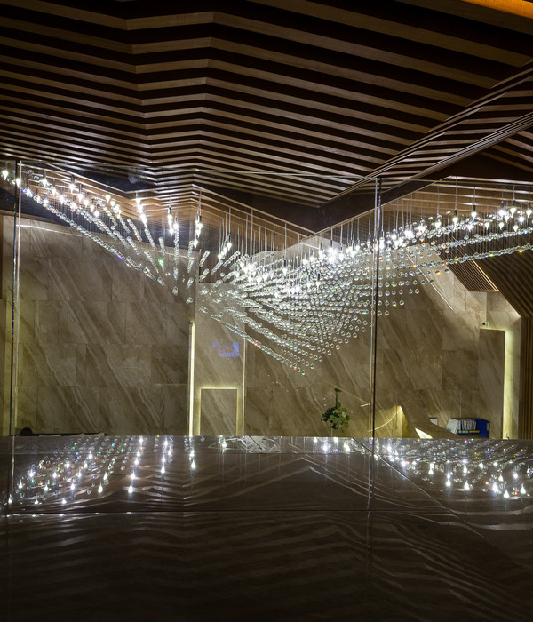
Imagined as a Pavilion and accessed through the hotel’s sunken garden, the main space visually connects with its environs through terrazzo paving slabs. With original glass facade on its north-facing side affording plentiful daylight, an open ceiling structure implies height to further extend and brighten the space. Comprising some 2,355 crosswise wood pieces, the installation is as functional as it is intricate: concealing systems including track lighting and sprinklers, it also features hooks for the hanging of photographs, posters, and other event collateral. Midway, a series of sliding partition doors create a foldable partition wall, allowing the transformed space to be divided into two different size spaces respectively. Another set of folding doors is installed at its far end of gallery to conceal or reveal a ceiling-height LED screen.
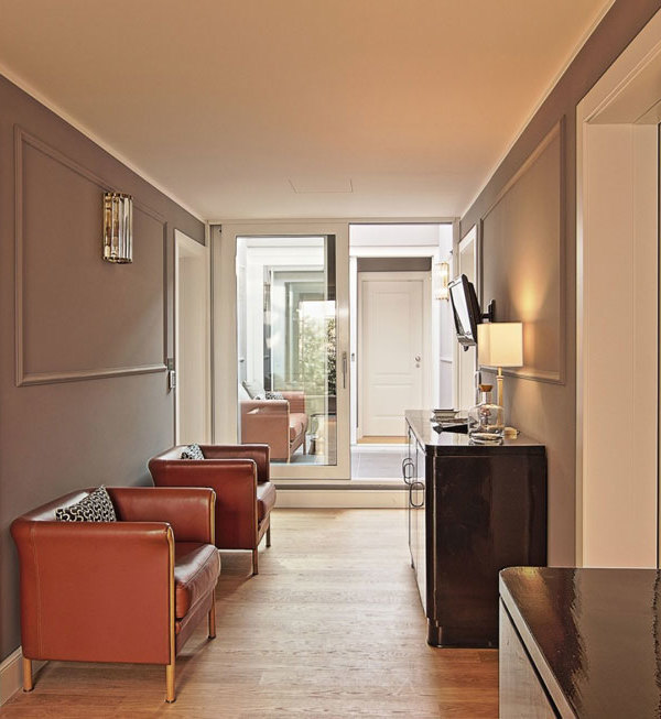
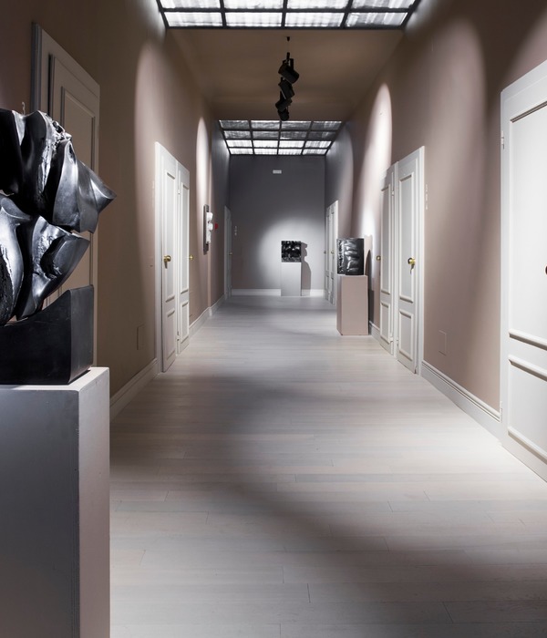
On its East and South sides, the main space is flanked by a multifunctional corridor. With minimalist, neutral wooden blocks doubling as a welcome desk; and elsewhere, as occasional tables punctuating simple stepped seating, the area hosts small-scale showcases; is as a reception, waiting, and breakout area; and primary access point for the main space. Now enlarged slightly, and framed with warm and inviting brass-finish stainless steel, the striking doorway becomes a focal point of the entire basement level.
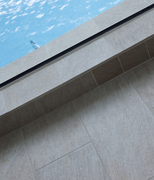
Maximizing natural light throughout the underground space was a particular priority. With this in mind, a glass partition separates the corridor area from the main space. Etched with a lattice design to echo the hotel’s striking facade, and semi-opaque for privacy, the material also creates a tantalizing evening-time glow. Glass also characterizes one of Kokaistudios’ most significant architectural interventions of the project: replacing the closed wall that stood before, a window looking down onto the hotel’s subterranean swimming pool now runs along the corridor’s outward-facing south side.
Further extending the design concept of a traditional Chinese garden, the bathrooms mark an abstract take on a grove of Bonsai trees. Spacious, and finished in warm brass tones, plant pot basins topped by mirrors lend a playful touch.
A fully flexible area to cater to a range of function types and renovated with neutrality in mind, Kokaistudios’ lower ground level event space brings new possibilities to The Opposite House hotel. At the same time, the Chinese garden-inspired concept nods to the property’s celebrated design legacy. A contemporary take on time-old traditions, Commune marks a sensitive, adaptable, and above all, practical upgrade to a modern icon of Beijing.
Project name: Commune at The Opposite House
Location: Beijing, China
Interior Area: 756sqm
Sunken Garden Area: 327sqm
Date of completion: July, 2020
Client: The Opposite House
Interior Design: Kokaistudios
Chief Designers: Andrea Destefanis, Filippo Gabbiani
Design Managers (alphabetical order by last name): Chang Qing, Ada Sun, Suzy Zhang
Design Team (alphabetical order by last name): Vivian Fang, Alex Jiang, Senny Wong
Photography: Dirk Weiblen
Text: Frances Arnold
{{item.text_origin}}

