小仙炖鲜炖燕窝是在新消费背景下强势发展的中式滋补新品类。作为品牌首家线下体验店,小仙炖邀请擅长品牌体验设计的立品团队操刀。立品在项目前期做了大量的市场调研,试图在基于消费和体验习惯的逻辑下建立更多元的体验模式。项目选址北京华贸商圈的核心商业地段,比邻 SKP 购物中心,由一栋三层高的旧商业建筑改造而成。设计师利用 U 型玻璃对整体建筑进行包覆,打造均一的外立面表皮,再置入多媒体动态灯光,呈现白里透红的灯光效果,在商圈场景中形成带有品牌宣传意义的可视媒介。
XFSEBN promotes a brand-new Chinese style nourishing product, which is growing fast in the Chinese market. As the first offline store, and experience center, XFSEBN has entrusted its design to Leaping Creative, reputed for its competence in retail brand experience design. Leaping Creative aims to establish a diverse experience mode with logic, based on its prior market investigations on customers’ consuming habits and experience expectations.The project, renovated on an old three-storey commercial building, occupies a select area within China Central Place CBD, Beijing, neighboring the luxury shopping center SKP. For its enclosing surface, the designers apply U-type glass to create a continuous vertical profile. In the channels of the U-type glass sheets, a dynamic lighting system is installed to produce a peaches-and-cream luster, achieving a visible brand-promotion effect.
▼外立面动态灯光效果,Lighting color gradient of the enclosing membrane©黄早慧
以当代表达对东方滋补文化进行焕新,应当探寻当代语境下形式与材料之间的关系。燕窝口感清润顺滑,素有让肌肤白里透红的滋补功效。设计师借此提炼出“清透”“流动”的设计语言,以白里透红为空间底色,结合不同材料的运用赋予空间新的秩序。
To innovate Chinese regimen culture in a contemporary way, we seek to probe into a new relationship between material and form. Inspired by the mild smooth and soothing taste of bird’s nest soup and its nourishing effects in producing a peaches-and-cream complexion, the designers adopt “translucent” and “flowing” to express their design ideals, aiming to endow various building materials with new spatial representations.
室内氛围概览,overall of interior©黄早慧
在空间内部,利用玻璃营造通透的场域效果,一方面,弱化层高带来的影响,另一方面,基于燕窝的清润顺滑形成新的肌理。立品通过对不同材料的对比研究,从材质形态本身找到与燕窝一样温润而柔软的基底,选用具备拉丝效果的人造石构成白色曲线墙面,与模拟燕窝拉丝状态的亚克力柱子共同给人强烈的品牌包裹感。一层接待区柜台正好被一根巨大的柱体插入,采用亮面波浪形态金属包覆后,柱子被赋予了雕塑感,打破了空间的秩序,形成有趣的反差。
▼概念示意图,concept diagram©立品设计
Glass is employed for interior decoration, creating a translucent domain, on the one hand, to soften the oppressive impact of the height, on the other hand, to emulate the moist and smooth tissue of bird’s nest soup.In order to create a sense of bird-nest like feeling, after many testing, designers from Leaping Creative choose the translucent white dupont corain, which are largely used to shape the seamless curvy and continuous wall throughout the 1th floor.A huge column is taking the central stage of the reception counter. The corrugated metals are used to render the column into a sculpture, making an intriguingly contrasting in this area.
▼入口区域利用玻璃营造通透的场域效果,Glass is employed for interior decoration, creating a translucent domain©黄早慧
一层接待区,Reception counter on the first floor©黄早慧
同样以玻璃材质打造的燕窝冰库,成为整个空间的核心张力,将品牌强调的“鲜”这一理念进行可视化传达,通过重叠、对称等设计手法,让空间在这里得到无限延展。
As the heart of the interior space, the refrigerant area made of glass has incorporated the brand concept “freshness” in its designs to ensure the best nourishing effects. With overlapping and symmetric details, the design accents infinite space expansion.
冰库,Refrigerant area for bird’s nest ©黄早慧
透明屏实时更新冰库温度,Real-time updating of temperature on a transparent screen©黄早慧
▼冰库内部,An interior view of the refrigerant area©黄早慧
围绕核心单一产品延展出一个完整丰富的体验动线,设计师在产品展示的基础上加入知识科普和文化再现模块,打造沉浸式的体验空间。一层空间主要以品牌零售为主,通过屏幕互动、产品展示以及售后服务等形式,向消费者展示完整的品牌线下销售空间形象。
Since there is only one product category, the design team has included a module for scientific knowledge and culture in addition to product display area, boosting an immersion experience for customers. The first floor is founded as a retail store for the touchscreen interaction, product display and after-sales service areas, which composes a space for a holistic offline image.
燕窝产品交互体验区,Interactive experience area of bird’s nest products©黄早慧
售后服务区,After-sales service area©黄早慧
▼人造石构成的白色曲线墙面,White curvilinear walls made of artificial stone©黄早慧
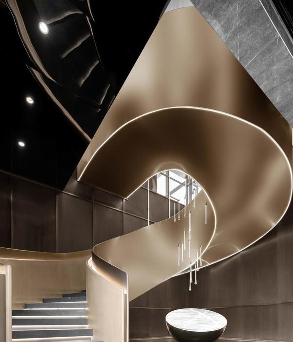
楼梯,staircase©黄早慧
楼梯扶手细部,Details of the staircase©黄早慧
人的探索欲需要被不断激发。立品在二层空间置入文化再现的场景表达,还原金丝燕生活的燕洞、热带雨林及现代燕屋虚拟场景。在表达手法上,如何平衡具象和抽象之间的关系?燕洞位于整个体验动线的入口处,以粗砺的岩洞结合金属材质,同时实现原始力量感和现代感。
In order to arouse customers’ curiosity, on the second floor, Leaping Creative implanted a cultural scenario to simulate the living conditions of swiftlets, including their caves, rainforest and modern swiftlet houses. What expressive methods are employed to bridge the abstract-concrete gap? Take the bird’s cave area for example, the entrance is fashioned after a bird’s cave with rough sand grains and metals on the curvy wall, so as to create a perfect tone of power and modernity.
层燕洞入口,Entrance to a bird’s cave simulation area on the 2nd floor©黄早慧
二层燕洞区,The bird’s cave simulation area on the 2nd floor©黄早慧
雨林区的营造更符合当下人们拍照打卡的习惯,由 Seen Vision 呈现的互动影像画面投射在若隐若现的纱幕上,人一旦经过,纱幕上群鸟飞舞,让人仿佛置身于热带雨林之中。
On the second floor, a rainforest area is simulated to cater to the netizens’ needs for moments snaps. An array of gossamer screens are arranged to receive interactive images projection from Seen Vision. Once a visitor passes the screens, a myriad of birds on them would flutter their wings as if experienced in a rainforest.
二层雨林区动态,Tropical rainforest simulation area on the second floor©黄早慧
体验的后端是品牌现代燕屋的虚拟装置和场景展示,到这里,关于品牌现代化工艺创新理念的表达逐渐清晰。联手 Discovery 打造的燕窝溯源纪录片被设置在体验的终端,通过真实的镜头、动人的叙事展现中国燕窝文化,带领人们进入另一层品牌文化感知的场域,并形成一种有力、持续的回响。
At the end of the experience journey, the customers would visit a modern swiftlet house and a processing scenario (both are simulated). Till that moment, a clear concept of the brand’s modern innovated processing technique would have been acknowledged. The designers set up a video area to display the video co-produced with Discovery Channel, by showing Chinese bird’s nest culture with authentic pictures and appealing narration, which enhancing a more powerful and enduring brand impression.
▼Discovery 燕窝溯源纪录片观影区,Video room playing the documentary of bird’s nests culture co-produced by Discovery Channel©黄早慧
三层空间承载燕窝品鉴和聚会功能,在白里透红的底色上引入亮眼的墨绿,带来不一样的空间印记。VIP 区与水吧区之间设置了隐形推拉隔断,可独立成为更私人的活动场地,举办围绕滋补文化展开的美学活动。
The third floor functions as an appreciation and partying area. Upon the peaches-and-cream basic tone, the designers introduce a brisk dark green for a change and for a distinct spatial impression. An invisible sliding partition stands between the VIP area and the water bar, enclosing a space for more private aesthetic activities.
▼三层空间承载燕窝品鉴和聚会功能,The third floor functions as an appreciation and partying area©黄早慧
▼亮眼的墨绿带来不一样的空间印记,brisk dark green for a change and for a distinct spatial impression©黄早慧
设计师在 VIP 区墙面设置开窗,巧妙地利用外立面的玻璃幕墙与内部开窗的关系,引入自然光线,玻璃隔断隐喻燕窝晶莹剔透、富有颗粒感的肌理,共同形成一个半围合空间,给人舒适的愉悦感。
三层接待区,Reception counter on the third floor©黄早慧
VIP 水吧区,VIP water bar©黄早慧
三层 VIP 区,VIP area on the third floor©黄早慧
为了更贴合燕窝的独特肌理,立品前期对不同材料的颜色和透光性进行研究。材与质之间,我们更注重“质”的表达,光的引入,增加了材质的温润质感,模拟燕窝给人的直观感受。即便在施工现场,我们仍然反复试验,对比不同材质,找到最接近“白里透红”的颜色变奏。
In order to better represent the distinctive texture of bird’s nest, Leaping Creative has studied different materials on luster and translucency, aiming to represent the direct visual impact of the product–soft, smooth and moist. Such contrasting is still performed on site, to find the most nicety cream-to-peaches color in a real scenario.
材料及白里透红颜色打样对比,Material samples and peaches-and-cream proof samples©黄早慧
随空间动线转换,设计师用不同的材质和肌理进行细节强调,通过折线的铺排、几何线条的特定组合,延续着空间的张力。树脂玻璃墙面模拟燕窝流动形态,在灯光和自然光线之下,暗喻燕窝的清透质感,赋予空间柔和之美。
In different spatial parts, details are accentuated by materials of different features and textures. The space seems to be infinitely expanding with the parallel fold lines and other crafty arrangement of geometric lines. Plexiglass wall simulates the flowing state of bird’s nest soup, highlighting its translucent texture, viewed especially under the lighting system.
空间细部,Details in space management©黄早慧
▼材料细部,Details in material©黄早慧
立品沿用一种非符号化的语言致敬传统,通过材质与色块的整体性表达空间张力,光影变幻、多媒体互动设计、不同材质之间的碰撞,带来节点性的体验变奏,与此同时,品牌想极力传达的关键词,与空间叙事相得益彰地演绎。
Leaping Creative, as always, employs a contemporary language to express tradition culture. We design the space by using different textures and stressing distinctive colors. Through shifts of light and shades, multimedia interaction and contrasts of different materials, showing a delicate and immersive experience space. Meanwhile, the key concepts of the brand are conveyed in our unique spatial expressions.
▼空间轴测图,axonometric diagram©立品设计
项目名称:小仙炖鲜炖燕窝北京旗舰店
项目地址:中国 北京
设计总监:郑铮 Zen
设计策略:陈常 CC
主案设计:陈晓雯
空间设计:张一璇、杨鹏辉、黄钦为
互动体验及展陈设计:曾敏冬、李因杰、罗紫君
动态视频制作及店内导视设计:纪喆铭、吴嘉纯
施工监理:陈李伟
材料经理:余柏泉
项目经理:荆盈莹
特别鸣谢 项目客户:小仙炖鲜炖燕窝
动态视觉设计:Seen Vision Studio
项目摄影:黄早慧
Project Name: Xiaoxiandun Fresh Stewed Edible Bird’s Nest((XFSEBN)-Beijing Flagship Store
Project Location: Beijing, China
Design Director: Zen Zheng
Design Strategy: CC Chen
Chief Designer: Chen Xiaowen
Space Designer: Zhang Yixuan, Yang Penghui, Huang Qinwei
Interactive Visitors Experiences & Exhibit Design: Zeng Mindong, Li Yinjie, Luo Zijun
Video Effects & Interior Space Guidance Design: Ji Zheming, Wu Jiachun
Project Supervisor: Chen Liwei
Materials Manage : Yu Baiquan
Project Manager: Jing Yingying
Acknowledgement Clients: Xiaoxiandun Fresh Stewed Edible Bird’s Nest
Dynamic Visual Effects: Seen Vision Studio
Project Photographer: Huang Zaohui
▼项目更多图片
{{item.text_origin}}


