China-based paint manufacturing company Anshan Naibang Chemical’s recent unveiling of their office building offers a glimpse into a different world — an interior that takes me back to my giddy kindergarten years when touring factories was fascinating. Wave.GB. gives an insight into the world of paint production, and one would find curiously colour inspiring.
Located in Tai’an County, Anshan City, Liaoning Province, Anshan Naibang’s facility concept was predominantly inspired by the conveyor belt often associated with factories and mass production. A white canvas and timber provided the base foundation for the interior, carried throughout the laboratory facilities.
However, the designers introduce or ‘inject’ a series of rainbow hues throughout the building to define programs within the space. After all, inside the 2,000-square-metre footprint, there are opportunities to provide office spaces, a cafeteria, and other communal areas.
On the ground floor, the heart of the headquarters is greeted by a circular reception desk dipped in red. Besides it looms a paint can from the original production line, deconstructed to puncture into the first floor above. The installation is retrofitted with a video animation of paint being pumped through the pipes protruding out of the can stretches across different spaces as a guide around the facility.
On the eastern end of the office, where the laboratory areas are clinically white and ornated with large and bold perforated ceilings, the use of interactive technology including colourful touchscreen walls and display cabinets still carries a similar sentiment of colour despite the clinically prescribed environment.
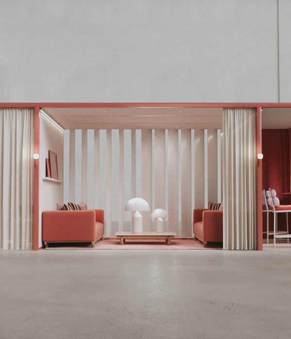
Though simple, the use colour blocking also serves as a clever methodology and signage for easy associations within the headquarters. Apart from the blood red in the reception, deep and lime greens and oranges offer warmth in the cafeteria area. Blue, pleasing to the eye softly signpost the staircase across the two storeys. Egg yolk yellow is used in the joinery in a conference room, fully lit by a brilliant skylight above.
Besides the walls and the vinyl flooring, furniture for coloured rooms shares the same shade. These include foldable partitions which allow a seamless colour transition for meeting spaces when they need to accommodate a larger audience.
The exhibition space, which technically is a corridor is left transparent to allow views of the overall facility serve as a backdrop while visitors appreciate the content exhibited.
While it can initially come off as kitsch, Wave.GB. balance the design detail with the fine ratio of white to coloured areas. Just like colouring within the lines, certain spaces that needed uplifting were seen as an opportunity, whereas those that are temporary were left in peace — ready for visitors to fill in the blanks of the narrative within.
[Images courtesy of Wave G.B.]
▼项目更多图片
{{item.text_origin}}

