项目概览
overview
项目名称:良正阀门
设计方:秋之圆设计
施工方:秋之圆装饰
项目地址:江苏,常州
施工面积:3000平方米
本项目面临着两个关键挑战:1.如何在两个月内完工。
2.开发一个有意义的体系结构来容纳生产设施,优化其功能并达成客户要求的匹配度。
外立面
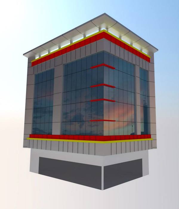
▼Exterior view of the factory
在大家的印象中,厂房和办公楼通常在建筑群体中是容易被忽视的一部分。它们往往采用最简单、最经济的建筑系统,很少提供丰富的空间体验。
秋之圆装饰在两个月内完成了室内空间的设计与施工,在原有房屋构架上最大限度的利用设计将工厂以及办公楼通过更好的展示方式将品牌的内涵传达给来访者。
Typically employing the simplest and most economical of construction systems, they offer few opportunities for rich spatial experiences or facade systems. In the project for Macjoy, a leading Chinese curtain walling company, MDO saw the chance to challenge this stereotype.
The design and construction of the building and interior space were completed in two months,in the original housing structure to maximize the use of design, the factory and office building through a better way to show the brand connotation to visitors.
入口大厅
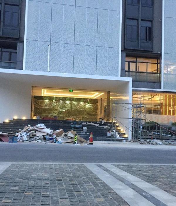
▼Office building entrance
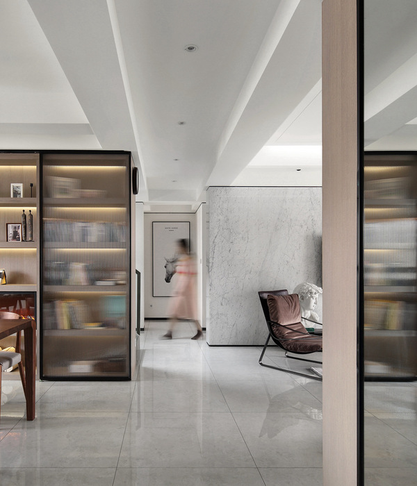
公司的发展,使得对新空间的需求也日益迫切。于是,新的生产大厅和行政大楼分期建成。与此同时保持企业内部的紧密联系仍然十分必要。在这样的理念基础上,该建筑的设计主旨便围绕保持公司内部的正常交流、员工间合适的物理距离以及视觉上的接触而展开。
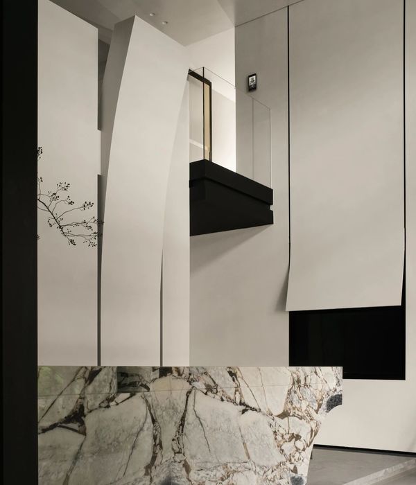
进门处的整体风格需要与公司理念氛围相融合。白色纹理的大理石地砖,四面实木质感的饰面材质,以及与环境融为一体的等候区,通过这样的排布方式,将室外光源透过挑高部分引入反射到室内空间,让整体效果更加充满韵律以及活力。
The overall style of the entrance needs to be integrated with the company’s concept atmosphere. White texture marble floor tiles, four solid wood texture facing materials, and the waiting area integrated with the environment, through this arrangement, the outdoor light source is introduced into the indoor space through the elevated part, making the overall effect more rhythmic and energetic.
公司理念与产品展区
▼Exterior view of the factory
本区域我们梳理展示了公司的发展历程与这些年的获得研发突破的历届拳头产品。白+蓝的整体色调不喧宾夺主,顶部灯光设计与异形展厅突出映射在研发产品上,整体参观流程沿着设计动线行进。
In this region, we have sorted out and displayed the company’s development history and the previous blockbuster products with R & D breakthroughs in recent years. The overall color of white and blue does not dominate. The top lighting design and special-shaped exhibition hall highlight the reflection on the R & D products. The overall visiting process goes along the design line.
研发区
▼R&D area
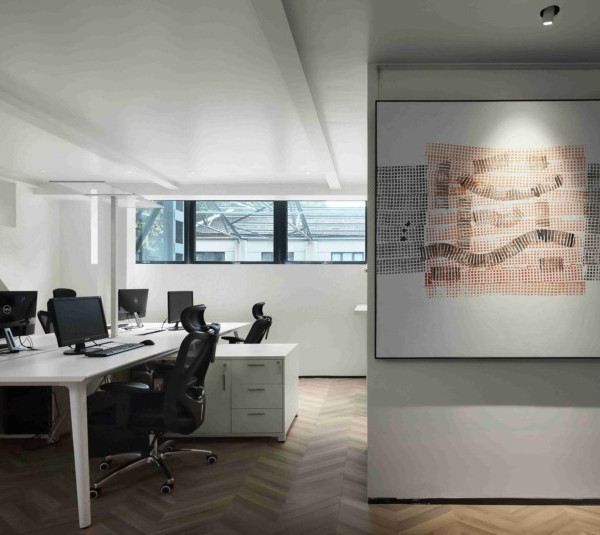
研发区域则需要更多的光源以及更为专业配合的布局。室内的墙地面使用专用建材进行翻新。室内空间的简单明朗。
The R & D area needs more light sources and more professional layout. The interior walls and floors are renovated with special building materials. Simple and clear interior space.
休闲区
▼Recreation area
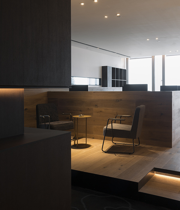
合适的角落我们留下一定的休闲区域,更多的天然光线和合适的布局,让员工在闲暇时间区域进行放松与社交。创造更好的环境,同时也营造了工作的氛围,激发了大家的自主能动性。
In the right corner, we leave a certain leisure area, more natural light and appropriate layout, so that employees can relax and socialize in the leisure time area. Create a better environment, but also create a working atmosphere, stimulate everyone’s initiative.
接待大厅
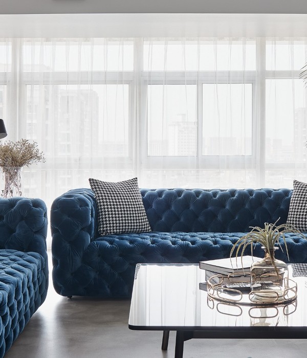
▼Reception room
贵宾接待大厅,新中式的风格给人一定的正式感,表达对于来访参观者的重视。地面材质与墙面材质搭配中和,顶部暖黄色的灯光在方正的吊顶设计的立体中晕染开来,配上简约舒适的白色沙发和实木风格的墙面。作为洽谈与接待重要来宾的适合场所。
The new Chinese style of the VIP reception hall gives people a certain sense of formality, expressing the importance of visitors. The floor material and the wall material match with each other. The warm yellow light on the top is dyed in the three-dimensional space of the square ceiling design. It is equipped with simple and comfortable white sofa and solid wood style wall. As a suitable place for negotiation and reception of important guests.
会议室
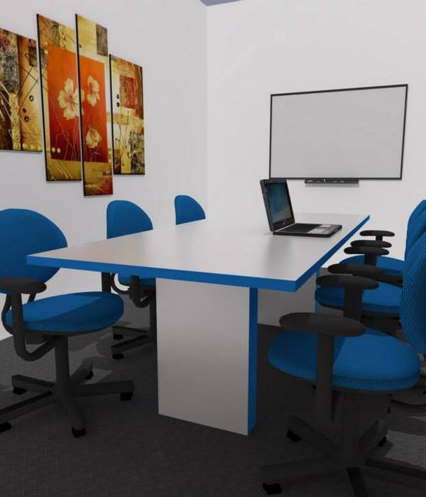
▼Meeting room
空间中我们设置了一些小型会议室。让小组部门可以方便的进行工作的布置与总结。
We set up some small conference rooms in the space. So that the team can easily arrange and summarize the work.
END
长按 - 识别 - 关注
江苏 · 常州
地址:关河西路180号恒远大厦19楼
(西新桥西侧)谢谢阅读|感谢分享
{{item.text_origin}}

