Negative film is the name for a photographic film that will give images which have their colors inverted, after development. This inversion means that the complementary color is used, for example, if in reality the colour is red, it might appear to be cyan on the negative film. Roll film is being preserved in the form of negative film.
This Cinema is based on this ‘negative film’ concept - even though the roll films have been replaced by digital format now, no one would forget how important these roll films used to be in the film industry. The colours chosen for the interior have also combined with the ‘negative film’ concept. This project has paid tribute to the traditional imagery, yet at the same time broken the traditional boundary.
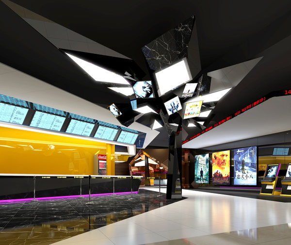
The most striking visual effect in the lobby is the contrast between red and white colours. There seems to be an invisible light wall in the space. The whole lobby is divided into two spaces in red and white. The white marble extends from the entrance to the ticket gate. When it combines with the red stones, they work together to turn the whole space into a striking scene of red.
When you step into the ‘red’ space, the red color of the walls and ceiling, combined with the red light, makes you feel like you have stepped into another completely different space. The white space seems so far far away. When you walk towards the cinema along the red space, there are clear signs to guide you towards different auditoriums.
Walking into the auditorium with giant screen, the contrast between red and cyan gives a more shocking visual effect. It seems that the two colors collide in a space, and the distinct strokes are integrated into one, as if there is a light that separates the space from top to bottom. Cyan and red are the complementary colors of the negative film. The designers follow the theme of ‘negative film’ in the choice of color as well - in conjunction with the lighting of the ceiling wall and the color of the seat, the details of the entire space are consistent throughout the whole space.
The designers have also considered many families or youngsters would go to see the movies in groups. These audience groups are all expecting to be entertained by this movie viewing experience. This is the reason why the designers have thought about some individual game themes at the beginning of the design development. They added a huge slide in the lobby design and used it throughout the whole design concept - from the red and white distinction to the whole illustration of forms. They would like to give the audience new whole new entertainment feeling and playing vibe, so to stand out from other cinema projects. Even if the audience does not really play with the slide, they would immediately think it’s funny when seeing it. They can also really climb up and slide down to truly enjoy being a child again.
The public areas of the hallway have also been designed as a children's activity areas, using tubes to extend throughout the space. Children can sit on these tubes or climb along the tubes to have fun. The designers have also added extra seating arranged in a circle to increase the interaction between parents and children.
The bathroom also uses the complementary colours of cyan and red. The red color of the walkway is cut off at the entrance of the bathroom. The interior space is covered in cyan - from the ceiling to the ground, including the wash basin, is also consistent with the overall space. Taking into account the height of the children, the designers have added the children's steps for the convenience of children.
The theme design of this negative film concept is being demonstrated with the use of colours matching. The clear division of the space makes the interior more interesting and vivid, rather than the ‘combination’ in the traditional sense. This new approach is designers’ new attempt to match the lights with a stronger contrast of complementary colors. This project is a good example of designers’ persistence towards design - inspired by tradition, yet breaking the boundaries in details.
The colors originate from the contrasting nature of colors in negative film; film - the cinematic connection. The idea incorporates family friendly and fully functional playground inspired design. Children & adults are encouraged to come and interact with and have fun in this playground before and after the movies.
After the site visit, we found out that many families would visit the shopping mall that this cinema is located in. Then we came up with this ‘playground’ idea so to attract more people to stay and play in this cinema. We also think that no one has ever thought about combining cinema and playground together before. It’s a very new concept that we were very excited about. The main challenge would be achieving this outcome with a limited budget.
We hope that with this stylish design, we would especially attract more adults to come and have fun. We would like to awaken the childlike innocence of the adults and remind them they can still have fun and play like a child even if they are grown-ups.
Also, we needed to think about the safety and practical issues regarding the slide design. We used durable materials for this design.
In order to lower the budget, we came up with this design concept of using colour contrast. This way we can rely on the colour contrast which won’t necessarily require expensive materials, yet still can create strong visual impact. It’s inspired by the complementary colours used in negative film.
The lobby red and white meant to be a Georges Rousse-style optical illusion when looked at from a certain angle - which added a sophisticated element to the space. From a certain angle you can only see red or white. This is especially difficult to achieve for our project because so much coordination is involved. There are so many objects inside the space which all need our careful consideration, e.g. slides, seatings, counters etc.
We also added the exposed ductworks so that both adults and children can play with them. They are inspired by the barber’s pole outside Shanghainese barber shops and Christmas candy canes. The complementary colours also echo with the main theme.
We think that we have successfully created a fun space for people to enjoy movies and have fun at the same time. A lot of adults are under a lot of stress at work. We hope that with this stylish design, we would especially attract more adults to come and have fun. We would like to awaken the childlike innocence of the adults and remind them that they can still have fun and play like a child even if they are grown-ups.
{{item.text_origin}}

