首尔 MCM 旗舰店 | 现代工业风与传统工艺的完美融合
Architect:Neri&Hu Design and Research Office
Location:Seoul, South Korea; | ;
Project Year:2016
Category:Shops
The project brief asked for a renovation of an existing 5 story building with an attached parking tower as the new flagship store for MCM in Seoul’s luxury district of Gangnam. Given MCM’s strong brand story and German roots, Neri&Hu set out to design a flagship store that would embody MCM’s attitude of celebrating the advances of the digital age while staying true to the brand’s commitment to heritage and attention to craftsmanship and detail. Neri&Hu’s design concept for the new flagship is inspired by the Bauhaus movement which married experimentation in manufacturing with craftsmanship and traditional arts. Beyond serving as just another architectural spectacle in Gangnam, we believed the new store should serve as a new “home” for the MCM brand -a house that embodies the Bauhaus’ totality of artistic mediums - spanning industrial, graphic, furniture, interior design and architecture.
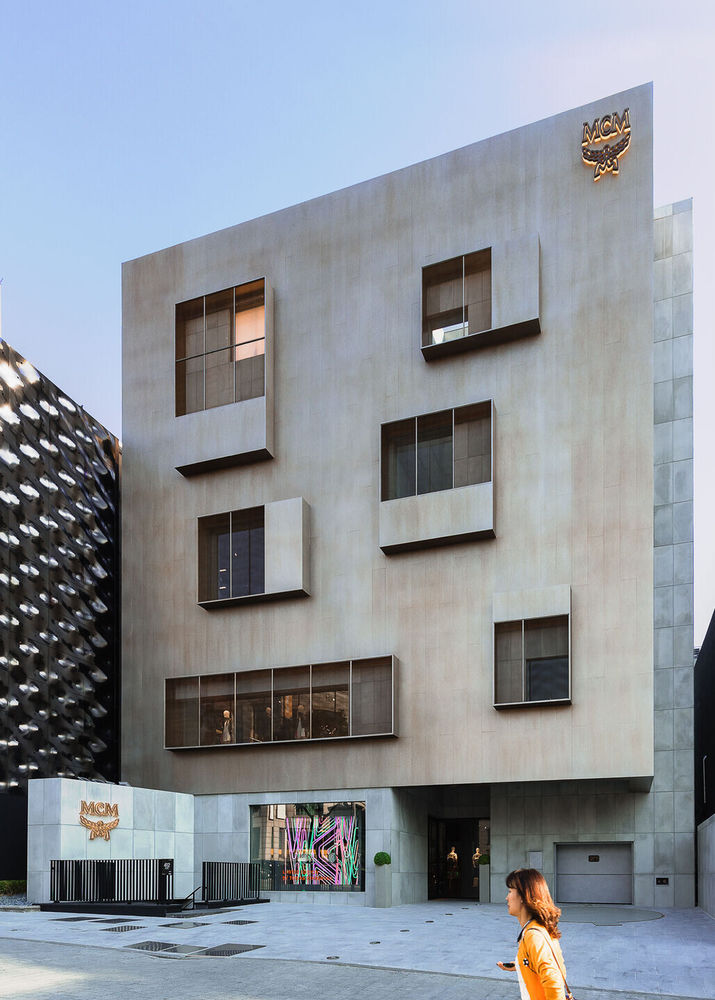
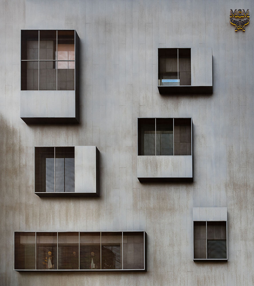
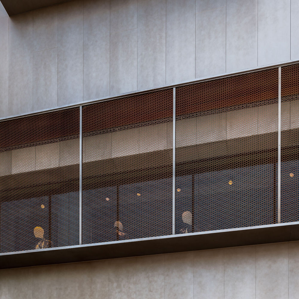
The Bauhaus ethos finds expression in flagship store’s new metal façade, the building reads as a curio box with curated window openings that rests on a heavy concrete base. The existing building was articulated as two separate facades and the main challenge was to create a new façade that would still respect the floor area ratio but be perceived as one building.
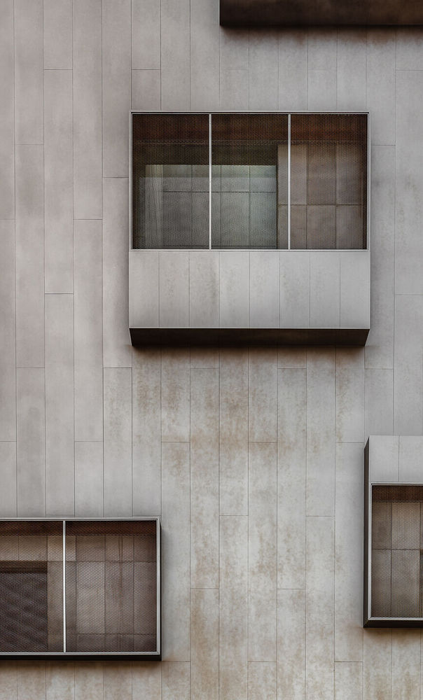
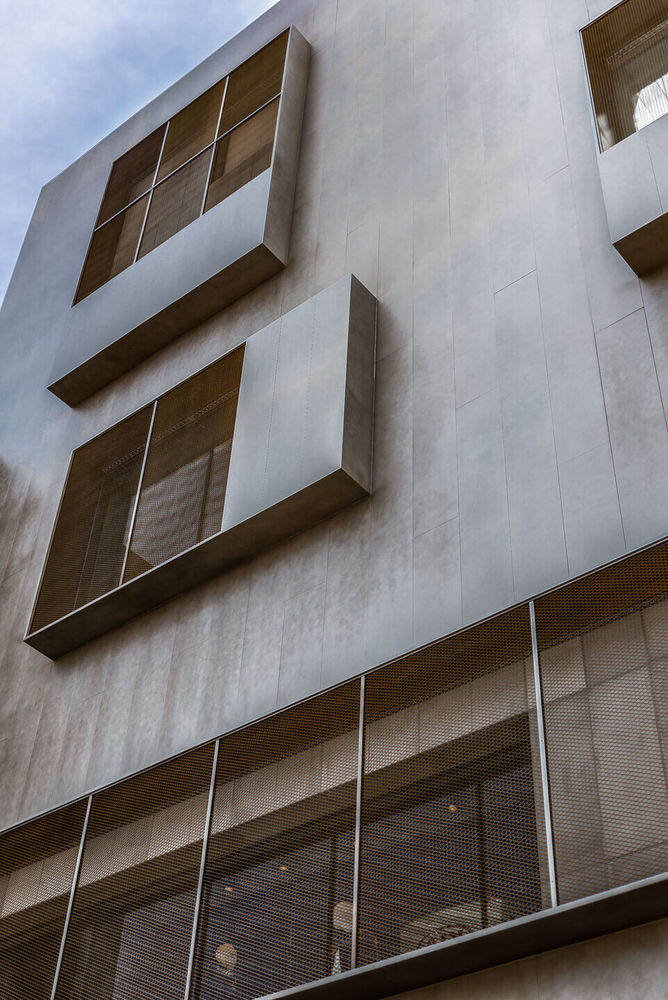
Additional structural reinforcement was required to support the new façade which was straightened to bridge the gap between the irregular slab edge between the parking tower and the retail area to create a singular massing. Given the client’s limited budget and construction timeframe of 4 months, the façade solution needed to achieve maximum visual impact within economical means. In response to the north facing condition of the façade, we chose a bronze colored metal to reflect as much natural light as possible and created windows with 400mm depth to create introduce relief and shadows. These large openings also help frame visual merchandise and the activities of the interior. Bronze metal mesh is veiled over the large openings and rests proud of the façade to give depth and textured layering. The brutal concrete base provides a street scape presence at the scale of the pedestrian and offers a dedicated show window for visual merchandise.
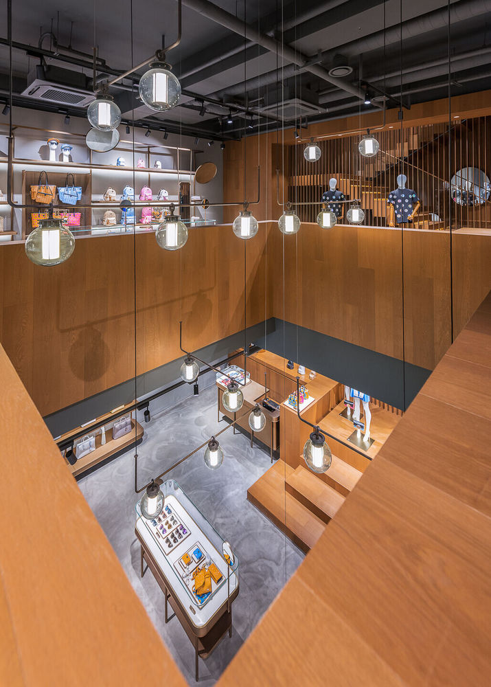
On the interior, graphic signage, lighting décor and carefully curated furniture selection brings MCM HAUS to life as a space for dwelling. The walls and floors are finished in raw concrete. Ceilings were left exposed and painted to maximize clear height. The simple exterior massing and form, exposed structural elements on the interior and use of raw concrete pays homage to functionalism and a return to material honesty. Bronze accents and metalwork throughout offer contrast with the raw finishes to give warmth and luxury to the space. Millwork for all vitrines, shelving and display platforms were all custom designed and tailored to the functional requirements of the various types of products on display. The fitting rooms are lined with a corrugated, ribbed glass-fiber-reinforced-concrete with bronze metalwork supporting hooks, shelving and curtains.
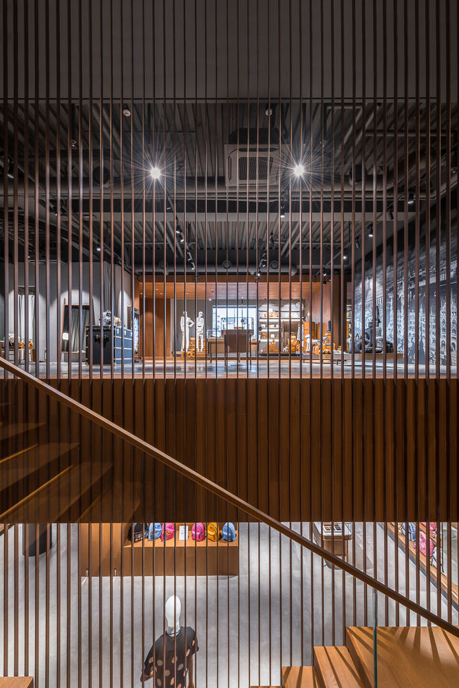
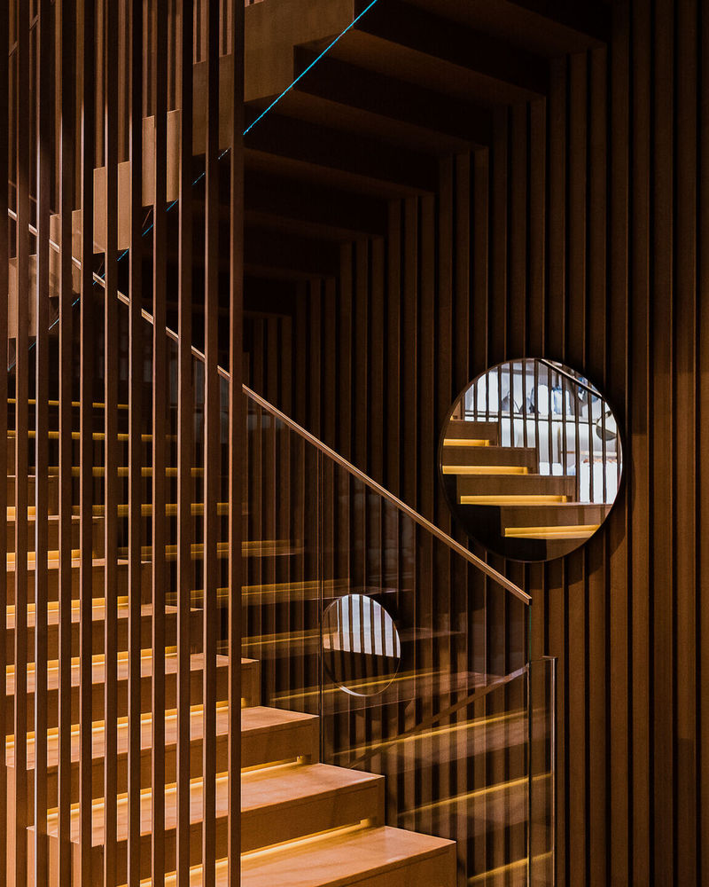
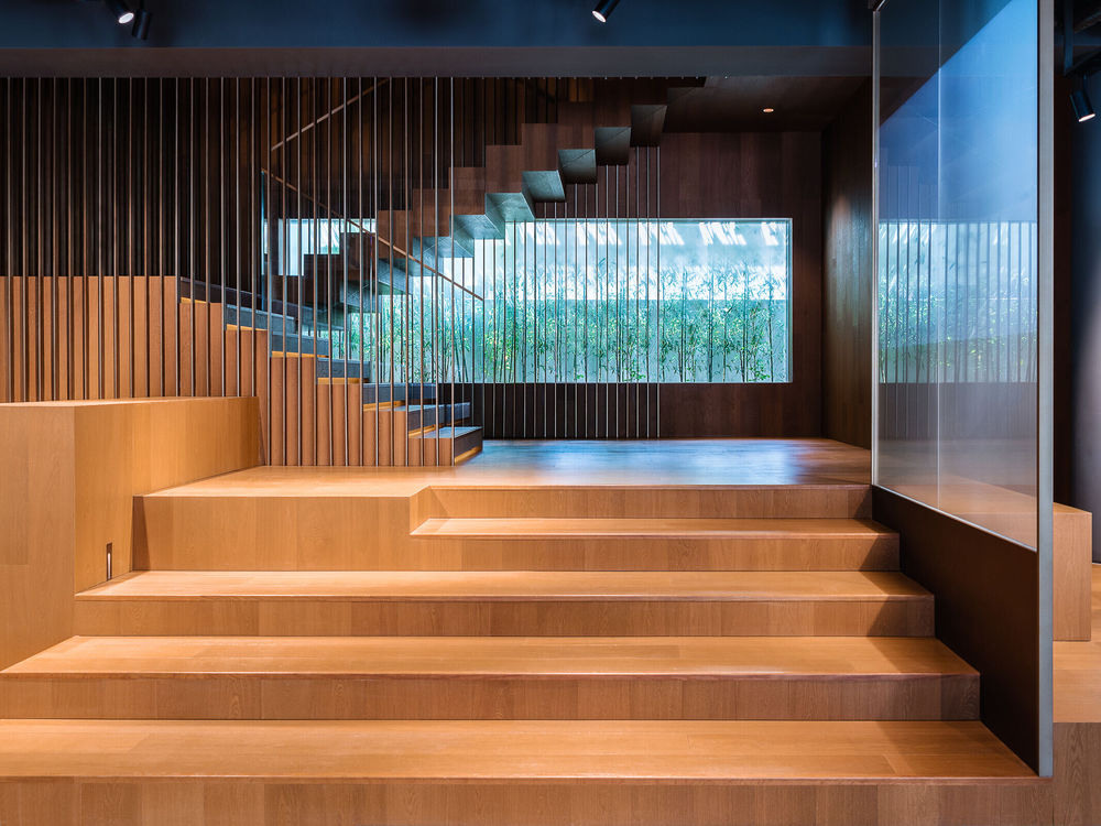
The interior journey begins on the ground floor - spatially the most open floor with large windows looking out to the street and rear courtyard garden. Built-in wall millwork display handbags and backpacks, while floating VMD platforms showcase larger products and lastly, the smaller vitrines showcase the smaller leather goods and accessories. The visitor then continues up the large sculptural staircase spanning 3 levels with large platforms that double a stage for rotating visual merchandise displays. Delicate bronze screens line the staircase with circular mirrors in front that offer unexpected glimpses of fellow shoppers and products on display.
The second level is decidedly introverted featuring a centralized built-in wooden platform that doubles as balustrade and bench, surrounding the slab cut framing a view to the ground floor. Arriving on the third level is the final retail level that houses the VIP area screened off by gray curtains and an elevated wooden platform which creates a “portal” display area for the brand’s special collection line.
▼项目更多图片
