Space Matrix Design Consultants designed the offices for Northern Trust, the global financial services company’s location in Pune, India.
Wellness in every sense: Northern Trust’s multi-sensory office design approach. When you walk into an office, what are the things you notice that help you build a first impression?
Perhaps you see the fabulous artwork on the walls, or the trendy seating area. Perhaps you notice the smooth jazz they have playing in the background. Or perhaps you first feel the cold blast of the air conditioner as you step in from the sunny street. We rely on multiple senses to inform us about an experience, so it’ll likely be a mix of all these factors. The extent of reliance on each sense, however, differs from person to person. So while one person might find clear, well-marked signs very useful, someone who is visually-impaired might be baffled in a space that relies only on visual indicators.
For Northern Trust’s Pune office, we conceptualised an empathetic, multi-sensory workplace strategy. As a future-facing financial services company, inclusivity and wellness for their partners are core to the company’s values. It was important for these values to come through in their workspace design — so we offered a solution built around the five senses.
Besides being a design that epitomises their brand and showcases their core values, Northern Trust wanted their space to be intuitive to use, specifically for those with special needs. By designing a space which engages all our senses — sight, sound, touch, smell, taste — work would make for a more appealing, immersive experience. Besides, the space would rely on multiple senses to impart information and offer wayfinding aid to improve accessibility along the entire journey.
Sight – Establishing the brand’s identity right at the entrance is a striking anchor installation that draws the eye. As the logo and symbol of Northern Trust, this anchor makes an unforgettable first impression.
The colour and tone of a space have a strong psychological impact too, and our designers used this to optimum advantage. The common areas are done up in earthy neutrals, with bold yellow, orange and green accents. This lends warmth and energy to the spaces where employees work and relax.
On the other hand, the meeting rooms may have an intense, charged atmosphere. To diffuse this energy and create a soothing vibe, we used cooler hues like blues and greys. The colour schemes also play an important role in making the office more inclusive — the colour contrasts are planned in a way that makes them easily distinguishable for people affected with colour blindness.
To keep the workday from getting monotonous, there are multiple alternate work areas — and a varied look and feel help establish a differentiated identity for each. For instance, the work nooks with exposed brick walls and low seating exude a relaxed café-like feel while the areas with visible ceiling ducts have a chic, urban atmosphere.
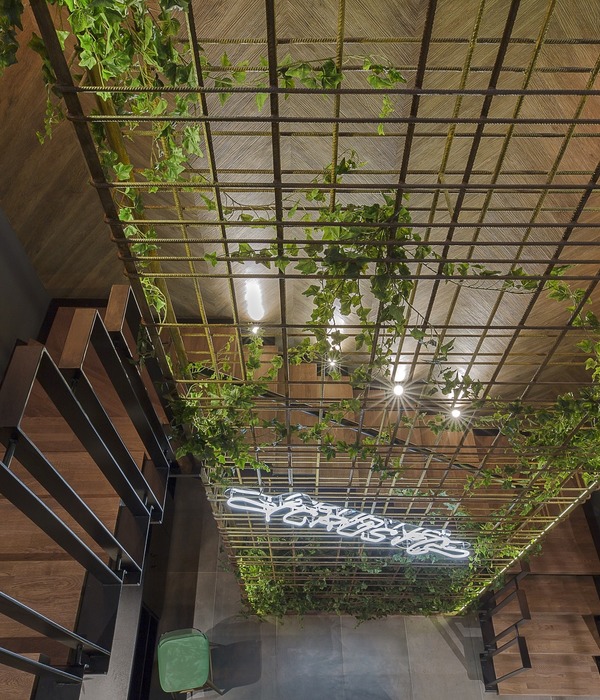
With plants, table-top pots, overhead planters and green walls, biophilic elements have been used to add depth and vivacity to the office interiors. In fact, the space is even illuminated to mimic and complement nature visually. The automated sun controlled blinds move up or down, depending on the sun’s rays. The circadian lighting system takes its cues from the angle, brightness and intensity of the sun, and optimises the light indoors accordingly. Apart from being gentle on the eyes, it also helps employees maintain their natural circadian rhythm, thereby improving workplace productivity.
Sound – Different acoustical elements add to the aural appeal of the space. The meeting rooms, work zones and private offices offer a higher degree of acoustic privacy to the occupants – plush carpets, upholstered furniture and felt wall panels are used here to muffle sounds and improve focus. For phone meetings or video conferences, we created individual phone and meeting booths for added privacy.
But silence is not really conducive when people are trying to brainstorm, ideate, or simply work as a team. The swing zones and common areas are designed as open spaces where, much like a café, the buzz actually lends itself to the creative atmosphere. The contrast between the quiet and busy zones provide wayfinding aid for the visually impaired — from buzzing chatter to hushed silence, the difference is immediately perceptible. Going the extra mile with workplace wellness, the office features an installation inspired by the soothing tones of a Buddhist singing bowl.
Touch – We used rich, variegated textures across the Northern Trust office to add to its sensory appeal. Wooden planks, exposed bricks, and leafy greenery lend character to the walls, and the furniture too, offers a rich kinesthetic variety as one moves from zone to zone. An employee may find wooden seats and low, upholstered stools in one part of the office, and get to enjoy plush accent chairs and leather booths as they move to another zone for their next meeting.
Flooring is differentiated with carpets, vinyl, concrete, and wood. There are tactile strips on the floor, that help visually impaired individuals easily navigate the space. Braille signage and braille-inspired artwork placed at strategic locations around the office not only function as wayfinding devices but also make the office more welcoming.
Smell – Comforting, homely aromas instantly make a space feel more cosy and welcoming. At Northern Trust, we designed food and coffee points near the entrance to create a great olfactory first impression. Nothing starts a workday better than walking in to the aroma of fresh coffee!
Apart from this, we also included an aroma wall installation to take people on a unique olfactory journey. This wall features different kinds of potpourri, each with an explanation of how different smells trigger specific moods.
Taste – Food and drinks are a great way to fuel conversation, improve workplace engagement and evoke a general feeling of happiness and wellbeing. To enable this, we created food and coffee points at every swing zone, so discussions can take place over snacks and beverages. Rather than one pantry for the entire office, we included a breakout area on each floor. With widescreen televisions and lots of greenery, these are perfect spots to socialise, bond over coffee and snacks, or catch an important match after work.
Designer: Space Matrix Design Consultants
Design Team: Supriya Pawar, Titir Dey, Deepali Moon
Photography: courtesy of Space Matrix
25 Images | expand for additional detail
{{item.text_origin}}

