这栋建筑是为一对牙医父子所设计的牙医诊所,新建筑体现出诊所的现代,高质等特点,将有助于牙医诊所的发展。建筑师挖掘场地潜力,预测城市发展。建筑将这一策略通过混合功能表达出来,一楼是诊所,二楼是商业租户,三楼是儿子的公寓。
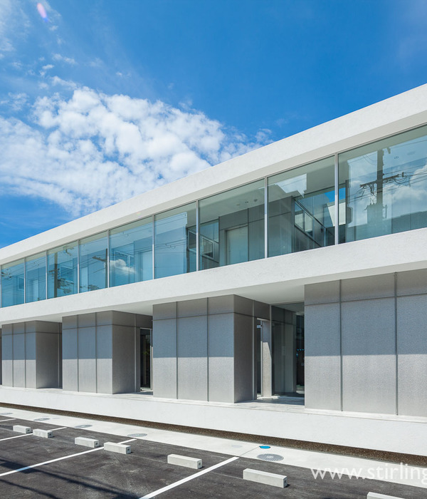
建筑外形符合牙医的审美,表面具有像牙齿那样的半透明,反射,深度,硬度,体现出牙科工艺的品质。临街面是光面大理石和玻璃饰面。因为光线的变化,在建筑的上端能形成接近半透明的反射效果。门口的前院体面的表达出迎接。直角的元素在不同的视角点提供不同的深度和动感。后侧外墙白色的深缝让体量显得锐,深窗口的设置除了造型的需要也提供了必要的遮阳。内部流线即能看到北侧街景,又能保护住宅隐私。游走的光,拓展出空间深度,嬉戏出空间魅力。
This project began when two dentists, who are also father and son, decided that they needed a new building for their growing dental practice – a building that would reflect the quality of their dentistry and modern equipment and a building that would serve their business well into the future.
Our first task was to assist the clients realise the potential of the site and to understand the projected local urban development. This exploration led to the brief being for a three storey mixed use building that provides the ground level for their dental business, a second level for a commercial tenant and a third level as an apartment for the son to occupy.
For the design of the building, we began by reflecting upon the aesthetic ideals of dentistry and the role of the dentist to sculpt and shape teeth. We took this as our starting point for the architecture. We developed the design to achieve a considered interplay of the qualities of translucency, reflection, depth, solidity, surface and composition with the aim of giving proper expression to the craft of dentistry. This attempt to evoke allusions to dentistry harks back to the tradition of buildings communicating the service or trade that occurs within.
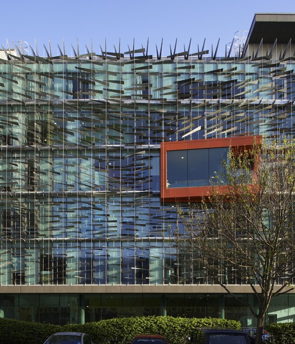
The street facade of this building is a smooth veneer of polished marble and glass. The pattern of the stone and the configuration of openings convey a homogenous surface. As the light changes those glazed surfaces that previously offered solidity via their reflections become deep punctures in the monolithic quality of the stone and, like an x-ray, it is the (uppermost) edges that appear most translucent. This facade folds in from the adjacent buildings to offer a forecourt and a modest expression of civic presence. The angled surfaces articulate the building as a cluster of elements and provide a sense of depth and movement via the manipulation of perspective sightlines.
The rear facades employ sharp incisions to white rendered surfaces to dissolve transform an otherwise box-like form into a cluster of crisp, white elements. Deep window reveals provide requisite shading and an expression of mass.
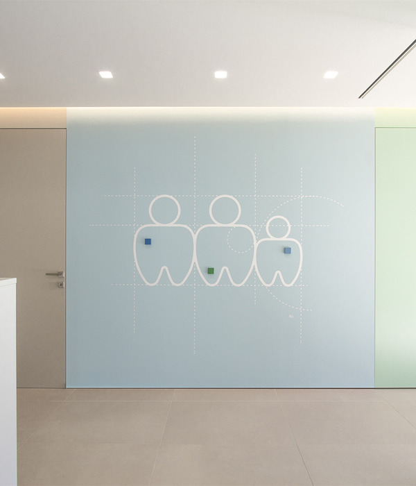
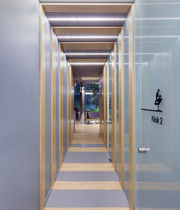
The interior spaces offer a picturesque circuit via the staircase and moments of vista. At the first floor large windows provide the strong visual connection with the street sought by tenants and the windows to the north are screened to respect the sensitivity of the residential interface. Throughout the apartment baroque-like concealed light sources suggest spatial extension; surfaces toy with reflection and the incised motif is again used to suggest mass.
ARCHITECTS
PRACTICE:DEMAINE PARTNERSHIP PTY LTD
DESIGN ARCHITECT: CRAIG BARKLA
PROJECT ARCHITECT:CRAIG BARKLA
PROJECT TEAM: ALAN DRISCOLL, ANDREA ZIDZIUNAS, NATASA MARKOVIC
PHOTOGRAPHY
PHOTOGRAPHER:PETER CLARKE PHOTOGRAPHY
CONSULTANT TEAM
SERVICES CONSULTANT:CARDNO ITC P/L
ESD CONSULTANT:CARDNO ITC P/L
STRUCTURAL CONSULTANT: INTRAX CONSULTING P/L
DENTAL CONSULTANT:LEVITCH DESIGN & ASSOCIATES P/L
PLANNING CONSULTANTS:AURECON P/L & KEEN PLANNING P/L
BUILDING SURVEYOR:BSGM P/L
ACCESS CONSULTANT:DISABLED ACCESS CONSULTING AUSTRALIA P/L
LANDSCAPE:BY CLIENT
QUANTITY SURVEYOR:RODNEY VAPP & ASSOCIATES P/L
FIRE SERVICES CONSULTANT:LAKE YOUNG & ASSOCIATES P/L
DETAILS
ADDRESS:7 NORTH CONCOURSE, BEAUMARIS, VICTORIA
CLIENT: BC DENTAL P/L
COST:$2.4M
DURATION:18 MONTHS DESIGN & APPROVALS / 18 MONTHS CONSTRUCTION
COMPLETION:LATE 2011
MORE:
Demaine Partnership
,更多请至:
{{item.text_origin}}

