米兰 Calligaris 集团展厅 | 经典与现代的完美结合
- 项目名称:米兰 Calligaris 集团展厅
- 设计方:Studio Marco Piva
- 项目类型:商业展厅
- 项目地点:米兰布雷拉区
- 项目面积:01000 平方英尺
- 完工时间:2022 年
- 主要材料:陶瓷,玻璃,金属,织物,木材等
Firm: Studio Marco Piva
Type: Commercial › Showroom
STATUS: Built
YEAR: 2022
SIZE: 0 sqft - 1000 sqft
The 7th of April 2022 saw the opening in the heart of the Brera district of the Calligaris Group’s new showroom, designed by Studio Marco Piva.
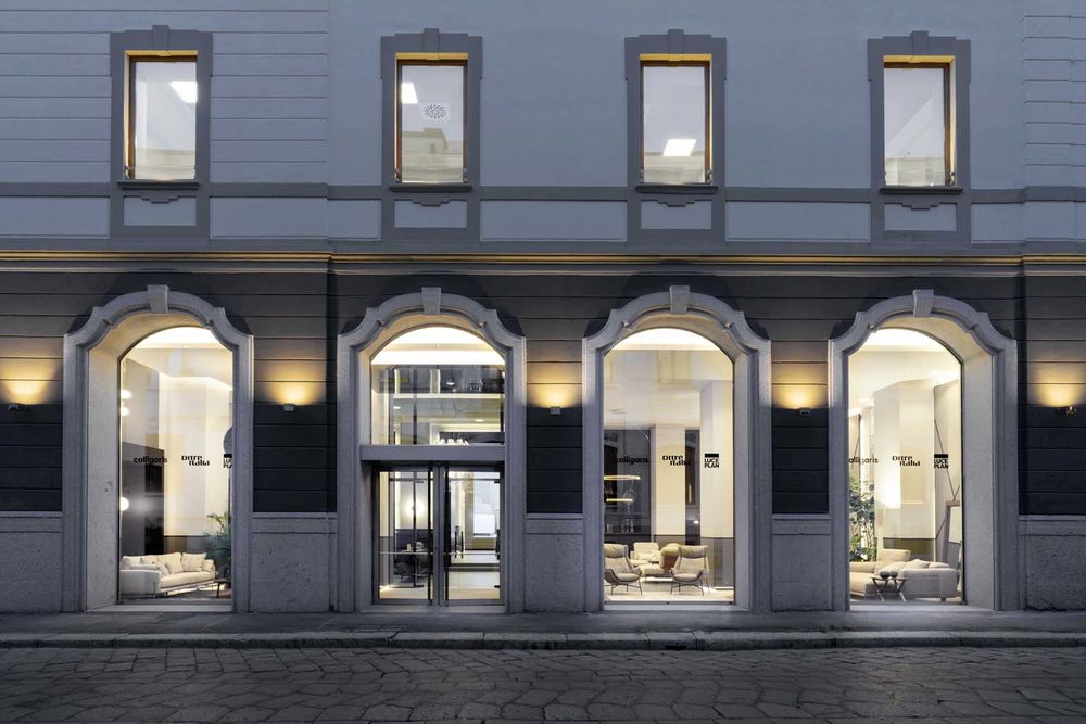
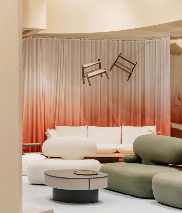
On the ground floor of the prestigious 19th-century building known as the "Cortile della Seta", recently refurbished by Savills Investment Management SGR and for many years the headquarters of the Banca Popolare Commercio e Industria, the new Flagship Store showcases collections by Calligaris, Ditre Italia and Luceplan.
The client’s brief was for a new strategic point of reference in which to present the brands' iconic collections and products, as well as to host events and public relations activities, offering the clientele an "immersive" shopping experience that reflects the group's style and qualities.
The objective of Studio Marco Piva's interior design project was to preserve the monumental architecture of the place, with its almost 5-metre-high ceilings, without changing the original layout, but rather by configuring the different areas for work, socialising, or discovery.
The Flagship Store’s concept accommodates open, flexible, and interconnected spaces: it integrates the three brands, creating scenarios that unify the different environments and ways of experiencing the contemporary home, making Italian design, manufacturing the focus of attention, and highlighting the wide range of customisation options available.
The dining, living, sleeping and recreational areas are configured in a fluid and dynamic way as community spaces within which more intimate and reserved areas can be created.
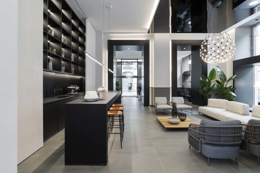
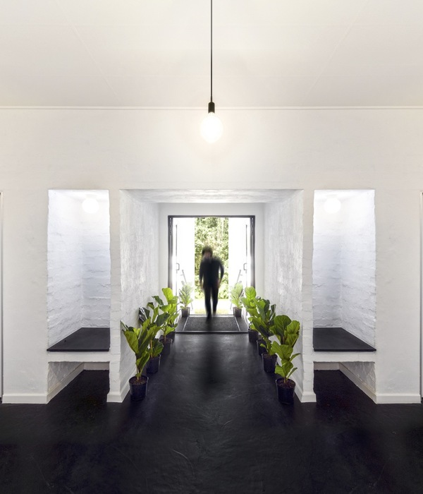
The entrance, created with a compass of grey smoked glass with black metal inserts, offers a sweeping view and an invitation to explore, culminating in the imposing 3.5-metre-high interactive LED wall located in the Lounge & Bar area, a latest generation screen promoting the group's achievements.
Large floor-to-ceiling windows unify the ground floor and the mezzanine: true picture windows that extend the interior spaces into the courtyard, and an invitation to citizens and people passing by on Via Solferino.
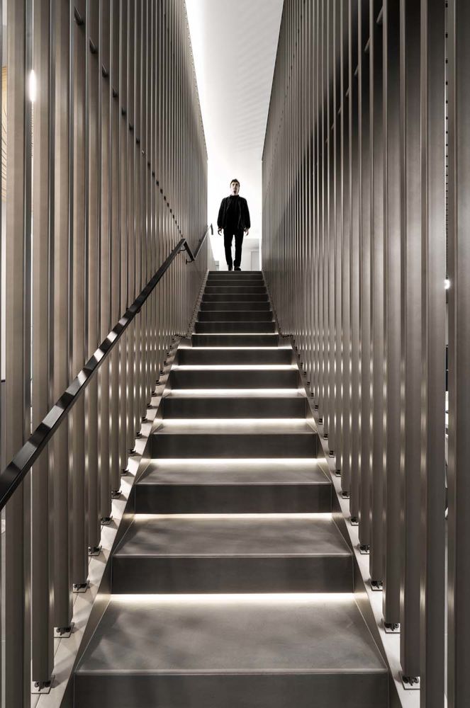
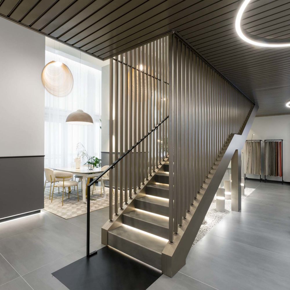
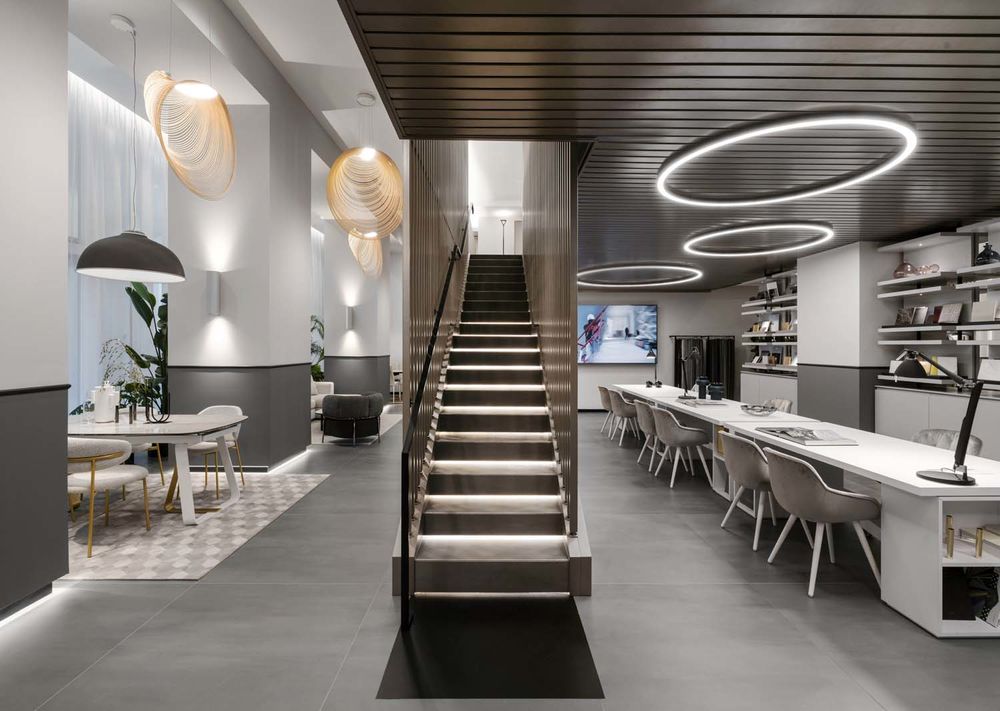
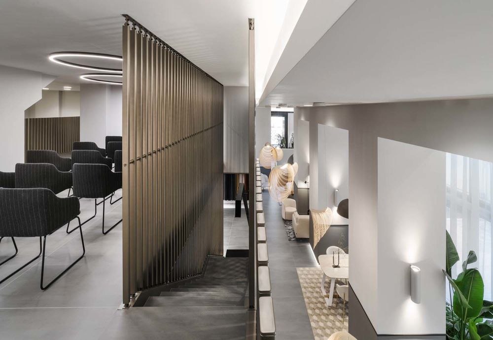
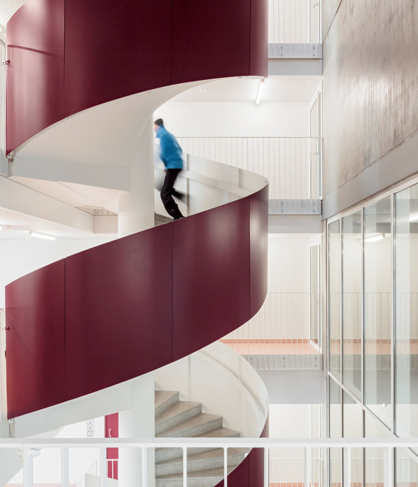
The existing iron staircase has been preserved and fitted with cantilevered stoneware steps with LED strips to accentuate the pathway, while for the balustrade it was decided to use champagne-coloured metal slats to create a vertical rhythm that echoes the load-bearing columns of the architecture and the laminates selected for the false ceiling in the area of the materioteca: a work of real craftsmanship with a great aesthetic impact, providing a dynamic effect of lightness and permeability.
The lighting, whether natural light from the large windows or artificial light, plays a key role: it highlights the products, the materials, and the architecture by means of recessed lighting and ceiling projectors, LED strips in the plinths and around the large portals that mark the pathways, to create vibrations in synergy with the decorative suspended lighting by Luceplan.
There are also four lighting scenarios, that can be selected depending on the time of day and the amount of natural light filtering in from outside.
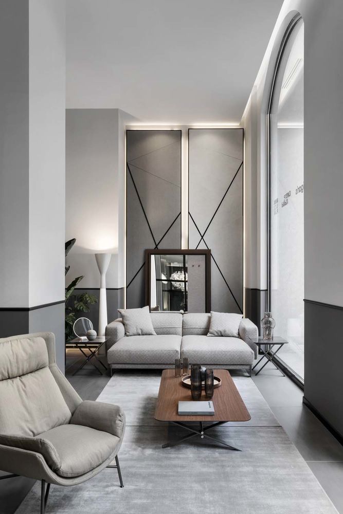
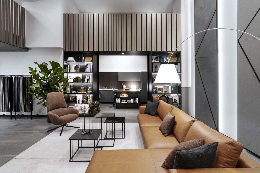
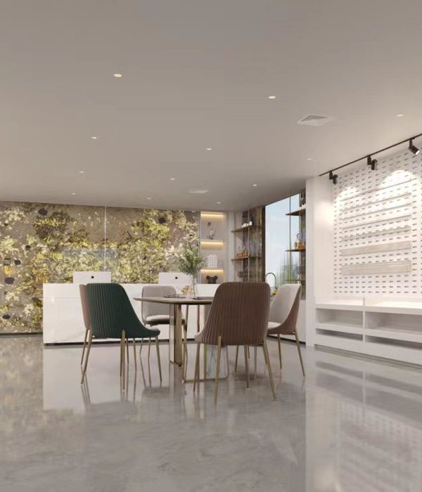
A significant aspect of the outfitting is the carefully designed colour scheme: neutral grey-scale tones (from anthracite to silver) have been selected. Applied to the floor and wall coverings and used to mark architectural elements, they emphasise the design of the products in the different configurations of the rooms, which have been designed to change with the changing seasons of the year or for the presentation of new collections.
The selected materials are durable and contemporary, a combination of ceramics, glass, metals, fabrics, and textures that create essential and elegant geometries accentuating the design of the products on display.
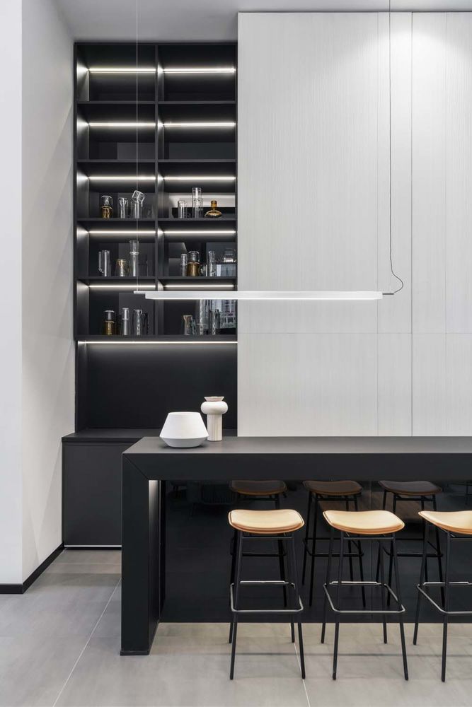
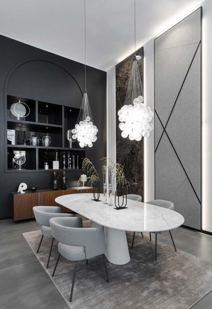
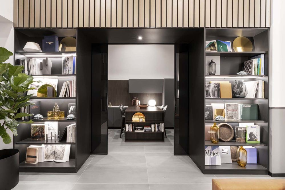
The fixed furnishings, such as the bar counter and the arched bookcase in black lacquer with reflective glass, and the portals, also in black lacquer, that mark out the pathways, were custom designed, with LEDs to emphasise their geometries.
Some large full height materic paintings (120 x h 450 cm) have also been specifically designed by Studio Marco Piva. Displayed on the walls, they show the materials that are the key elements of the creations of Calligaris and Ditre Italia: fabrics, ceramics, leather, and wood harmoniously combine in changeable displays, whose materials can be replaced as required, enhancing the original materials from which the furnishings are made.
Spaces for conversing, socialising, and sharing – such as the space cinema – alternate with other areas used as exhibition/interactive and co-working spaces – the materioteca and lounge bar – to offer visitors, professionals, and guests of the Store an immersive experience enhanced by the addition of technology, which contributes to enriching the pathway and making it more usable.
A meeting hub having the appearance of an urban loft, a place that combines the art of hospitality and domestic intimacy, professionalism, and sensitivity.

