Hoo boy, what a year that’s passed. Yadda, yadda – we’ve heard it all before, and I have nothing new to add to the barrage of information thrown at you from all depths of the internet. Instead, what I can offer is some comfort in this timely dwelling designed for those of us in need of peace and quiet in the wake of 2020.
London superstars (and Yellowtrace favourites) Jonathan Tuckey Design have spun a yarn for us in the shape of a newly renovated ground floor apartment on Wimpole Street, Marylebone. In the words of Virginia Woolf “…the most august of London streets, the most impersonal. Indeed, when the world seems tumbling to ruin, and civilisation rocks on its foundations, one has only to go to Wimpole Street…”. Embodying this quote, the design of this regency style home is serene and orderly on the very street Woolf refers to.
I’m the type of person who finds inner peace in a tidy home and, devoid of clutter, this Marylebone Apartment has helped me reach enlightenment. Masters of modifying and transforming old buildings to modern needs, the team at Jonathan Tuckey Design have created a system of joinery that in their words “referenced a regency style… However, the aim was to achieve this as a modern interpretation with a subtly as not to be pastiche”.
This considered joinery system, informed by John Soane’s Bank of England plan and also Louis Kahn’s investigation into British castles, has created an internal architecture within the larger volume of the building. Simply put by the designers themselves, “both of these precedents helped inform the idea of walls as rooms… by increasing the thickness of the walls it can enable volumes (rooms) to be excavated from them.” Designed with the intent to subdivide areas it simultaneously creates an auxiliary space within the vertical proportions of the existing design language.
Helping to conceptualise the joinery pieces that create this structure-within-a-structure are two works by Italian renaissance painter Stefano Di Giovanni. This influence can be seen in the compositions playful use of arches, niches and walls cutouts.
Much like in all of their work, circulation plays a pivotal role here. Gold detail picture rails are recessed in the joinery as it follows their cascading curves to link views sequentially through the apartment.
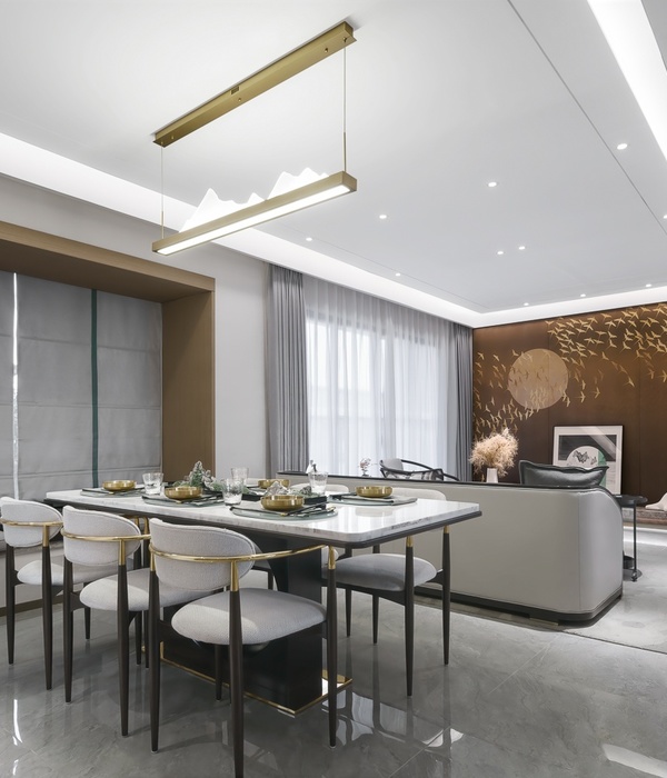
The palette is soft and harmonious. Sage and cream joinery sit ensconced in mostly white walls. Dark wood with navy panels creates a point of difference in the study. While churchlike this material choice never feels heavy thanks to the abundance of natural light filtering throughout.
By using the existing structure to their advantage, Jonathan Tuckey Design has created an illuminating solution to modern-day needs. The result is a refined and unfussy renovation, embodying the essence of the regency style rather than reproducing it.
[Images courtesy of Jonathan Tuckey Design. Photography by Ståle Eriksen.]
{{item.text_origin}}

