成都無早咖啡厅 | 极简空间,细节之美
- 设计方:ATMOSPHERE
- 主创及设计团队:ATMOSPHERE
- 设计团队:Deniel Hwang,Norma Lee
- 项目地址:成都市锦江区清莲上街62号
- 面积:101 sqm
- 摄影版权:形在建筑空间摄影 贺川
- 品牌:Paramita度仓家具
很多人说生活没那么简单,可是生活本就是一餐一饭。——《海街日记》 多くの人が人生はそれほど単純ではないと言うが、人生は食事、食事であり。——《Our Little Sister》
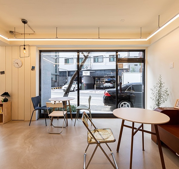
▼咖啡厅室内一览,overview of the cafe ©形在建筑空间摄影 贺川
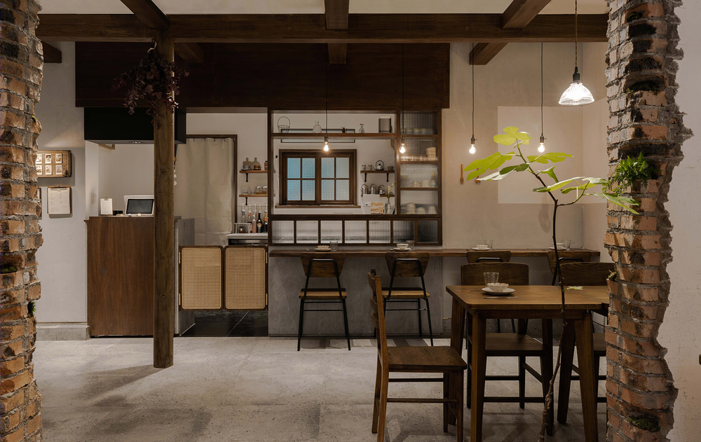
设计之初,面对一个沉淀5年,辨识度极高且自带“预设值”的品牌时,需要将無早的独特调性与创新做平衡。“与其做加法,不如溯源初心,让它重归‘简单’—— Life is simple。”
空间大量运用白色与木质元素,乍看同常规日式无异,可墙面却“暴露”了于细节之处的巧思。有别于崭新墙面自带的疏离感,“有意为之”的斑驳,于无声中引导人与其产生触碰与交互,瞬间拉近空间与人的距离。
At the beginning of the design, in the face of a brand that has been precipitated for 5 years and has a high degree of recognition and comes with a “preset value”, it is necessary to balance the unique uniqueness and innovation without any early. “Instead of doing the addition, it is better to trace the original, let it return to ‘simple’ – Life is simple.”
The space uses a lot of white and wood elements, which is the same as the conventional Japanese style, but the wall is “exposed” to the ingenuity of the details. Different from the alienation feeling of the new wall, the “intentional” mottled, in silent, guides people to touch and interact with them, and instantly closes the distance between space and people.
▼咖啡厅室内,设有“有意为之”的斑驳墙面,interior view of the cafe with the “intentional” mottled walls ©形在建筑空间摄影 贺川
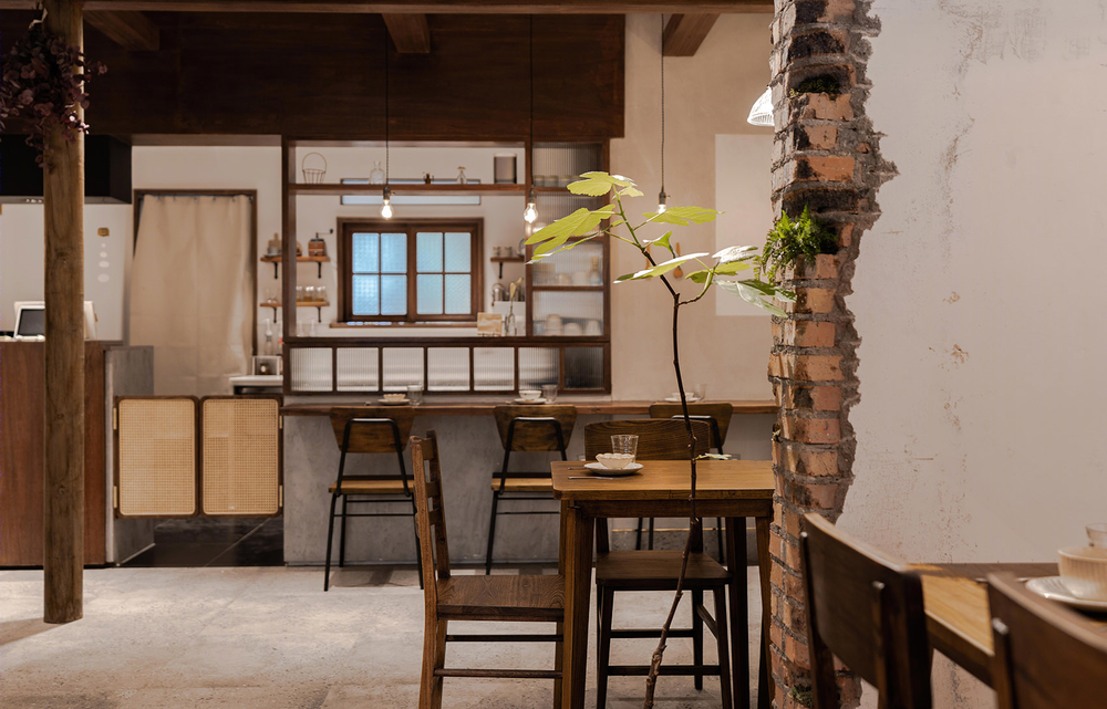
▼斑驳的墙面拉近空间与人的距离,the mottled walls close the distance between space and people ©形在建筑空间摄影 贺川
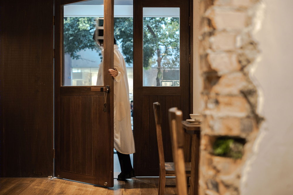
极具洞穴感的破坏性墙面将空间的层次感打开。由浅入深的色泽变化,由表及里的多重氛围塑造,随着木质地板向深色地面的过度亦随之递进。
▼空间爆炸轴测图,墙面将空间的层次感打开,the exploded axon, walls open the layer of space ©氣象建築
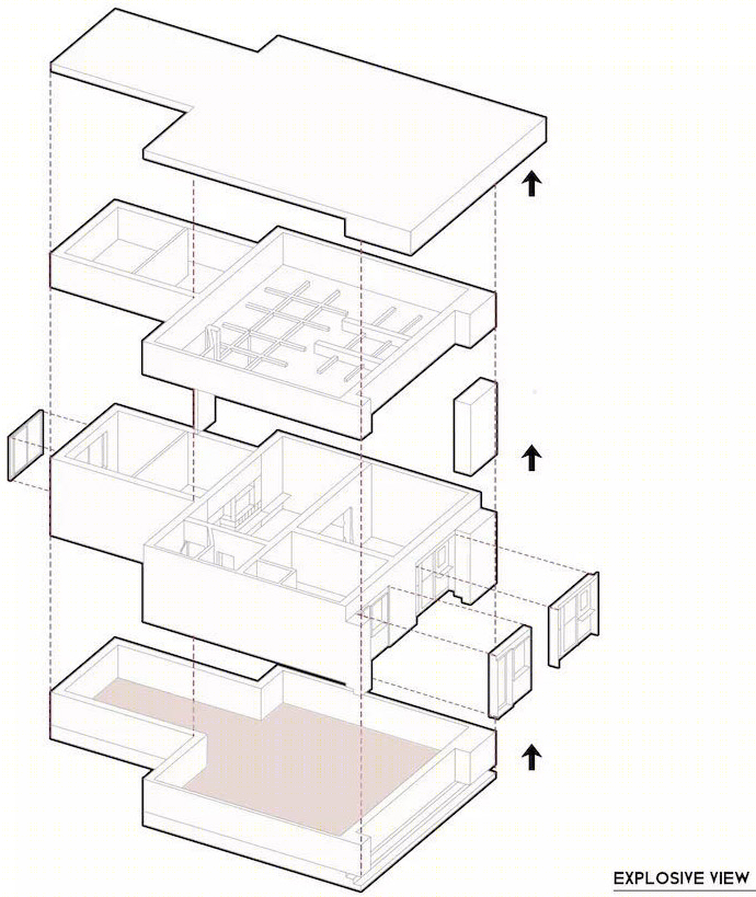
A destructive wall with a cave feel opens the layer of space. The change from the light to the deep color is shaped by the multiple atmospheres in the table and the interior, and the wooden floor to the dark ground is also progressive.
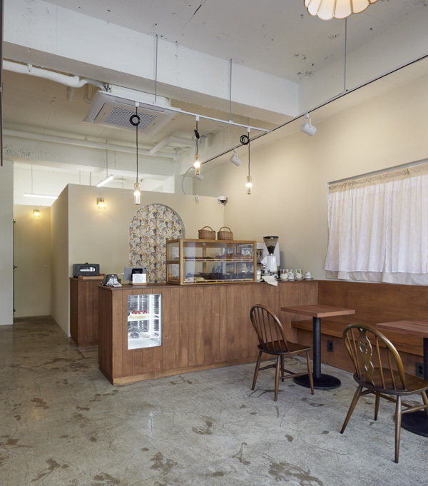
▼室内空间,interior view of the cafe ©形在建筑空间摄影 贺川
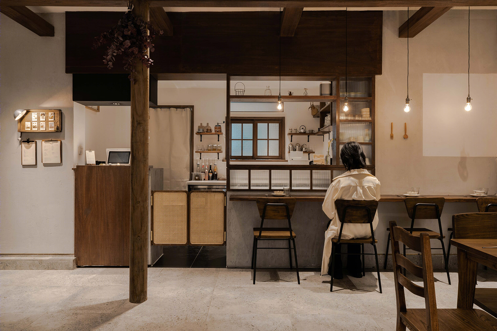
▼室内空间局部,partial interior view of the cafe ©形在建筑空间摄影 贺川
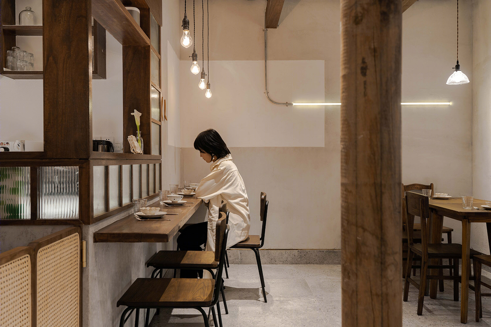
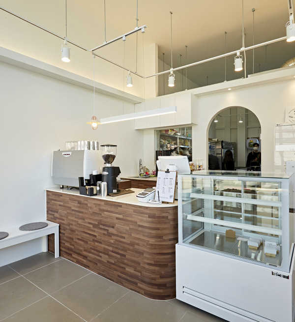
退至空间内部的吧台与半开放式厨房相连。“功能中心”的移动与整合,不仅让员工间沟通协助更为高效,亦在无形中引导进店客人路径动线,成为联动店内两个空间的纽带。而吧台边的座位设置,在打破空间布局单调性的同时,更为顾客与员工之间营造了自然亲切的交流语境。
The bar that retreats into the space is connected to the semi open kitchen. The movement and integration of the “Function Center” not only makes the communication and assistance between employees more efficient, but also guides the inbound route of the inbound customers and becomes the link between the two spaces in the linkage store. The seat setting on the side of the bar, while breaking the monotony of the space layout, creates a natural and friendly communication context between the customer and the employee.
▼退至空间内部的吧台与半开放式厨房相连,the bar that retreats into the space is connected to the semi open kitchen ©形在建筑空间摄影 贺川
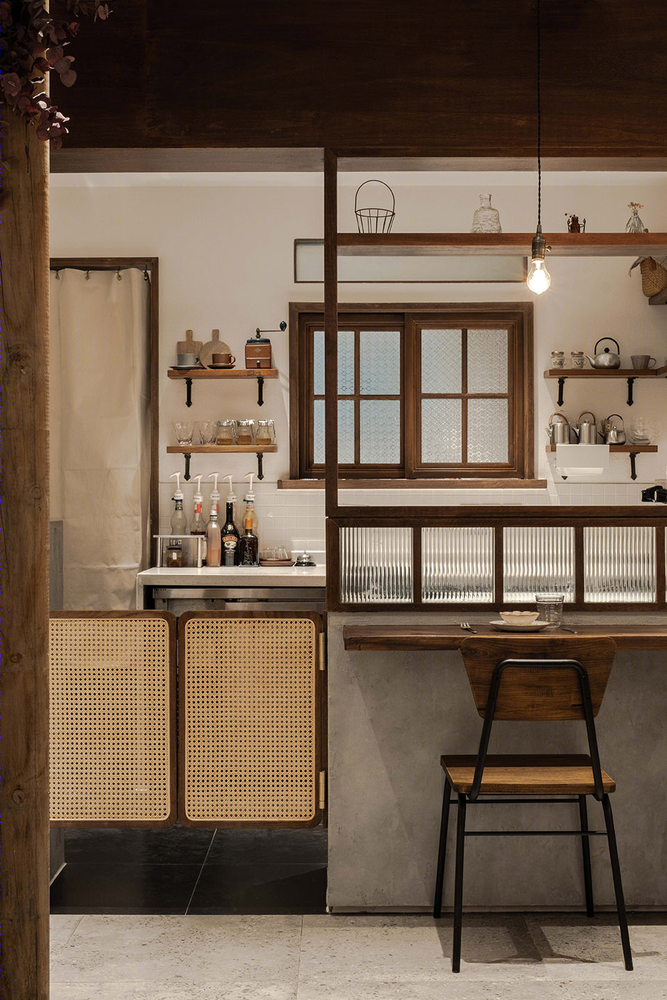
▼吧台与厨房细节,details of bar and kitchen ©形在建筑空间摄影 贺川
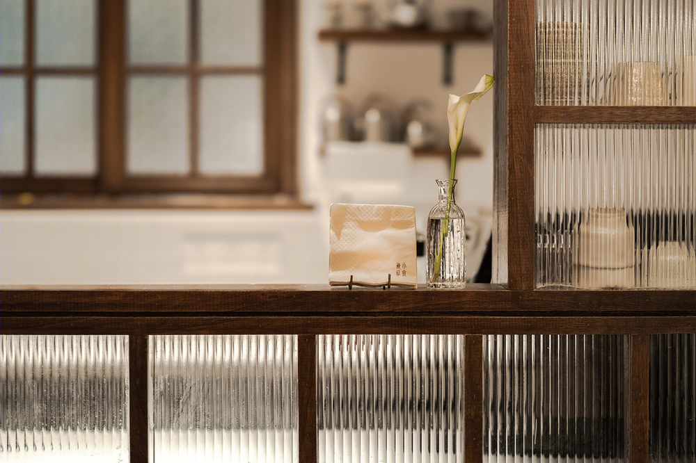
▼吧台细节,bar details ©形在建筑空间摄影 贺川
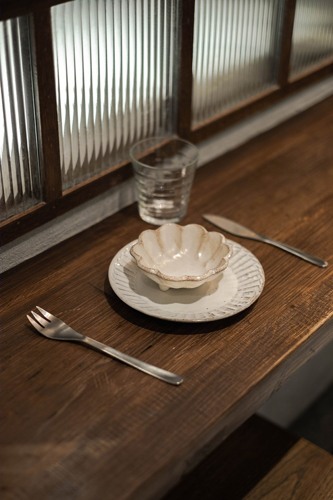
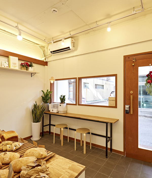
▼用餐空间,the dining area ©形在建筑空间摄影 贺川
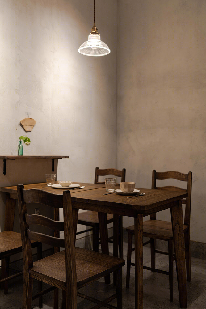
为进一步营造家庭感,原空间顶部的“形单影只”的横梁成为了突破口。按照日本传统坡屋顶顶梁设计,数根深褐色木料依次排开,重构空间顶部,而线条之间的交叠错落又有着属于几何的独特秩序。
▼数根深褐色木料依次排开,重构空间顶部,several dark brown woods are arranged in order to reconstruct the top of the space ©形在建筑空间摄影 贺川
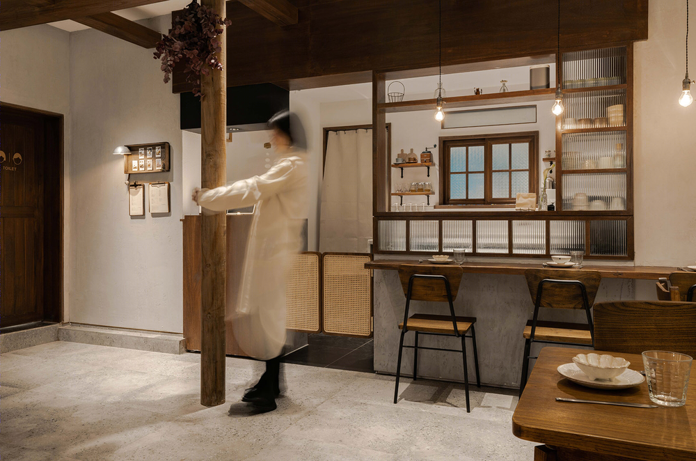
In order to further create a sense of family, the “shaped single shadow” beam at the top of the original B space has become a breakthrough. According to the design of the traditional sloping roof beam of Japan, several dark brown woods are arranged in order to reconstruct the top of the space, and the overlap between the lines has a unique geometric order.
▼室内空间细节,interior space details ©形在建筑空间摄影 贺川
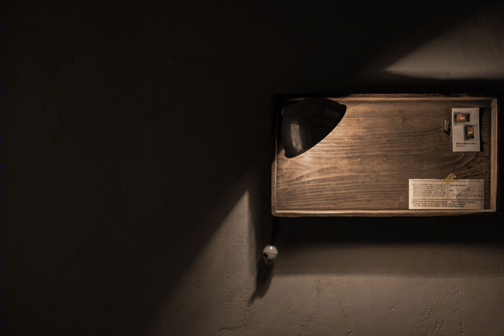
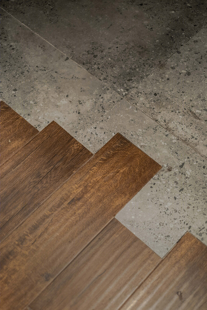
▼室内空间细节(左),地面细节(右),interior space details (left), floor details (right) ©形在建筑空间摄影 贺川
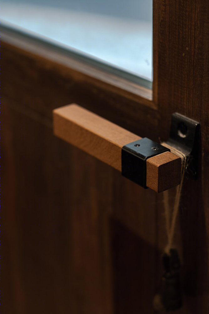
▼灯具和墙面细节,lighting and wall surface details ©形在建筑空间摄影 贺川
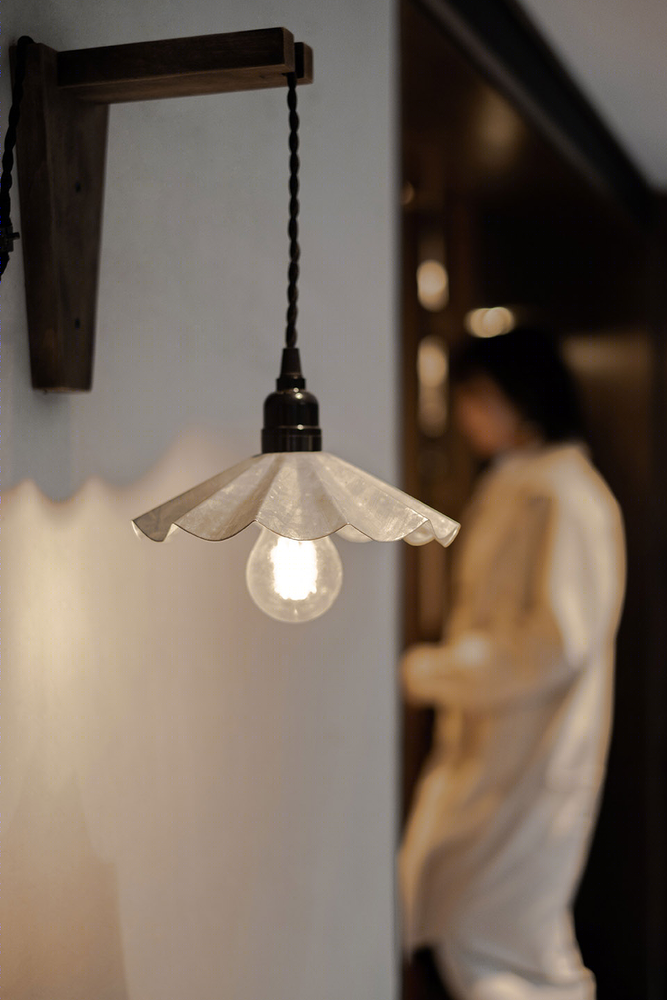
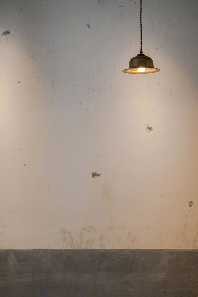
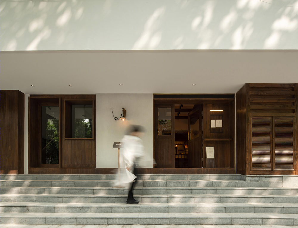
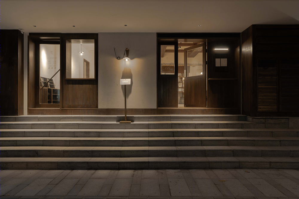
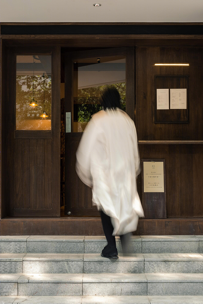
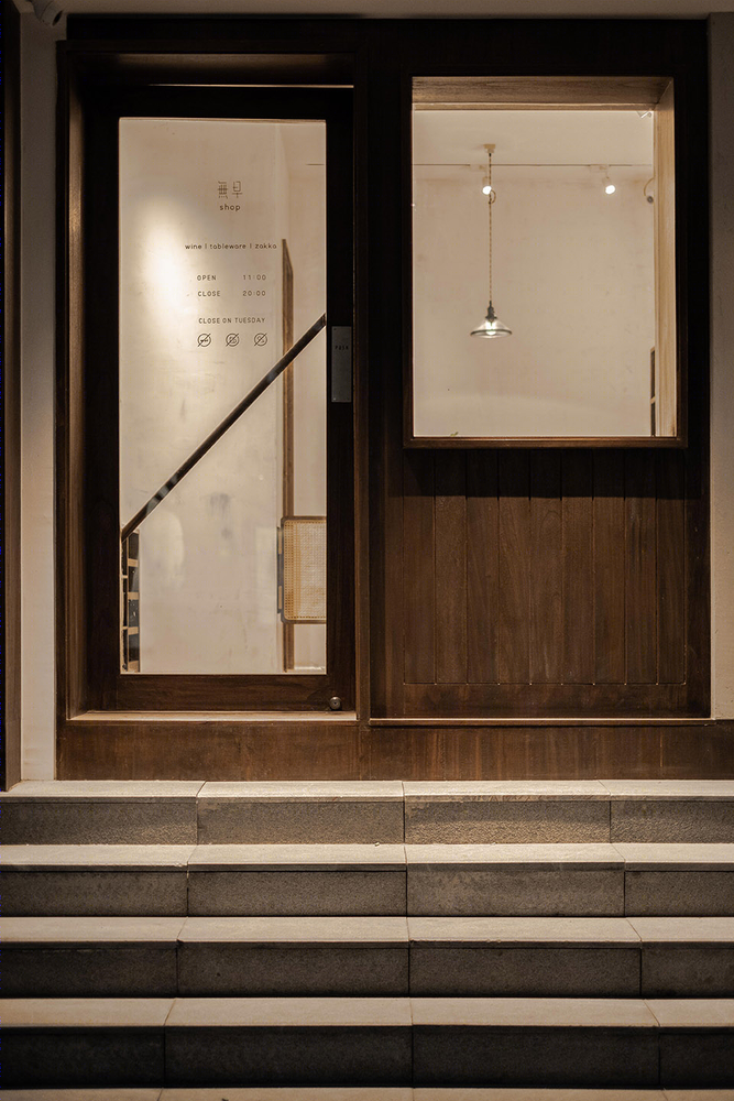
简单的东西往往在细节之处带给人们更多感受。这一点,不仅贯穿设计始终,并在空间外立面得到了更为极致的体现。摒弃店招,而采用大面积的木与白充盈门脸儿,极简色彩与材质运用,自带辨识度的同时亦跳脱出大环境所带来的纷杂之感。简单至此,自成一派。
“Less is More.”—— Ludwig Mies Van der Rohe Simple things tend to give people more feelings in the details. This point is not only throughout the design, but also in the space façade has been more extreme. Abandon shop tricks, and use a large area of wood and white to fill the door face, minimalist color and material use, with its own recognition and also jump out of the mixed environment. Simple to this, self-containe.
▼外立面日景,采用大面积的木与白充盈门脸,the facade view during the day, using a large area of wood and white to fill the door face ©形在建筑空间摄影 贺川
▼外立面夜景,极简色彩与材质运用使店铺自带辨识度,the facade view at night, minimalist color and material use provide its own recognition ©形在建筑空间摄影 贺川
▼外立面局部,partial view of the facade ©形在建筑空间摄影 贺川
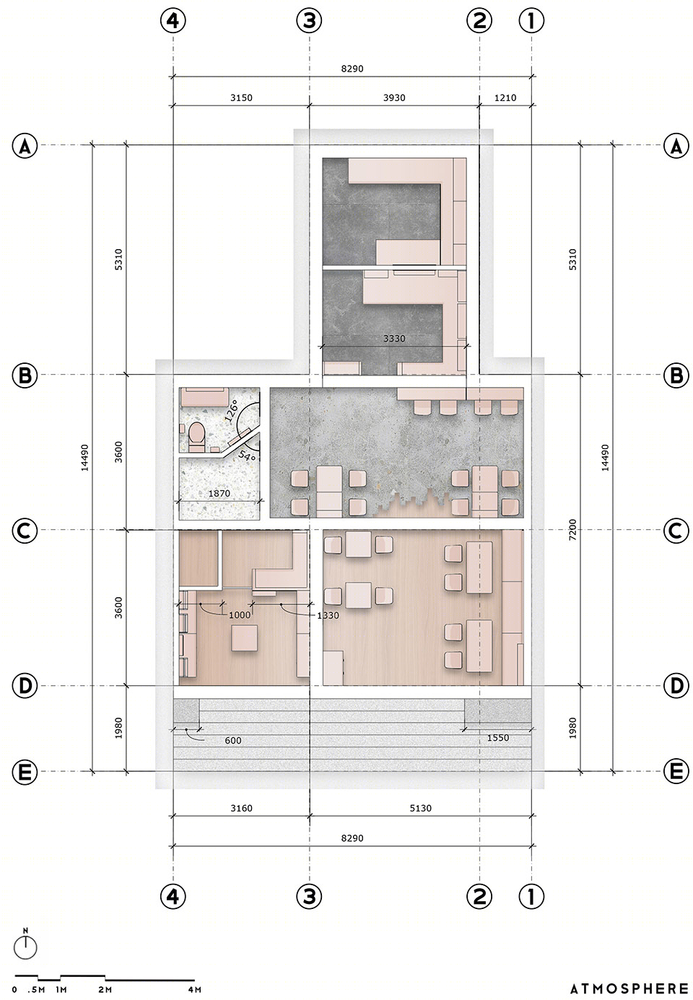
▼平面布置图,layout plan ©氣象建築
项目名称:無早Cafe 设计方:ATMOSPHERE 氣象建築 项目设计 & 完成年份 2018年8月 & 2019年1月 主创及设计团队:ATMOSPHERE 氣象建築 主创: Tommy Yu 设计团队: Deniel Hwang ,Norma Lee 项目地址:成都市锦江区清莲上街62号 Area: 101 sqm 摄影版权: 形在建筑空间摄影 贺川 品牌: Paramita度仓家具
Project name: No Morning Café Design: ATMOSPHERE Project Complete: January.2019 Leader designer & Team: ATMOSPHERE ARCHITECTS Design in charge: Tommy Yu Space Design: Deniel Hwang ,Norma Lee Project location: Chengdu, China Area: 101 sqm Photo credits: Here Space Photography Chuan He Brands / Products used in the project: Paramita


