版权@壹贰壹捌设计事务所
LD & Restaurant
01
客厅
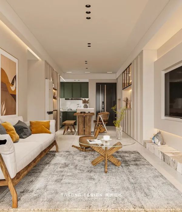
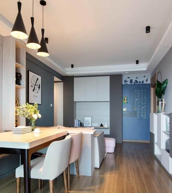
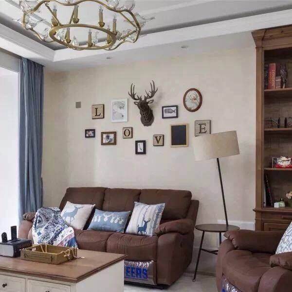
全屋空间以奶油色搭配原木色系为主,整体呈现出明亮的室内环境,让整个空间干净又显高级。为了孩子有活动的空间,做去客厅化设计,弱化客厅固有的功能性,并延申做出亲子互动、阅读、娱乐灯多功能性,增加空间实用性。
The whole house space is mainly cream color with log color, and the overall indoor environment is bright, making the whole space clean and high-end. In order for children to have space for activities, the design of the living room is depleted, the inherent functionality of the living room is weakened, and the multi-functionality of parent-child interaction, reading, and entertainment lights is extended to increase the practicality of the space.
设计上经过与屋主的前期沟通,我们摒弃了传统的电视背景墙,改为客厅书柜和涂鸦墙,可涂鸦创作,也可以记录家庭日常生活,让孩子的天马行空也有迹可循。
After preliminary communication with the owner, we abandoned the traditional TV background wall and replaced it with a living room bookcase and graffiti wall, which can be used for graffiti creation and can also record the daily life of the family, so that children's imagination can also be traced.
Kitchen area
02
餐厨区
狭长厨房和餐导一体,将功能区集中,动线流畅便捷,橱柜延申整个个窗户,冰箱电器嵌入式,与柜体融合,无把手柜子,干净整洁。
The long and narrow kitchen and dining guide are integrated, the functional area is concentrated, the movement line is smooth and convenient, the cabinets extend the entire window, the refrigerator appliances are embedded, and the cabinet is integrated, and the handleless cabinet is clean and tidy.
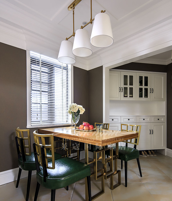
相较于墙漆、橱柜的简洁,软装搭配上,选择了黑色的餐桌搭配藤编的木椅,三盏与木色相近色彩的圆形吊灯,高度不一显得有层次感,给空间增加了复古的感觉!
Compared with the simplicity of the wall paint and cabinets, the soft decoration is matched, the black dining table with rattan wooden chairs is chosen, and the three round chandeliers with similar colors to the wood color are different in height and appear to have a sense of hierarchy, adding a retro feeling to the space!
Living room
03
主卧
主卧玄关是进入主卧得一道亮丽风景线,一门到顶得奶油白衣柜,中间镂空做端景,摆放绿植,简约又大气,床头背景没有做任何造型,仅在最上端做了一层木板,增加空间层次感,干净又舒适。
The entrance of the master bedroom is a beautiful scenery line to enter the master bedroom, a cream white wardrobe from the door to the top, the hollow in the middle is used as an end scene, and the green plants are placed, simple and atmospheric, and the bedside background does not do any modeling, only a layer of wood is made at the top end, which increases the sense of space hierarchy, clean and comfortable.
Living room
04
次卧
Living room
05
功能书房
书房采用半开放式设计,折叠木质玻璃门可开可合为一体,通透开阔,可变空间方便屋主使用,让空间保证私密与开放共存。
The study adopts a semi-open design, with folding wooden glass doors that can be opened and closed, transparent and open, and the variable space is convenient for the owner to use, so that the space can ensure the coexistence of privacy and openness.
布局上选择了榻榻米加书桌得组合设计,床下是抽屉储物空间,弥补了收纳空间得确实,空间利用到最大化。
The layout is designed with a combination of tatami mats and a desk, and there is a drawer storage space under the bed, which makes up for the storage space and maximizes the use of space.
项目信息
项目位置 | 广州天阳路海逸阁
主案设计 | 1218设计事务所
设计风格 | 原木风
建筑面积 | 110m²
🔺改造后平面布置图
{{item.text_origin}}

