美甲设立二楼无窗没有光线,只能借助楼梯窗户的光,所以整个把一楼二楼区域的墙体拿掉,镂空的黑色方管直接重一楼通向二楼顶面,既显的通透,又保证了二楼空间的安全性,与一楼的区域很好的做了一个结合。 MANICURE set up the second floor with no windows and no light, only the light from the staircase windows, so the whole wall of the first floor and the second floor area was removed, and the hollow Black Square pipe directly re-opened the first floor to the top of the second floor, which was both transparent and transparent, it also ensures the safety of the second floor space, and the first floor of the area to do a good combination.
一层平面规划 First floor plan
二层平面规划 Bilevel plan
本案的位于松江九亭,地理位置沿街,一层进户面朝正西,非常迷你的小空间,两层加38㎡。客户是一个精致而时尚的珠宝原创设计师,一层为珠宝设计展示,二楼也由于许多爱美的小姐妹到访,二楼设立了个美甲美睫的空间,所以二层也就是仅有的17㎡,需要满足两美甲桌,美甲椅,美容床(用时最好能隐蔽)展示,储物,水洗,等等些功能,所以空间的尺寸的把控至关重要。
The case is located in Jiuting, Songjiang, along the street, the first floor into the house facing west, very small space, two plus 38 M2. The client is an exquisite and fashionable jewelry original designer, the first floor is for jewelry design display, the second floor also because many love the beauty of the young ladies visit, the second floor has set up a nail and eyelash space, so the second floor is only 17 M2, needs to meet two nail table, nail chair, beauty bed (time is best concealed) display, storage, washing, and so on some functions, so the control of space size is crucial.
一楼珠宝墙面展示造型灵感来源于蜜蜂窝,采用精致的金属色收边,有种蜜蜂产蜜,金属色的首饰置放在蜂窝的柜体里也就很好的跟蜂蜜色完美结合。 The Jewelry Wall display on the first floor is inspired by the honeycombs. It uses a delicate metallic finish. Some bees produce honey. The metallic jewelry is placed in the cabinet of the honeycombs and is perfectly combined with the honey color.
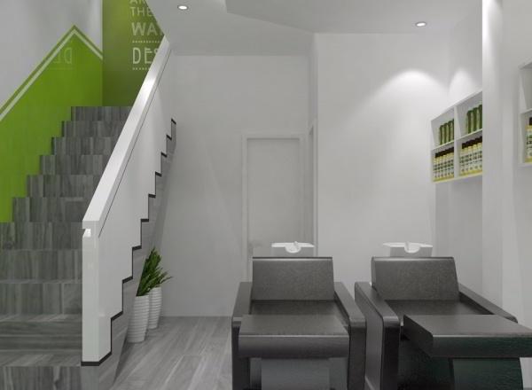
二楼整体为淡雅的冷色系,采用了墙顶一体色系淡绿,灵感来源于方型盒子,绿色部分为盒子盖子,墙体下段采用干净清爽的纯白来进行对比分界,中间金属拉丝不锈钢进行墙群收边,既清爽干净又显格调,丰富了空间层次感。做美甲小件品多,所以储物空间是必不可少的,不然会使整个小空间显的非常凌乱,为了使空间更加的整体性,柜体色系跟墙体色系一致,加上金属收边条收边,使整个展示柜精致美观又实用,深入浅出的壁龛柜体颜色跟家具色度统一,这样跟墙体颜色上层次分明,结合空间的辅助灯光,整个空间氛围被很好的烘托出来。考虑到空间的通透性美容床采用跟楼梯统一黑色方管的手法跟材质进行阻隔,用时空间可以独立,不需要时又可以完全的开放。使空间达到最佳状态。 The whole of the second floor is a cool and elegant color scheme, which adopts a light green color scheme on the top of the wall. The inspiration comes from the square box. The green part is the cover of the box. The lower part of the wall adopts a clean and pure white for contrast and demarcation, middle Metal Wire drawing stainless steel wall group edge, both clean and obvious style, rich sense of spatial hierarchy. Nail art small pieces to do more, so storage space is essential, otherwise it will make the whole small space appear very messy, in order to make the space more integral, the cabinet color system and the wall color system consistent, plus metal receive edge, make the whole display cabinet delicate and beautiful and practical, deep shallow niche cabinet color and furniture chroma unity, so with the wall color upper level clear, combined with the space auxiliary lighting, the whole space atmosphere is very good foil out. In view of the permeability of space beauty bed with the staircase uniform Black Square tube with material barrier, with time and space can be independent, do not need and can be completely open. To optimize the space.
{{item.text_origin}}

