这项甜蜜的计划的主人公,是一对特别有意思95后的准夫妻,计划将手中这套顶楼复式改造后作为他们的婚房。两人的诉求都是不喜欢房子过于方正的生硬感,希望打造有弧度的温暖的生活空间。我们选择了“中古风”的装修方式,帮助他们实现有格调、时髦的的“轻复古风格”。
The protagonist of this sweet plan is a particularly interesting couple born in 1995 who plan to renovate their penthouse as their wedding home. Both people's demands are that they do not like the stiffness of the house being too square, and they hope to create a warm and curved living space. We have chosen a "medieval style" decoration method to help them achieve a stylish and stylish "light retro style".
经过和业主多次沟通,在功能布局上,将整个空间划分出生活核心区、睡眠休息区、阳光露台、阁楼居住四大生活版块。改造后的家,不仅满足男女主人对新家的构想,并且整个视觉空间大了不止一倍。
After multiple communications with owner, the functional layout has been divided into four major living areas: the core living area, the sleep and rest area, the sunny terrace, and the attic living area. The renovated home not only meets the male and female hosts' vision of a new home, but also expands the overall visual space by more than twice.
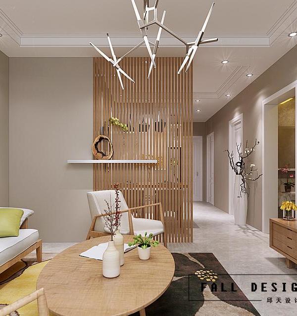
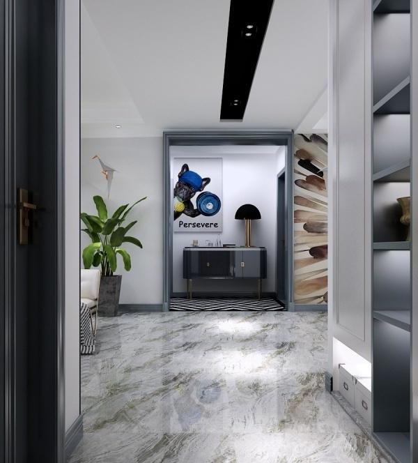
对玄关区做了个性化设计,在玄关处做了对景设计,使用了比较重的木色。整体色彩由深到浅,层次丰富。通过拱形门、木地板与瓷砖拼接等元素,打造出明确的功能分区。在玄关区域,通过搭配花砖和拱形造景,形成入户的仪式感。每天卸下一身疲惫,打开门就仿佛能听到这所屋子在说“主人,欢迎回家。”
Personalized designs were made in the entrance area. It has been designed with a contrasting landscape, using a heavier wood color. The overall color ranges from deep to light, with rich layers. Create clear functional zones through elements such as arched doors, wooden flooring, and tile splicing. In the entrance area, a sense of ritual of entering the house is formed by combining tiles and arched landscaping. I feel exhausted every day, and when I open the door, I feel like I can hear the house saying, 'Master, welcome home.'
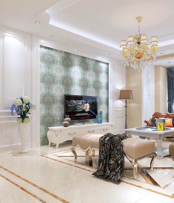
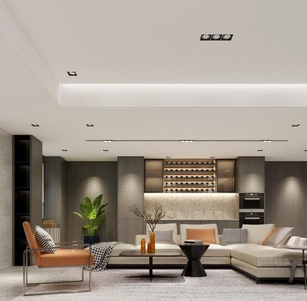
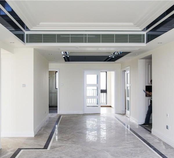
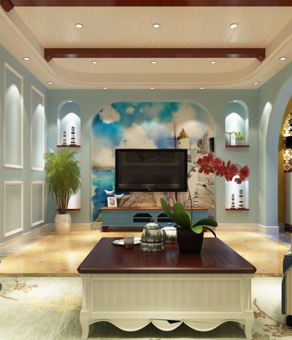
整个客厅无吊顶设计,采用通体奶油色与餐厅厨房空间相呼应。并在墙面部分使用了玻璃砖,打破房间的沉闷感,并且解决房间的采光问题。软装部分选择了面包型沙发,沙石色的羊羔绒面料柔和、温暖,搭配胡桃木小茶几和单椅,衬在人字拼地板和乳白色羊毛地毯上,流淌出法式慵懒、优雅的气质。
The entire living room has no suspended ceiling design, and adopts a full body cream color that echoes the dining room kitchen space. And glass bricks were used on the wall to break the dull feeling of the room and solve the lighting problem of the room. The soft decoration section has chosen a bread shaped sofa, with a soft and warm sandstone colored lamb fleece fabric, paired with a walnut small coffee table and a single chair, lined with herringbone flooring and milk white wool carpet, exuding a French lazy and elegant temperament.
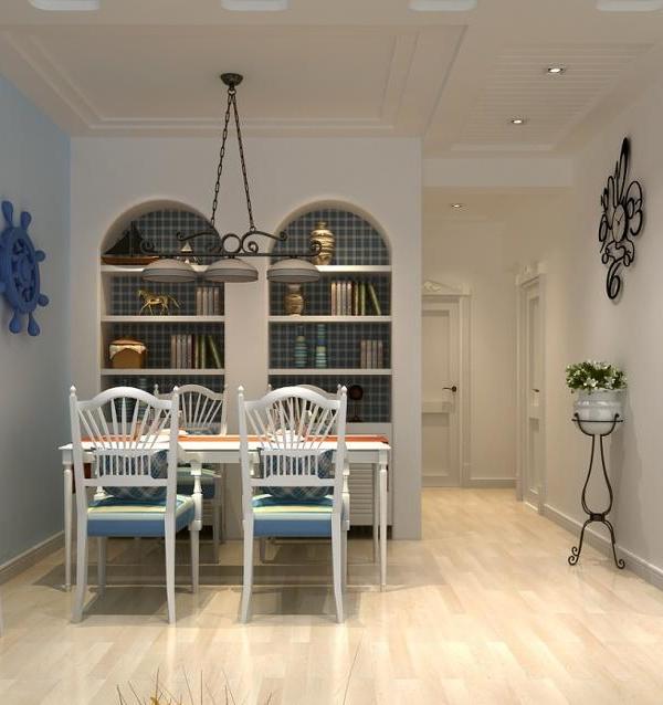
对原餐厅做了空间调整,将老房子原本的客厅改为餐厅。餐厅与客厅空间形成呼应,流线型的动线打通南北空间。餐厅按照女主人的品味,从中古餐边柜、椅子、圆桌到灯饰、以及挂画等软装方式,打造出轻奢怀旧复古的文艺餐厅。
The original restaurant has undergone spatial adjustments, replacing the living room of the old house with a dining room. The dining room and living room space complement each other, with streamlined lines connecting the north-south space. The restaurant follows the taste of the hostess, creating a light and luxurious retro literary restaurant with soft decoration methods such as medieval sideboards, chairs, round tables, lighting, and hanging paintings.
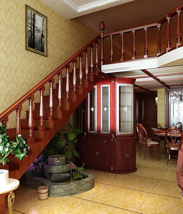
楼梯在空间上连通一层区域,同时与弧形元素融合,并将楼梯立面拉成一个整体,使空间看起来不零碎,更显开阔,成为空间的视觉亮点。从二层楼梯向下看过去,楼梯的旋转式扶手设计形成视觉焦点,奶油色和胡桃色呼应,复古典雅。平日坐在这里喝茶、看书,恣意放松,简直是小资情结满溢的理想地!
The staircase connects a layer of area in space, while integrating with curved elements, and pulls the staircase facade into a whole, making the space look more fragmented and spacious, becoming a visual highlight of the space. Looking down from the second floor staircase, the rotating handrail design of the staircase forms a visual focus, echoing cream and walnut colors, with a retro and elegant look. Sitting here on weekdays drinking tea, reading books, and relaxing recklessly is simply an ideal place for petty bourgeoisie sentiment!
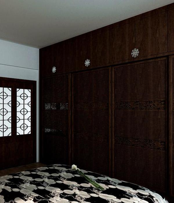
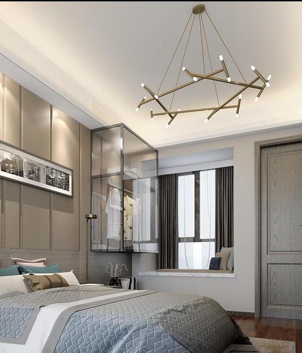
卧室床头两侧的门分别通向过道和衣帽间,形成对称的美感。因为屋主有非常大的储物需求,所以我们特别打造满墙的衣柜,外加上衣帽间的储物量,充分满足夫妻二人的收纳需求。床头左右两侧设计小夜灯,尽显高级,营造出古董级的美感,就像电影里的布达佩斯大饭店,含蓄且富有故事感。
The doors on both sides of the bedroom bed lead to the hallway and cloakroom, creating a symmetrical aesthetic. Due to the significant storage needs of the homeowner, we have specially designed a wall full wardrobe, coupled with the storage capacity in the cloakroom, to fully meet the storage needs of the couple.
Small night lights are designed on the left and right sides of the bedside to showcase luxury and create an antique level aesthetic, just like the Budapest Hotel in the movie, which is implicit and full of a sense of story.
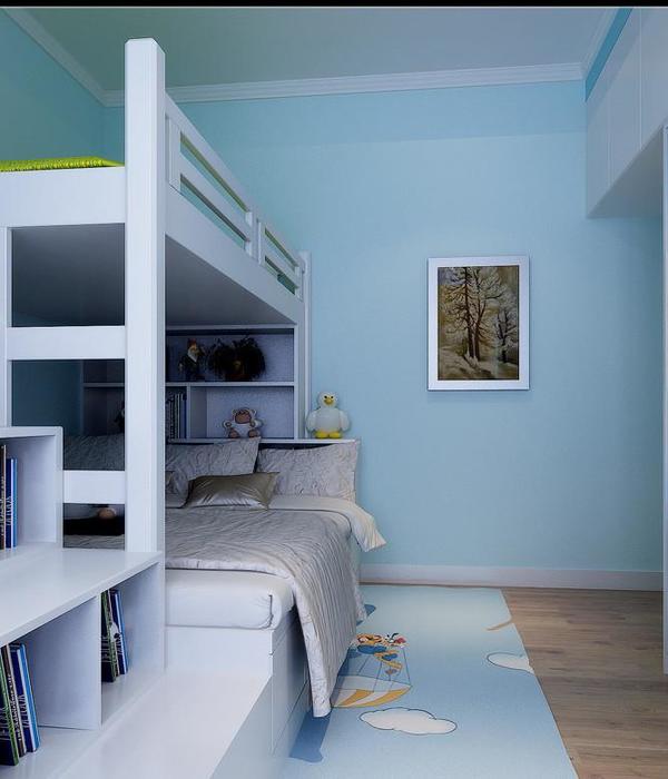
在儿童房的设计上,我们将没有充分利用的角落空间容纳进儿童房,这样就拥有了一个采光充足、推窗见绿的阳光角,满足孩子对阳光采光的需求。考虑孩子的生长活动需要,儿童床做了下沉式的地台,不仅可以收纳孩子的衣物,也可以作为影音角。比起居住空间,这更像个孩子的乐园。
Interiors:文君空间设计
Photos:立明
{{item.text_origin}}

